1959
About posters with fingers
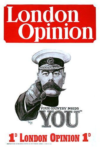
In 1914 the magazine "London Opinion" was released with a cover depicting a drilling gaze and pointing at the viewer British War Minister Lord Kitchener. The inscription reads: "You want your country».
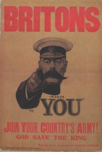
Illustration rather unceremoniously. Field Marshal poke a finger in his face, and according to etiquette, the use of the index finger of showing even to inanimate objects - impolite. In addition, the hand is shown in a white glove, symbolizing a major military post. That is, you need their own country but know your place. The viewer seems that painted eyes watching them from any angle. Index finger plays the same role - he shows the viewer, even if you get to the image side. The First World War. Illustration has been asked - with the consent of her magazine altered in military poster.
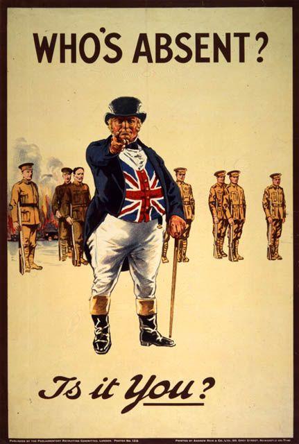
In January 1916, a new poster, this time to draw and without gloves on hand. Depicts the finger at the viewer John Bull (British collective image, similar to Uncle Sam).
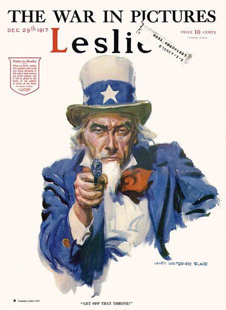
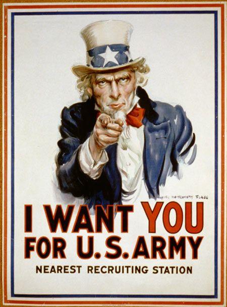
In July 1916, when the United States was preparing to participate in the First World War, James Montgomery Flagg illustration with the words "What are you doing for readiness?" With a picture of Uncle Sam appears on the cover of an illustrated weekly magazine "Leslis." In February 1917, exactly the same illustration appears on the cover of the latest issue "Leslis", but with the words "I need you." In the same year in the United States is provided with a large illustration of the words "I need you in the United States Army" and print millions of copies, urging soldiers to take part in the war.
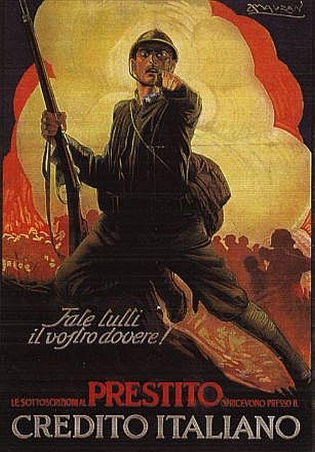
Poster with graphic stroke goes in Italy.
Poster becomes world classics and parodied countless times. Flagg on the cover of the same "Leslis" beat your own graphic in December 1917 (ie, when the propaganda version is already hung at each corner).
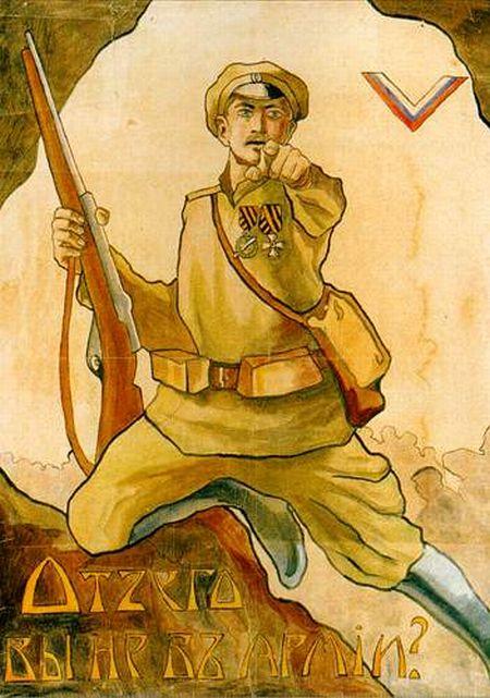
In 1919 appears the White Guards poster "Why are you not in the army?". Poster frankly weak. Firstly, the image is redrawn with the Italian poster. Second, do not read the inscription. Third font in the Art Nouveau style gives the impression that the viewer is invited to a glass of champagne and dancing. Fourth, there is absolutely inappropriate treatment "you" (it is appropriate in the Italian version, because there tout military loans, and do not call the front).
It's hard to shake the feeling that whites have lost the war only because of the design of helplessness - all of their posters fade against the background of red propaganda. But this is a topic for a separate study.
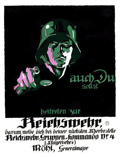
The Germans used the same method.
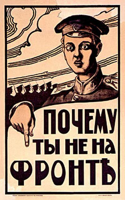
In 1920, Dmitry Moor creates his famous poster that became a classic of the same in the USSR as flaggovsky poster with Uncle Sam all over the world.
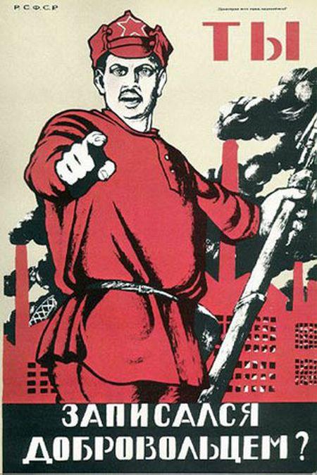
Moore was not just a superb artist, he has skillfully mastered poster word. The phrase "You volunteered?" Was no less classic than the image of a soldier. In the world of a huge number of similar works. During World War II poster with Uncle Sam again began to use for propaganda purposes. Curiously, the Moor at the same time redrew his work, to modernize the image of the soldier.

Today the image, piercing stare and point the finger at the audience, perceived solely as a parody posters or Flagg Moor.
via artlebedev.ru

Illustration rather unceremoniously. Field Marshal poke a finger in his face, and according to etiquette, the use of the index finger of showing even to inanimate objects - impolite. In addition, the hand is shown in a white glove, symbolizing a major military post. That is, you need their own country but know your place. The viewer seems that painted eyes watching them from any angle. Index finger plays the same role - he shows the viewer, even if you get to the image side. The First World War. Illustration has been asked - with the consent of her magazine altered in military poster.

In January 1916, a new poster, this time to draw and without gloves on hand. Depicts the finger at the viewer John Bull (British collective image, similar to Uncle Sam).

In July 1916, when the United States was preparing to participate in the First World War, James Montgomery Flagg illustration with the words "What are you doing for readiness?" With a picture of Uncle Sam appears on the cover of an illustrated weekly magazine "Leslis." In February 1917, exactly the same illustration appears on the cover of the latest issue "Leslis", but with the words "I need you." In the same year in the United States is provided with a large illustration of the words "I need you in the United States Army" and print millions of copies, urging soldiers to take part in the war.

Poster with graphic stroke goes in Italy.

Poster becomes world classics and parodied countless times. Flagg on the cover of the same "Leslis" beat your own graphic in December 1917 (ie, when the propaganda version is already hung at each corner).

In 1919 appears the White Guards poster "Why are you not in the army?". Poster frankly weak. Firstly, the image is redrawn with the Italian poster. Second, do not read the inscription. Third font in the Art Nouveau style gives the impression that the viewer is invited to a glass of champagne and dancing. Fourth, there is absolutely inappropriate treatment "you" (it is appropriate in the Italian version, because there tout military loans, and do not call the front).

It's hard to shake the feeling that whites have lost the war only because of the design of helplessness - all of their posters fade against the background of red propaganda. But this is a topic for a separate study.

The Germans used the same method.

In 1920, Dmitry Moor creates his famous poster that became a classic of the same in the USSR as flaggovsky poster with Uncle Sam all over the world.

Moore was not just a superb artist, he has skillfully mastered poster word. The phrase "You volunteered?" Was no less classic than the image of a soldier. In the world of a huge number of similar works. During World War II poster with Uncle Sam again began to use for propaganda purposes. Curiously, the Moor at the same time redrew his work, to modernize the image of the soldier.

Today the image, piercing stare and point the finger at the audience, perceived solely as a parody posters or Flagg Moor.
via artlebedev.ru


