1500
Art print advertising
In the era of viral video, many underestimate the art of print advertising without giving proper znacheniya.Odnako posters, print advertising now more relevant than ever. It is definitely a good advertising. What distinguishes good from bad publicity? Firstly, it should be easily distinguishable and recognizable even from a distance. Secondly, it should be immediately clear whose it is advertising even without a brand logo. And most importantly, we need an idea that can instantly take over the minds of consumers.
All of the following 40 prints cope with these tasks. This collection of innovative advertising campaigns demonstrates how you can patch from the banal advertising, for example, to create something beautiful. We inspire and learn from the best examples of print ads.
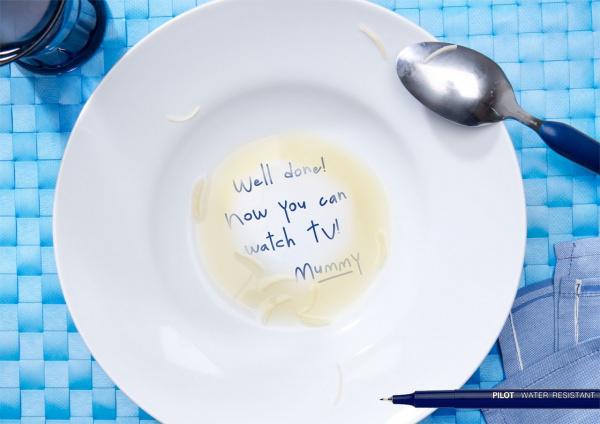
"Well done! Now you can watch TV. Mom. "This is a great advertisement waterproof markers Pilot, developed by Barcelona's agency Grey. Everyone learns in the print or yourself, a child or a parent yourself.
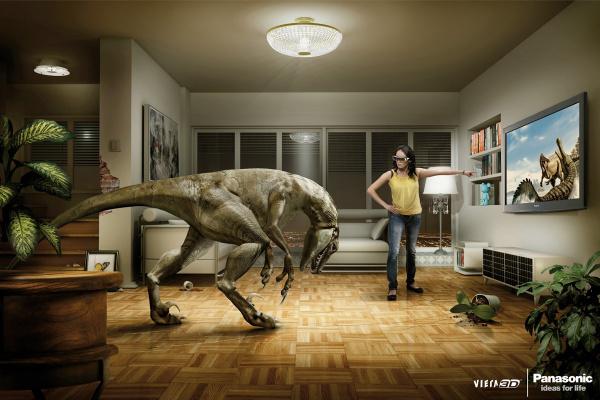
A witty and catchy advertising account 3D Panasonic TVs from the Chilean Agency Lobo demonstrates the scope and innovation of new technology.
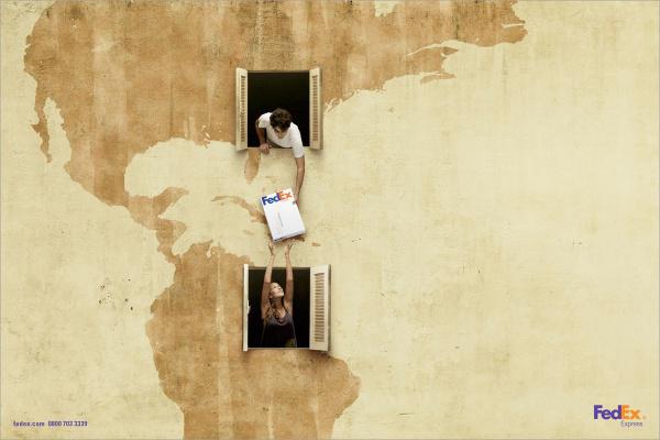
Advertising FedEx «US-Brazil." The idea with the contours of the wall of the building - simple and ingenious. Advertised product in the center of the print. The message is easy to read and without FedEx's logo in the corner. Creative agency DDB Brasil.
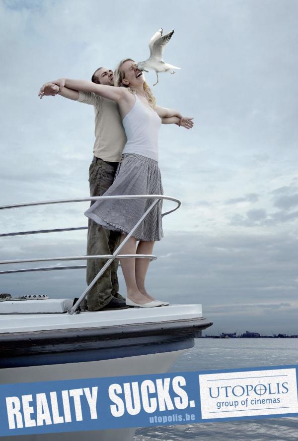
"Reality sucks." Funny, destroying the illusion of advertising cinema chain Utopolis.
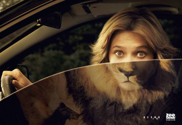
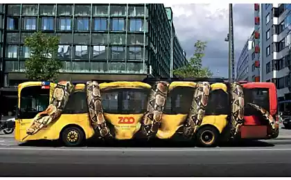
Advertising zoo without cages. Bright idea, a successful photography, retouching and excellent choice of colors from the agency DDB.
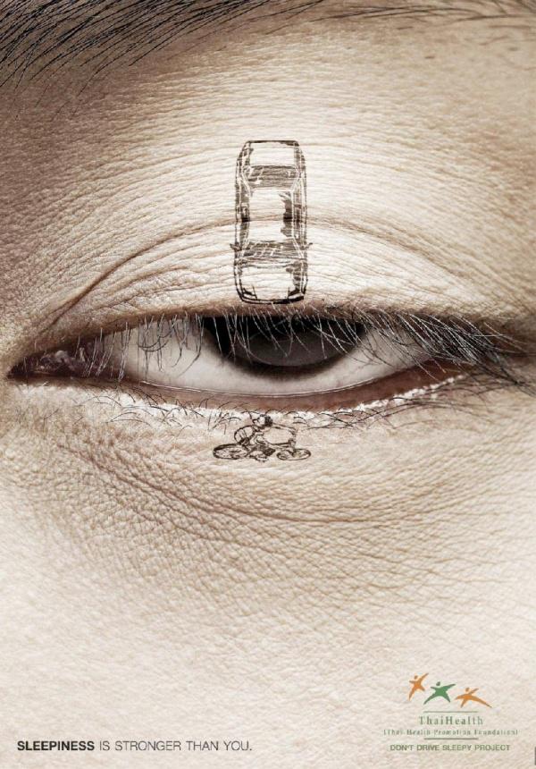
"Drowsiness is stronger than you" - warns Thai Health Fund in the framework of the campaign "Do not drive drowsy» (Do not Drive Sleepy Project). No accidents, victims, blood and horror inherent in a public service announcement about safe driving, the agency BBDO Bangkok showed the seriousness and danger of driver fatigue at the wheel.
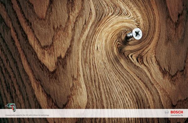
The bright, catchy and simple to genius advertising super-powerful screwdriver Bosch. The natural twisting of the wood used to demonstrate the power of the tool.
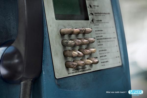
The first thing that is advertising an antibacterial gel for hands Sanzer, it's disgusting. And then the instinctive desire to wash your hands. Which seeks the advertisement. The slogan "To what do you really you touch?»
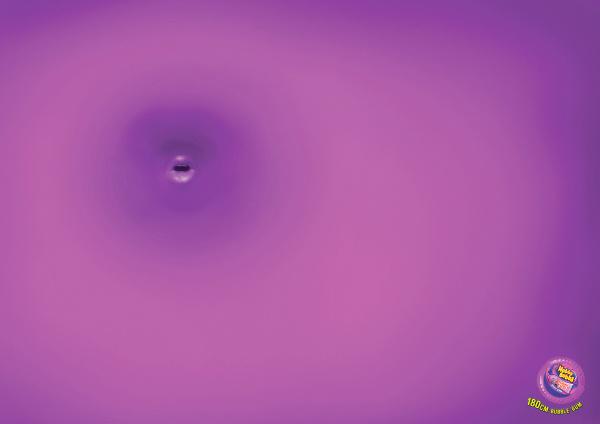
The view from the huge bubble gum Hubba Bubba. Creative agency DDB.
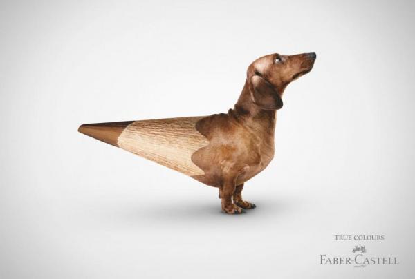
Seeing this strange creature on a billboard, people certainly want to know what is advertised. This advertising campaign pencils Faber-Castell «True Colors».
"Love yourself and do not put in your mouth the dirtiest," - tells us advertising Slimming WeightWatchers. The glamorous image of her painted lips and mouth full of greasy potatoes, convey a message without too much mentoring and negative associations.
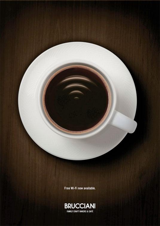
Free Wi-Fi in cafes Brucciani. British Creative agency Big Communications. The message read at once. But when looking closer, you notice a cup of coffee signal Wi-Fi, you understand the subtlety and genius idea.
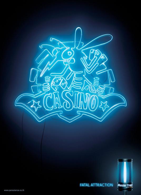
Simple, fun and more efficiently advertising insect traps Master Trap «Casino». The slogan "Fatal Attraction." Creative Thai agency Ogilvy & Mather.
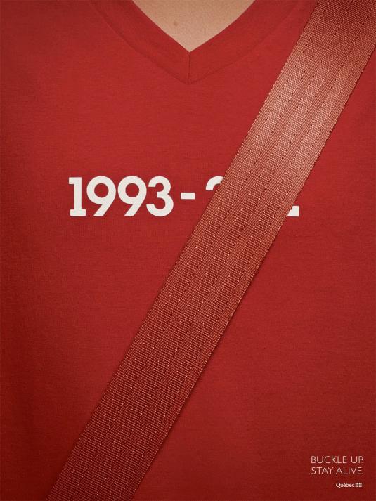
Automobile Insurance Company of Quebec Canadian perfectly promotes the use of seat belts, "Buckle up and stay alive." Creative agency Lg2.
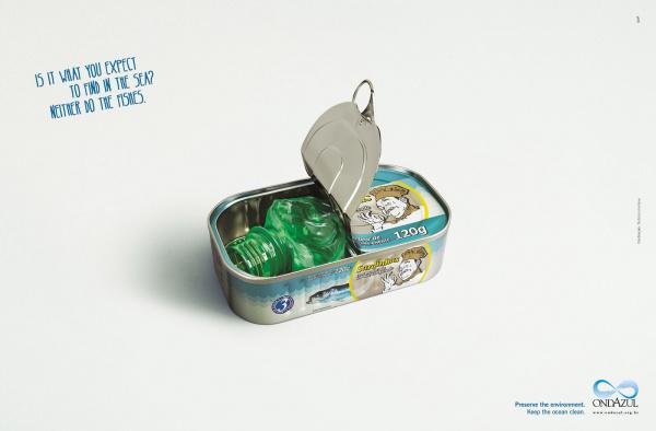
"You expect to find it in the sea? That's no fish "- a social advertising about clean seas and beaches. Creative Brazilian agency Quê. For additional emotional burden attached to print font. The slogan is written like a child's hand, indicating that the innocence of nature and of the dangers threatening it.
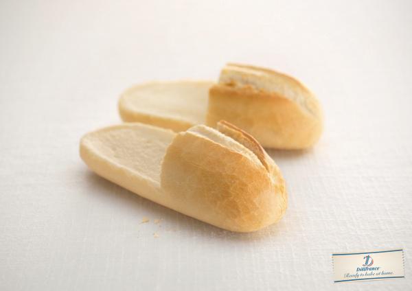
"Ready oven at home?" Warm and cozy home advertising Bread DeliFrance. Baguette and slippers, which can be attractive?
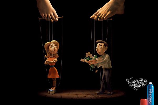
Advertising deodorant Foot Baruel. Slogan: "Get rid of the odor until someone does not get rid of you." Creative Brazilian Agency Z + Comunicação. Advertise with visual trick: do not immediately notice that the puppets run legs, not your hands.
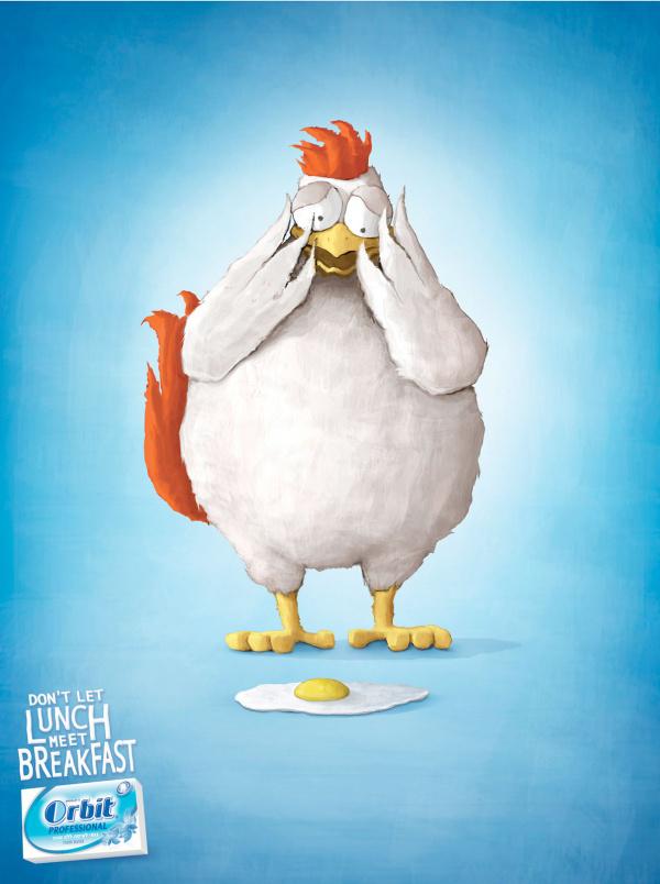
Chewing gum Orbit: Do not give dinner to meet with breakfast. Excellent choice of color and illustrations, in harmony with the "stupid" slogan. Creative agency Gitam BBDO.
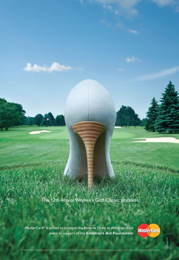
Championship women's golf - that's priceless. Fine and bright advertising MasterCard from the Canadian agency MacLaren McCann. In pursuit of the audience's attention in advertising women's sports easily slip to excessive frankness. MasterCard was able to avoid it. The secret - a good idea and a great touch-up.
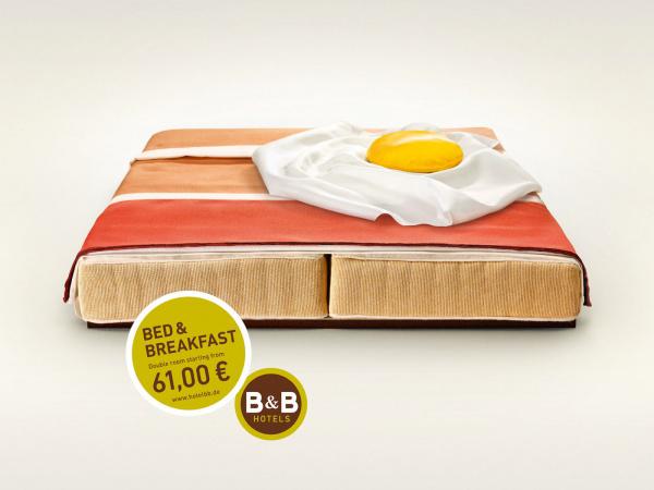
Brilliant art direkshn in an advertisement B & B Hotels «Hotel Bed and Breakfast." Advertising German agency Publicis - is a work of art, pleasing the eye.
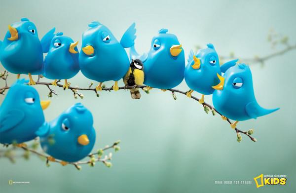
Children's magazine National Geographic Kids. Today's children are plunged into social networking, interactive entertainment and video games. "Give wildlife a place" - says advertising expert in this field. South African creative agency FoxP2.
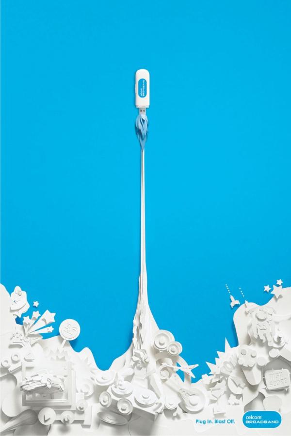
Excellent graphics in the paper advertising Internet provider Celcom. The slogan "Get involved and start", leaving behind all the paperwork. Creative agency M & CSaatchi.
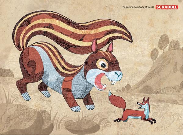
Advertising board game Scrabble, known in Russia under the name of "Scrabble". According to the rules, the word "protein" bring the player more points than the word "fox". Therefore, in print giant rodent Gonet of defenseless predator. Creative Indian agency Ogilvy & Mather.
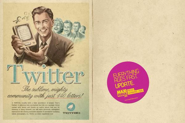
Brazilian agency Moma manufactured vintage advertising posters modern inventions of civilization. To proreklamrovat a series of workshops, the authors had aged innovations of recent years such as the FaceBook, Youtube, Skype, thus showing how quickly obsolete technology.
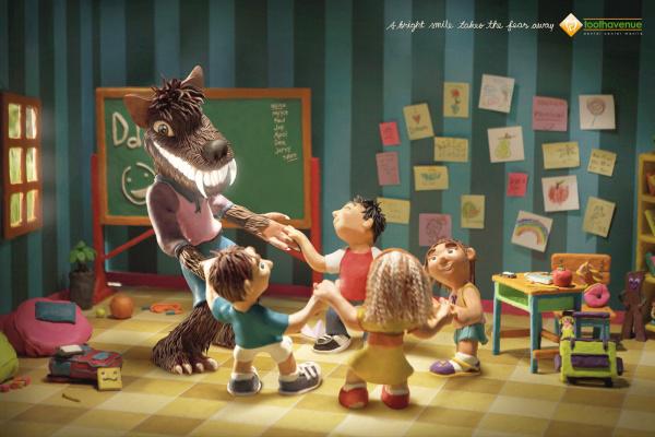
The bright smile of a wolf killing children for fear of dentistry print advertising. Plasticine advertising cause clear association with the game, have fun, joy and a good pastime. What else you need to get the child to treat teeth?
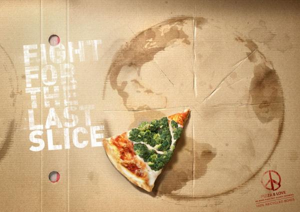
ADVERTISEMENT "Fight for the last piece of" pizzeria announced the release of environmentally friendly packaging and the transition to the exclusive use of organic products for pizza. The forest of broccoli on the last piece of pizza signals about the importance of forest conservation. Attentive customer will notice that the logo in the lower right corner - this is not Pacifik and pizza.
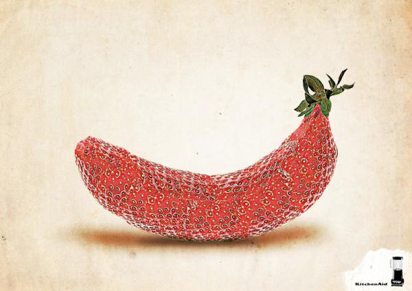
Advertising Blender Kitchen Aid, perfect for preparing smoothies and other fruit drinks. One of them is presented in print in the form of exotic fruit klubnikobanana.
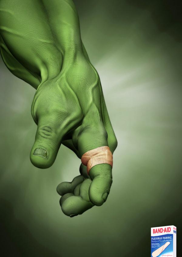
Image Band Aid plaster on the hand of the strongest superhero Hulk does not require further clarification. Even the slogan on the prints would be superfluous.
Looking to advertise Perrier, seems to feel the skin coming from the heat of the print. Impressive art direkshn from British Ogilvy.
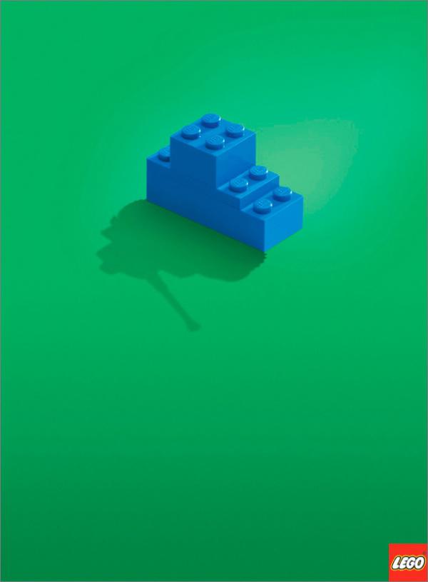
Advertising Lego assures us that the world is limited only by the limits of our imagination. Words are superfluous.
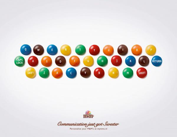
The keyboard of the M & Ms. Communication has never been so sweet. Sit in social networks, chew candies. That's so simple, recognizable and understandable.
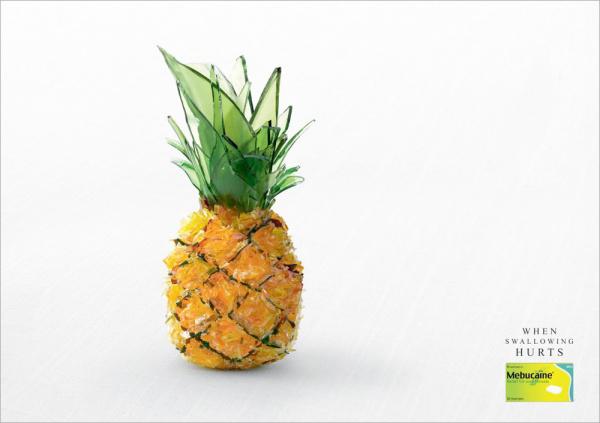
Anyone who has ever suffered from angina, become close and clear advertising Mebucaine. Each sip - like a glass of sore throat. Pineapple Glass - good comparison, a good implementation of the idea.
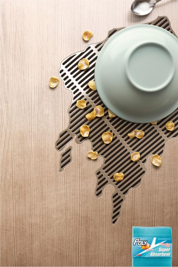
Advertising super-absorbent cloths Poly-Brite. The liquid goes through the cracks like a lattice. Creative belongs agency Ogilvy & Mather.
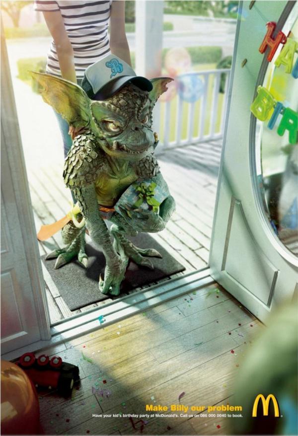
"Make your little monsters of our problem", - children's holiday offers advertising in McDonald's. Creatives from agencies DDB came up with a great character monsters, embodying the nightmare of all parents.
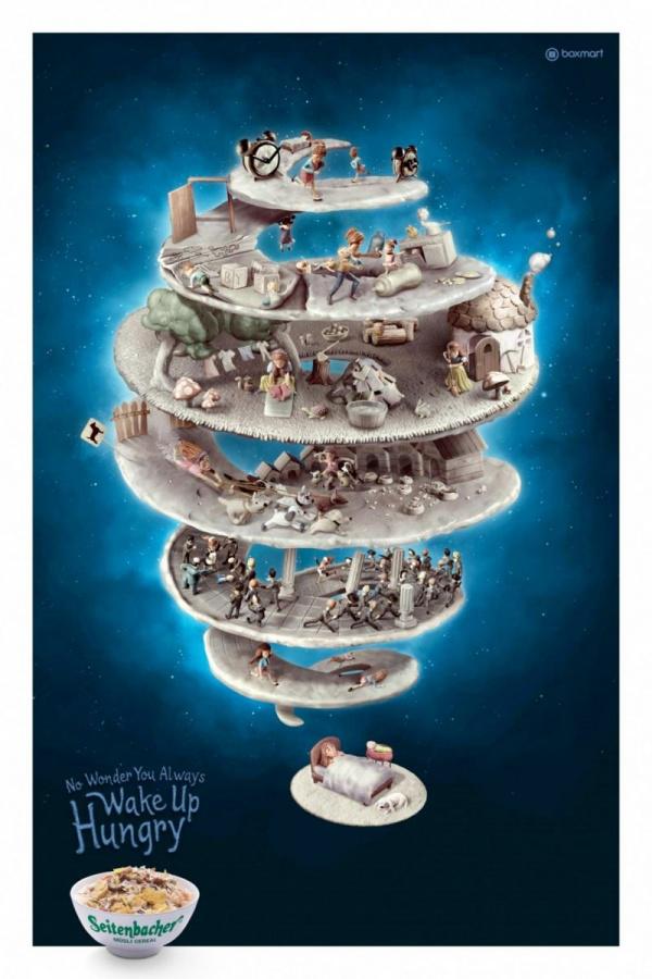
"Not surprisingly, that you always wake up hungry." Amazingly detailed 3D illustration show adventure in a dream.
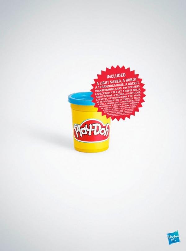
Advertising plasticine Play-Doh is designed for the power of imagination. In the center of the print - a jar, which is located inside the robot, Tyrannosaurus, machine-transformer, toy soldier ...
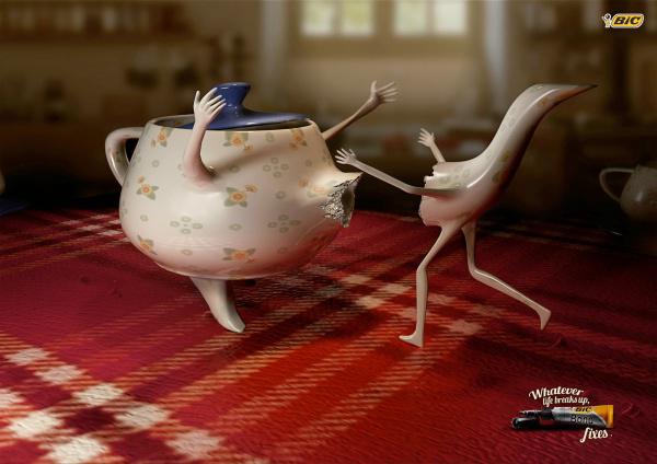
Clay BIC glues any relationship. The fact that life breaks, BIC glue sticks together. The idea is not new, but the implementation and emotion prints bribe.
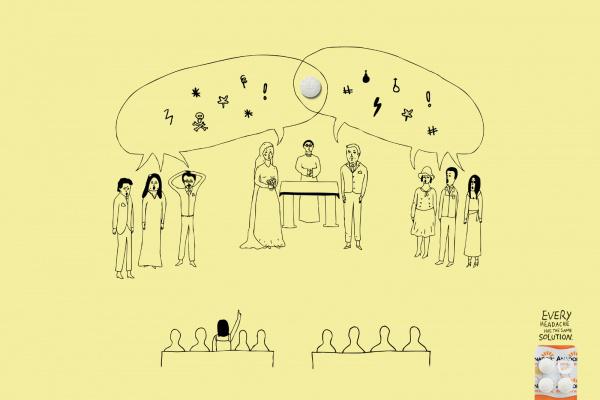
Illustrations "by-hand" in advertising anesthetic Anador. Slogan: Do any headaches one solution.

What could be better in the advertisement powder than dirt. It is because of her and made an advertising campaign OMO. This is not the computer graphics, and a simple picture on the background of a picture of the dirty sand. Natural and hand-made in advertising is always a price.
The best print ads, the
Creative handmade
Training for creative brain
via www.adme.ru/creativity/trenirovka-dlya-kreativnogo-mozga-almapbbdo-339980-149433/
All of the following 40 prints cope with these tasks. This collection of innovative advertising campaigns demonstrates how you can patch from the banal advertising, for example, to create something beautiful. We inspire and learn from the best examples of print ads.

"Well done! Now you can watch TV. Mom. "This is a great advertisement waterproof markers Pilot, developed by Barcelona's agency Grey. Everyone learns in the print or yourself, a child or a parent yourself.

A witty and catchy advertising account 3D Panasonic TVs from the Chilean Agency Lobo demonstrates the scope and innovation of new technology.

Advertising FedEx «US-Brazil." The idea with the contours of the wall of the building - simple and ingenious. Advertised product in the center of the print. The message is easy to read and without FedEx's logo in the corner. Creative agency DDB Brasil.

"Reality sucks." Funny, destroying the illusion of advertising cinema chain Utopolis.

Advertising zoo without cages. Bright idea, a successful photography, retouching and excellent choice of colors from the agency DDB.

"Drowsiness is stronger than you" - warns Thai Health Fund in the framework of the campaign "Do not drive drowsy» (Do not Drive Sleepy Project). No accidents, victims, blood and horror inherent in a public service announcement about safe driving, the agency BBDO Bangkok showed the seriousness and danger of driver fatigue at the wheel.

The bright, catchy and simple to genius advertising super-powerful screwdriver Bosch. The natural twisting of the wood used to demonstrate the power of the tool.

The first thing that is advertising an antibacterial gel for hands Sanzer, it's disgusting. And then the instinctive desire to wash your hands. Which seeks the advertisement. The slogan "To what do you really you touch?»

The view from the huge bubble gum Hubba Bubba. Creative agency DDB.

Seeing this strange creature on a billboard, people certainly want to know what is advertised. This advertising campaign pencils Faber-Castell «True Colors».
"Love yourself and do not put in your mouth the dirtiest," - tells us advertising Slimming WeightWatchers. The glamorous image of her painted lips and mouth full of greasy potatoes, convey a message without too much mentoring and negative associations.

Free Wi-Fi in cafes Brucciani. British Creative agency Big Communications. The message read at once. But when looking closer, you notice a cup of coffee signal Wi-Fi, you understand the subtlety and genius idea.

Simple, fun and more efficiently advertising insect traps Master Trap «Casino». The slogan "Fatal Attraction." Creative Thai agency Ogilvy & Mather.

Automobile Insurance Company of Quebec Canadian perfectly promotes the use of seat belts, "Buckle up and stay alive." Creative agency Lg2.

"You expect to find it in the sea? That's no fish "- a social advertising about clean seas and beaches. Creative Brazilian agency Quê. For additional emotional burden attached to print font. The slogan is written like a child's hand, indicating that the innocence of nature and of the dangers threatening it.

"Ready oven at home?" Warm and cozy home advertising Bread DeliFrance. Baguette and slippers, which can be attractive?

Advertising deodorant Foot Baruel. Slogan: "Get rid of the odor until someone does not get rid of you." Creative Brazilian Agency Z + Comunicação. Advertise with visual trick: do not immediately notice that the puppets run legs, not your hands.

Chewing gum Orbit: Do not give dinner to meet with breakfast. Excellent choice of color and illustrations, in harmony with the "stupid" slogan. Creative agency Gitam BBDO.

Championship women's golf - that's priceless. Fine and bright advertising MasterCard from the Canadian agency MacLaren McCann. In pursuit of the audience's attention in advertising women's sports easily slip to excessive frankness. MasterCard was able to avoid it. The secret - a good idea and a great touch-up.

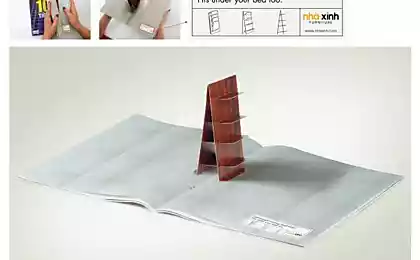
Brilliant art direkshn in an advertisement B & B Hotels «Hotel Bed and Breakfast." Advertising German agency Publicis - is a work of art, pleasing the eye.

Children's magazine National Geographic Kids. Today's children are plunged into social networking, interactive entertainment and video games. "Give wildlife a place" - says advertising expert in this field. South African creative agency FoxP2.

Excellent graphics in the paper advertising Internet provider Celcom. The slogan "Get involved and start", leaving behind all the paperwork. Creative agency M & CSaatchi.

Advertising board game Scrabble, known in Russia under the name of "Scrabble". According to the rules, the word "protein" bring the player more points than the word "fox". Therefore, in print giant rodent Gonet of defenseless predator. Creative Indian agency Ogilvy & Mather.

Brazilian agency Moma manufactured vintage advertising posters modern inventions of civilization. To proreklamrovat a series of workshops, the authors had aged innovations of recent years such as the FaceBook, Youtube, Skype, thus showing how quickly obsolete technology.

The bright smile of a wolf killing children for fear of dentistry print advertising. Plasticine advertising cause clear association with the game, have fun, joy and a good pastime. What else you need to get the child to treat teeth?

ADVERTISEMENT "Fight for the last piece of" pizzeria announced the release of environmentally friendly packaging and the transition to the exclusive use of organic products for pizza. The forest of broccoli on the last piece of pizza signals about the importance of forest conservation. Attentive customer will notice that the logo in the lower right corner - this is not Pacifik and pizza.

Advertising Blender Kitchen Aid, perfect for preparing smoothies and other fruit drinks. One of them is presented in print in the form of exotic fruit klubnikobanana.

Image Band Aid plaster on the hand of the strongest superhero Hulk does not require further clarification. Even the slogan on the prints would be superfluous.
Looking to advertise Perrier, seems to feel the skin coming from the heat of the print. Impressive art direkshn from British Ogilvy.

Advertising Lego assures us that the world is limited only by the limits of our imagination. Words are superfluous.

The keyboard of the M & Ms. Communication has never been so sweet. Sit in social networks, chew candies. That's so simple, recognizable and understandable.

Anyone who has ever suffered from angina, become close and clear advertising Mebucaine. Each sip - like a glass of sore throat. Pineapple Glass - good comparison, a good implementation of the idea.

Advertising super-absorbent cloths Poly-Brite. The liquid goes through the cracks like a lattice. Creative belongs agency Ogilvy & Mather.

"Make your little monsters of our problem", - children's holiday offers advertising in McDonald's. Creatives from agencies DDB came up with a great character monsters, embodying the nightmare of all parents.

"Not surprisingly, that you always wake up hungry." Amazingly detailed 3D illustration show adventure in a dream.

Advertising plasticine Play-Doh is designed for the power of imagination. In the center of the print - a jar, which is located inside the robot, Tyrannosaurus, machine-transformer, toy soldier ...

Clay BIC glues any relationship. The fact that life breaks, BIC glue sticks together. The idea is not new, but the implementation and emotion prints bribe.

Illustrations "by-hand" in advertising anesthetic Anador. Slogan: Do any headaches one solution.

What could be better in the advertisement powder than dirt. It is because of her and made an advertising campaign OMO. This is not the computer graphics, and a simple picture on the background of a picture of the dirty sand. Natural and hand-made in advertising is always a price.
The best print ads, the
Creative handmade
Training for creative brain
via www.adme.ru/creativity/trenirovka-dlya-kreativnogo-mozga-almapbbdo-339980-149433/
