1223
Advertising that nobody understood
Unfortunate placement unintelligible message or an inadequate idea can negate all the efforts of creatives and material investments reklamodatelya.Esche Ogilvy once made the famous phrase: "I know that half of the advertising budget I waste, but do not know what it is." Below are the bright examples of where advertising does not work. Time and money for creative, production and media have been spent, and not make much sense and the desired effect of advertising is not. Advertising is, but it does not work.
When there is no sense
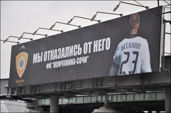
For example, in February of this year in Moscow was posted advertising Sochi football club, "Pearl-Sochi" with the image of David Beckham (David Backham) and the slogan "We have given up on him." It is not clear what results from this campaign was waiting for Russian football club from the city of Sochi. Muscovites and residents of other cities, discussing the senselessness of such a PR on the Internet, did not understand the concept and general objective of these billboards.
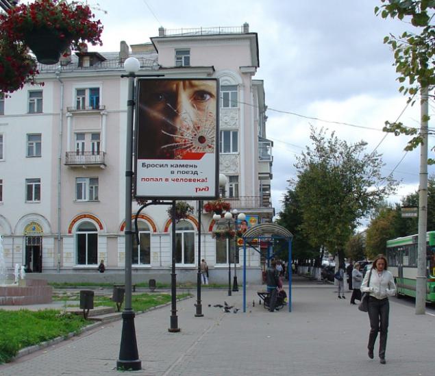
Railways campaigns against vandalism for new high-speed train "Sapsan", which follow on the route Moscow - Vladimir - Nizhny Novgorod. Trying to convince the disgruntled residents not to spoil w / d property and not to interfere with the new mode of transport, the advertiser has placed models with the slogan "throw a stone into the train - hit the man!».
Instead, in order to improve communication infrastructure of various types of transport, money is spent on pointless social campaigns that cause the population completely reverse the planned effect. The whole story of the cartoon series about Sapsanchik - cute train accident, which all hurt unfairly - is an example of a completely meaningless to the image point of view of the campaign, as the embodiment of which is only ridicule.
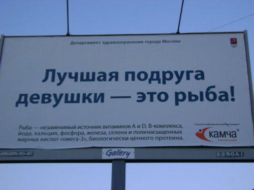
Fish-trading company "Kamchia" posted the billboard with the mysterious phrase "girl's best friend - a fish».
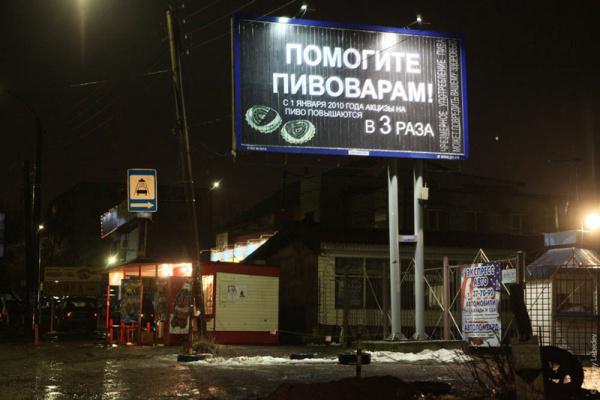
This call is more like a "voice in the wilderness", rather than the beer brand advertising message.
When not seen
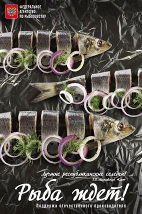
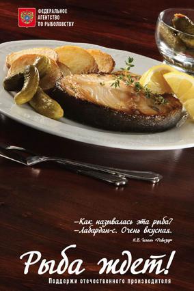
These posters Federal Fisheries Agency were placed on billboards along highways. Appetizing sprats with onion on rye bread were immediately attract attention and cause a desire to delay the view of the billboard, trying to understand what it is advertised. But this was very difficult due to the very small print and high speed motion. All that time to catch a keen eye - is that "Fish is waiting!", And where, when and who and left many residents of mystery.

This is perhaps one of the prettiest in terms of image examples of indiscriminate Russian outdoor advertising. Passion advertisers for placement on the boards of price lists is well known.
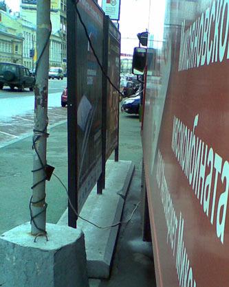
Throughout the day, a stall slaughterhouse on wheels parked on the site, completely blocking the two advertising posters. Time and money, "drip", and no one sees advertisements.
Social advertising
A striking example of meaningless social advertising: phone number for which you want to call in the event of a collision with corruption, advertisers apparently decided not to specify.

Here in this form appeared before Kazan bribe officials.

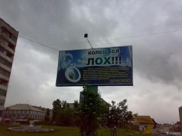
Here is a beautiful in its categorical social advertising was found in Biysk. Brains, flushed down the toilet, and terribly useful, but no information available, typed small yellow bukovkami, accompanied by the statement "prick? Loch! »
It's hard to think of anything more senseless than encourage women to have children out of a sense of patriotism, for the record for the country.

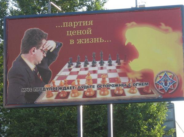
Social advertising MOE encourages people not to play with fire in chess.
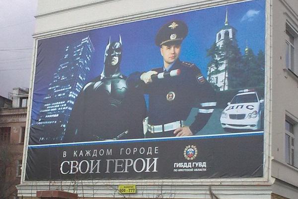
Senseless and merciless advertising traffic police.

In March 2010, in Moscow at the Moscow Ring Road were advertising posters with quotations from the Bible. Advertising constructions belong to the agency "Anko", which refused to name the customer, but clarified that it is not "the Russian Orthodox Church».
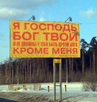
I am the Lord thy God, and do not have to be you have other gods besides me. i>


Teasers
Qualitative and interesting rosiyskie teasers can be counted on the fingers of one hand. Basically the mass no intrigue, they do not produce, but only add confusion and meaninglessness Russian outdoor advertising.
In the city of Krasnodar appeared here such teaser posters calling turn. Most city residents wondered what this might mean, advertising appeared quite clear. Because few people familiar with the logo shown on the poster advertised fashion store COSMO.
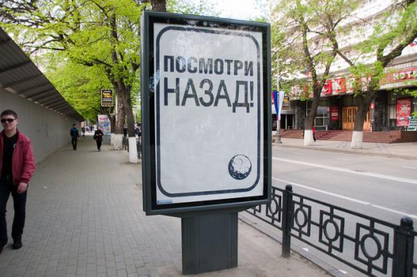
The teaser campaign Absolut Bank used to receive missing punctuation in an ambiguous phrase - "Buy you can not save" and "Eats, Blogs". Tricky linguistic trick known to many, but how does it relate to the bank, do not understand everything and not immediately.
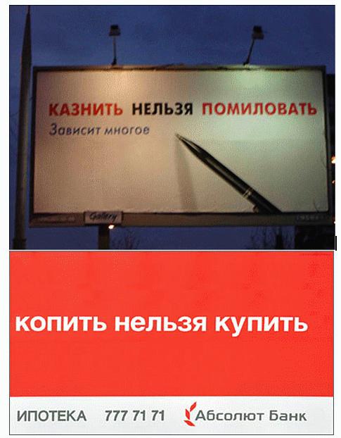
And some more senseless and merciless teasers.
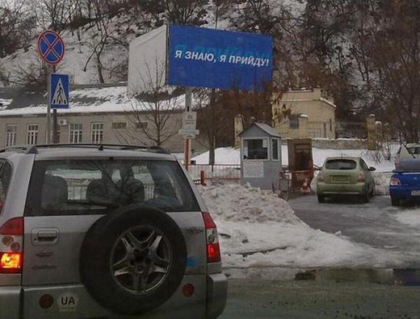
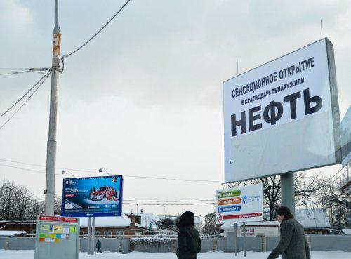
Unfortunate placement
In order not to be trapped by placing a banner ad or a billboard, should carefully examine their surroundings and especially advertising media. Otherwise, advertising risks not just lose all meaning, but also to become the laughing stock of the present.
Whether the trash appeared later, whether designers outlet Nestle Ice Cream not considered treacherous neighborhood. But advertising is more disgusted than the desire to buy ice cream.
Which designer or creative people had an idea so absurd advertise Airlines, creating the illusion of falling aircraft and how to prevent or could miss such representatives of the customer?
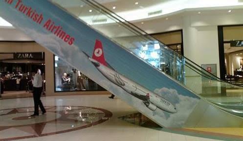
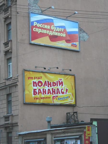
In Moscow, on the street. Lower Krasnoselskaya d.6, next to a tram stop, there was a "synergy effect" when placing two posters, one above the other.
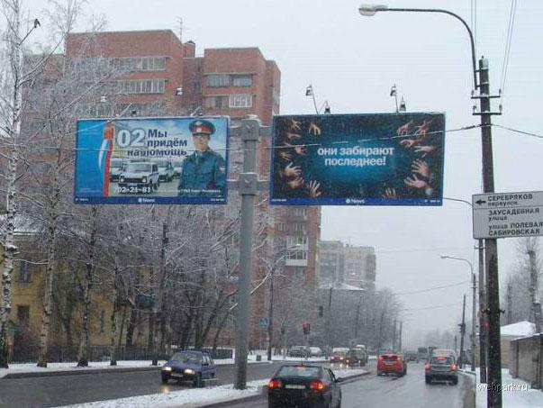
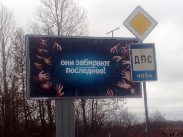
In Russia, about the objects of police and traffic police appeared in January 2008, an unusual teaser TELE2 with the words "They take the latter." Apparently, the media planning teaser campaign advertiser specifically chosen so as to place the billboards around the objects with respect to the traffic police and the police.
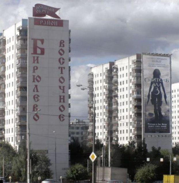
Advertising film "Resident Evil 3" in Biryulyovo:
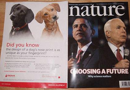
The front and back cover of the September issue of 2008 the American journal Nature is an excellent example of a failed advertising. Although no such mysterious coincidence company Sigma navryadli have secured a similar attention.
The inscription on top of advertising: "The fight against cancer nebeznadёzhna. I - a living example »
Advertising juicer with a picture of a huge carrot, adjacent to the advertising of the fitness center, showing the girl in knee-elbow position. In this context, the slogan juicer "was very thirsty?" Gets set to "experience an irresistible desire?».
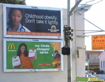
The inscription on the billboard top neighboring the advertising fast-food restaurant McDonald's, says, "Childhood Obesity. Do not take this lightly ».
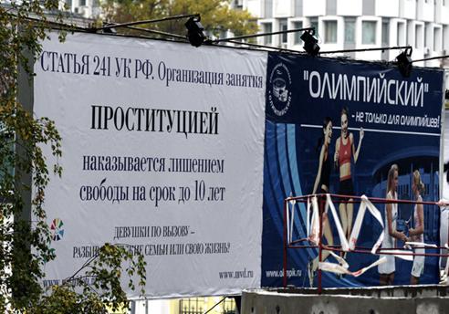
Advertise sports complex "Olympic" argues that it is not only for Olympians. For anyone else - could not help asking the answer for those who to turn to social sphere on the left.
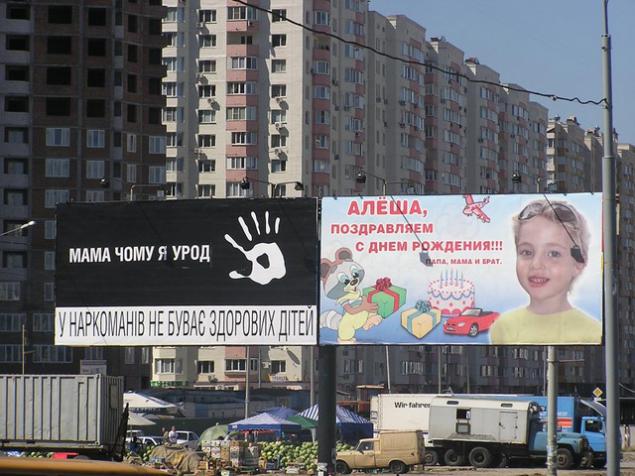
In St. Petersburg, almost all OOH-design in 2005, were decorated with a poster of the 60th anniversary of the Victory. At the same time there was a campaign of the film "Star Wars».
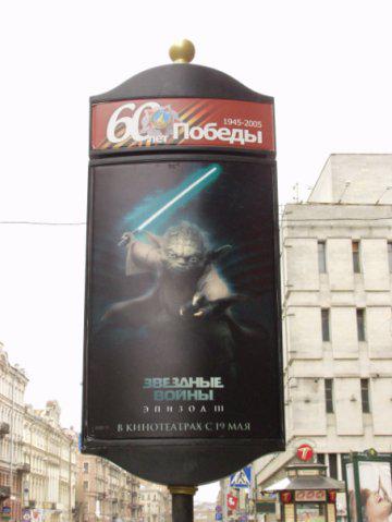
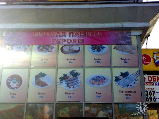
Who died heroically in battle with the butcher - not specified.
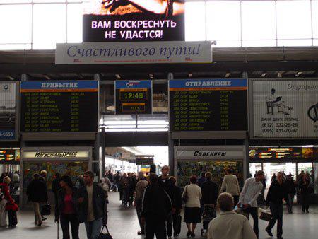
Station wished us "Happy Journey" and the movie ads grim promises that no one will rise again.
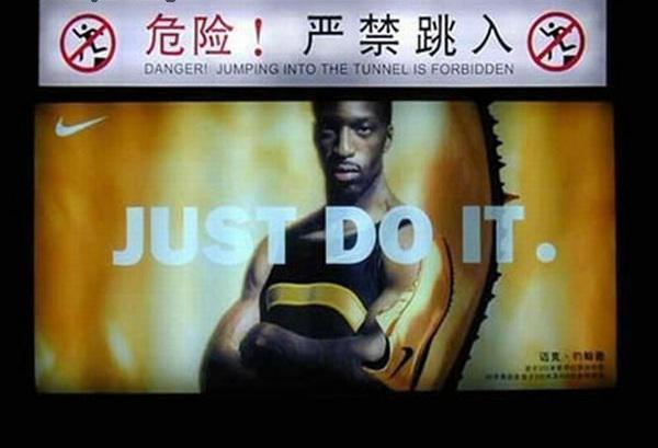
In the subway warning of danger in the tunnel jumping reinforced by calling «Just Do It»
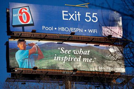
Advertising motels, which are known to have sex like the wrong husbands and wives, inadvertently appeared next to the advertisement with Tiger Woods. We all remember the scandal that surfaced numerous Woods infidelity to his wife.
Funny coincidence in Moscow metro:
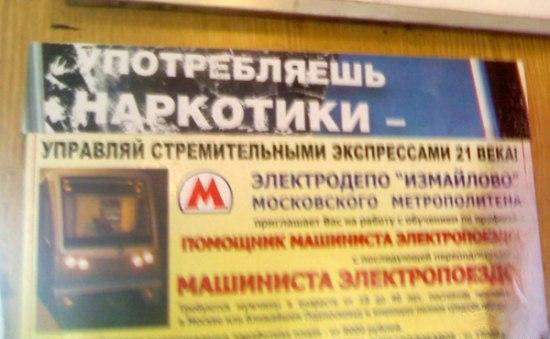
Failure accommodation setiV network, given the rapid change of the main content and advertising next to him, such a funny coincidence that reduce the effectiveness of advertising, even more.
This failure did not escape even the placement of our website:
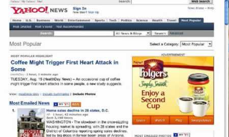
Advertising coffee adjacent article that the tonic can trigger a heart attack.
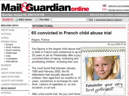
Another article about the connection with minors. Advertising banner on the right calls to recall his first girl.
"The parachutist died after being blown off his feet in the air," reads the headline of the article. The inscription on the banner of American Airlines: «We know why you fly».
The article about the death of the notorious "Crocodile Hunter." And next advertisement in which a child asked dad what will happen to them, and his mother, if he dies.

The inscription at the top: "Pope John Paul II dies." The inscription at the bottom: "It's time».

Advertising Zurich insurance company with the slogan "Someday you'll remember it with a smile," was placed under the message of the victims of explosions.

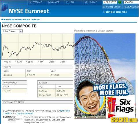
Stock quotes are aligned perfectly with the banner of the theme park. However, the worst of it was not exactly the park. But it was clearly demonstrated the direction of the global economy.
Share examples of useless, senseless and incomprehensible advertising in the comments!
via # image1735105
When there is no sense
For example, in February of this year in Moscow was posted advertising Sochi football club, "Pearl-Sochi" with the image of David Beckham (David Backham) and the slogan "We have given up on him." It is not clear what results from this campaign was waiting for Russian football club from the city of Sochi. Muscovites and residents of other cities, discussing the senselessness of such a PR on the Internet, did not understand the concept and general objective of these billboards.

Railways campaigns against vandalism for new high-speed train "Sapsan", which follow on the route Moscow - Vladimir - Nizhny Novgorod. Trying to convince the disgruntled residents not to spoil w / d property and not to interfere with the new mode of transport, the advertiser has placed models with the slogan "throw a stone into the train - hit the man!».

Instead, in order to improve communication infrastructure of various types of transport, money is spent on pointless social campaigns that cause the population completely reverse the planned effect. The whole story of the cartoon series about Sapsanchik - cute train accident, which all hurt unfairly - is an example of a completely meaningless to the image point of view of the campaign, as the embodiment of which is only ridicule.
Fish-trading company "Kamchia" posted the billboard with the mysterious phrase "girl's best friend - a fish».

This call is more like a "voice in the wilderness", rather than the beer brand advertising message.

When not seen
These posters Federal Fisheries Agency were placed on billboards along highways. Appetizing sprats with onion on rye bread were immediately attract attention and cause a desire to delay the view of the billboard, trying to understand what it is advertised. But this was very difficult due to the very small print and high speed motion. All that time to catch a keen eye - is that "Fish is waiting!", And where, when and who and left many residents of mystery.


This is perhaps one of the prettiest in terms of image examples of indiscriminate Russian outdoor advertising. Passion advertisers for placement on the boards of price lists is well known.
Throughout the day, a stall slaughterhouse on wheels parked on the site, completely blocking the two advertising posters. Time and money, "drip", and no one sees advertisements.

Social advertising
A striking example of meaningless social advertising: phone number for which you want to call in the event of a collision with corruption, advertisers apparently decided not to specify.

Here in this form appeared before Kazan bribe officials.

Here is a beautiful in its categorical social advertising was found in Biysk. Brains, flushed down the toilet, and terribly useful, but no information available, typed small yellow bukovkami, accompanied by the statement "prick? Loch! »

It's hard to think of anything more senseless than encourage women to have children out of a sense of patriotism, for the record for the country.

Social advertising MOE encourages people not to play with fire in chess.

Senseless and merciless advertising traffic police.


In March 2010, in Moscow at the Moscow Ring Road were advertising posters with quotations from the Bible. Advertising constructions belong to the agency "Anko", which refused to name the customer, but clarified that it is not "the Russian Orthodox Church».

I am the Lord thy God, and do not have to be you have other gods besides me. i>


Teasers
Qualitative and interesting rosiyskie teasers can be counted on the fingers of one hand. Basically the mass no intrigue, they do not produce, but only add confusion and meaninglessness Russian outdoor advertising.
In the city of Krasnodar appeared here such teaser posters calling turn. Most city residents wondered what this might mean, advertising appeared quite clear. Because few people familiar with the logo shown on the poster advertised fashion store COSMO.

The teaser campaign Absolut Bank used to receive missing punctuation in an ambiguous phrase - "Buy you can not save" and "Eats, Blogs". Tricky linguistic trick known to many, but how does it relate to the bank, do not understand everything and not immediately.

And some more senseless and merciless teasers.


Unfortunate placement
In order not to be trapped by placing a banner ad or a billboard, should carefully examine their surroundings and especially advertising media. Otherwise, advertising risks not just lose all meaning, but also to become the laughing stock of the present.
Whether the trash appeared later, whether designers outlet Nestle Ice Cream not considered treacherous neighborhood. But advertising is more disgusted than the desire to buy ice cream.
Which designer or creative people had an idea so absurd advertise Airlines, creating the illusion of falling aircraft and how to prevent or could miss such representatives of the customer?

In Moscow, on the street. Lower Krasnoselskaya d.6, next to a tram stop, there was a "synergy effect" when placing two posters, one above the other.

In Russia, about the objects of police and traffic police appeared in January 2008, an unusual teaser TELE2 with the words "They take the latter." Apparently, the media planning teaser campaign advertiser specifically chosen so as to place the billboards around the objects with respect to the traffic police and the police.


Advertising film "Resident Evil 3" in Biryulyovo:

The front and back cover of the September issue of 2008 the American journal Nature is an excellent example of a failed advertising. Although no such mysterious coincidence company Sigma navryadli have secured a similar attention.

The inscription on top of advertising: "The fight against cancer nebeznadёzhna. I - a living example »
Advertising juicer with a picture of a huge carrot, adjacent to the advertising of the fitness center, showing the girl in knee-elbow position. In this context, the slogan juicer "was very thirsty?" Gets set to "experience an irresistible desire?».
The inscription on the billboard top neighboring the advertising fast-food restaurant McDonald's, says, "Childhood Obesity. Do not take this lightly ».


Advertise sports complex "Olympic" argues that it is not only for Olympians. For anyone else - could not help asking the answer for those who to turn to social sphere on the left.

In St. Petersburg, almost all OOH-design in 2005, were decorated with a poster of the 60th anniversary of the Victory. At the same time there was a campaign of the film "Star Wars».

Who died heroically in battle with the butcher - not specified.

Station wished us "Happy Journey" and the movie ads grim promises that no one will rise again.

In the subway warning of danger in the tunnel jumping reinforced by calling «Just Do It»

Advertising motels, which are known to have sex like the wrong husbands and wives, inadvertently appeared next to the advertisement with Tiger Woods. We all remember the scandal that surfaced numerous Woods infidelity to his wife.

Funny coincidence in Moscow metro:

Failure accommodation setiV network, given the rapid change of the main content and advertising next to him, such a funny coincidence that reduce the effectiveness of advertising, even more.
This failure did not escape even the placement of our website:
Advertising coffee adjacent article that the tonic can trigger a heart attack.

Another article about the connection with minors. Advertising banner on the right calls to recall his first girl.

"The parachutist died after being blown off his feet in the air," reads the headline of the article. The inscription on the banner of American Airlines: «We know why you fly».
The article about the death of the notorious "Crocodile Hunter." And next advertisement in which a child asked dad what will happen to them, and his mother, if he dies.

The inscription at the top: "Pope John Paul II dies." The inscription at the bottom: "It's time».

Advertising Zurich insurance company with the slogan "Someday you'll remember it with a smile," was placed under the message of the victims of explosions.

Stock quotes are aligned perfectly with the banner of the theme park. However, the worst of it was not exactly the park. But it was clearly demonstrated the direction of the global economy.

Share examples of useless, senseless and incomprehensible advertising in the comments!
via # image1735105


