416
A categorical NO in interior decoration
Moscow designer told us about the most popular mistakes beginners to build their own (or even someone else's!) space, and showed the horrible examples of their work. Well, and then – all the ways to save even the most a stalemate. Read and get inspired by!
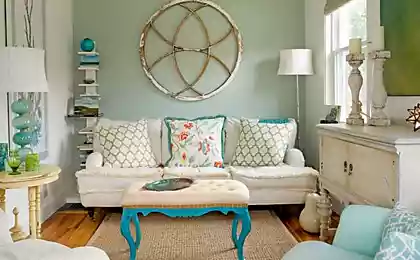
Upholstered furniture
If You are unsure of yourself as a designer – do not buy upholstered furniture from a picture. No matter how beautiful it may be.
NO:

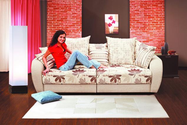
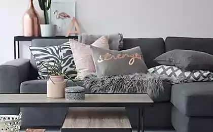
Stop for a plain sofa. Or chair. And with a couple of pillows and blanket, you can always change the decor. Wanted – flowered, PSP – in a cage.
YES:

Love floral print? A couple of pillows – and OPP. Floral sofa. In the winter he replaced the pillow on the cell – and here's the relevant decision, if the next tree. Freewheeling depressnyak – changed pillowcases black stripe. And beautiful, and what you need in this moment. And worth a penny, don't need a sofa to be changed.
YES:
Shelves anywhere
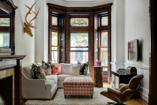
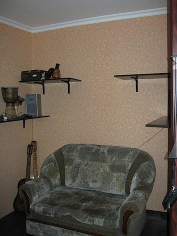
The second terrible mistake. Shelves. Small and large open shelves are hung haphazardly. With a bunch of junk and gnomes on them. This is the personal hell of a designer. The most luxurious repair looks terribly cheap, if you are everywhere these terrible shelves.
NO:
If you for some reason can not do without the open shelves, hang them symmetrically. One below the other.
YES:
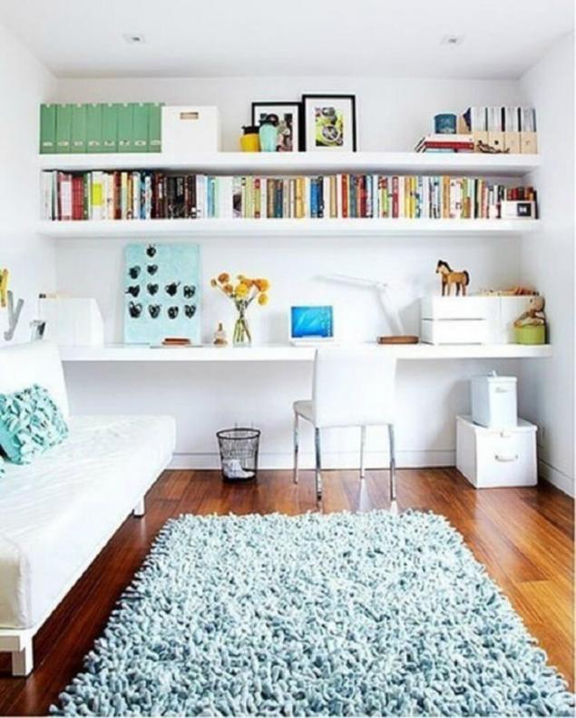
Exactly above the bed, for example. Again, respecting the symmetry. And most importantly – on the open shelf, all should be nice and neat.
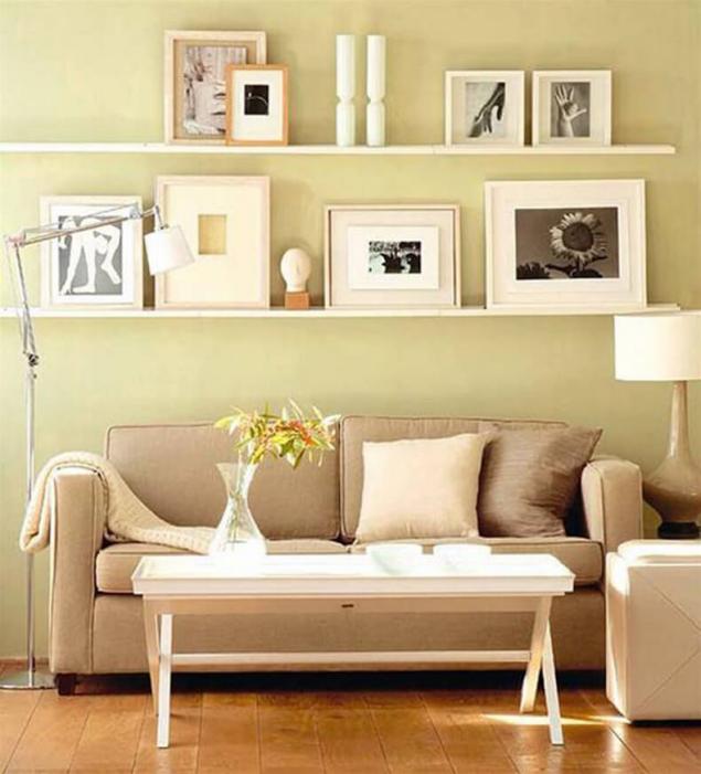
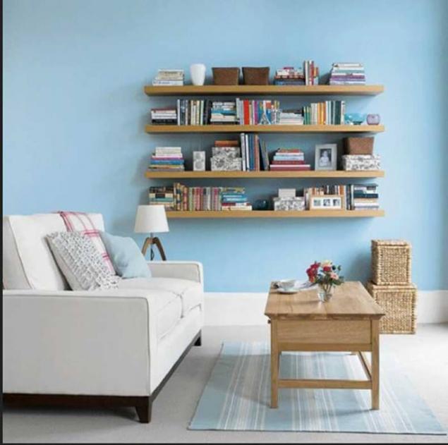
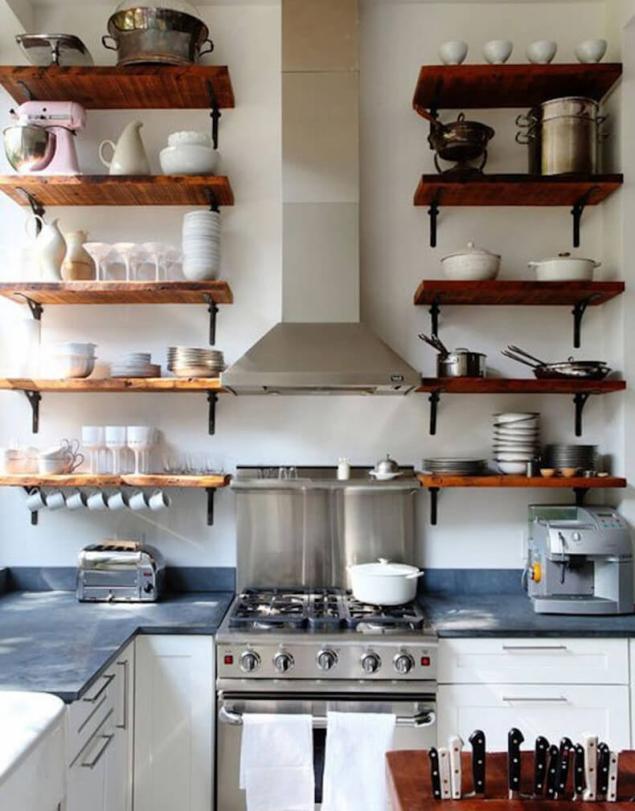
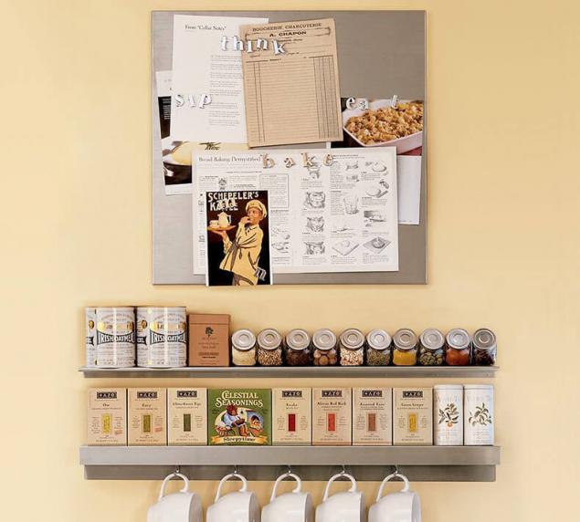
A very important symmetry and order. But I always wonder, will you be able to maintain such order? Hand on heart. And functionally? In my opinion – no. Purely decorative technique. For the sake of the scenery please.
Lonely pictures
The third mistake. Lonely hanging paintings.
NO:
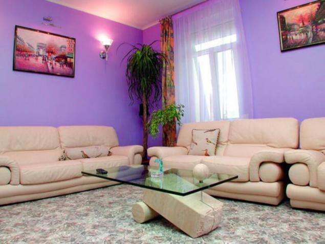
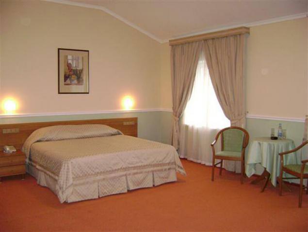
All these photos were taken in a state-owned hotel rooms. Domestic. No more dreary spectacle than the dreary picture on a huge wall.
Designers have long figured out how to decorate the wall above a sofa or a TV. Because bare walls of the apartment will look cozy, if that's not hell tech.
YES:
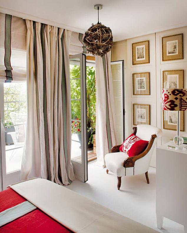
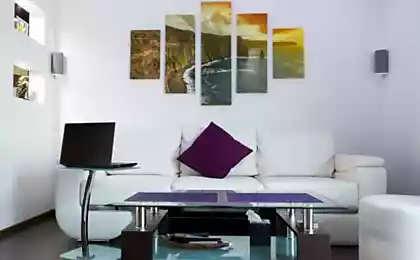
I do not propose to bother much. You will be enough four frames instead of 12. Or two more. Most importantly, the next. Options – the sea. Suitable – anything but LONELY HANGING ON a HUGE WALL PAINTING.

Here are lots of ways to hang pictures over a sofa, bed, just on the bare wall.
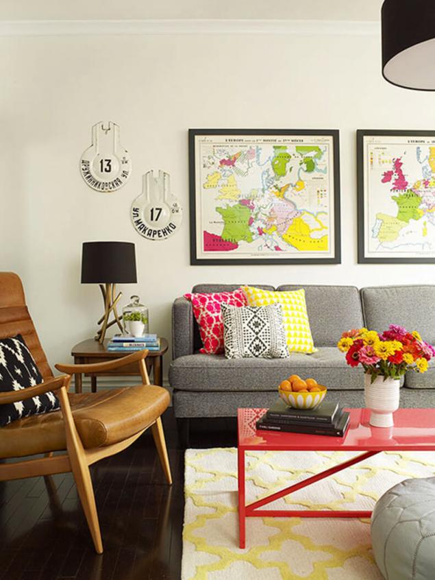
I'm always up for symmetry. Can't go wrong. For creativity the desired taste and imagination, in which a normal man is always in doubt.
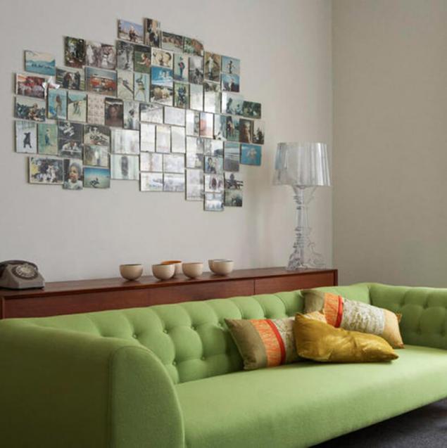
And that's a bad example. Because overkill. Too finely and densely. The size of the frames should match the size of the area in which they hang.
NO:
Creative curtains
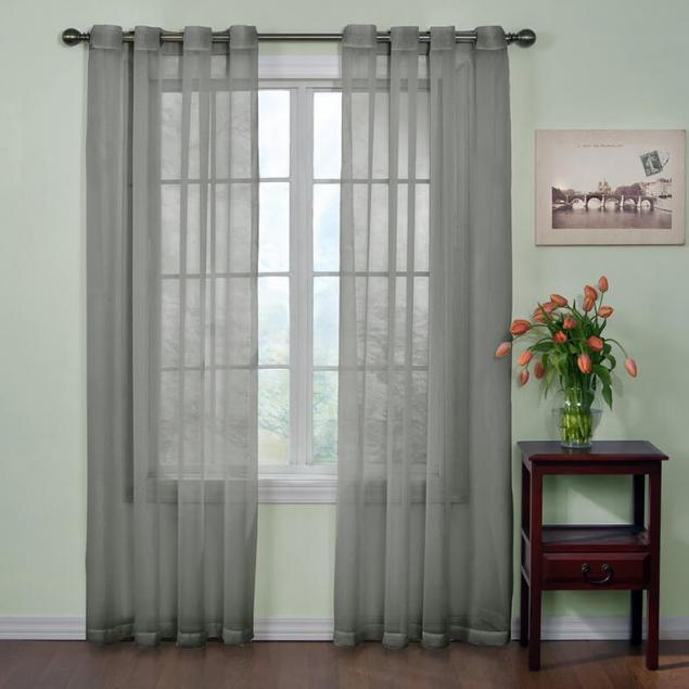
I don't even know what more “love”: single shelves, crammed with stuff, or “creative” curtains organza and similar materials.
NO:
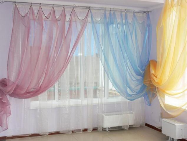
Forget all that word – “organza”, please. No need to experiment. Unless you are the designer of the “new Russian” in the house or room.
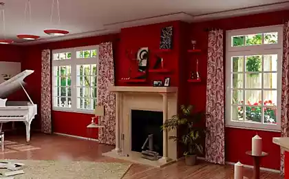
On any picture with a European interior curtains will not do, or will it be direct plain curtains to the floor. Max with some stripes.
YES:
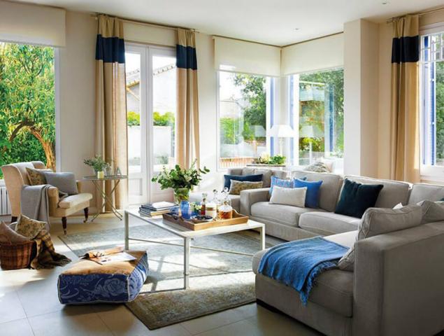
If you choose a monochrome solution, choose curtains with a tone or two darker than the walls. Otherwise they will be lost.
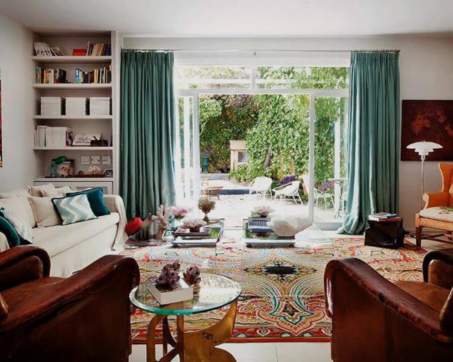
The second great invention of mankind (well, after the organza :) – all sorts of Roman and roller blinds. They need to be careful in terms of colors and it is better to choose something to match the walls. On two or three shades darker. Not sure, don't BS.
YES:
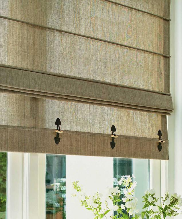
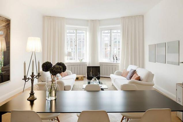
But if love has a transparent, we will stay here on this version.
But the attention. The white curtains – the so-called Scandinavian style. And they blend with it. Simple but cosy. White or very dark furniture, color spots or no. In a typical Russian interior white curtains will look ridiculous.
Author: Olga Taboo
P. S. And remember, only by changing their consumption — together we change the world! © Join us at Facebook , Vkontakte, Odnoklassniki
Source: www.pics.ru/chetyre-net-v-dekore-interera-primery-ot-dizajnera
Upholstered furniture
If You are unsure of yourself as a designer – do not buy upholstered furniture from a picture. No matter how beautiful it may be.
NO:


Stop for a plain sofa. Or chair. And with a couple of pillows and blanket, you can always change the decor. Wanted – flowered, PSP – in a cage.
YES:

Love floral print? A couple of pillows – and OPP. Floral sofa. In the winter he replaced the pillow on the cell – and here's the relevant decision, if the next tree. Freewheeling depressnyak – changed pillowcases black stripe. And beautiful, and what you need in this moment. And worth a penny, don't need a sofa to be changed.
YES:

Shelves anywhere
The second terrible mistake. Shelves. Small and large open shelves are hung haphazardly. With a bunch of junk and gnomes on them. This is the personal hell of a designer. The most luxurious repair looks terribly cheap, if you are everywhere these terrible shelves.
NO:

If you for some reason can not do without the open shelves, hang them symmetrically. One below the other.
YES:

Exactly above the bed, for example. Again, respecting the symmetry. And most importantly – on the open shelf, all should be nice and neat.


A very important symmetry and order. But I always wonder, will you be able to maintain such order? Hand on heart. And functionally? In my opinion – no. Purely decorative technique. For the sake of the scenery please.


Lonely pictures
The third mistake. Lonely hanging paintings.
NO:


All these photos were taken in a state-owned hotel rooms. Domestic. No more dreary spectacle than the dreary picture on a huge wall.
Designers have long figured out how to decorate the wall above a sofa or a TV. Because bare walls of the apartment will look cozy, if that's not hell tech.
YES:

I do not propose to bother much. You will be enough four frames instead of 12. Or two more. Most importantly, the next. Options – the sea. Suitable – anything but LONELY HANGING ON a HUGE WALL PAINTING.

Here are lots of ways to hang pictures over a sofa, bed, just on the bare wall.

I'm always up for symmetry. Can't go wrong. For creativity the desired taste and imagination, in which a normal man is always in doubt.
And that's a bad example. Because overkill. Too finely and densely. The size of the frames should match the size of the area in which they hang.
NO:

Creative curtains
I don't even know what more “love”: single shelves, crammed with stuff, or “creative” curtains organza and similar materials.
NO:

Forget all that word – “organza”, please. No need to experiment. Unless you are the designer of the “new Russian” in the house or room.
On any picture with a European interior curtains will not do, or will it be direct plain curtains to the floor. Max with some stripes.
YES:

If you choose a monochrome solution, choose curtains with a tone or two darker than the walls. Otherwise they will be lost.

The second great invention of mankind (well, after the organza :) – all sorts of Roman and roller blinds. They need to be careful in terms of colors and it is better to choose something to match the walls. On two or three shades darker. Not sure, don't BS.
YES:

But if love has a transparent, we will stay here on this version.

But the attention. The white curtains – the so-called Scandinavian style. And they blend with it. Simple but cosy. White or very dark furniture, color spots or no. In a typical Russian interior white curtains will look ridiculous.

Author: Olga Taboo
P. S. And remember, only by changing their consumption — together we change the world! © Join us at Facebook , Vkontakte, Odnoklassniki
Source: www.pics.ru/chetyre-net-v-dekore-interera-primery-ot-dizajnera


