429
What color are the walls in the house?
While I'm in quarantine, I'm thinking about repairs. If the soul asks for updates, why not change something in your home first? Perhaps this is the perfect time for habitation And make it comfortable!
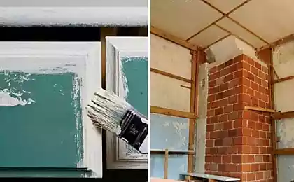
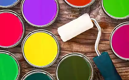
Today's edition. "Site" prepared coloringTo transform the atmosphere of the apartment. During the quarantine, I show off in the artist's beret, paint the hallway. We'll hold off on the balcony.

Colors of walls in the interior
Editorial Board I also suggest to get acquainted with the selection of stylish interiors of apartments in shades of green. The theme of spring freshness never goes out of fashion!
Use your quarantine time as an opportunity to improve atmosphere. Be inspired, recharge with new ideas, do what you can and take care of yourself and your family. I sincerely wish you good health, good mood and successful alterations!
Today's edition. "Site" prepared coloringTo transform the atmosphere of the apartment. During the quarantine, I show off in the artist's beret, paint the hallway. We'll hold off on the balcony.

Colors of walls in the interior
- "Guacamole"
This warm and pleasant shade of olive is best suited if you want to refresh the space of the apartment and use the fashionable colors of the walls. 2020 interior. Against the background of this shade, tropical houseplants and prints will look good. View this post on Instagram
Olive in interior decoration? Olive shade in interior decoration is a great choice. Why? Its soft and elegant shade corresponds to all architectural and decorative styles. It is very simple and understandable for use in the interior. This color is right for you if you like to change and follow trends – it will play the perfect background. Olive will fit into the interior of any room, both as the main element and decor: in painting, furniture or decorative details such as pillows, lamps and even carpets. It is the golden mean between gray and green – not so neutral, but unsaturated and not “pulling on the blanket”. So, is it a great choice for a monochrome that won’t get bored? Olive goes well with untreated wood. It is best to choose a light tree such as beech, pine or oak. If dark, the shade of olive should also be brighter and more saturated. Another possibility of its “introduction” is gold shades, it will make them softer and will harmonize well. So if you have a few copper shades, go for it? How do you like this color in the interior? We think that there is a place to walk around and achieve incredible combinations.
A post shared by Argo Interior Centre (@argomogilev) on Feb 28, 2020 at 10:42am PST
View this post on Instagram
Is it time to dream of a future beautiful home if you are quarantined because of the current environment? Take advantage of this time!???? Determine your requirements for the level and quality of your future life, colors and style solutions. You can select interiors on Pinterest. As designers, it is important to understand your tastes. For example, a green range in the interior will suit you if you want to feel peace and comfort at home. In ancient India, green was considered the “great harmonizer.” And adding a natural aspect to the interior will create a special pleasant atmosphere! In such a space, lost resources will be restored faster. We wish you to remain calm and hope that soon we will all be back on track?
A post shared by Interior Design? CG.Design (@creategreat_design) on Mar 20, 2020 at 6:28am PDT
It is worth combining furniture and textiles with him in warm colors, as cold ones can enter into a dispute with him.
View this post on Instagram
If you want to create a noble atmosphere in the house with notes of ancient or classical style, choose an olive color for the interior. Established, conservative, for those who do not want to rush anywhere, it will create a cool and calm mood in the room, bring severity and balance. Olive color is often found in Italian interiors, Mediterranean and ethno styles. To emphasize the restraint of olive, making the interior strict, focus on chrome details, mirrored and glass surfaces. And the furniture of this shade is perfectly combined with white and gold tone. #first builder repair #interior design #design room #olive flower #olive interior #design apartment
A post shared by Repair Apartment Yekaterinburg (@pervostroitel_remont) on Jan 31, 2019 at 5:22am PST - Dove.
Gray and light gray shades combine versatility and elegance. This tone can be applied in any style, in any room. View this post on Instagram
Friends, today I started with a bedroom at @berg.interior, and I propose to finish with an equally bright and interesting living room. Do you agree that the project ???? All the interiors of the living room you can see by my thematic #berg_livingroom Author: a great designer ???? Anna Vasilyeva Photo ?: Evgeny Kulibaba Stylist ?: Ksenia Breivo #berginterior @couture.interiors @evgeniikulibaba @breivo
A post shared by Interiors and Designs (@berg.interior) on Feb 9, 2020 at 6:52am PST
View this post on Instagram
Friends, flick through the gallery of the kitchen area in the studio apartment, how do you combine gray with gold? All kitchens are collected by my thematic #berg_kitchen Author ?????: Antonina Sinchugova Photo ?: Sergey Ananyev Stylist ?: Daria Grigorieva у #berginterior @antoninasinchugova @sergeyananiev @d_grigorieva
A post shared by Interiors and Designs (@berg.interior) on Feb 27, 2020 at 7:45am PST
It is light enough to visually expand a small space and multifaceted enough to large-room And to prevent the feeling of emptiness and inadequacy.
View this post on Instagram
Clarification in remarkable design by @by_betina
A post shared by Interior & More (@myinterior) on Mar 25, 2020 at 6:40am PDT - "Creme de Peche"
The shade of light peach will please not only charming ladies, but also a strong half of humanity with softness and lightness. View this post on Instagram
Top decor, loving the pastel colors and the setup of art? by @iwona_boho_home
A post shared by Interior & More (@myinterior) on Jan 12, 2020 at 4:26am PST
View this post on Instagram
The interior of the children's room for a little princess ?? I'm sure that's a dream for any girl? Do you agree that the interior is simply magnificent? In my profile @berg.interior collected only the coolest? interiors, come in, will you regret? Author????: Lesya Pechenkina #berg_kids @lesya.pechenkina
A post shared by Interiors and Designs (@berg.interior) on Nov 19, 2019 at 1:14am PST
It is relevant for a small bedroom, living room or a baby girl. Helps to create a chamber and light space that adjusts to peace and rest.
View this post on Instagram
A life without grout is what I'd imagine a life without calories to be like. Net door to heaven.
A post shared by Homepolish (@homepolish) on Sep 8, 2019 at 6:31am PDT - "Coal-black"
This is probably one of the most mysterious flowers. When used correctly, it works wonders and is able to turn an apartment into the most cozy and comfortable place in the world. Black color is harmoniously combined with various types of wood and golden interior items. View this post on Instagram
Credit @huizedop
A post shared by Interior & More (@myinterior) on Mar 23, 2018 at 5:22am PDT
View this post on Instagram
InteriorInspiration: This monochrome masterpiece by designer Phoebe Nicol takes the concept of counterbalance to a new (and more literal) level. We're talking about kitchen counter balance, and how well the barely-there backsplash and silver spice storage offset the tetured cabinets and the absence of hardware down below. Consider our hunt for hunter green harmony officially over. Photo by Feli Forest.
A post shared by Homepolish (@homepolish) on Jul 31, 2019 at 1:09pm PDT
In combination with light beige, this shade is able to create a secluded protected space where you can enjoy peace and quiet away from the hustle and bustle of the city, which is important in the current situation in the world.
View this post on Instagram
Top living room design by @huizedop #livingroom #home #decor #interior #interiordecor #top #love #love #loveatfirstsight #beautiful
A post shared by Interior & More (@myinterior) on Dec 11, 2019 at 12:48am PST - "New Mint"
Many designers consider mint to be the most promising shade of 2020. This color gives a feeling of lightness, airiness and purity, relieves fatigue and creates a good mood. View this post on Instagram
@neon_doves effectively hit the first-time homeowner's jackpot when she found this charming Craftsman style home. Here's to hope today brings a little luck to everyone else too. ? (Image: @ellie.lillstrom | Home: @neon_doves)
A post shared by Apartment Therapy (@apartmenttherapy) on Mar 17, 2018 at 10:22am PDT
View this post on Instagram
#mint color. In fact, this color has nothing to do with the plant from which it got its name. Compared to the leaves of mint, it is not so grassy green, but it is close to very light blue. Since the mint color is natural, it is perceived as fresh, contributing to rest and peace. Mint color will help to relax and "let off steam" #mint#mintwinter#visualization#design#mintcolor
A post shared by @ my_medlee on Mar 1, 2020 at 1:51am PST
It goes well with white, however, together they create a cold combination that will look good only in southern countries with hot sun.
View this post on Instagram
Mood color...mint? Mint in the interior can be found not only in the marine style, the popular color is used increasingly in furniture, textiles and decoration. Calming and cooling effect is suitable for the interior of any room. A mint shade is called a combination of blue and green, the intensity of mint depends on the predominance of a particular color. The resulting mint has no direct relation to the color of the mint leaves. A type of mint can be considered menthol, turquoise in a light shade, the color of sea foam and light pistachio. Like the whole group of green shades, mint has a positive effect on the psyche, tunes for relaxation, favorably affects the work of the organs of vision. In the classic interior, mint monochromatic walls are combined with plaster molding, a high white ceiling and a parquet board. If bright upholstery is used, then it should be repeated in curtains or lambrecken. In the interior, minimalism will suit striped walls or painted with geometry. Wallpaper can be textured, decorated with paintings within the frame. Large patterns and the combination of more than three colors within the same room are unacceptable. In the style of Provence mint can be the main color, it can be painted and slightly shabby furniture, walls made of tram or with floral wallpaper. Gray tulle with mint frill or white and mint curtains-cafe will decorate the room. Country style is combined with light and dark shades of brown, beige. The rustic style is decorated with pillows, covers and blankets, textiles and curtains in a mint shade. The sea interior combines pastel cold palette: blue, blue, turquoise, green and mint. The walls can be in a wide strip, monochrome, curtains repeat the pattern on the pillows. The tulle is selected light and translucent.
A post shared by Remont and Departure Chelyabinsk??? (@174_remonta) on Nov 11, 2019 at 12:27am PST - "Galactic Blue."
The Pantone Color Institute chose to associate with the cosmos, creating a name for this deep dark blue hue, not coincidentally - this color really disposes to calm brooding contemplation. It creates a sense of serenity and tranquility. View this post on Instagram
The bedroom in dark blue color is fashionable, stylish and, importantly, very cozy. For this interior, designers from Terre Grise Studio chose a deep matte shade of Ardoise Bleue from Argile's "Couleurs de Terre" palette. ... #argile #French paint #color interior #interior design #interior #paint #design #inspiration #colour #argilepeinture #architect #decorator #decorator #design #interior #interiordesign #interiorpainting #design
A post shared by Argile (@argileru) on Mar 25, 2020 at 8:38am PDT
View this post on Instagram
Friends, in the gallery ее️ design project of a small guest bathroom, with an area of ?? sq.m. You just have to give an assessment of this project, thank you in advance. Author ????: Design studio Fisheye @interior_design_spb ️?.. Don't forget my current (?????) direct ??? on the topic of "Legal Plannings", in Storis more detailed information! ? #berginterior #berg_bathroom ??
A post shared by Interiors and Designs (@berg.interior) on Mar 24, 2020 at 12:58am PDT
“Galactic blue” will be appropriate in the bedroom or nursery, it will be suitable for the design of the office or zoning of the work area, and will be an extraordinary solution for the corridor. It combines well with dark blue, blue, white and silver.
View this post on Instagram
Friends, I always try to please you with the coolest projects, I hope you will appreciate this kitchen project. Write е️ what you liked about the kitchen design project. As I wrote above, or rather, I boast that I have the most bombshell interiors in @berg.interior! Author ?: BALCÓN design studio and Anastasia Frolova х #berg_kitchen @balcon.studio х #kitchendesign #kitchenaid #kitchendecor #kitchensofinstagram #kitcheninspiration #blackinterior #kitchendesignideas #interiorideas #interiordesignideas #kitchen #kitchendesign #idea #idea #ideokitchen #idekitchen #interiorkitchen #interiorkitchen #interiorkitourkits #interiorkit #interiorkit #interiorkit #interiortiers #interiortiers #interiorior #interioriorior #interior #interiortiers #interior #interioris #interior
A post shared by Interiors and Designs (@berg.interior) on Jan 3, 2020 at 5:52am PST - The Orange Tiger.
Energetic warm orange charges the space of the house with energy, makes the room saturated and alive. As a color of walls or large objects, it is especially suitable for rooms with windows to the north. It will also be an interesting solution for the bathroom. View this post on Instagram
Whose room do you think this is, boys or girls?? Why would you say that? Design project from design studio @braintwister.design › #berg_kids ›
A post shared by Interiors and Designs (@berg.interior) on May 28, 2019 at 8:34am PDT
View this post on Instagram
Friends, let’s lift the mood with such an interesting and lively interior (leak through the gallery) that it is not sad, because summer is gone. What emotions did this interior cause you? Author?: ZE|WORKROOM studio #berg_bathroom @zeworkroom
A post shared by Interiors and Designs (@berg.interior) on Sep 26, 2019 at 1:49am PDT
And if you want to shade a bright accent, use cool light colors of white or blue.
View this post on Instagram
Friends, in the gallery ️ bathroom with terazzo tiles and juicy red-orange ️? color! What do you say, be a flower?? Designer of this project ????: Arina Troilova @troilova_arina #berg_bathroom
A post shared by Interiors and Designs (@berg.interior) on Aug 20, 2019 at 1:31am PDT - white
White is definitely the most versatile color, which is most often used in the decoration of rooms. This is especially true of the modern Scandinavian style and neonordic style. View this post on Instagram
Friends, let us spend the last outgoing weekend of the year with such a beautiful bright interior of the kitchen-living room (area ?? sq.m.). How is he?? Remind me that I have thematic hashtags: • kitchens #berg_kitchen • living rooms #berg_livingroom Author?: Balcon design studio › #berginterior @balcon.studio ›
A post shared by Interiors and Designs (@berg.interior) on Dec 29, 2019 at 2:54am PST
View this post on Instagram
A few minutes in to our coffee table chess tutorial we realized we wouldn't mind spending all night here moving like a knight-in an L-shape from the chair to the bar to the sofa and back. We find it's a great way to stall our opponent and our guests from making us leave our living room. Design by @amycourtneydesign / Photo by @patrickclinephotography
A post shared by Homepolish (@homepolish) on Aug 27, 2019 at 5:50pm PDT
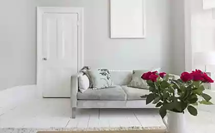
white heighten It adds air and light, makes a small space beautiful and easy. On a white background, the texture of the tree looks good: together they create a pleasant, cozy atmosphere. It can be combined with any color!
View this post on Instagram
How is everyone doing today? (via @theressnowplacelikehome).
A post shared by Apartment Therapy (@apartmenttherapy) on Mar 21, 2020 at 5:01am PDT
Editorial Board I also suggest to get acquainted with the selection of stylish interiors of apartments in shades of green. The theme of spring freshness never goes out of fashion!
Use your quarantine time as an opportunity to improve atmosphere. Be inspired, recharge with new ideas, do what you can and take care of yourself and your family. I sincerely wish you good health, good mood and successful alterations!
What pompous residents of megacities can learn from ordinary people from the village
The skill of making homemade buns and cakes
