1266
My name is Red
BBDO Branding Site and continue a series of articles devoted to color in branding. Today on the strong colors - bright, leadership, energy and the reklamnom.Ya happy that I am a red! I'm burning inside, I'm sure
in itself, I saw, I know that I am hard to beat.
I'm not hiding: for me the main thing - no subtlety, grace
and tenderness and determination and will. I speak openly.
I'm not afraid of other colors, shadows, or piles
loneliness. How beautiful it is: fill surface
his victorious fire!
Orhan Pamuk, "My Name is Red»

The facts that you may know: The earliest flowers first appeared in human culture, are generally considered white, black and red. Red - this is the first color that distinction after birth children and people temporarily lost their color vision. The word "red" has become the color value of blood with XV-XVI centuries. It was inherited from the old Russian word "scarlet" as carmine, a bright red dye in Russia extracted from insects scale insects (scarlet). Also from this root it is formed by the name of the month, when the scale insects breed - Cherven (July). The name "gold piece" comes from the word "Red", ie red. Pure gold - vysokoprobny alloy of gold and copper has a reddish tint. It is the color of love, activity, blood, fighting, ban, hazard error of the revolution. Psychological manifestations red: joyous, WHO * are fishing, the desire to dominate, lo * sualnost (Max Lüscher). The red symbolizes the American love in China - kindness, holiday, luck, India - Life; Russia's red originally meant "beautiful." In most countries - from China to Africa - people associate red with prosperity and high status. The red flag was not the invention of the Bolsheviks, as is commonly believed. In the Middle Ages the color red was a sign of the supreme power and then became the color of rebellion, was used during the Paris Commune of 1817 The red flag in the British navy was established in the XVII century and represents a challenge to fight. Red - the color of anarchy. Supporters of the Italian national leader Giuseppe Garibaldi's Red Shirts called as a sign of defiance to the authorities wore red shirts. There is a misconception that the bulls react to red. This is not so - the bulls dichromatic vision. In their eyes, there are only 2 types of light-sensitive proteins, whereas three of them human. Third, the lack bulls protein closest to the red end of the spectrum. Therefore bulls distinguish blue from green, but do not distinguish green from red. We can say that any bright fabric may irritate them. These are bullfighters, shaking hood (red fabric) before attacking a bull, and the shepherds wear nondescript clothes gray and black tones. The red color is perceived faster than the other colors, because It has the longest wavelength in the visible spectrum. Of all the colors red it looks the most "heavy" weight, and white - "easy". The heavier the color for the painted figure, the less it seems its size. French ships on the flag ratio bands - 33:30:37 (blue, white, red). Red stimulates decision-making. For example, 28% of respondents were able to clearly express their position in the questionnaire, printed in red, and only 10% - in the same questionnaire in black. The red color enhances the various sensations of man: is the apparent increase in the volume of noise, sounds also enhances taste: red ware products in or near the red objects seem to be more tasty and fragrant. Want to lose weight - eat dishes with blue:). Red lighting contributes to high blood pressure, heart palpitations. No wonder the edge * nye lights have long been used to attract customers in the brothel. Red people tend to leave the room quickly. People dressed in red, the opposite sex voprinimaet se * sualnymi more than other colors. The red color is used for short-term revitalization. For example, Aivazovsky worked in the room, painted in red, it stimulated his creativity. Prolonged exposure to this color, on the contrary, leads to fatigue. Staining of telephone booths in red was calculated including the fact that people quickly interrupted the conversation: red areas people tend to get out as soon as possible. C XVIII century, the British Navy in the ropes began to weave a red thread. This innovation was due to increased frequency of thefts from vehicles. Red thread shows belonging things the English fleet. Goethe used this expression in his novel "related nature." Thanks to him, the phrase "Go red thread" turned into idiom and was borrowed from the German many languages. In the codices text written usually in black ink or ink, and the first letters of paragraphs decorate vermilion (very expensive while the red paint or ink). These letters, and for them and all of the first line of a paragraph and the chapter is called "red". With the transition to the old custom printed books gradually loss, with only the phrase "with a red line».
Gradation and color sochetaniyaKrasny has many gradations: from the hot crimson - the color of blood and fire, cool and sublime purple. "Camym red" in printing is considered to be a combination of colors 100% Magenta + 100% Yellow (CMYK). But beyond just red, there are many shades, eg: alizarin, cardinal, carmine, falunsky red, fuchsia, magenta, sangria, terracotta, vermilion, amaranth, garnet and so on. D. We will look at several shades that are close enough-clear red.
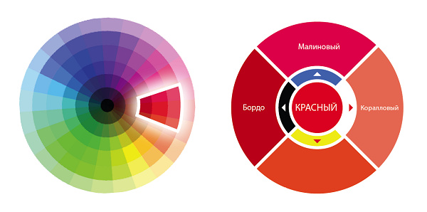
Scarlet. If the red over yellow than purple, it becomes hotter and "material" is associated with fire, blood, power and energy. It is good for cases where needed "a cry of color", attracting attention or even aggression. Remember? Advertise revolutions often were scarlet.
Raspberry. If we shift on the color circle towards the violet, we get a cool red. Raspberry is considered to be saturated with bright shade of red, c by the addition of a small blue. Also called raspberry color midway between red and pink. It combines the stimulating effect of red and blue toning ability.
It is more natural, natural shade of red. No wonder he was such a "delicious" name.
Burgundy. c Red adding black - the embodiment of solidity and solemnity of conservatism and moderation. It can often be found in the design of receptions and in cases when it is necessary to emphasize the importance and weight of something. Also, this color is associated with wine, velvet and luxury.
Red clarified. If you lighten red, it turns into a coral is not very popular in advertising color because it looks quite dirty printing. More popular with his distant cContact - pink. It is absolutely color other properties with its own unique character and role. Pink deserves special attention, and perhaps we will devote a separate article to it :)
Also, the perception of red is strongly dependent on who is next to him the colors:
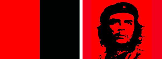
In the neighborhood of black to the fore such characteristics red as belligerence, aggression and excessive tension. This combination of war, anarchy, revolution.
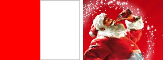
Next white Red, on the other hand, expresses the joy and fullness of life, celebration and love. Suffice it to recall Coca-Cola with their slogan "Festival comes to us!". Red on white one of the most distinct eye combinations.
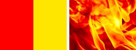
Red yellow - the hottest mix of these colors reinforce the warmth of each other and together look hot. This combination is associated with fire, warmth and fertility.
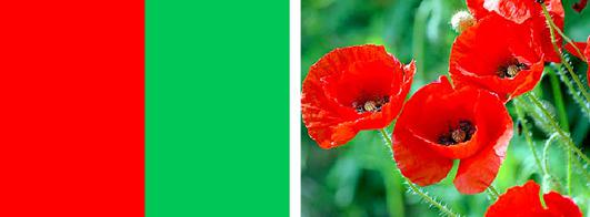
Red surrounded by Green - bright and flashy. Green is the opposite of red - these colors enhance the brightness of each other.
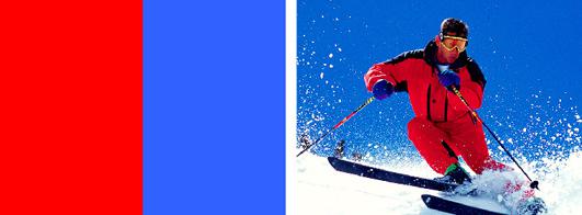
Red blue - a combination of two very different but equally strong colors, in this confrontation a lot of energy and strength. No wonder this combination is often used in sports. Superheroes also choose these colors (remember Cupermena or Cpaydermena).
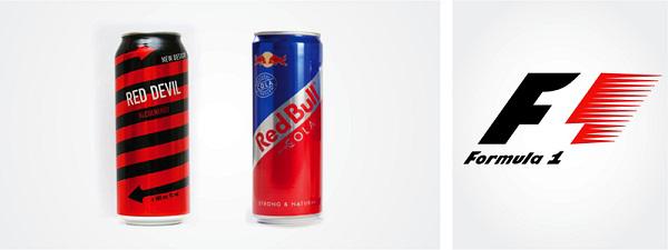
The energy (speed, aggression) The fact that the red color is very energetic and aggressive, widely used by many brands - from the great and terrible to the Coca-Cola energy drinks (Red Devil, Red Bull). And, of course, no accident logo "Formula 1" contains red.
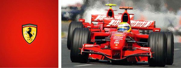
When a person tries to imagine a fast sports car, it is almost always red. This color fire, the color that is associated with energy, danger, strength, power and determination, that is, with all the qualities that are inherent in sports cars.
Perhaps, in the style of Ferrary red color and speed they are so closely connected that it has become a classic combination. When the car racing originated as a sport, each country was assigned a color. Green secured the British machines, blue - for the French, white - for German, yellow - for the Italian, and red - for the US. But as Americans has virtually no impact on the European race, soon red appropriated Italians.
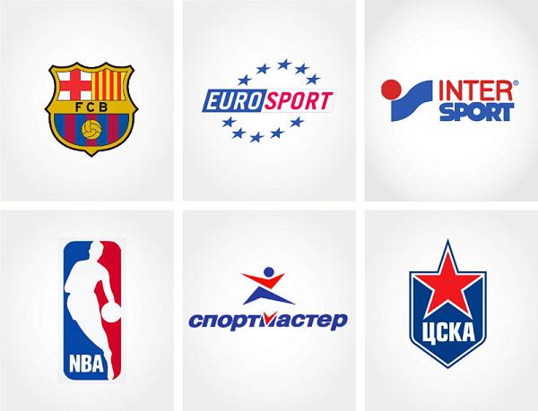
Red combined with dark blue - the classic "sports" color scheme ("Sportmaster", CSKA football club "Barcelona», Intersport, NBA, broadcaster Eurosport).
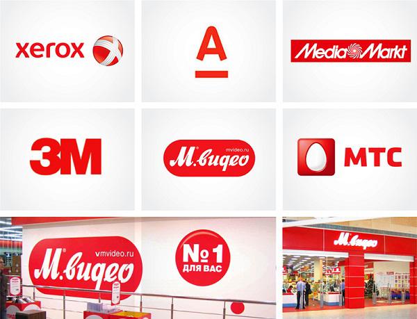
Leadership "If you want to consider all your leader - Take Me Red" - says a popular marketing wisdom. And that is how a lot of companies entered. 3M, MTS, Vodafone, Xerox, Alfa-Bank, M-Video, Railways associate themselves with red. At the same time, as a rule, companies that want to show themselves as leaders, and the second a neutral color - white or black / gray (Media Markt, «Eldorado", "Alfa Insurance"). Signature red the world's largest mobile operator Vodafone is the best support their slogan Power to you.
Life and krovKrasny represents life itself, and many companies and organizations identify themselves with this aspect of it.
For example, charitable organizations, the Red Cross and Red Crescent. The logo of the International Red Cross - is the inverse image of the national flag of Switzerland. This solution was chosen in honor of the Swiss founder of the organization, Henry Dunant. In countries with a predominantly Muslim population, instead of the red cross used by the red crescent. Thus, the emblem can not carry a religious or political sense, is not a symbol of medicine and equivalent use.
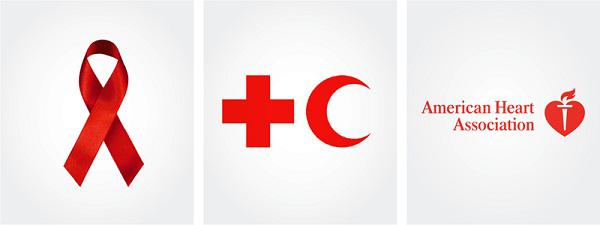
Red has become the symbol of the fight against HIV through the movement of The Red Ribbon. In April 1991, to draw public attention to the problem of AIDS, the artist Frank Moore creates a red ribbon. Red ribbon and red are the official international symbol of the fight against AIDS.
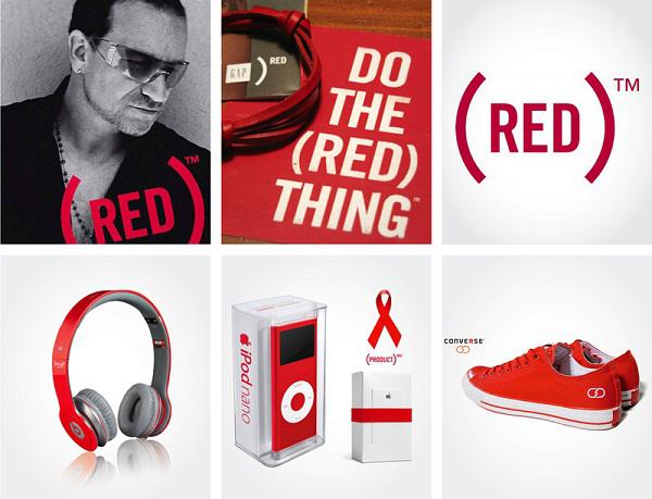
Another striking example of the use of red in branding - The Global Fund to fight AIDS in Africa «Product Red». Under this brand out products from companies such as Apple, Microsoft, American Express, Motorola, GAP, Dell, Microsoft, and many others. All such products are presented in a bright red color. A large percentage of sales of each Red-product goes to charity - to fight disease in Africa: AIDS, Tuberculosis and Malaria. Here the red color appears in full force, and in the title and in the promotion of the brand. The idea of the brand - red as a symbol of the fight against Speedman and a symbol of power
passion strength and courage for the joint fight. The symbolism in this project it is versatile and accurate: red = blood = life = love. All of this works to attract attention to the problem. It was founded in 2006. The initiative of its creation belongs to the frontman of rock band U2, Bono and Bobby Shriver of the Association for the fight against AIDS in Africa.
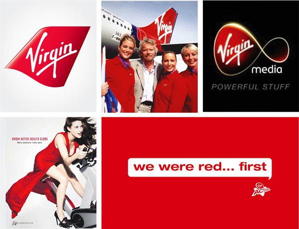
Referring to the association "Red - the blood," one can not forget the legendary brand Virgin. Initially, the logo looked like an inscription made with blood, and only then came the inversion option. Life-affirming philosophy of the brand, not afraid to constantly expand their activities into new areas where previously had no experience.
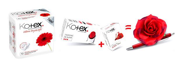
Kotex brand is very recognizable thanks to the package of bright red accents combined with black and white photographs. The bold design idea in this project - entirely merit planners of Coley Porter Bell, who entered the essence of the brand and concluded that women are proud of their femininity, so the characters can and should be bright.
National tsvetV 80% of world flags is red.
Symbolically, for example, that the flags of absolutely all the leading countries "Big Eight" is red. Red is considered its national in Austria, Latvia, Georgia, Turkey, Denmark, Poland, China, Canada, Tunisia, Malta and many other countries.
Japan
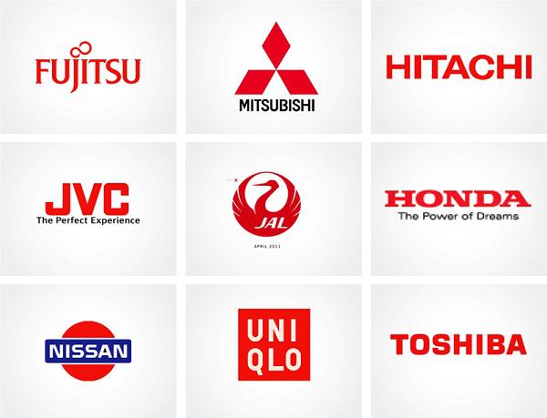
In Japan, a special attitude to red. The Japanese release of red and many shades of each of them, of course, has its symbolic name. The color of the sun, in their opinion, it is red. It is also the color of beauty, prosperity and integrity. In Japan there is a tradition to marry in red outfits. This nation most committed to its national color in branding, try to recall the brand of Japanese origin, and it is almost always red: Hitachi, Toyota, Mitsubishi, Uniqlo, Nissan, JVC, Fujitsu, Honda, Suzuki and many others.
England
Red is also a symbol of England. The cross on the flag of England is the cross of St. George - the patron saint of Jurisdictions. Everyone is familiar with such characters England as red double-decker bus, red telephone boxes and mailboxes. This color is closely associated with London and is often used in branding. Here is a sampling of some world-famous brands that originated in the heart of England: TESCO, Lonsdale, Carol, BBC. Emblems of many national football teams ("Liverpool", "Arsenal", "Manchester United") have in their symbolism red.
Switzerland
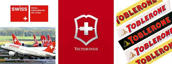
Red color on the Swiss flag symbolizes courage, diligence, strength and courage of the state - a willingness to fight for freedom and equality. Swiss flag - the main element of national identity and identification. Swiss National Airlines is one of the symbols of the state. And, of course, well-known brands such as knives, Victorinox, chocolate Toblerone, bank UBS proud red logo.
Russia
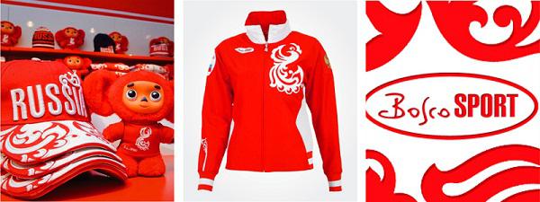
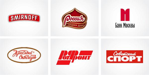
Interestingly, Russia abroad is consistently associated with red. He really has always played an important role in our history. In ancient Russia "red" and "beautiful" are synonyms. Whatever the changes and revolutions do not comprehend Russia, red has always been a symbol of power. Therefore, brands targeted at foreign partnerships, often used as a brand is red. The Russian branding intention to emphasize the national character of the units the leads to the use of red color: chocolate factory "Russia", the Olympic clothes of Bosco, in the bitch Smirnoff, Bank of Moscow or
appealing to the Soviet past confectionery factory "Red October" spirits "Red Moscow" perfume factory "New Dawn", the newspaper "Soviet Sport».
Industrial krasnyySuschestvuet several types of businesses, which is a typical red, you can say the industrial color.
Food Industry
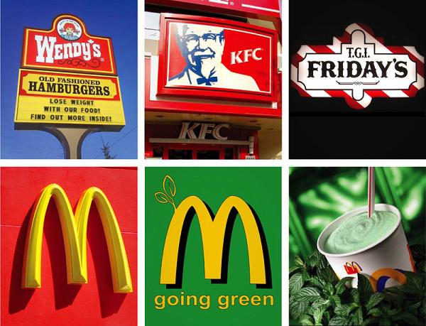
Red has a strong physiological effects. It activates all the processes of perception. Food red ware appear fragrant and delicious. It is no coincidence fast food industry is overwhelmingly used to attract visitors to this color. However, the chief representative of the industry, "McDonald's", recently decided to check out from this strong association, and go into a healthy and eco-friendly "green" way of trying to avoid the negative association that has acquired the concept of fast food.
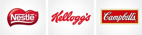
Such food giants like Nestle, KFC, Kellogs also used in his trademark style red.
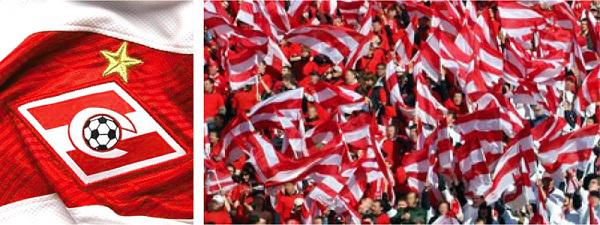
With the food industry and indirectly related red and white "Spartacus" - the largest in the USSR Voluntary Society of trade unions. Initially society united workers of trade, co-operatives, light and food industries. In the spring of 1934 for the first time the team takes the field in red shirts with white transverse stripe. Gradually, the relationship with the food industry has been lost, and now the red-white combination is strongly associated with the football club.
The tobacco business
via www.adme.ru/kreativnyj-obzor/zelenyj-eto-novyj-chernyj-bbdo-branding-268655/
in itself, I saw, I know that I am hard to beat.
I'm not hiding: for me the main thing - no subtlety, grace
and tenderness and determination and will. I speak openly.
I'm not afraid of other colors, shadows, or piles
loneliness. How beautiful it is: fill surface
his victorious fire!
Orhan Pamuk, "My Name is Red»

The facts that you may know: The earliest flowers first appeared in human culture, are generally considered white, black and red. Red - this is the first color that distinction after birth children and people temporarily lost their color vision. The word "red" has become the color value of blood with XV-XVI centuries. It was inherited from the old Russian word "scarlet" as carmine, a bright red dye in Russia extracted from insects scale insects (scarlet). Also from this root it is formed by the name of the month, when the scale insects breed - Cherven (July). The name "gold piece" comes from the word "Red", ie red. Pure gold - vysokoprobny alloy of gold and copper has a reddish tint. It is the color of love, activity, blood, fighting, ban, hazard error of the revolution. Psychological manifestations red: joyous, WHO * are fishing, the desire to dominate, lo * sualnost (Max Lüscher). The red symbolizes the American love in China - kindness, holiday, luck, India - Life; Russia's red originally meant "beautiful." In most countries - from China to Africa - people associate red with prosperity and high status. The red flag was not the invention of the Bolsheviks, as is commonly believed. In the Middle Ages the color red was a sign of the supreme power and then became the color of rebellion, was used during the Paris Commune of 1817 The red flag in the British navy was established in the XVII century and represents a challenge to fight. Red - the color of anarchy. Supporters of the Italian national leader Giuseppe Garibaldi's Red Shirts called as a sign of defiance to the authorities wore red shirts. There is a misconception that the bulls react to red. This is not so - the bulls dichromatic vision. In their eyes, there are only 2 types of light-sensitive proteins, whereas three of them human. Third, the lack bulls protein closest to the red end of the spectrum. Therefore bulls distinguish blue from green, but do not distinguish green from red. We can say that any bright fabric may irritate them. These are bullfighters, shaking hood (red fabric) before attacking a bull, and the shepherds wear nondescript clothes gray and black tones. The red color is perceived faster than the other colors, because It has the longest wavelength in the visible spectrum. Of all the colors red it looks the most "heavy" weight, and white - "easy". The heavier the color for the painted figure, the less it seems its size. French ships on the flag ratio bands - 33:30:37 (blue, white, red). Red stimulates decision-making. For example, 28% of respondents were able to clearly express their position in the questionnaire, printed in red, and only 10% - in the same questionnaire in black. The red color enhances the various sensations of man: is the apparent increase in the volume of noise, sounds also enhances taste: red ware products in or near the red objects seem to be more tasty and fragrant. Want to lose weight - eat dishes with blue:). Red lighting contributes to high blood pressure, heart palpitations. No wonder the edge * nye lights have long been used to attract customers in the brothel. Red people tend to leave the room quickly. People dressed in red, the opposite sex voprinimaet se * sualnymi more than other colors. The red color is used for short-term revitalization. For example, Aivazovsky worked in the room, painted in red, it stimulated his creativity. Prolonged exposure to this color, on the contrary, leads to fatigue. Staining of telephone booths in red was calculated including the fact that people quickly interrupted the conversation: red areas people tend to get out as soon as possible. C XVIII century, the British Navy in the ropes began to weave a red thread. This innovation was due to increased frequency of thefts from vehicles. Red thread shows belonging things the English fleet. Goethe used this expression in his novel "related nature." Thanks to him, the phrase "Go red thread" turned into idiom and was borrowed from the German many languages. In the codices text written usually in black ink or ink, and the first letters of paragraphs decorate vermilion (very expensive while the red paint or ink). These letters, and for them and all of the first line of a paragraph and the chapter is called "red". With the transition to the old custom printed books gradually loss, with only the phrase "with a red line».
Gradation and color sochetaniyaKrasny has many gradations: from the hot crimson - the color of blood and fire, cool and sublime purple. "Camym red" in printing is considered to be a combination of colors 100% Magenta + 100% Yellow (CMYK). But beyond just red, there are many shades, eg: alizarin, cardinal, carmine, falunsky red, fuchsia, magenta, sangria, terracotta, vermilion, amaranth, garnet and so on. D. We will look at several shades that are close enough-clear red.

Scarlet. If the red over yellow than purple, it becomes hotter and "material" is associated with fire, blood, power and energy. It is good for cases where needed "a cry of color", attracting attention or even aggression. Remember? Advertise revolutions often were scarlet.
Raspberry. If we shift on the color circle towards the violet, we get a cool red. Raspberry is considered to be saturated with bright shade of red, c by the addition of a small blue. Also called raspberry color midway between red and pink. It combines the stimulating effect of red and blue toning ability.
It is more natural, natural shade of red. No wonder he was such a "delicious" name.
Burgundy. c Red adding black - the embodiment of solidity and solemnity of conservatism and moderation. It can often be found in the design of receptions and in cases when it is necessary to emphasize the importance and weight of something. Also, this color is associated with wine, velvet and luxury.
Red clarified. If you lighten red, it turns into a coral is not very popular in advertising color because it looks quite dirty printing. More popular with his distant cContact - pink. It is absolutely color other properties with its own unique character and role. Pink deserves special attention, and perhaps we will devote a separate article to it :)
Also, the perception of red is strongly dependent on who is next to him the colors:
In the neighborhood of black to the fore such characteristics red as belligerence, aggression and excessive tension. This combination of war, anarchy, revolution.

Next white Red, on the other hand, expresses the joy and fullness of life, celebration and love. Suffice it to recall Coca-Cola with their slogan "Festival comes to us!". Red on white one of the most distinct eye combinations.

Red yellow - the hottest mix of these colors reinforce the warmth of each other and together look hot. This combination is associated with fire, warmth and fertility.

Red surrounded by Green - bright and flashy. Green is the opposite of red - these colors enhance the brightness of each other.

Red blue - a combination of two very different but equally strong colors, in this confrontation a lot of energy and strength. No wonder this combination is often used in sports. Superheroes also choose these colors (remember Cupermena or Cpaydermena).

The energy (speed, aggression) The fact that the red color is very energetic and aggressive, widely used by many brands - from the great and terrible to the Coca-Cola energy drinks (Red Devil, Red Bull). And, of course, no accident logo "Formula 1" contains red.

When a person tries to imagine a fast sports car, it is almost always red. This color fire, the color that is associated with energy, danger, strength, power and determination, that is, with all the qualities that are inherent in sports cars.
Perhaps, in the style of Ferrary red color and speed they are so closely connected that it has become a classic combination. When the car racing originated as a sport, each country was assigned a color. Green secured the British machines, blue - for the French, white - for German, yellow - for the Italian, and red - for the US. But as Americans has virtually no impact on the European race, soon red appropriated Italians.

Red combined with dark blue - the classic "sports" color scheme ("Sportmaster", CSKA football club "Barcelona», Intersport, NBA, broadcaster Eurosport).

Leadership "If you want to consider all your leader - Take Me Red" - says a popular marketing wisdom. And that is how a lot of companies entered. 3M, MTS, Vodafone, Xerox, Alfa-Bank, M-Video, Railways associate themselves with red. At the same time, as a rule, companies that want to show themselves as leaders, and the second a neutral color - white or black / gray (Media Markt, «Eldorado", "Alfa Insurance"). Signature red the world's largest mobile operator Vodafone is the best support their slogan Power to you.

Life and krovKrasny represents life itself, and many companies and organizations identify themselves with this aspect of it.
For example, charitable organizations, the Red Cross and Red Crescent. The logo of the International Red Cross - is the inverse image of the national flag of Switzerland. This solution was chosen in honor of the Swiss founder of the organization, Henry Dunant. In countries with a predominantly Muslim population, instead of the red cross used by the red crescent. Thus, the emblem can not carry a religious or political sense, is not a symbol of medicine and equivalent use.

Red has become the symbol of the fight against HIV through the movement of The Red Ribbon. In April 1991, to draw public attention to the problem of AIDS, the artist Frank Moore creates a red ribbon. Red ribbon and red are the official international symbol of the fight against AIDS.
Another striking example of the use of red in branding - The Global Fund to fight AIDS in Africa «Product Red». Under this brand out products from companies such as Apple, Microsoft, American Express, Motorola, GAP, Dell, Microsoft, and many others. All such products are presented in a bright red color. A large percentage of sales of each Red-product goes to charity - to fight disease in Africa: AIDS, Tuberculosis and Malaria. Here the red color appears in full force, and in the title and in the promotion of the brand. The idea of the brand - red as a symbol of the fight against Speedman and a symbol of power
passion strength and courage for the joint fight. The symbolism in this project it is versatile and accurate: red = blood = life = love. All of this works to attract attention to the problem. It was founded in 2006. The initiative of its creation belongs to the frontman of rock band U2, Bono and Bobby Shriver of the Association for the fight against AIDS in Africa.

Referring to the association "Red - the blood," one can not forget the legendary brand Virgin. Initially, the logo looked like an inscription made with blood, and only then came the inversion option. Life-affirming philosophy of the brand, not afraid to constantly expand their activities into new areas where previously had no experience.

Kotex brand is very recognizable thanks to the package of bright red accents combined with black and white photographs. The bold design idea in this project - entirely merit planners of Coley Porter Bell, who entered the essence of the brand and concluded that women are proud of their femininity, so the characters can and should be bright.

National tsvetV 80% of world flags is red.
Symbolically, for example, that the flags of absolutely all the leading countries "Big Eight" is red. Red is considered its national in Austria, Latvia, Georgia, Turkey, Denmark, Poland, China, Canada, Tunisia, Malta and many other countries.
Japan

In Japan, a special attitude to red. The Japanese release of red and many shades of each of them, of course, has its symbolic name. The color of the sun, in their opinion, it is red. It is also the color of beauty, prosperity and integrity. In Japan there is a tradition to marry in red outfits. This nation most committed to its national color in branding, try to recall the brand of Japanese origin, and it is almost always red: Hitachi, Toyota, Mitsubishi, Uniqlo, Nissan, JVC, Fujitsu, Honda, Suzuki and many others.

England

Red is also a symbol of England. The cross on the flag of England is the cross of St. George - the patron saint of Jurisdictions. Everyone is familiar with such characters England as red double-decker bus, red telephone boxes and mailboxes. This color is closely associated with London and is often used in branding. Here is a sampling of some world-famous brands that originated in the heart of England: TESCO, Lonsdale, Carol, BBC. Emblems of many national football teams ("Liverpool", "Arsenal", "Manchester United") have in their symbolism red.
Switzerland

Red color on the Swiss flag symbolizes courage, diligence, strength and courage of the state - a willingness to fight for freedom and equality. Swiss flag - the main element of national identity and identification. Swiss National Airlines is one of the symbols of the state. And, of course, well-known brands such as knives, Victorinox, chocolate Toblerone, bank UBS proud red logo.

Russia

Interestingly, Russia abroad is consistently associated with red. He really has always played an important role in our history. In ancient Russia "red" and "beautiful" are synonyms. Whatever the changes and revolutions do not comprehend Russia, red has always been a symbol of power. Therefore, brands targeted at foreign partnerships, often used as a brand is red. The Russian branding intention to emphasize the national character of the units the leads to the use of red color: chocolate factory "Russia", the Olympic clothes of Bosco, in the bitch Smirnoff, Bank of Moscow or
appealing to the Soviet past confectionery factory "Red October" spirits "Red Moscow" perfume factory "New Dawn", the newspaper "Soviet Sport».


Industrial krasnyySuschestvuet several types of businesses, which is a typical red, you can say the industrial color.
Food Industry
Red has a strong physiological effects. It activates all the processes of perception. Food red ware appear fragrant and delicious. It is no coincidence fast food industry is overwhelmingly used to attract visitors to this color. However, the chief representative of the industry, "McDonald's", recently decided to check out from this strong association, and go into a healthy and eco-friendly "green" way of trying to avoid the negative association that has acquired the concept of fast food.

Such food giants like Nestle, KFC, Kellogs also used in his trademark style red.

With the food industry and indirectly related red and white "Spartacus" - the largest in the USSR Voluntary Society of trade unions. Initially society united workers of trade, co-operatives, light and food industries. In the spring of 1934 for the first time the team takes the field in red shirts with white transverse stripe. Gradually, the relationship with the food industry has been lost, and now the red-white combination is strongly associated with the football club.

The tobacco business
via www.adme.ru/kreativnyj-obzor/zelenyj-eto-novyj-chernyj-bbdo-branding-268655/