772
How to successfully combine colors in the interior
Selection of colors is quite an important lesson. The combination of colours has always been one of the key tasks. Be sure to attach importance to color combinations, this is important!
Colors You should not ever strain or stress, but rather to keep the harmony. The choice of colors starts with deciding what You still want from the design color. The only way You will be able to choose the right combination of colors.
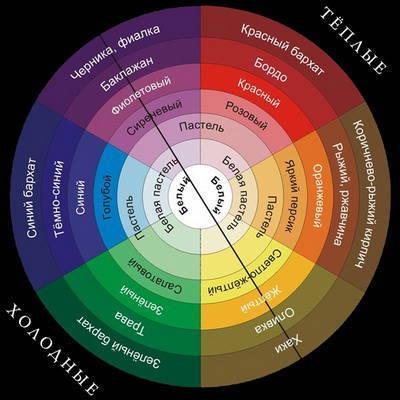
The "hot" color is orange. Most cold blue, always associated with cool water and ice. Going from blue through green and yellow tones, the colors are warming, keep "high temperature" red, Burgundy, brown and some shades of pink and purple and then back "down" to the cold through purple and blue. However, provided graduation is conditional, since the edge between cold and warm subtle. For example, lime is probably the yellow hue, but it is a cool color. Conversely, a deep, rich purple that can be both warm and cold, whichever dominates the red or blue.
And yet it is warm or cold palette can transform a room. For example, in order to expand the walls of a small room, it is desirable to use not just light, and light cool colors.
Conversely, making too spacious and therefore an empty room more cozy will help warm shades. They will also add a bit of Sunny mood, if there is not enough natural light, and use fluorescent lights. While plenty of room lit with large Windows, you can "dress up" in a cold tone.
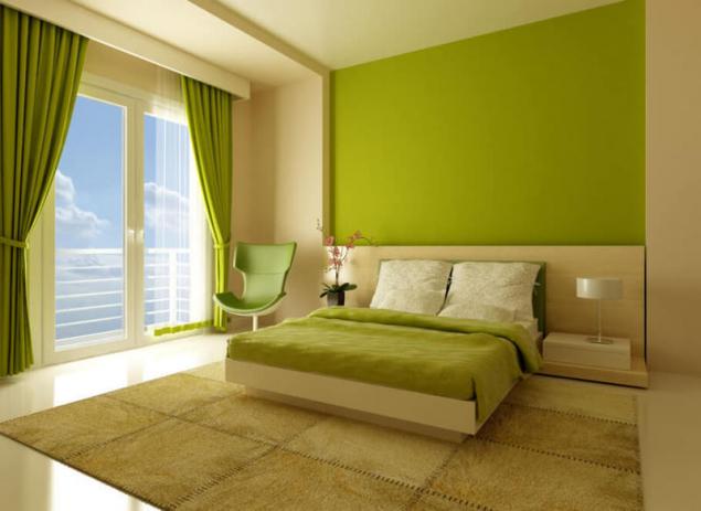
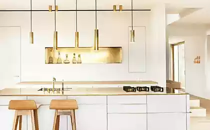
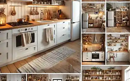
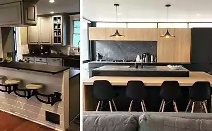
The particular breadth of different color interior design kitchens. If You arrange the kitchen, you should note that juicy warm colors – orange, herbal green, egg yellow increase appetite, while blue and white help to keep yourself in the bounds and eat in moderation.
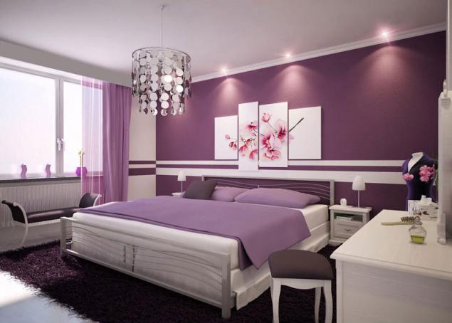
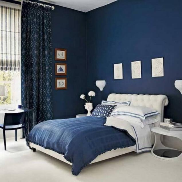
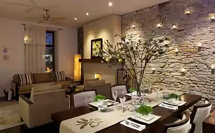
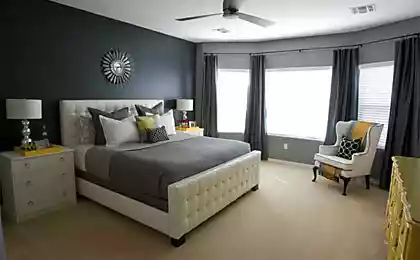
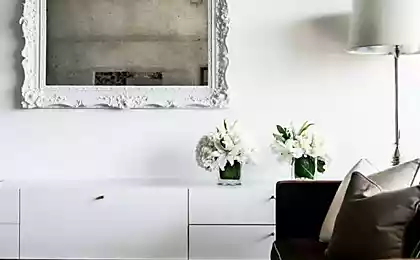
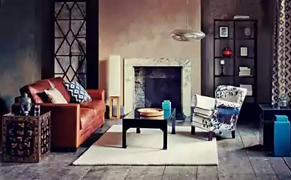
Bedroom – whether it be a place to relax from the rigors of everyday life or the epitome of romance – also requires a special approach. In the first case, it is better to paint it in cool colors, far from requiring mowing solution. In the second, of course, the first role and the red and all its shades, or any other color that you like and belongs to warm colours. The color will quickly restore power, if transferring their energy and warmth to you. The rules for combining colors
Of course, there are fashionable combination of colors in every season. But when You make the selection of combinations of colors, should still be based on a table of combinations of colors and their own feelings.
There is no right combination of colors, there is only a good combination of colors.
In order to choose the combination of colors, there are several approaches. The first type is plain
Color scheme varies the base color, it just gets darker or lighter. For example, dark blue, blue, blue. However, is designed so the room can be slightly diluted with "patches" of another color, not too attractive to the attention. For example, the room in blue and blue colors can complement the white and light beige. The second type is a harmonious
If you want diversity, but not so radical that to speak about contrasts, "paint" the room in the harmonious combination of colors. The most winning examples of combinations that can be safely combined with each other:
- For red: pink purple and orange and egg yellow
- For the orange: red – pink and egg yellow
- For yellow: orange — egg yellow and lime – green
- For green: lime – green and celadon – blue
- For blue: green – celadon, and lilac – purple
- For purple: blue – purple and rose red
For fans of original and bright design – the game of contrasts. Each color in the palette has its "antithesis":
- Red – green
- Orange is the colour of a sea wave
- Egg yellow – blue
- Yellow – purple
- Lime – purple
- Light green – pink
As a result of a colour-themed rooms invisibly directs your emotions and actions.
"Dysfunctional" colors and combinations of colors
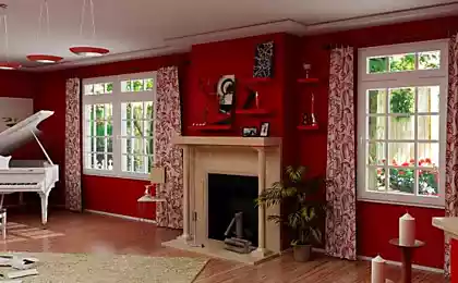
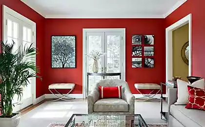
Red – creates tension (can cause hypertension).
Black (and purple) is "eating up" the space.
Brown (including finishing "under the tree"), a melancholy can lead to depression.
Grey — sadness and despondency.
Blue – feeling cold and neuyutnosti. Favorable colors
- Shades of yellow, green, calm and optimistic range, fatigue.
- Pastel shades of yellow, beige – "reconcile" and comfortable color.
- Turquoise gives a feeling of freshness (suitable for bathroom).
- Blue-soothes, causes drowsiness is ideal for bedrooms and rest rooms, but in offices and working areas is contraindicated.
- Dark blue – "cool" space and dust (e.g. at the negotiating table), is a serious and businesslike colors.
- Yellow and orange – stimulates and tones (not suitable for bedrooms), suitable for room Windows to the North.
- White – can cause a feeling of cold and discomfort, on the other hand, the "clean sheet" is the perfect background for any design decisions. Red or terracotta in the form of accents – cheerful, uplifting.
- Black in the form of accents gives the interior a graphic quality and special style.
- Light in the "mix" with other colors – business environment.
Special harmony have combinations of colors that are in the color wheel on the opposite side from each other. This is because between such related pairs of-contrasting colors there is a double bond: they consist of an equal number combining a main color and equal amounts of contrasting colors. In practice, rarely have to deal with compositions that contain only two colors. The simplest balanced combination of the two related-contrasting colors are much enriched by adding a color from the tonal range of these flowers, and raspalennoe or dark.
Also, color harmony can be formed by the combination of colors located at the vertices of inscribed in the color circle of an equilateral triangle. Rotating this triangle inside the circle you can get any combination of colors, it will necessarily harmonious. The successful combination of flowers and colors in the interior — a pledge of comfort in the house.
Color combinations in clothing is a very important point in the selection of clothing, the design of new models when knitting. Harmonious — this means well-suitable in combination.
The harmony of colors in clothes is based on the principle of combining related or contrasting colors. In clothes it is possible to speak about harmonious combinations, on the basis of shades of the same color, then it is a monochrome harmony.
Harmony can be built on a combination of similar colours, i.e., adjacent colors on the color wheel, e.g. yellow and yellow-orange, orange and red-orange.
Harmony can be built on contrasting colors. This means that the selected color from the adjacent sectors of the color circle. The best combination between a color located at an angle of 90° in neighboring sectors. Another variety contrast harmony are combinations of colors are to each other in the color wheel at an angle of 180°.
The main is considered to be 4 pure colors: yellow, red, blue, green. All others are intermediate (yellow-red, yellow-green, green-blue, blue-red).
A pair of "yellow—blue", "red—green" are in addition, contrast combinations. Colors can be arranged in the form of a circle with the axes: the "yellow—blue", "red—green".
Distinguished 3 types of colour combinations:
kindred, kindred-contrast, contrast.
Contrast is a combination of the opposite quarters of the circle (the angle between them is 180°), only 44 combinations.
A related contrast is the combination of colors from two adjacent quarters of the circle (the angle between them is less than 180°), a total of 36 combinations.
is a range from this color to the next main. Related are the yellow and any of the gap — yellow-red (but not pure red).
Color harmony is understood as a color balance in blending the colors of the amounts of the main colors (pure yellow, blue, red and green).
There are related harmonious colors with equal brightness and saturation, if you make them the same number of main colors.
Harmonious in kinship and contrasting colors are all the pairs of colors that are located at the ends of the chords, parallel to the layers, connecting the main color (as they contain an equal number of main and additional colors).
On the basis of these harmonic pairs can be constructed more complex multi-color harmony. Thus it is necessary to observe three rules:
1. Two matching related-contrasting colours can be added the third primary color, which makes them weakened by saturation. For example, yellowish-red, yellowish-green and yellowish-white colors can be matched by the same jeltovatogo.
2. Two related to harmony-contrast colors, you can add a third and a fourth, balanced with them. For example, a harmonious combination of orange with yellow-green may be supplemented with purple and blue.
3. You can create a harmony of related and complementary colours. For example, harmony is yellowish-white and leaf-green can be refilled Magenta.
An unfavourable combination of colors in the interior
- Black and purple colors make the space compressed, the depressing.
- Brown causes of depressive mood, melancholy.
- Red background unnerving and can increase blood pressure.
- The grey colour adds to the atmosphere of despair, depression, sadness.
- Blue color annoying sensation of cold.
Suppose man I visited Bali and saw how people live there, picked up the new colour impressions, came back and wanted to redo everything in "gaudy jungle." And tomorrow went, say, to America – and again wants to change everything in the fashionable psychedelic colours. So can continue indefinitely. However, the color project picture: sometimes it is impossible to "improve", you can only screw it up.
Magical mix of colors in the interior
In the color palette each color has its pole, by which the interior is bright, fantastic, or incredibly stylish. Helps to create a contrasting color combination in the interior of the table of opposites:
- Orange and Marengo.
- Blue and yellow (yolk).
- Purple (Indigo) and lime.
- Pink (Flamingo) and light green.
- Gentle yellow and purple.
- Green and fiery red.
- Grey – blue, blue, yellow, green, black, red, pink.
- Purple with yellow, light green, gold, orange.
- Lilac with brown, grey, light purple.
- Pink – Burgundy, brown, gray.
- Green, black, gray, red, orange, Burgundy, yellow.
- Brown with pink, yellow, Golden, beige, gray.
- Blue – gray, red, gold, Burgundy.
- Blue with orange, red, light purple and blue.
Exquisite color composition is an integral part of our life – its colors, rhythm and dance. Created under the laws of outer beauty combination of colors in the interior receives its energy. Communicating with color is soothing, helps to relax, forget about troubles.
Flavor just like people: it can saturate the house with feeling, has the temperament, inspires sympathy and antipathy, imitates the master. The true harmony lies in the concept of auspicious confluence of colors.
White and sand background, stones and marble give the desired coolness.
Bamboo furniture color will be respected when using the design in the style of "patio".
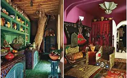
The room, the abode of the shades of red and striped blue-and-white nuances at the bottom of the world inside the house and catch all of the walls bright.
Terracotta connects the space in and out, internal and external. Inside it can lead to color ceramics, outside oak doors.
Someone solid seems boring monotony, and someone draws a traditional combination of colors in the interior, whereby the interior of the home retains its unique appearance, singing his song, he turns and invites you to waltz. But all this is nothing more than different ways of expression. So, if you want to become intimate with the interior, make it a part of your history, just paint the house in his style. published
P. S. And remember, only by changing their consumption — together we change the world! ©
Source: tulkindom.ru/tablica-sochetaniya-cvetov


Daniel Golman: business and emotional intelligence
Russian archaeologists have made a list of the most unexpected finds in Moscow