920
The red color in the interior: the details of design
The red color in the interior is suitable for active people, always wanting to be the center of attention. It helps create a sense of celebration to highlight the accents infuse the room with warmth and energy. How to use red in the interior? What color is it better to combine? Below we consider the most and least successful alliances with other red shades.
The value red and its shadesRed interior always attracts attention. This color is associated with life, energy, power. He incites to action, tones and increases efficiency. However, red is able and have a negative impact on the human psyche: it may increase the irritation of the nervous system, cause aggression, can lead to depression, tantrums.
Emotionally disturbed people should not use red in the living room, dining room, bedroom, study. Red accents can be applied for interior decoration of bathroom, toilet, kitchen, hallway.
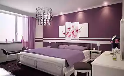
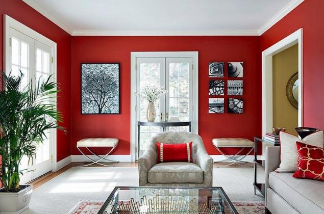
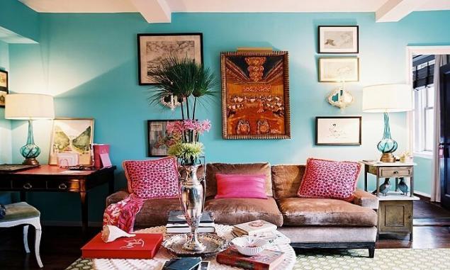
Red has a less aggressive colors, which can be freely used in design of bedroom and living room. These include wine, terracotta, Burgundy, coral. These tones enable you to create gorgeous interiors, highlighting the luxury and style of the premises.
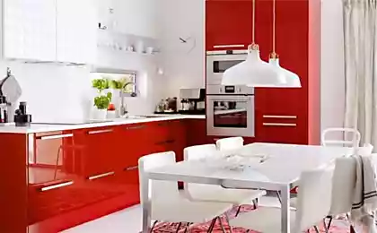
It should be remembered that the red color in the interior of small apartments is not recommended, as it reduces the visual space. Get involved in this particular color is also not worth it, not to make the interior a tiring, challenging and even vulgar. However, red can be safely combined with other flowers. The right mix of hues will help create a warm, cozy, lively interior.
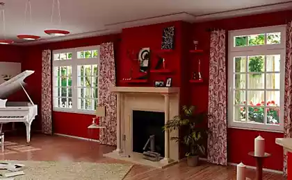
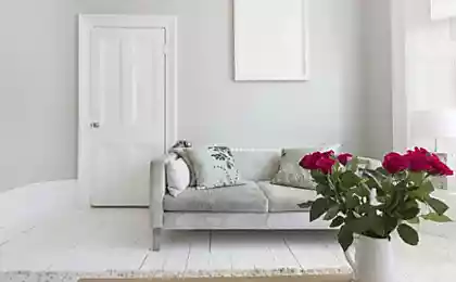
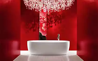
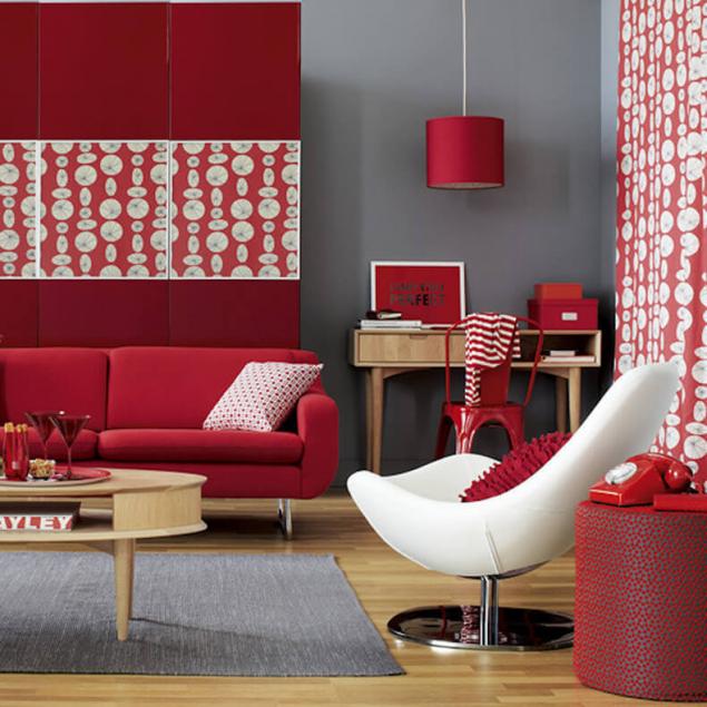
Red and whitea Combination of red and white is the most successful. It does not require additional color inclusions. White color smooths out excessive aggressiveness of red and the Union of these colors symbolizes justice, purity, care. This combination gives the interior a fresh and visually expands the room, it is easy to see in the photo examples. To complement the red and white can be brown or black accessories will make the interior more luxurious.
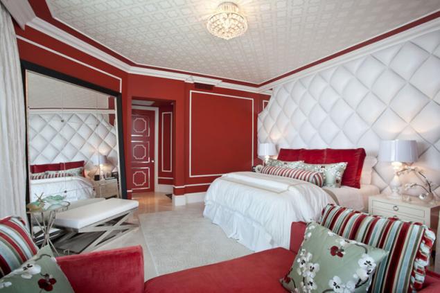
White-red interior are best made in one of two ways. First, you can only use solid objects, diluting them with two or three objects with patterns. Secondly, primarily to the patterned detail of the interior should add more solid.
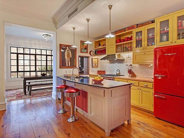
Red and yellowcombined with the color red creates the most warm, joyful interior? Of course, with yellow and its shades. Combinations of these colors are perfect for decoration of children's room, kitchen, dining room, hall for fitness. However, before you choose these hues to decorate the room, you should determine on which side his window.
If the room is warm, Sunny, a mix of red and yellow can strengthen the sense of heat, and in this room will be uncomfortable. It is not necessary to use these colours and in children's hyperactive child, as they will contribute to further increasing its activity.
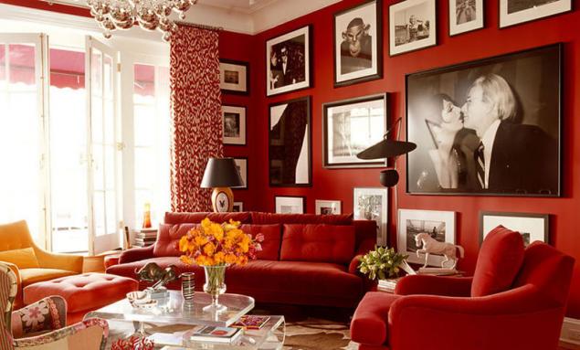
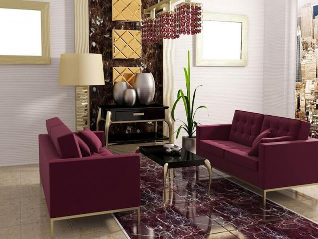
The effect is quite different the combination of red and gold. This chic color Alliance is appropriate in expensive restaurants, hotels, museums, but it can be used to design living room in classic style. Looks rich combination of maroon and Golden hues. In these interiors you can add black color to contrast and enhance the effect of luxury.
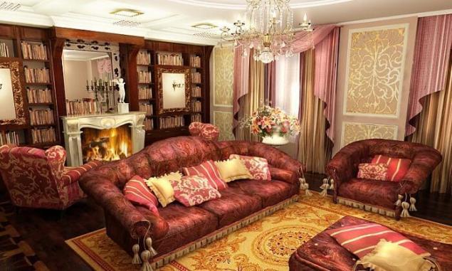
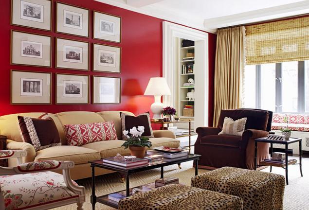
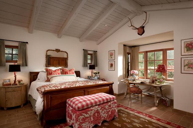
Red and brown,These hues are related, so are very well together in the interior. The red-brown atmosphere always looks solid and noble. The combination of dark brown and Burgundy can be used to design the rooms in a restrained English style. If we add to these the hints of gold, you get the luxury Victorian style. To the interior of this room was not too pompous, you can dilute it with white color.
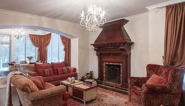
What shade of brown goes well red? Cozy and warm will be the interior, where al is used together with woody undertones. You can also choose other colors: terracotta, chocolate, beige, vanilla.
Less successful color combinationswith all the shades of red are combined so well. The following are the rarely used color combination.
The interior, decorated in red with the observance of certain rules is always stylish and popular. It is only important to correctly use colors, select more colors, and then the room will become alive, energetic, but at the same time warm and welcoming atmosphere.published
Source: decorstars.ru/koloristika/cvet/krasnyj-cvet-i-ego-sochetaniya-v-interere.html


The value red and its shadesRed interior always attracts attention. This color is associated with life, energy, power. He incites to action, tones and increases efficiency. However, red is able and have a negative impact on the human psyche: it may increase the irritation of the nervous system, cause aggression, can lead to depression, tantrums.

Emotionally disturbed people should not use red in the living room, dining room, bedroom, study. Red accents can be applied for interior decoration of bathroom, toilet, kitchen, hallway.

Red has a less aggressive colors, which can be freely used in design of bedroom and living room. These include wine, terracotta, Burgundy, coral. These tones enable you to create gorgeous interiors, highlighting the luxury and style of the premises.

It should be remembered that the red color in the interior of small apartments is not recommended, as it reduces the visual space. Get involved in this particular color is also not worth it, not to make the interior a tiring, challenging and even vulgar. However, red can be safely combined with other flowers. The right mix of hues will help create a warm, cozy, lively interior.

Red and whitea Combination of red and white is the most successful. It does not require additional color inclusions. White color smooths out excessive aggressiveness of red and the Union of these colors symbolizes justice, purity, care. This combination gives the interior a fresh and visually expands the room, it is easy to see in the photo examples. To complement the red and white can be brown or black accessories will make the interior more luxurious.


White-red interior are best made in one of two ways. First, you can only use solid objects, diluting them with two or three objects with patterns. Secondly, primarily to the patterned detail of the interior should add more solid.

Red and yellowcombined with the color red creates the most warm, joyful interior? Of course, with yellow and its shades. Combinations of these colors are perfect for decoration of children's room, kitchen, dining room, hall for fitness. However, before you choose these hues to decorate the room, you should determine on which side his window.
If the room is warm, Sunny, a mix of red and yellow can strengthen the sense of heat, and in this room will be uncomfortable. It is not necessary to use these colours and in children's hyperactive child, as they will contribute to further increasing its activity.

The effect is quite different the combination of red and gold. This chic color Alliance is appropriate in expensive restaurants, hotels, museums, but it can be used to design living room in classic style. Looks rich combination of maroon and Golden hues. In these interiors you can add black color to contrast and enhance the effect of luxury.

Red and brown,These hues are related, so are very well together in the interior. The red-brown atmosphere always looks solid and noble. The combination of dark brown and Burgundy can be used to design the rooms in a restrained English style. If we add to these the hints of gold, you get the luxury Victorian style. To the interior of this room was not too pompous, you can dilute it with white color.

What shade of brown goes well red? Cozy and warm will be the interior, where al is used together with woody undertones. You can also choose other colors: terracotta, chocolate, beige, vanilla.

Less successful color combinationswith all the shades of red are combined so well. The following are the rarely used color combination.
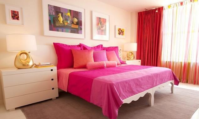
- Red and pink
Interior composition of these shades are more appropriate in the East. Our opinion this combination is unusual, so should be used with great caution and only in the case if you choose to create unusual design of the room.

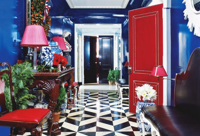
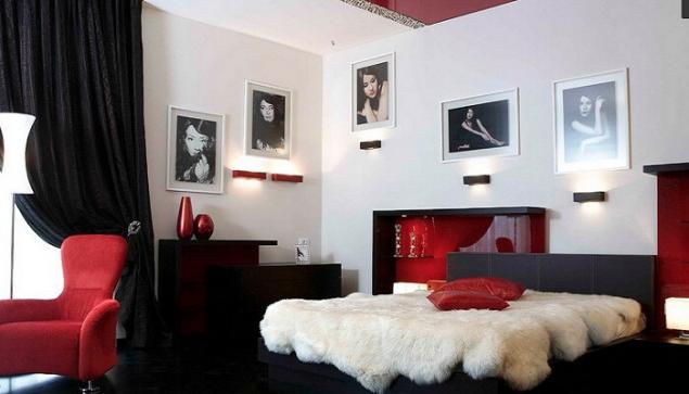
- Red and black
This color composition is very rarely used in the interior, as it is depressing. So the situation is not too grim to red and black to add shades of yellow or white color.

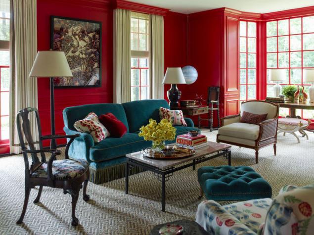
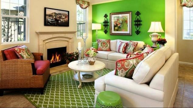
- Red and green
Bold, but not always a happy marriage. The red color in the interior is rarely combined with green, as these colors will always be in conflict. If you decide to decorate in red and green tones, pre-decide what color you will use as your primary, and which only highlight the minor details of the interior.

- Red and blue
A very rare combination because of the complete opposite shades. Red is associated with warmth, fire, blue for cold, ice. However, if you choose red as the main background, blue may very well complete environment.

The interior, decorated in red with the observance of certain rules is always stylish and popular. It is only important to correctly use colors, select more colors, and then the room will become alive, energetic, but at the same time warm and welcoming atmosphere.published
Source: decorstars.ru/koloristika/cvet/krasnyj-cvet-i-ego-sochetaniya-v-interere.html