1370
All shades of red- interior design for the most energetic
This is the strongest of all colors, symbolizing the flow of life force. Red always makes an impression! Red excites, excitements.
Cool shades of red. Bright red with blue adjusting formed by the addition of pure blue. More muted ruby red and floksovy obtained by adding blue-gray or gray-pink flowers.
Warm shades of red. Poppy-red, red - the result of the addition of pure yellow. Muted tone -. Tomato-red, orange-red
It refers to the red of the three primary colors (more blue and yellow). This color has many shades - from light pink to red-brown
. King of flowers - red immediately attracts attention. One of the three primary colors - additional to it the green - it varies from hot orange-red to red-violet cold
. Red creates both positive and negative emotions. In some cultures, a symbol of life and love, in others - the danger. Red is considered the color of the call, the color of the fight. In the old days, a red dye obtained from insects, from the roots of plants, of minerals. Nowadays, you can get any shade of red synthetically, this color has become readily available, so now costs nothing to reproduce the flavor georgianskih canteens, Gothic stained glass, fashionable in the 1950s. polka dot faded or Tuscan mural.
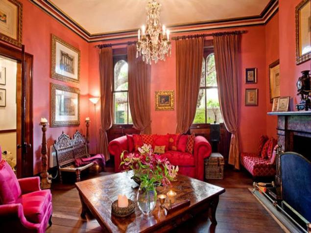
Variations on the red side of the spectrum of warm, tawny tones of brick, give a warm, warm color; at the other edge of the spectrum, closer to purple red forms a purple and scarlet colors, used in religious ceremonies and festive magic and causing fear and trepidation. However, any of these shades of red soften easily: add a whitewash, and they immediately lose its strength and will find gentle pastel shades of pink or lavender
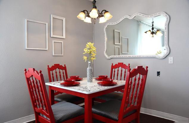
. Intense, clean red suppresses the other colors of the interior, if they are covered by a larger plane; but administered in doses, in the form of separate spots of color on the walls, drapes, cushions, in the arrangement of colors, he lifts the mood, gives a charge of vivacity.
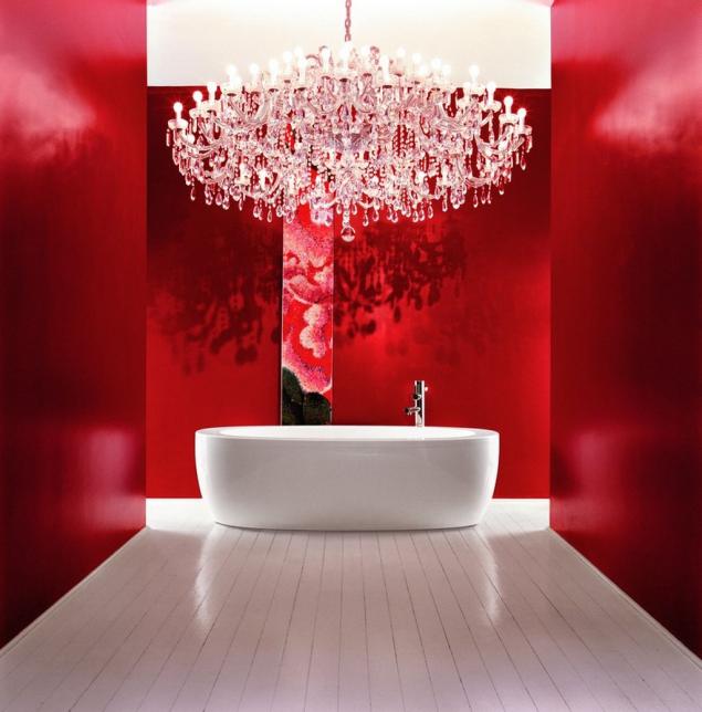
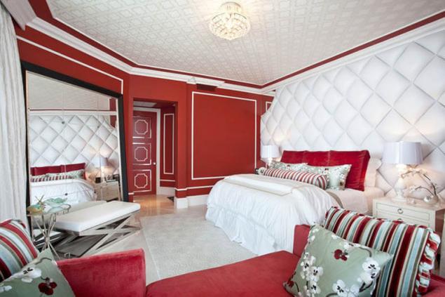
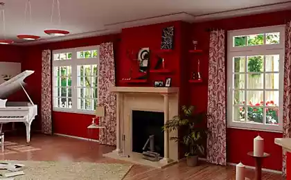
Red - the most active, creating a warm mood and spectacular interiors, is used in the finishing of almost all the rooms. However, it should be used with caution, because it can be too exciting and emotional. This color is more suitable for the common rooms of the apartment - the living room, study room, fireplace room, hallway or lobby, that is there, where the most active family life. Please note that the room settled in red tones, will look smaller, below.
Red colors present in the so-called intellectual palette, that is believed that they stimulate intelligence. However, we have in mind is not a pure color and its shades, as close to the color of nature, or complex - for example, cranberry or burgundy. A catchy combination of red, orange and dark yellow interior energy charges. Turning pink, red becomes feminine, and darkening - on the contrary, courageous. Mixed with yellow, it turns into a cheerful orange and blue - in the mysterious purple
. Modern and interesting contrast combinations, although not everyone will venture on a combination of red, for example, with azure-blue or green.
Of course, the color perception at everyone, and absolute truth does not exist here. Composing palette of your interior, do not restrain ourselves with common rules - be guided by their attitude
. Scarlet
The color of the poppy is full of drama, it's a bold color choice. Who saw the yellowing cornfield with bright speckled scarlet poppy, he knows a delicious combination of red, straw yellow and celestial blue. Scarlet - the color of courage, bravado, and interior decoration of this can not be ignored. Not everyone will dare to paint their walls of their homes. The red color makes the object visually closer, so a room with red walls looks smaller. This effect can be used in a narrow, elongated room, painted in red opposite smaller walls.
Scarlet is best combined with the nearest neighbors with the yellow side of the color wheel, as they share with them his power of influence. And in combination with carmine and purple it creates a very strong energy field. If you want to make the contrast with metals -Choose juicy antique gold
Brick-red
Deep, rich and warm color. How to describe it - terracotta, ocher, red, Indian red, red, brick-red, bull's blood - this shade of red it is known to all and involves all its warmth. All a wide variety of shades - from fiery red to deep dark red - can be mixed with each other, as well as the color of earth, wood and leather in the world few colors and shades with which it could not get along. Deep purple, the color of aqua and dark gray - are the most usual combinations, and they are all pleasing to the eye, especially if interrupted neutral light gray
.
Brick Red looks particularly intense and bright, combined with black and cream. If you want to get more exciting effect, try a pale, clear as ice blue, and the combination of the green and red looks rough. If on the basis of brick-red color to make a matte whitish paint, by adding lime or chalk, and paint the walls, you get a special oriental flavor; paint this color is also good for wooden panels, curbs and skirtings.
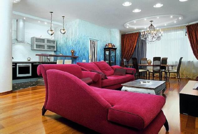
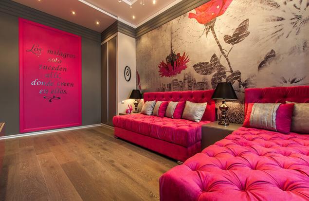
Raspberry
It is the color of youth and energy spurting through the edge at the same time having a certain coldness. Vibrating red with crimson tinge as its complementary color is pistachio green - a combination that causes the summer unions. Few dare to paint the walls in the house entirely in crimson color, but the color of the floral patterns are common. Wallpapers with such patterns, ubiquitous in the 1950s., Are in vogue again.
By itself, the crimson color can be seen a few cold and aloof, but it is very sensitive to other colors. If you want to design the interior in a colorful and bright colors, combine risk crimson red with a bright orange, turquoise, silver frames, lamps and small utensils.
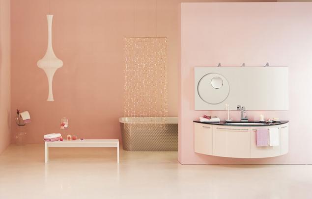
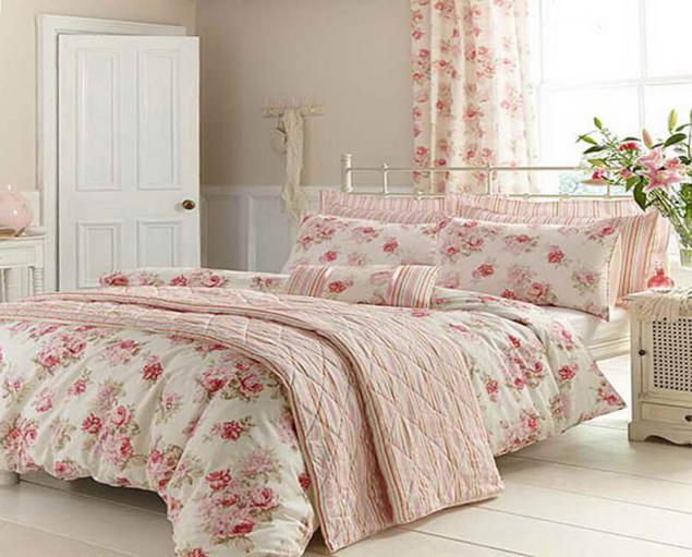
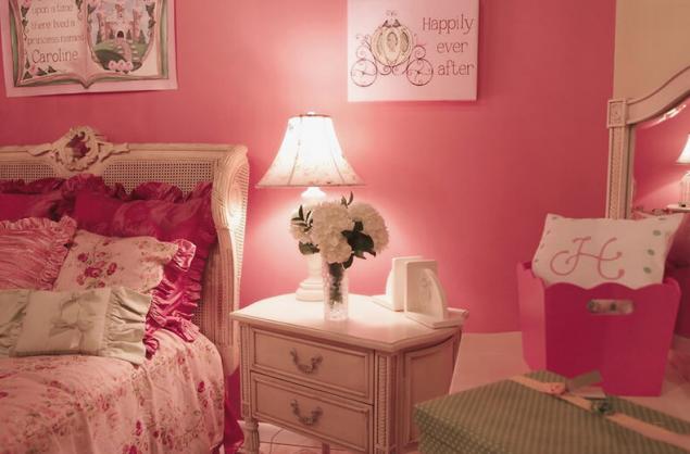
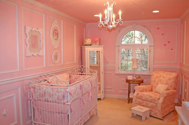
Pale pink
It's so gentle color that must be handled very carefully. It should just lose all sense of proportion - and it would be corny and cloying. This light version of carmine; like carmine, it also has a dose of cold blue, persuaded him to Mauve, as can be seen particularly in combination with shades of purple or lavender. Feminine nature of this pink hue makes it a popular floral pattern in the production of calico.
To maintain the freshness of color, use it in equal parts with a white or allow it to come into the game with a pale lemon or bright green. If you want it to sound more romantic, they cover the walls and panels and all the wooden elements of the interior -. Matte gray-green
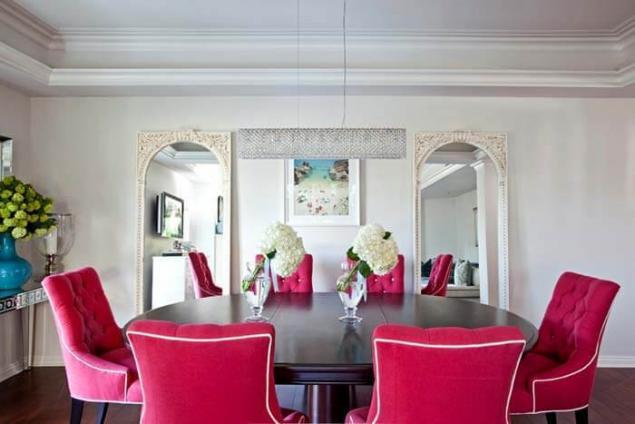
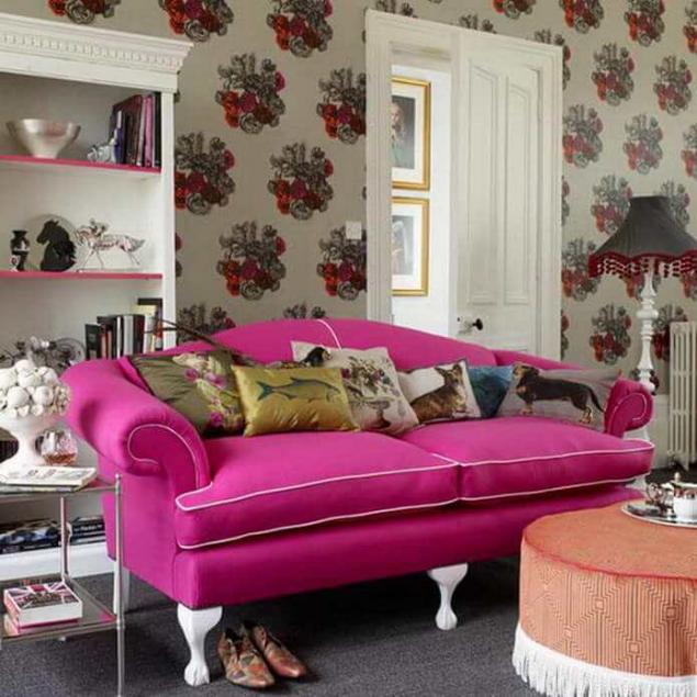
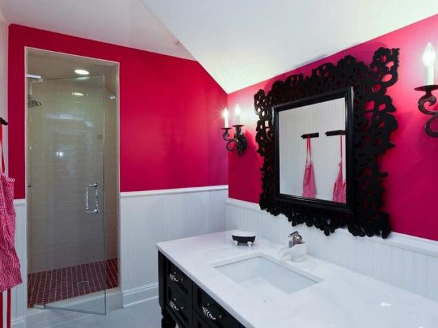
Shocking pink
The name of this color speaks for itself so bright pink that inevitably attracts the eye. This color-extrovert, he is always looking for attention, and even with the addition of white retains its extravagance. If you wish to recreate the style of the 1950s. - Combine pink with black peas or strips; but if you want to recall the spirit of the 1960s and 1970s. - Do not be put off by the collision of pink with a bright orange, purple or scarlet. If retro is not your style, combine pink with bright colors of the national textile homespun samples -. Emerald-green or bright blue
strawberries with cream color
It gives a feeling of warmth, softness and serenity. It is the most exquisite shade of pink obtained by mixing a small amount of crimson with lots of yellowish white. As ripening strawberries from the green becomes white, then yellow and finally bright and juicy crimson; When Scarlet do pink, yellow gives it some warmth and softness. The resulting pink - cheerful, pleasing the eye color
.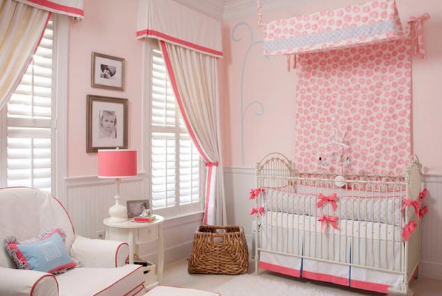
This is a favorite color of houses with thatched roof, which many in Suffolk in England; where they at first bright pink, and then the sun, wind and rain do their thing, and they are of bright pink becoming pale pink.
As for the rural interiors, then rose as the whitewashed traditional painted plastered walls, and it is the perfect backdrop for a simple home-made furniture and homespun.
Cool shades of red. Bright red with blue adjusting formed by the addition of pure blue. More muted ruby red and floksovy obtained by adding blue-gray or gray-pink flowers.

Warm shades of red. Poppy-red, red - the result of the addition of pure yellow. Muted tone -. Tomato-red, orange-red
It refers to the red of the three primary colors (more blue and yellow). This color has many shades - from light pink to red-brown
. King of flowers - red immediately attracts attention. One of the three primary colors - additional to it the green - it varies from hot orange-red to red-violet cold
. Red creates both positive and negative emotions. In some cultures, a symbol of life and love, in others - the danger. Red is considered the color of the call, the color of the fight. In the old days, a red dye obtained from insects, from the roots of plants, of minerals. Nowadays, you can get any shade of red synthetically, this color has become readily available, so now costs nothing to reproduce the flavor georgianskih canteens, Gothic stained glass, fashionable in the 1950s. polka dot faded or Tuscan mural.
Variations on the red side of the spectrum of warm, tawny tones of brick, give a warm, warm color; at the other edge of the spectrum, closer to purple red forms a purple and scarlet colors, used in religious ceremonies and festive magic and causing fear and trepidation. However, any of these shades of red soften easily: add a whitewash, and they immediately lose its strength and will find gentle pastel shades of pink or lavender
. Intense, clean red suppresses the other colors of the interior, if they are covered by a larger plane; but administered in doses, in the form of separate spots of color on the walls, drapes, cushions, in the arrangement of colors, he lifts the mood, gives a charge of vivacity.
Red - the most active, creating a warm mood and spectacular interiors, is used in the finishing of almost all the rooms. However, it should be used with caution, because it can be too exciting and emotional. This color is more suitable for the common rooms of the apartment - the living room, study room, fireplace room, hallway or lobby, that is there, where the most active family life. Please note that the room settled in red tones, will look smaller, below.
Red colors present in the so-called intellectual palette, that is believed that they stimulate intelligence. However, we have in mind is not a pure color and its shades, as close to the color of nature, or complex - for example, cranberry or burgundy. A catchy combination of red, orange and dark yellow interior energy charges. Turning pink, red becomes feminine, and darkening - on the contrary, courageous. Mixed with yellow, it turns into a cheerful orange and blue - in the mysterious purple
. Modern and interesting contrast combinations, although not everyone will venture on a combination of red, for example, with azure-blue or green.
Of course, the color perception at everyone, and absolute truth does not exist here. Composing palette of your interior, do not restrain ourselves with common rules - be guided by their attitude
. Scarlet
The color of the poppy is full of drama, it's a bold color choice. Who saw the yellowing cornfield with bright speckled scarlet poppy, he knows a delicious combination of red, straw yellow and celestial blue. Scarlet - the color of courage, bravado, and interior decoration of this can not be ignored. Not everyone will dare to paint their walls of their homes. The red color makes the object visually closer, so a room with red walls looks smaller. This effect can be used in a narrow, elongated room, painted in red opposite smaller walls.
Scarlet is best combined with the nearest neighbors with the yellow side of the color wheel, as they share with them his power of influence. And in combination with carmine and purple it creates a very strong energy field. If you want to make the contrast with metals -Choose juicy antique gold

Brick-red
Deep, rich and warm color. How to describe it - terracotta, ocher, red, Indian red, red, brick-red, bull's blood - this shade of red it is known to all and involves all its warmth. All a wide variety of shades - from fiery red to deep dark red - can be mixed with each other, as well as the color of earth, wood and leather in the world few colors and shades with which it could not get along. Deep purple, the color of aqua and dark gray - are the most usual combinations, and they are all pleasing to the eye, especially if interrupted neutral light gray
.

Brick Red looks particularly intense and bright, combined with black and cream. If you want to get more exciting effect, try a pale, clear as ice blue, and the combination of the green and red looks rough. If on the basis of brick-red color to make a matte whitish paint, by adding lime or chalk, and paint the walls, you get a special oriental flavor; paint this color is also good for wooden panels, curbs and skirtings.

Raspberry
It is the color of youth and energy spurting through the edge at the same time having a certain coldness. Vibrating red with crimson tinge as its complementary color is pistachio green - a combination that causes the summer unions. Few dare to paint the walls in the house entirely in crimson color, but the color of the floral patterns are common. Wallpapers with such patterns, ubiquitous in the 1950s., Are in vogue again.
By itself, the crimson color can be seen a few cold and aloof, but it is very sensitive to other colors. If you want to design the interior in a colorful and bright colors, combine risk crimson red with a bright orange, turquoise, silver frames, lamps and small utensils.


Pale pink
It's so gentle color that must be handled very carefully. It should just lose all sense of proportion - and it would be corny and cloying. This light version of carmine; like carmine, it also has a dose of cold blue, persuaded him to Mauve, as can be seen particularly in combination with shades of purple or lavender. Feminine nature of this pink hue makes it a popular floral pattern in the production of calico.
To maintain the freshness of color, use it in equal parts with a white or allow it to come into the game with a pale lemon or bright green. If you want it to sound more romantic, they cover the walls and panels and all the wooden elements of the interior -. Matte gray-green


Shocking pink
The name of this color speaks for itself so bright pink that inevitably attracts the eye. This color-extrovert, he is always looking for attention, and even with the addition of white retains its extravagance. If you wish to recreate the style of the 1950s. - Combine pink with black peas or strips; but if you want to recall the spirit of the 1960s and 1970s. - Do not be put off by the collision of pink with a bright orange, purple or scarlet. If retro is not your style, combine pink with bright colors of the national textile homespun samples -. Emerald-green or bright blue


strawberries with cream color
It gives a feeling of warmth, softness and serenity. It is the most exquisite shade of pink obtained by mixing a small amount of crimson with lots of yellowish white. As ripening strawberries from the green becomes white, then yellow and finally bright and juicy crimson; When Scarlet do pink, yellow gives it some warmth and softness. The resulting pink - cheerful, pleasing the eye color
.


This is a favorite color of houses with thatched roof, which many in Suffolk in England; where they at first bright pink, and then the sun, wind and rain do their thing, and they are of bright pink becoming pale pink.
As for the rural interiors, then rose as the whitewashed traditional painted plastered walls, and it is the perfect backdrop for a simple home-made furniture and homespun.


Australia could become the world leader in the number of solar-powered electric vehicles
Our character is not ours, but our shadow ....