757
Win-win color for the kitchen interior of your dreams
Beige is one of the safest and versatile colors, which can be a starting point in the design of the kitchen in any style. Beige kitchen, wall, Wallpaper, floor, aprons, table tops, curtains, tables and chairs in neutral tones, designers are valued for practicality, the ability to "calm" bright accents "soften" the dark tone make the atmosphere a feeling of warmth and harmonize with all colors of the spectrum.
For those who are on the planning stage of your kitchen design or want to refresh the already formed beige interior, we have prepared 3 tips for working with space and a list of the 9 best "colors"companion.
3 top tips
The beige color is all around us, but it is so neutral that we can not ignore it. In nature, beige found in the form of sand, stones, shells, light wood, faded plants, animals... color and even the color of our skin is one of the shades of beige, so it goes well with almost all colors of the rainbows.
But to create in your kitchen the desired mood and style, you need to choose the right color companion.
The color "beige" has more than 1,000 variations – from light brown to cream. It can have neutral, warm and cool temperature and this should be considered in making the interior.
1. Consider, on which side the kitchen window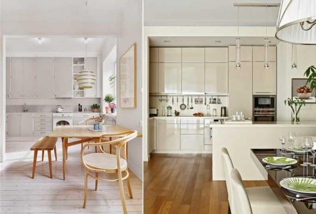
If the beige color is chosen as the main focus, they most often are made of the wall.
2. Create optical illusions by playing with shades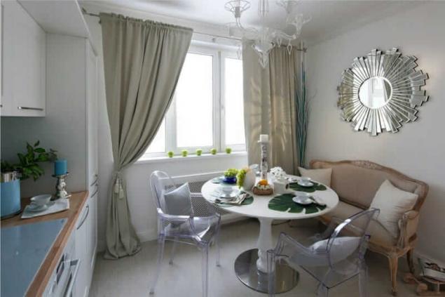
If medium and small kitchens need a visual increase in space, it is large – in the creation of intimacy and comfort. Very help simple rules of color:
It is clear that according to these points, for small kitchens more profitable gamma light and bright "companions" or a combination of dark and light tones, but you can go even further and create winning optical illusion.
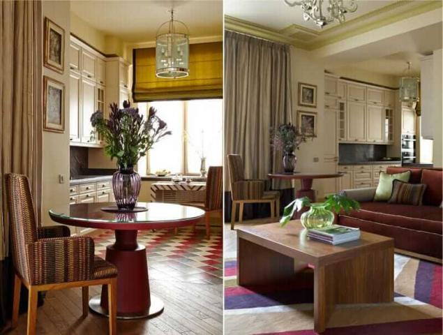
Suppose you wanted to make a small kitchen in a classic style in beige and brown colours, then you can do the following: paint the walls (or Wallpaper) with a light beige paint, set to choose a white and dilute this white-beige idyll backsplash, countertops and flooring in brown color with cool undertone. In such a combination, dark-brown, without which it is difficult to do in a traditional interior, will not "eat" space, but rather expand it, creating an effect of depth.
But great idea how you can beat niche. The walls are decorated in a warm beige, set in ecru, and apron in an alcove – in light gray-beige. Because of the play of cold and warm colors create an optical illusion of the separation wall.
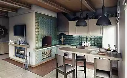
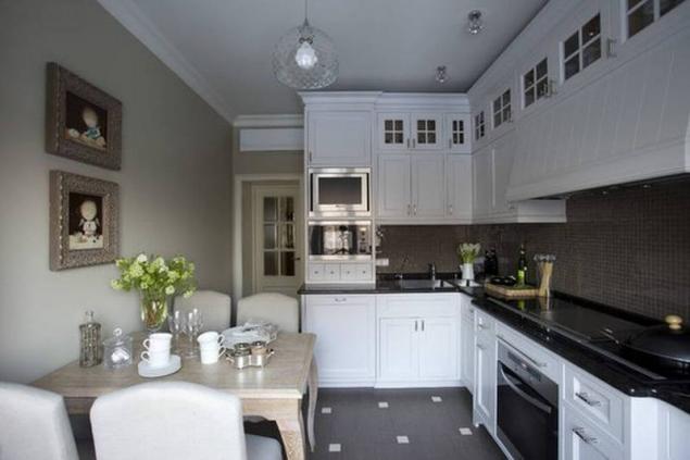
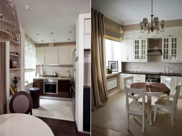
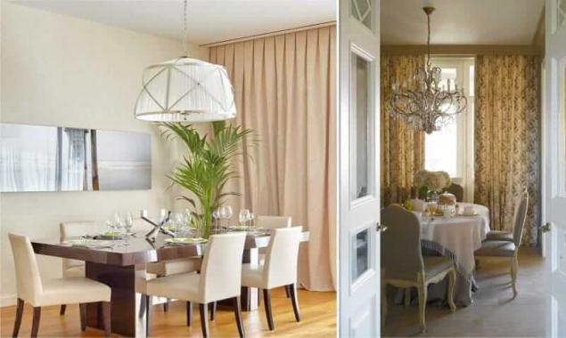
The spacious kitchen to create a cozy atmosphere will help warm shades of beige, which increasingly fill the space and create a sense of harmony. However, overdo it with the heat in the atmosphere is also not worth it, because some cool shades make it fresh and interesting, as, for example, in the interior of this kitchen in the photo below, where the beige curtains, upholstery, Wallpaper, wooden set "cooled" white and taupe "colors-companions."
3. Use the color wheel and principles of color combinations
Whether you are planning the design of future kitchen or want to upgrade a little the situation, you choose a harmonious combination of colors and shades that will simulate the atmosphere and style of your kitchen, you will help the color wheel and checked the schema.
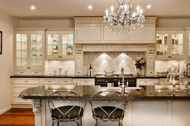
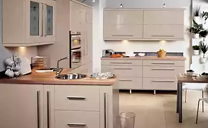
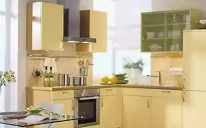
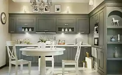
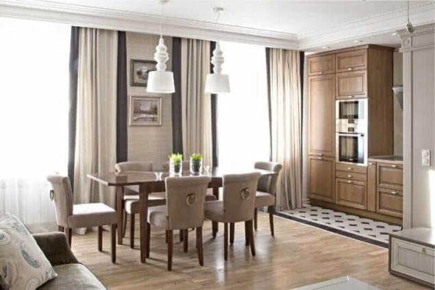
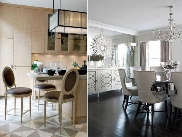
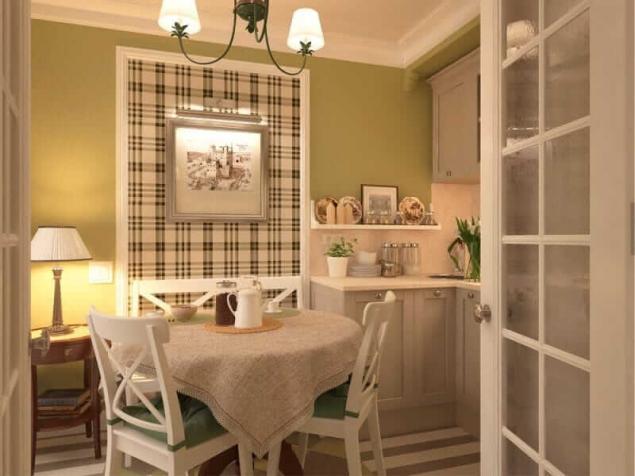
The 9 best "colors" companion for beige color Combination with shades of brown
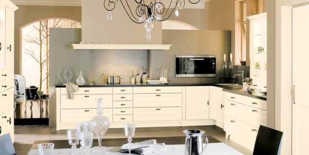
This is a very common range in interior design in beige which most often dominates as a lighter color, and brown (chocolate, woody notes, wenge, dark walnut, etc.) complements or accompanies it.
If you want to withstand kitchen design in beige tones exclusively, to diversify the interior, will help the use of patterns, textures and textures. For example, you can hang beige patterned curtains or Drapes, Wallpaper, or textured with a pattern, to coat apron "pig" or mosaics, the floor is tiled in with the decor or textured wood facades to choose glossy, with glass inserts or panels and equipment with fittings in bronze or gold, etc.
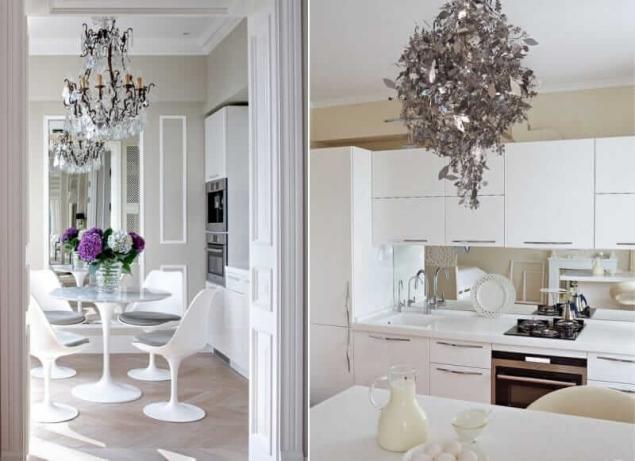
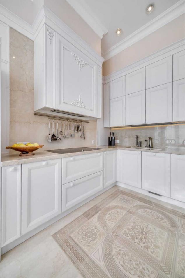
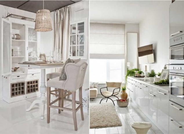
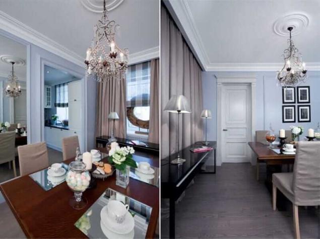
The combination with white color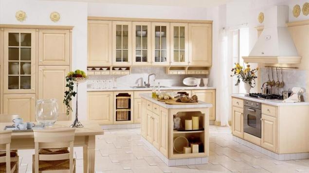
White color paired with beige is the most versatile combination, which often becomes the basis for inclusion in the interior of bright colors. Sometimes, however, this neutral combination is used as a full range, built on a play of shades and textures.
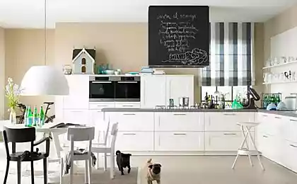
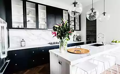
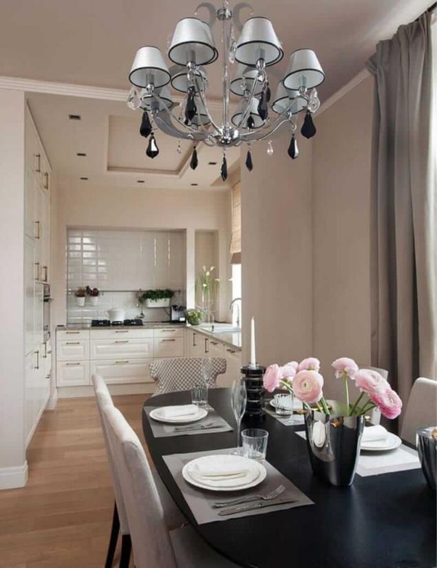
The combination with black
The contrast of black and beige in the kitchen in any style will look stylish and not corny.
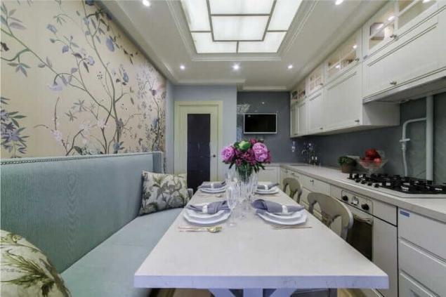
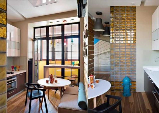
The combination of blue and blue
As you know, the most harmonious color combinations created by nature itself. Recall sandy beaches and azure sea and you will understand why all shades of beige blended with blue and cyan colors. In this pair of blue and blue colors are cool shades of beige, and the interior is perfectly balanced.
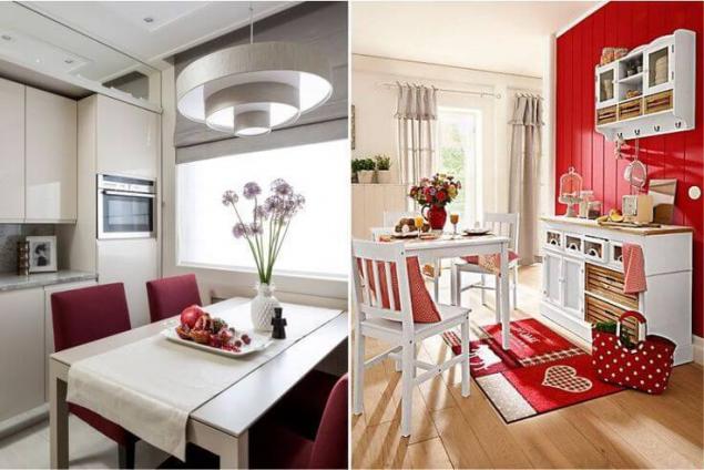
A combination of red
Calm beige on the background and impulsive red accents – not the most common but effective complementary contrast combination. The main thing here is to correctly handle the aspect ratio.
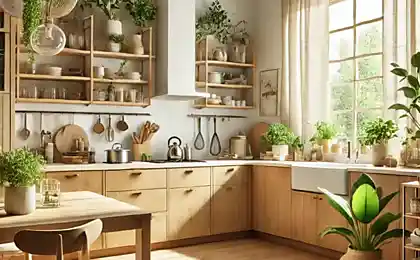
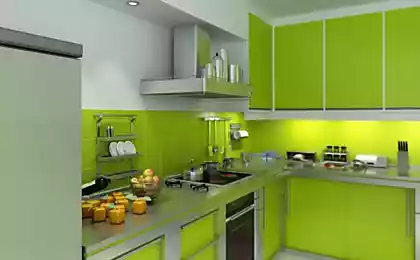
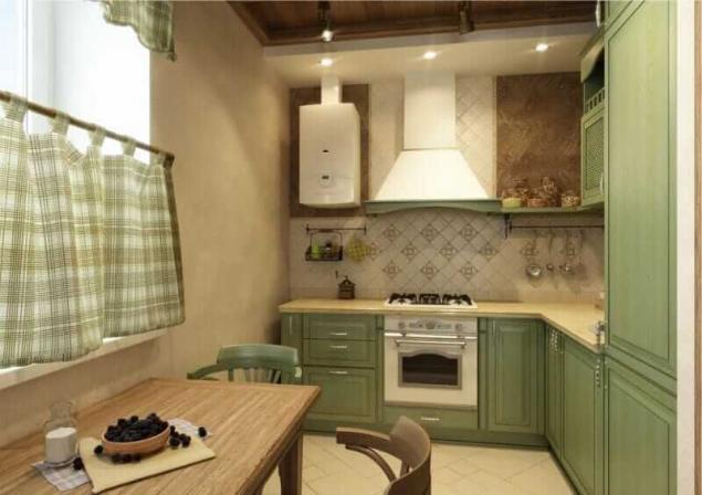
The combination with green
Another soothing eye gamma – beige-green. Depending on the shade of green or an additional color patches to create a modern or classic interior.
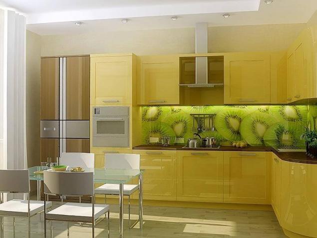
The combination with yellow
This warm combination would look good in the interior of the kitchen, adding cooling colors, e.g. blue, blue, fresh green.
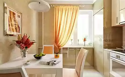
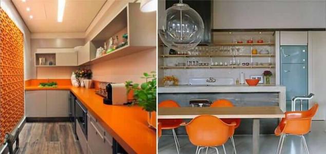
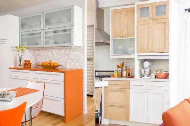
The combination with the orange
This is also a very warm combination that you need to balance illuminating accents. published
Also interesting: the Red color in the interior: the details of design
Turquoise and chocolate bedroom decor
Source: kitchendecorium.ru/design/color/bezhevyj-cvet-v-interere-kuxni.html
For those who are on the planning stage of your kitchen design or want to refresh the already formed beige interior, we have prepared 3 tips for working with space and a list of the 9 best "colors"companion.

3 top tips
The beige color is all around us, but it is so neutral that we can not ignore it. In nature, beige found in the form of sand, stones, shells, light wood, faded plants, animals... color and even the color of our skin is one of the shades of beige, so it goes well with almost all colors of the rainbows.
But to create in your kitchen the desired mood and style, you need to choose the right color companion.
The color "beige" has more than 1,000 variations – from light brown to cream. It can have neutral, warm and cool temperature and this should be considered in making the interior.
1. Consider, on which side the kitchen window

If the beige color is chosen as the main focus, they most often are made of the wall.
- When choosing Wallpaper or the shade of paint for the walls , focus on what side of the world beyond the kitchen window. For the "South", plenty of natural light kitchens, more suited to the cold gray-beige tones for the "Northern" and the dark – light and warm sand, cream, straw, olive and beige shades.

- If you have already formed a beige kitchen, you will be able to update it by adding cool or warm accents.
2. Create optical illusions by playing with shades

If medium and small kitchens need a visual increase in space, it is large – in the creation of intimacy and comfort. Very help simple rules of color:
- Warm colors tend to visually zoom in slightly and ease, and cold (even in a dark color) – a bit of distance and weight items and objects.
- Also, don't forget about the famous principle that light colors enlarge the space and make it lighter, and the dark – reduce and absorb light.
It is clear that according to these points, for small kitchens more profitable gamma light and bright "companions" or a combination of dark and light tones, but you can go even further and create winning optical illusion.
Suppose you wanted to make a small kitchen in a classic style in beige and brown colours, then you can do the following: paint the walls (or Wallpaper) with a light beige paint, set to choose a white and dilute this white-beige idyll backsplash, countertops and flooring in brown color with cool undertone. In such a combination, dark-brown, without which it is difficult to do in a traditional interior, will not "eat" space, but rather expand it, creating an effect of depth.

But great idea how you can beat niche. The walls are decorated in a warm beige, set in ecru, and apron in an alcove – in light gray-beige. Because of the play of cold and warm colors create an optical illusion of the separation wall.

The spacious kitchen to create a cozy atmosphere will help warm shades of beige, which increasingly fill the space and create a sense of harmony. However, overdo it with the heat in the atmosphere is also not worth it, because some cool shades make it fresh and interesting, as, for example, in the interior of this kitchen in the photo below, where the beige curtains, upholstery, Wallpaper, wooden set "cooled" white and taupe "colors-companions."

3. Use the color wheel and principles of color combinations
Whether you are planning the design of future kitchen or want to upgrade a little the situation, you choose a harmonious combination of colors and shades that will simulate the atmosphere and style of your kitchen, you will help the color wheel and checked the schema.

The 9 best "colors" companion for beige color Combination with shades of brown
This is a very common range in interior design in beige which most often dominates as a lighter color, and brown (chocolate, woody notes, wenge, dark walnut, etc.) complements or accompanies it.

If you want to withstand kitchen design in beige tones exclusively, to diversify the interior, will help the use of patterns, textures and textures. For example, you can hang beige patterned curtains or Drapes, Wallpaper, or textured with a pattern, to coat apron "pig" or mosaics, the floor is tiled in with the decor or textured wood facades to choose glossy, with glass inserts or panels and equipment with fittings in bronze or gold, etc.

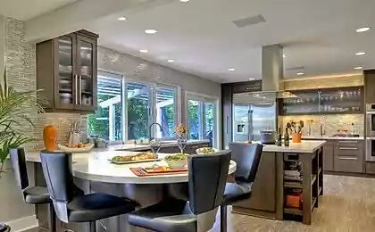
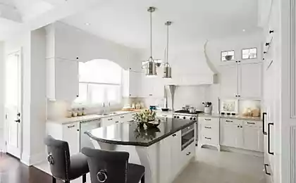
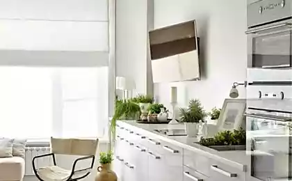
The combination with white color

White color paired with beige is the most versatile combination, which often becomes the basis for inclusion in the interior of bright colors. Sometimes, however, this neutral combination is used as a full range, built on a play of shades and textures.


The combination with black
The contrast of black and beige in the kitchen in any style will look stylish and not corny.

The combination of blue and blue
As you know, the most harmonious color combinations created by nature itself. Recall sandy beaches and azure sea and you will understand why all shades of beige blended with blue and cyan colors. In this pair of blue and blue colors are cool shades of beige, and the interior is perfectly balanced.


A combination of red
Calm beige on the background and impulsive red accents – not the most common but effective complementary contrast combination. The main thing here is to correctly handle the aspect ratio.


The combination with green
Another soothing eye gamma – beige-green. Depending on the shade of green or an additional color patches to create a modern or classic interior.


The combination with yellow
This warm combination would look good in the interior of the kitchen, adding cooling colors, e.g. blue, blue, fresh green.


The combination with the orange
This is also a very warm combination that you need to balance illuminating accents. published


Also interesting: the Red color in the interior: the details of design
Turquoise and chocolate bedroom decor
Source: kitchendecorium.ru/design/color/bezhevyj-cvet-v-interere-kuxni.html