950
The most noticeable change logos 2013
Trends this year: a return to simplicity and clean istokam.Dizaynery overloading detail, get rid of unnecessary extras: striving for simplicity, to be easy to read and remember the sign. In this article, we summarize and present you with a selection of the changes in the logos of famous companies in the world for 2013. By the way, Website is also changed the logo this year.
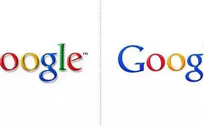
search engine services and Google
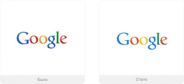
Minor changes, as usual with this company, but expressed in the new logo is the main trends: the logo has become flat, left the shadows and volume.
Design: Own development.
Index Pegman on Google maps
In May 2013 the company introduced a new interface card, and at the same time changed the design of the index, sticking tendencies.
Design: Matt Delbridge.
Data Warehouse Dropbox
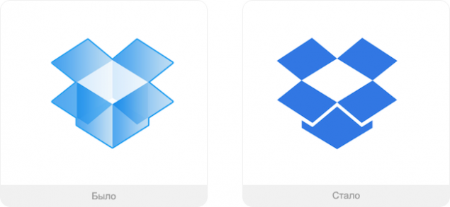
And this is the case when it was worse than it was. Service is positioning itself so even if you spill coffee on a laptop, you will not lose your data (everything is stored on remote servers). Now there is no sense of security: the box was flat and bottomless in the worst sense of the word.
Design: unknown.
Cosmetics Nivea
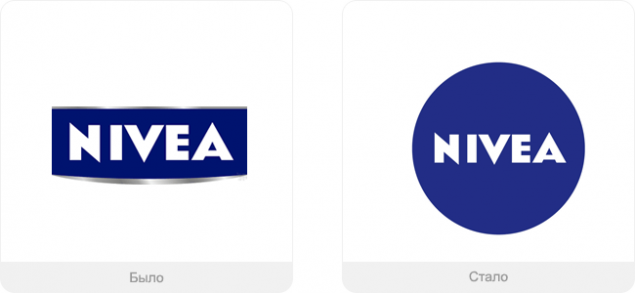
Nivea got rid of the wrinkles of their own: the basis for a new logo took the legendary blue tin jar of cream - is the most famous product of the company.
Design: Fuseproject.
Cigarettes Lucky Strike
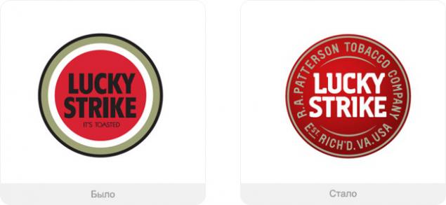
Despite the extremely recognizable design packages legendary cigarette manufacturers have decided to go back to the old logo - it was still in the tin boxes in 1930 - and presented it in an updated form.
Design: G2.
photoappendices Instagram
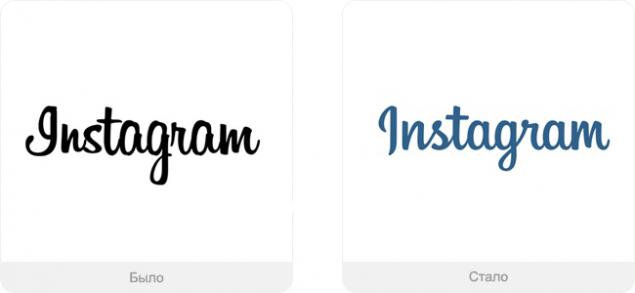
Creators repelled from the previous version, wanted to get rid of everything unnecessary, preserving recognizable detail - a new logo to represent the application as a lifestyle. The main complaints were a capital letter.
Design: Mackey Saturday.
Service definition music Shazam
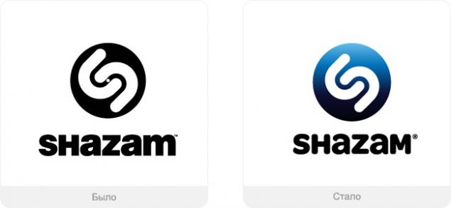
The company wants to position itself as a multi-service, now it is not just music. When creating a new logo inspired by a traveling band download.
Design: The Brand Union.
restaurant chain TGI Fridays
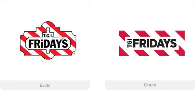
New times, and a network of restaurants should not lag behind. Therefore we removed all the extra characters in the title and simplified form, retaining the main motive.
Design: Harrison.
Tires Continental
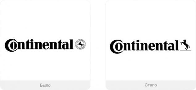
The horse is set free, and he is spoiling for a fight - you can now move forward more quickly.
Design: Peter Schmidt Group.
money transfer system Western Union
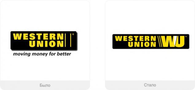
Now monogram WU became recognizable, but too huge.
Design: unknown.
consumer products Procter & Gamble Co.
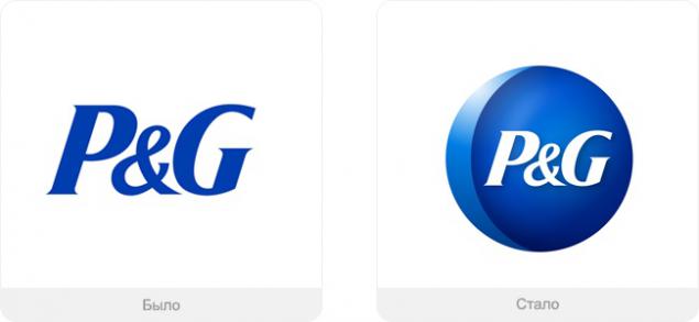
Over time, people have ceased to perceive the letters as a logo of the company - it's just a mark on the bank of almost any shampoo. Therefore, the company decided to change the attitude and regain individuality.
Design: Landor.
search engine services and Yahoo!
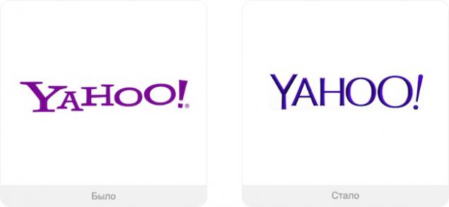
The company set out to change the logo for 30 days, broadcasting course changes on its website. They wanted to preserve the special character of the company and the goodwill of the logo - it seems worse.
Design: own design, Marissa Mayer.
search engine Bing
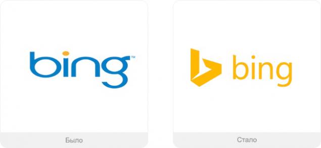
Finder - development of Microsoft, so they would naturally enter the logo in other services of the company, it should not stand out from the main row of icons.
Design: own design.
The telecommunications company Motorola
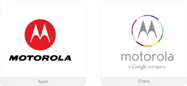
The need for change is obvious: the company is now owned by Google, and it had to somehow display. From the original logo remained except a recognizable character.
Design: own design.
The company Philips
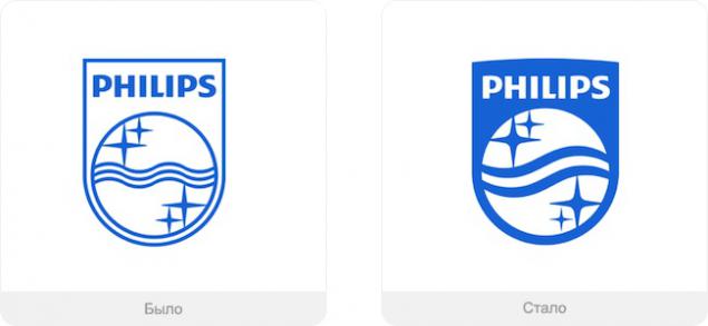
Philips is changing lives for the better, and begins with its coat of arms: the wave intensified, the stars became more and generally filled with color logo.
Design: own design.
magazine Vanity Fair
The previous logo was considered too glamorous, now it has become a little more serious.
Design: Commercial Type
Broadcaster ABC
Again, less volume and shine more haze and tranquility.
Design: Loyalkaspar.
newspaper Wall Street Journal
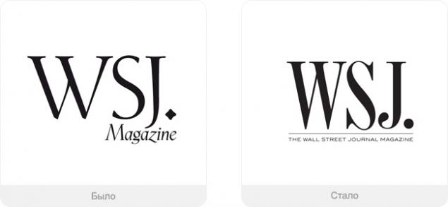
The logo became more subdued and orderly.
Design: own design.
Chips Doritos
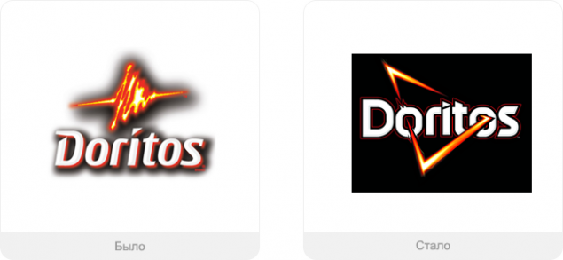
To develop a new logo, the design team has visited many cities around the world - to see how the chips are sold, and to find the best approach to their audience. They explored trends, fashion, games and visual culture of young people in general. The goal: to create a dynamic and friendly way, taking into account the peculiarities of different cultures to easily use the packaging in different countries.
Design: Hornall Anderson.
The Sydney Symphony Orchestra
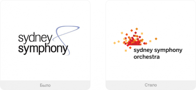
The famous orchestra changed its name, and with it the logo. Dynamic abstraction represents the orchestra and the audience: the logo immediately makes it clear that the company can offer an exciting and exciting concerts.
Design: Sametz Blackstone.
National company Opera Australia
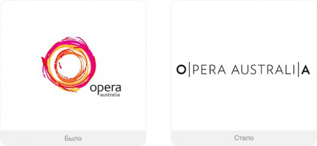
New logo of the company wanted to show its versatility - it's more than the stage show. It's the music, the costumes, emotions, events and much more. Therefore, the logo can be easily transferred to the other company, while maintaining a consistent style - colors become less in favor of mobility. Design: Interbrand Sydney.
Weekly magazine Billboard
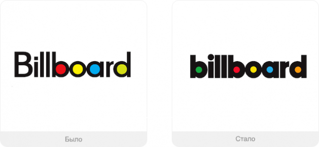
Journal of popular music wanted to be a little more seriously - and yes, such a font looks more solid.
Design: Michael Bierut, Pentagram.
Shop Online JCPenney
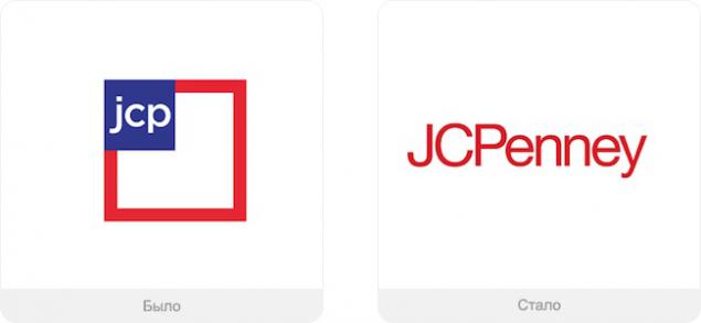
Over the past three years the company for the third time changes the logo - sales are down and loses logo recognition. This time we go back to the old logo (it was until 2011). They want to convince their buyers that it is the same store that they know and love.
Design: Unimark.
The national airline of Serbia
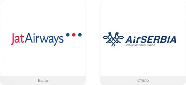
One head is good, but two - better image of the company has changed the name and the logo can now be seen a two-headed eagle.
Design: Tamara Maksimovic.
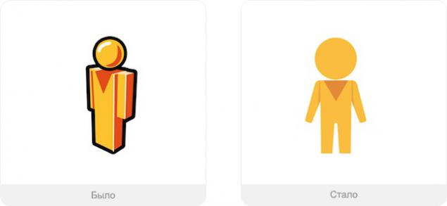
Favorite portal works Website
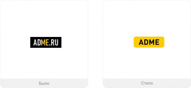
We also blew a wind of change, and we changed the logo on more resilient. Following the trend, we have eliminated all unnecessary. Over the years, we are changing, getting better, as our brand name. And only our love to you, the readers, remains unchanged.
See also:
Trends in design logos 2013
5 ways to spoil logo
Honest logos
via www.adme.ru/logotip/chestnye-logotipy-342405/
search engine services and Google

Minor changes, as usual with this company, but expressed in the new logo is the main trends: the logo has become flat, left the shadows and volume.
Design: Own development.
Index Pegman on Google maps

In May 2013 the company introduced a new interface card, and at the same time changed the design of the index, sticking tendencies.
Design: Matt Delbridge.
Data Warehouse Dropbox

And this is the case when it was worse than it was. Service is positioning itself so even if you spill coffee on a laptop, you will not lose your data (everything is stored on remote servers). Now there is no sense of security: the box was flat and bottomless in the worst sense of the word.
Design: unknown.
Cosmetics Nivea

Nivea got rid of the wrinkles of their own: the basis for a new logo took the legendary blue tin jar of cream - is the most famous product of the company.
Design: Fuseproject.
Cigarettes Lucky Strike

Despite the extremely recognizable design packages legendary cigarette manufacturers have decided to go back to the old logo - it was still in the tin boxes in 1930 - and presented it in an updated form.
Design: G2.
photoappendices Instagram

Creators repelled from the previous version, wanted to get rid of everything unnecessary, preserving recognizable detail - a new logo to represent the application as a lifestyle. The main complaints were a capital letter.
Design: Mackey Saturday.
Service definition music Shazam

The company wants to position itself as a multi-service, now it is not just music. When creating a new logo inspired by a traveling band download.
Design: The Brand Union.
restaurant chain TGI Fridays

New times, and a network of restaurants should not lag behind. Therefore we removed all the extra characters in the title and simplified form, retaining the main motive.
Design: Harrison.
Tires Continental

The horse is set free, and he is spoiling for a fight - you can now move forward more quickly.
Design: Peter Schmidt Group.
money transfer system Western Union

Now monogram WU became recognizable, but too huge.
Design: unknown.
consumer products Procter & Gamble Co.

Over time, people have ceased to perceive the letters as a logo of the company - it's just a mark on the bank of almost any shampoo. Therefore, the company decided to change the attitude and regain individuality.
Design: Landor.
search engine services and Yahoo!

The company set out to change the logo for 30 days, broadcasting course changes on its website. They wanted to preserve the special character of the company and the goodwill of the logo - it seems worse.
Design: own design, Marissa Mayer.
search engine Bing

Finder - development of Microsoft, so they would naturally enter the logo in other services of the company, it should not stand out from the main row of icons.
Design: own design.
The telecommunications company Motorola

The need for change is obvious: the company is now owned by Google, and it had to somehow display. From the original logo remained except a recognizable character.
Design: own design.
The company Philips

Philips is changing lives for the better, and begins with its coat of arms: the wave intensified, the stars became more and generally filled with color logo.
Design: own design.
magazine Vanity Fair

The previous logo was considered too glamorous, now it has become a little more serious.
Design: Commercial Type
Broadcaster ABC

Again, less volume and shine more haze and tranquility.
Design: Loyalkaspar.
newspaper Wall Street Journal

The logo became more subdued and orderly.
Design: own design.
Chips Doritos

To develop a new logo, the design team has visited many cities around the world - to see how the chips are sold, and to find the best approach to their audience. They explored trends, fashion, games and visual culture of young people in general. The goal: to create a dynamic and friendly way, taking into account the peculiarities of different cultures to easily use the packaging in different countries.
Design: Hornall Anderson.
The Sydney Symphony Orchestra

The famous orchestra changed its name, and with it the logo. Dynamic abstraction represents the orchestra and the audience: the logo immediately makes it clear that the company can offer an exciting and exciting concerts.
Design: Sametz Blackstone.
National company Opera Australia

New logo of the company wanted to show its versatility - it's more than the stage show. It's the music, the costumes, emotions, events and much more. Therefore, the logo can be easily transferred to the other company, while maintaining a consistent style - colors become less in favor of mobility. Design: Interbrand Sydney.
Weekly magazine Billboard

Journal of popular music wanted to be a little more seriously - and yes, such a font looks more solid.
Design: Michael Bierut, Pentagram.
Shop Online JCPenney

Over the past three years the company for the third time changes the logo - sales are down and loses logo recognition. This time we go back to the old logo (it was until 2011). They want to convince their buyers that it is the same store that they know and love.
Design: Unimark.
The national airline of Serbia

One head is good, but two - better image of the company has changed the name and the logo can now be seen a two-headed eagle.
Design: Tamara Maksimovic.
Favorite portal works Website

We also blew a wind of change, and we changed the logo on more resilient. Following the trend, we have eliminated all unnecessary. Over the years, we are changing, getting better, as our brand name. And only our love to you, the readers, remains unchanged.
See also:
Trends in design logos 2013
5 ways to spoil logo
Honest logos
via www.adme.ru/logotip/chestnye-logotipy-342405/