1021
The most noticeable change logos 2009
Before the traditional summing up the year, we offer rebranding remember the most noticeable change logos end of 2008 and the first half of 2009. goda.Dazhe unless required repositioning of the brand, all large companies have resorted to different periodicity in the rebranding and change of corporate identity. Some update the visual representation of the brand - a tribute to fashion trends in logotipostroenii, for some - a reason to create a buzz around the brand, and some way expresses its environmental stance.
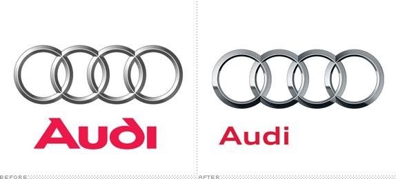
AudiZnamenity logo, consisting of four rings, underwent slight restyling. The new logo has become more voluminous, chrome and more photographic.
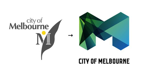
MelburnVlasti Australian city of Melbourne changed the logo, because the thought that Melbourne "vital" to the city appeared "innovative and strong brand." Logo design, reminiscent of a crystal, the agency implemented Landor.
General MotorsPosle of concern General Mototrs was officially declared bankrupt, it began a long process of restructuring the company, including - change the logo of the corporation. It is expected that the new color scheme will reflect the reorientation of GM's release of compact cars that are far less polluting.


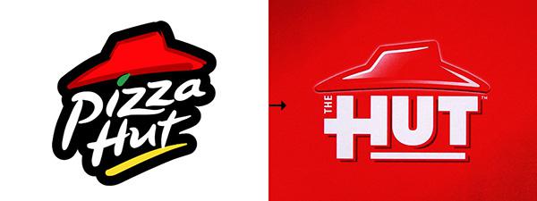
Pizza HutPizza Hut announced the change of the logo. The new logo has appeared so far only on the packaging, uniformed staff and coupons Pizza Hut. Taking into account the recent campaign to rename the Pizza Hut to Pasta Hut, all this looks more like a regular advertising campaign.
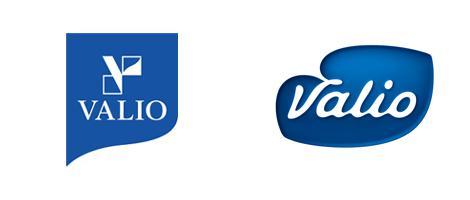
ValioNovy corporate identity Finnish food company is designed to carry a positive attitude, happy and pleasant. White and blue colors designed to display the origin of products and the Finnish manufacturer's connection to agriculture.
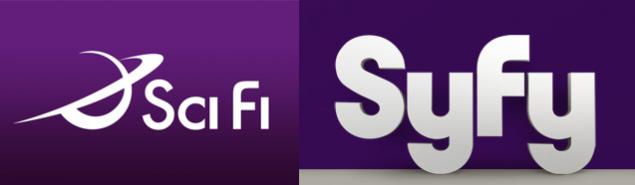
Sci FiOsnovnoy purpose of rebranding was to get away from the strict binding of genre, for which the name of the Sci Fi Channel changed to SyFy. Changes in the shape of the channel Sci Fi touched brendneyma of identity and that, according to the top management of the channel will expand the boundaries of the format.
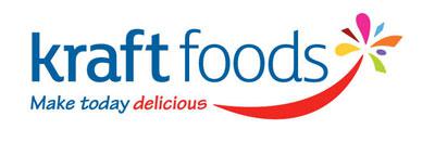
KraftNovy corporate logo of concern for the production of packaged food Kraft Foods have developed in an ad agency Nitro. The products under the brands of Kraft retain their old logo.

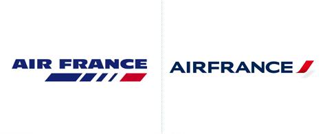
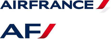
Air FranceRestayling airline Air France, whose logo 25 years left unchanged and is well known to all fans to travel by air, was carried out by Brandimage, reduced it to two letters.
Dubai International Airport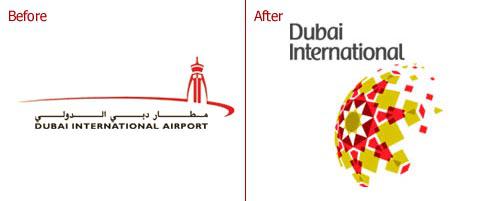
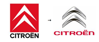
CitroënLogotip Citroen - two arrowheads in the frame, which is considered the founder of the company founder Henri Citroen replaced with a new logo, designed by the marketing department Citroen and agency Landor. Update branded logos timed to the 90th anniversary of the brand.
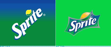
SpriteSprite timed restyled its logo to the NBA All-Star's Slam Dunk, a basketball competition, sponsored by the brand. The logo, depicting not the "gurgling" not a small local explosion gained a bit more dynamics in comparison with the previous version.
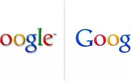
GoogleGoogle updated its site icon - the previous version lasted a full eight and a half years. Changing the icon caused by the need to adapt to new platforms, especially the iPhone and additional mobile devices. The company believes that the new favicon - brilliant in all senses and respects.
Akzo Nobel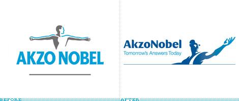
Bank Of New Zealand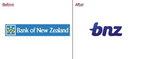
Best Buy
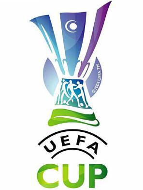
UEFA Cup - UEFA League EvropyKubok replaced Identity. It is now called UEFA Europa. The creators of the new logo is saying that it will help to emphasize the characteristics of the tournament and its unique appeal of sports.

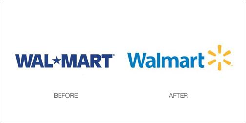
Wal-MartWal-Mart for the first time in 16 years changed its logo. Change Logo - part of a strategy Wal-Mart to update the image.
BreastCancer.org
Radio AllaPri development of a new logo took into account the wishes of the artistic director of "Radio Alla" Alla Pugacheva and used her favorite color. Now it is not a heart of gold, red and pink and black graphics. According to Alla Pugacheva, the new logo is more expresses its inner spiritual life.


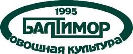
BaltimorBrendingovoe agency TNC.Brands.Ads. It has developed a new logo for the "Baltimore" to bring to production even more consumer attention. The Agency will try to make of aging and nostalgic brand of modern and contemporary while remaining Russian and preserving its national scope and scale.
via # image2426155
AudiZnamenity logo, consisting of four rings, underwent slight restyling. The new logo has become more voluminous, chrome and more photographic.

MelburnVlasti Australian city of Melbourne changed the logo, because the thought that Melbourne "vital" to the city appeared "innovative and strong brand." Logo design, reminiscent of a crystal, the agency implemented Landor.

General MotorsPosle of concern General Mototrs was officially declared bankrupt, it began a long process of restructuring the company, including - change the logo of the corporation. It is expected that the new color scheme will reflect the reorientation of GM's release of compact cars that are far less polluting.


Pizza HutPizza Hut announced the change of the logo. The new logo has appeared so far only on the packaging, uniformed staff and coupons Pizza Hut. Taking into account the recent campaign to rename the Pizza Hut to Pasta Hut, all this looks more like a regular advertising campaign.

ValioNovy corporate identity Finnish food company is designed to carry a positive attitude, happy and pleasant. White and blue colors designed to display the origin of products and the Finnish manufacturer's connection to agriculture.

Sci FiOsnovnoy purpose of rebranding was to get away from the strict binding of genre, for which the name of the Sci Fi Channel changed to SyFy. Changes in the shape of the channel Sci Fi touched brendneyma of identity and that, according to the top management of the channel will expand the boundaries of the format.

KraftNovy corporate logo of concern for the production of packaged food Kraft Foods have developed in an ad agency Nitro. The products under the brands of Kraft retain their old logo.


Air FranceRestayling airline Air France, whose logo 25 years left unchanged and is well known to all fans to travel by air, was carried out by Brandimage, reduced it to two letters.


Dubai International Airport

CitroënLogotip Citroen - two arrowheads in the frame, which is considered the founder of the company founder Henri Citroen replaced with a new logo, designed by the marketing department Citroen and agency Landor. Update branded logos timed to the 90th anniversary of the brand.

SpriteSprite timed restyled its logo to the NBA All-Star's Slam Dunk, a basketball competition, sponsored by the brand. The logo, depicting not the "gurgling" not a small local explosion gained a bit more dynamics in comparison with the previous version.

GoogleGoogle updated its site icon - the previous version lasted a full eight and a half years. Changing the icon caused by the need to adapt to new platforms, especially the iPhone and additional mobile devices. The company believes that the new favicon - brilliant in all senses and respects.
Akzo Nobel

Bank Of New Zealand

Best Buy

UEFA Cup - UEFA League EvropyKubok replaced Identity. It is now called UEFA Europa. The creators of the new logo is saying that it will help to emphasize the characteristics of the tournament and its unique appeal of sports.


Wal-MartWal-Mart for the first time in 16 years changed its logo. Change Logo - part of a strategy Wal-Mart to update the image.

BreastCancer.org

Radio AllaPri development of a new logo took into account the wishes of the artistic director of "Radio Alla" Alla Pugacheva and used her favorite color. Now it is not a heart of gold, red and pink and black graphics. According to Alla Pugacheva, the new logo is more expresses its inner spiritual life.


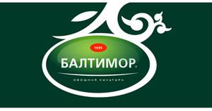
BaltimorBrendingovoe agency TNC.Brands.Ads. It has developed a new logo for the "Baltimore" to bring to production even more consumer attention. The Agency will try to make of aging and nostalgic brand of modern and contemporary while remaining Russian and preserving its national scope and scale.


via # image2426155