705
Trends in design logos 2012
LogoLounge.com portal published a report on global trends in logo design for 2012 god.LogoLounge, the most authoritative portal logos, annual analyzes all sent to the editors of the work and determine trends for the year.
To prepare for the review in 2012 the founder Bill Gardner LogoLounge (Bill Gardner) and colleagues looked at several tens of thousands of logos and choose the ones that determine the main directions of thought in the design of identity in the current year.
Clusters ikonok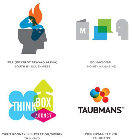
Common icons (such as a pedestrian on a road sign or a triangle with a circle indicating a male or female toilet) are an excellent means of communication, they are at a minimum of graphics convey maximum information at the same time quite clearly and unambiguously. Typically, these icons, signs and symbols have always remained outside logotipostroeniya, because it was thought that the logo is something personal, unique, descriptive and it can not be used of commonly used symbol.
The current trend is changing the attitude in this situation. There is taken a few simple symbols, which are combined into a single composition, often using a transparency overlay. The result is quite a unique composite character, the main value is the information content. This approach allows you to combine several letters in the logo. And the designer, like the words, pictograms, shapes appeal to the consumer.
Transparent tsepochki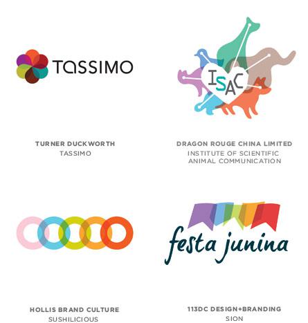
Logo design by combining a plurality of elements - has long been the practice. But the combination of these elements in the "chain" through transparency - a new fashion. It does not matter whether they are grouped in a circle or a line, one concept. Additionally, using the effect of imposing a color that shows transparency and demonstrates the relationship of elements.
Although little new in the use of transparency, the importance of this trend is likely in its critical mass. As a general rule, use a light, bright colors to enhance positive emotions.
Akvarel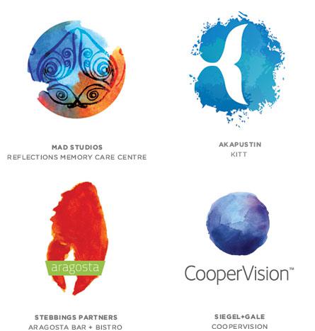
Every year, at least one trend of trying to do everything possible to get away from modern technology and closer to the feeling of natural, human perception. It does not matter whether it is achieved artistic brush from the squirrel or a digital filter. Watercolor trend has taken its rightful place in the trend in 2012.
Chipsy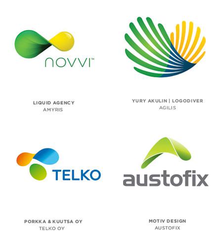
It is well known to form a twisted potato chips, also known in the world of science as a hyperbolic paraboloid. Comparison with the chips we have chosen is no accident, in addition to similar forms, logos in this category differ from one another, as well as chips in a package. In general, most of the forms will appear as a circle or ellipse, but with a slight rotation, creating a three-dimensional object hint.
Bole is also characterized by the widespread use of gradients, since the use of colors would create the effect of a plane figure or a sign infinity. These signs create a certain tension in the viewer, the impression that the sign will break and is now under the influence of physical forces will return to its original flat shape. This technique creates an associative array of flexibility and elasticity, and the simultaneous demonstration of both sides opens up even more opportunities for brand perception.
Anaglify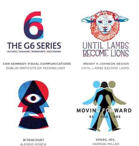
Never have two colors do not carry such a universal set of directions. Shifts red and blue picture - symbolizing the well-known pseudo 3D. This optical technique was invented back in the 1850s in France. If you look at the image through a lens of a particular color, you'll see one or the other image.
Naturally, in order to look at the logo glasses are not needed - and so everything is clear. However, this technique shows the duality of choice. Logo tells the viewer that he can make a choice of one or the other, but not both simultaneously. Also, the concept implies that the responsibility for the selection of delegates to the consumer logo. Since this is a relatively new approach in the design of logos and brand communications, consumers need a little time before he will decrypt the message communication.
Custom rezkost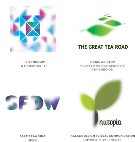
Modern hardware and software allow almost anyone who wants to help his digital camera to get interesting dramatic pictures. Not surprisingly, this technique came to the Identity and logo design. The effect produces quite interesting and beautiful artwork. These trend illustrates how the field of design fueled by ideas from other spheres of life of consumers.
Tkan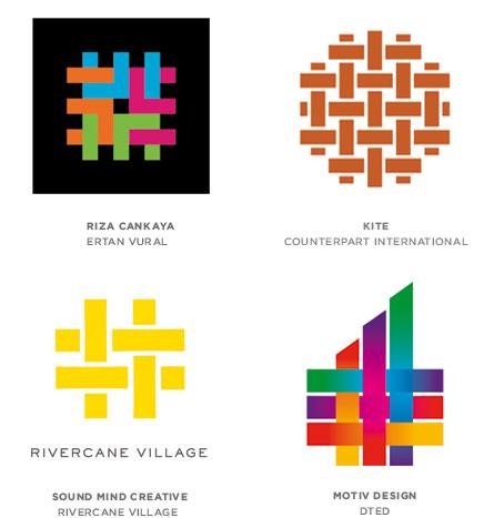
Fashion at the intersecting fiber began last year, but now the trend has got quality. The approach is intended to demonstrate the concept of combining vectors divergent in a single plane, the filaments are combined into a web.
Zavitushki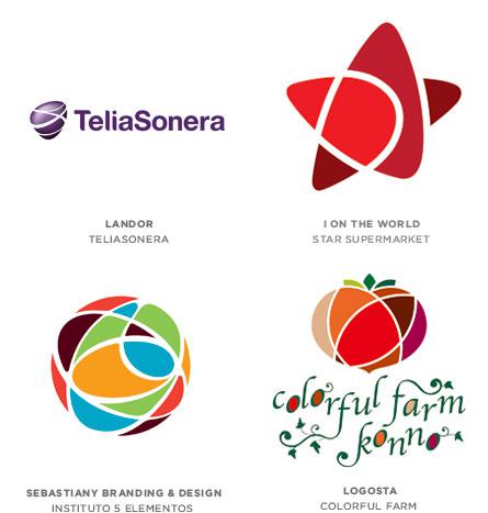
Admission allows you to break the monotonous simple form, the variety of their colors. Typically, graphical solution on the border with the style of the lines drawn by a child. Often creates the impression of three-dimensionality, even without the use of gradients.
Rostki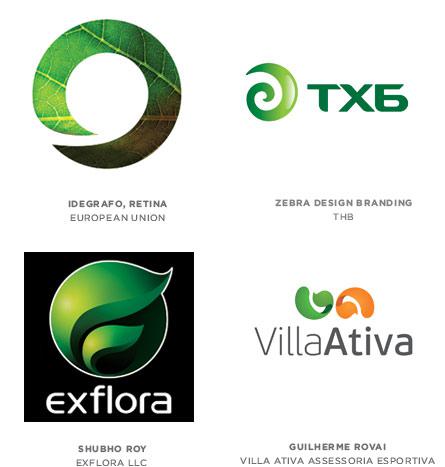
Despite the apparent perepahannost design field, the new ideas still continue to occur. As an example, the inspiration of ideas in the form of the germ, which just came out of the seed. Still do not know what it will be - a flower, a tree or a weed, but the association with a new movement, the origin, development, growth, etc. obviously guessed.
Kozhura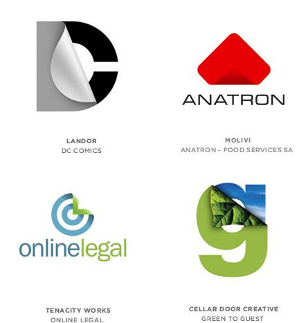
Dual labels have long been used in advertising design. A few years ago, these images are captured actively segment of web design. Now they have come to the logos. This simulation is also an example of elements of the real world. The idea of receiving - the inner part of the show, the back side, a look behind the scenes to reveal the hidden meaning or demonstrate versatility.
Carving in sferah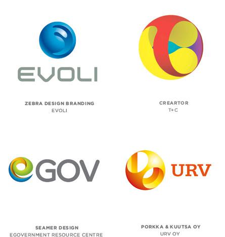
Imagine that you were asked to create a logo, as the material given the wooden balls and beads, as well as tools - a variety of drills and drill. It is difficult to trace the origin of a trend, maybe it resembles a Chinese carving in ivory balls. Areas transmit promise to global and abstract solutions may show in a lot of qualities, including the complexity and difficulty.
Prilozheniya
The place occupied by mobile devices in today's life and decisions in this area can predetermine how Visual Identity will develop in the coming years. We are entering an era when the boundaries between the logos, icons, buttons or icons of applications are becoming increasingly blurred. All of these graphical elements were previously related, but their unions are creating new models in the design of logos. If the application needs a logo that will be placed on the application buttons, why not just make a logo in the form of a button to all media, he looked monotonous.
Mozaiki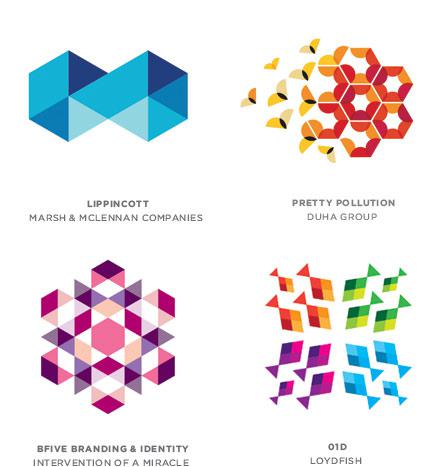
Those who closely followed the annual report on trends in the design of logos, one will notice that this style is not new, and in particular, is very similar to the trend of pixel 2011. The mosaics of several geometric shapes assembled into a picture of repetitive patterns. Most elements have a common color scheme, creating aliasing and transparency. Logos range from very simple to very complex, created only a few elements. Apart from its beauty, such logos convey the concept of power in the amount of stress the versatility, accuracy, painstaking accuracy.
Swirling dugi
Geometric trends were previously much easier - as a rule, rectangles, circles, triangles, and combinations thereof. And the graphic symbol was not more than a dozen peaks. This trend has also received its continuation, and we see something similar to "chipsovy" trend. At this time rectangles bent 90 degrees and twisted simultaneously. As a result we see new complex shapes in logos. Elements-arc combined and arranged in intricate compositions, symbolizing the dynamics and the cyclical movement.
Fraternal serii
This trend has been noticed in the last year (remember the logo of Melbourne), but now has become particularly popular. The essence of this trend that is not created by a single logo and a series of combined graphical form. In addition, each element has its own stylistic design.
See also: - the trend in the design of logos 2011
- The most noticeable change logos 2011
Translation: designers.dp.ua
via www.designers.dp.ua/
To prepare for the review in 2012 the founder Bill Gardner LogoLounge (Bill Gardner) and colleagues looked at several tens of thousands of logos and choose the ones that determine the main directions of thought in the design of identity in the current year.
Clusters ikonok

Common icons (such as a pedestrian on a road sign or a triangle with a circle indicating a male or female toilet) are an excellent means of communication, they are at a minimum of graphics convey maximum information at the same time quite clearly and unambiguously. Typically, these icons, signs and symbols have always remained outside logotipostroeniya, because it was thought that the logo is something personal, unique, descriptive and it can not be used of commonly used symbol.
The current trend is changing the attitude in this situation. There is taken a few simple symbols, which are combined into a single composition, often using a transparency overlay. The result is quite a unique composite character, the main value is the information content. This approach allows you to combine several letters in the logo. And the designer, like the words, pictograms, shapes appeal to the consumer.
Transparent tsepochki

Logo design by combining a plurality of elements - has long been the practice. But the combination of these elements in the "chain" through transparency - a new fashion. It does not matter whether they are grouped in a circle or a line, one concept. Additionally, using the effect of imposing a color that shows transparency and demonstrates the relationship of elements.
Although little new in the use of transparency, the importance of this trend is likely in its critical mass. As a general rule, use a light, bright colors to enhance positive emotions.
Akvarel

Every year, at least one trend of trying to do everything possible to get away from modern technology and closer to the feeling of natural, human perception. It does not matter whether it is achieved artistic brush from the squirrel or a digital filter. Watercolor trend has taken its rightful place in the trend in 2012.
Chipsy

It is well known to form a twisted potato chips, also known in the world of science as a hyperbolic paraboloid. Comparison with the chips we have chosen is no accident, in addition to similar forms, logos in this category differ from one another, as well as chips in a package. In general, most of the forms will appear as a circle or ellipse, but with a slight rotation, creating a three-dimensional object hint.
Bole is also characterized by the widespread use of gradients, since the use of colors would create the effect of a plane figure or a sign infinity. These signs create a certain tension in the viewer, the impression that the sign will break and is now under the influence of physical forces will return to its original flat shape. This technique creates an associative array of flexibility and elasticity, and the simultaneous demonstration of both sides opens up even more opportunities for brand perception.
Anaglify

Never have two colors do not carry such a universal set of directions. Shifts red and blue picture - symbolizing the well-known pseudo 3D. This optical technique was invented back in the 1850s in France. If you look at the image through a lens of a particular color, you'll see one or the other image.
Naturally, in order to look at the logo glasses are not needed - and so everything is clear. However, this technique shows the duality of choice. Logo tells the viewer that he can make a choice of one or the other, but not both simultaneously. Also, the concept implies that the responsibility for the selection of delegates to the consumer logo. Since this is a relatively new approach in the design of logos and brand communications, consumers need a little time before he will decrypt the message communication.
Custom rezkost

Modern hardware and software allow almost anyone who wants to help his digital camera to get interesting dramatic pictures. Not surprisingly, this technique came to the Identity and logo design. The effect produces quite interesting and beautiful artwork. These trend illustrates how the field of design fueled by ideas from other spheres of life of consumers.
Tkan

Fashion at the intersecting fiber began last year, but now the trend has got quality. The approach is intended to demonstrate the concept of combining vectors divergent in a single plane, the filaments are combined into a web.
Zavitushki

Admission allows you to break the monotonous simple form, the variety of their colors. Typically, graphical solution on the border with the style of the lines drawn by a child. Often creates the impression of three-dimensionality, even without the use of gradients.
Rostki

Despite the apparent perepahannost design field, the new ideas still continue to occur. As an example, the inspiration of ideas in the form of the germ, which just came out of the seed. Still do not know what it will be - a flower, a tree or a weed, but the association with a new movement, the origin, development, growth, etc. obviously guessed.
Kozhura

Dual labels have long been used in advertising design. A few years ago, these images are captured actively segment of web design. Now they have come to the logos. This simulation is also an example of elements of the real world. The idea of receiving - the inner part of the show, the back side, a look behind the scenes to reveal the hidden meaning or demonstrate versatility.
Carving in sferah

Imagine that you were asked to create a logo, as the material given the wooden balls and beads, as well as tools - a variety of drills and drill. It is difficult to trace the origin of a trend, maybe it resembles a Chinese carving in ivory balls. Areas transmit promise to global and abstract solutions may show in a lot of qualities, including the complexity and difficulty.
Prilozheniya

The place occupied by mobile devices in today's life and decisions in this area can predetermine how Visual Identity will develop in the coming years. We are entering an era when the boundaries between the logos, icons, buttons or icons of applications are becoming increasingly blurred. All of these graphical elements were previously related, but their unions are creating new models in the design of logos. If the application needs a logo that will be placed on the application buttons, why not just make a logo in the form of a button to all media, he looked monotonous.
Mozaiki

Those who closely followed the annual report on trends in the design of logos, one will notice that this style is not new, and in particular, is very similar to the trend of pixel 2011. The mosaics of several geometric shapes assembled into a picture of repetitive patterns. Most elements have a common color scheme, creating aliasing and transparency. Logos range from very simple to very complex, created only a few elements. Apart from its beauty, such logos convey the concept of power in the amount of stress the versatility, accuracy, painstaking accuracy.
Swirling dugi

Geometric trends were previously much easier - as a rule, rectangles, circles, triangles, and combinations thereof. And the graphic symbol was not more than a dozen peaks. This trend has also received its continuation, and we see something similar to "chipsovy" trend. At this time rectangles bent 90 degrees and twisted simultaneously. As a result we see new complex shapes in logos. Elements-arc combined and arranged in intricate compositions, symbolizing the dynamics and the cyclical movement.
Fraternal serii

This trend has been noticed in the last year (remember the logo of Melbourne), but now has become particularly popular. The essence of this trend that is not created by a single logo and a series of combined graphical form. In addition, each element has its own stylistic design.
See also: - the trend in the design of logos 2011
- The most noticeable change logos 2011
Translation: designers.dp.ua
via www.designers.dp.ua/