902
Rating the worst and the best logo of the year
American online magazine about branding and corporate identity Brand New has published a ranking of the best and worst changes logos of the outgoing year, providing it with witty comments of the author of the project Armin Vit. «2009 was for Brand New good year, giving a never-ending source of new or improved logos from all world. We all had fun, criticizing them all "in tatters." But in the end it all comes down to the definition of the best and the worst. We have reviewed our entire archive and selected 12 logos in each category. »

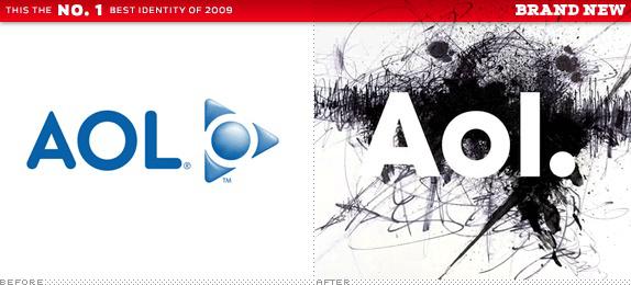
AOL Designed by: Wolff Olins
Hold your rotten tomatoes. I agree, AOL both technically and aesthetically is not the best logo of the year. But none of the logo will not have much impact on the evolution of the brand than this. Branding most companies trying to comply with its audience, branding AOL aims to attract a new audience. The name, perhaps, gives 90s, but is fully consistent with Identity 21st century. Wolff Olins may be the subject of jokes many designers, but whether you like it or not, it will be the last laugh.
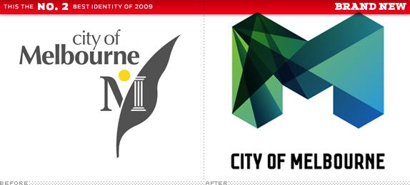
City of Melbourne Designed by: Landor (Sydney)
Immediately after the announcement of the new logo of Melbourne was praiseworthy. And when we have the opportunity to compare it with other "M", it turned out to be even steeper. In terms of visual performance and personality, it was one of the strongest, the logos.
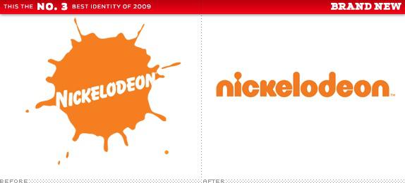
Nickelodeon Designed by: Eric Zim (wordmark)
Total reconstruction of not only the TV channel Nickelodeon, which we all grew up, but also the entire company, which has grown in countless television channels in 175 countries, kinoprodakshen, as well as hundreds of branded toys and games. It is no longer a nostalgic splash, but your opinion - it is not what they need, so you better accept that. As Syfy (perhaps it is even a stylistic trend), logo Nickelodeon - is a simple word mark, which will promote the company a quarter of a millennium.
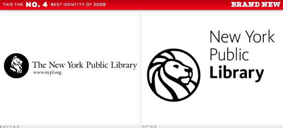
New York Public Library Designed by: NYPL In-house Staff
A careful study of the visual possibilities of using a lion's head led to the creation of a strong new logo of a favorite of the New York institutions. Great works in all dimensions than could boast of the old logo.

Pfizer Designed by: Siegel + Gale
The logo has undergone minor changes, but they have helped to soften the image of the largest player in the pharmaceutical market.
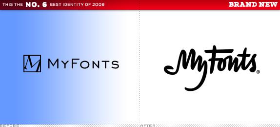
MyFonts Designed by: UnderWare
Their previous logo no sets the bar high, while the new does this, and not only for ourselves, but for the entire printing industry. Some people do not like that word «My» in the logo resembles a hand ... Well, you can talk to her, because the person does not listen.
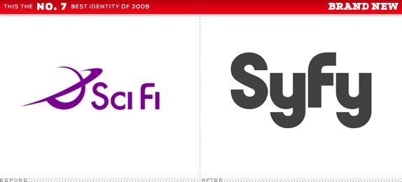
Syfy Designed by: Proud Creative
The name change made everyone jittery and, unfortunately, overshadowed a great re-design.
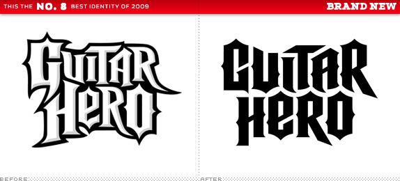
Guitar Hero Designed by: Pentagram
Despite the fact that some "mourned" the loss of rough, not refined character of the original logo, the new Identity is more suitable multi-billion dollar company it represents. Big Island, the island is less - it is still a rock.
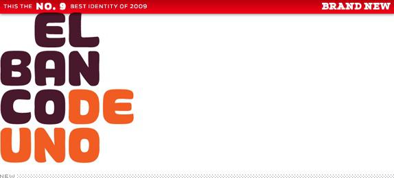
El Banco Deuno Designed by: Saffron
I was one of the few defenders of the logo, sometimes doubting the correctness. But returning to it in my archive, after almost a year, I am convinced that the Mexican bank's logo stands out from most.
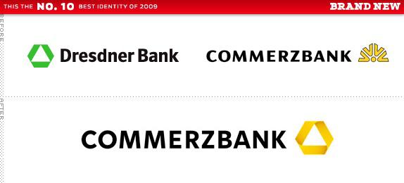
Commerzbank Designed by: Meta Design
The fact that the angle of the letters "K" coincides with the angle icon, is already sufficient reason to classify the logo to the category of "best." Everything in it is so carefully planned and executed, that I could not leave it unnoticed, despite the fact that he had plenty of enemies.
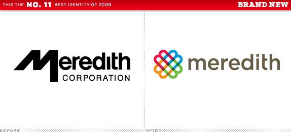
Meredith Corporation Designed by: Lippincott
Lively, colorful and clear modernization of the logo women's publications, deprived of female cliches like pink color simulating handwritten font. Thank Lippincott!
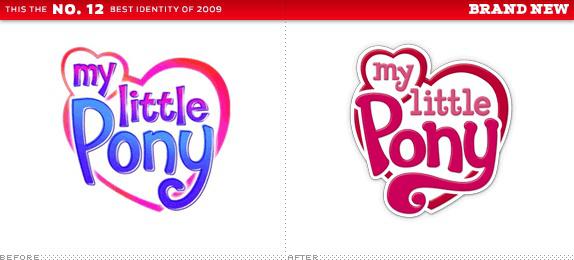
My Little PonyUveren many of you thought I was crazy, including My Little Pony the best in the category. Frankly, there were more technically and stylistically impressive artwork in 2009. Yet the context plays an important role in the design of logos, and given the audience and the market in which the brand (manufacturer of children's toys - approx. Ed.), This is a great example of the re-branding, which could turn into sheer ugliness.

Bing Designed by: Razorfish
When I first published the new logo of the search engine Microsoft, I criticized him for his boldness of the font. Then Bob from Razorfish informed us that "all forms of letters were made from scratch." I would prefer to think that this negligence was made unconsciously, than to know that it was done intentionally.
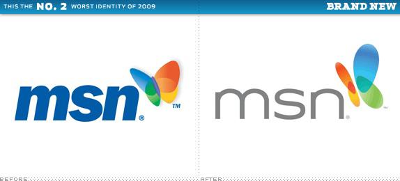
MSNZa butterfly could still deliver a satisfactory evaluation, if I was so generous, and if not ridiculous font, which is suffering "syndrome Bing». He wants to be cool and modern, but suffers from a complete lack of propriety font.
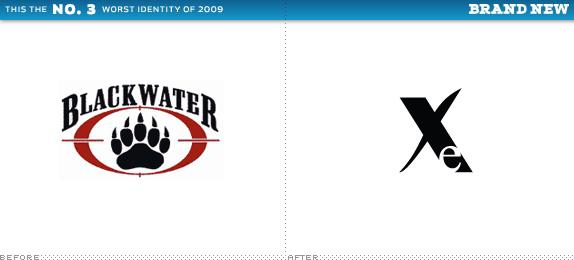
Bad move Xe1 Volume Protection: rename the corporation. Step 2: Change the logo. Step 3: hoped that people will forget the old logo after a couple of years. A relative of the logo, I can not even imagine what's going on.
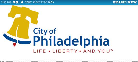
City of Philadelphia Designed by: The Star Group
The only thing I would like to do is to upset the residents of Philadelphia and, judging by the number of comments to the news about the new logo of the city, to brand their web font (Trebuchet) and badly rendered the Liberty Bell.
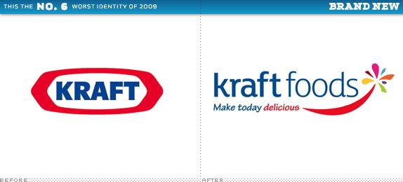
Kraft FoodsV while the well-known logo in the form of Kraft "treadmill" will remain on the packaging manufacturer decided that it is too steep for them and prefer stupid carnival headsets and random shapes.
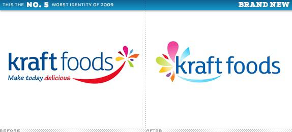
Kraft Foods, Redux
Just five months later, Kraft Foods introduced a new logo. The implication was that an improved version of the previous one. You know the expression: pig a pig, as it does not kras? In this case, it looks as if the pig is not embellishing the face, and he-you-know-what.
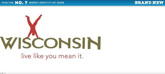
Wisconsin Department of Tourism Designed by: Red Brown Klé
Light color and font selection, and even less choice of form and scale, makes the logo one of the strangest in all of 2009. Live as you like, to do what you want.
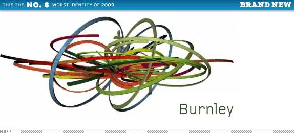
BurnleyNeskolko positive comments about the logo me, honestly surprised. I still believe that this is not the logo, and the pathetic "excuse". My cat spins the thread tangles with the best performance and strategy. It is noteworthy that some customers competed for the privilege of using this logo.
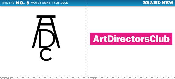
Art Directors Club Designed by: Trollbäck + Company
All are united in the opinion that we have already passed. For organizations working in the creative industry, the logo is neither creative nor, uh, industrial. The image of the logo in action and did not save the situation.
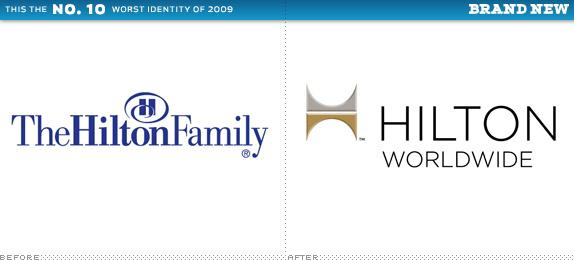
Hilton Worldwide Designed by: Landor
It might be a solid corporate re-design, but spoiled unnecessary slants, and the location, size and alignment of elements quite comparable with each other.
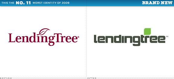
LendingTree Designed by: Mullen
Old logo does not cause much enthusiasm, but he sootvetsvoval audience and provides services at the time, as a new suggestive of Terminator.
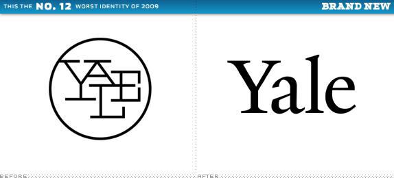
Yale University Press Designed by: Matthew Carter (Yale Typeface)
To be very honest, the new logo technically there is nothing wrong, since it's just a dialer word «Yale» - the result of skilful work of Matthew Carter. But, of course, sad to see disappearing one of the most recognizable logos, Paul Rand.
via # image1996355


AOL Designed by: Wolff Olins
Hold your rotten tomatoes. I agree, AOL both technically and aesthetically is not the best logo of the year. But none of the logo will not have much impact on the evolution of the brand than this. Branding most companies trying to comply with its audience, branding AOL aims to attract a new audience. The name, perhaps, gives 90s, but is fully consistent with Identity 21st century. Wolff Olins may be the subject of jokes many designers, but whether you like it or not, it will be the last laugh.

City of Melbourne Designed by: Landor (Sydney)
Immediately after the announcement of the new logo of Melbourne was praiseworthy. And when we have the opportunity to compare it with other "M", it turned out to be even steeper. In terms of visual performance and personality, it was one of the strongest, the logos.

Nickelodeon Designed by: Eric Zim (wordmark)
Total reconstruction of not only the TV channel Nickelodeon, which we all grew up, but also the entire company, which has grown in countless television channels in 175 countries, kinoprodakshen, as well as hundreds of branded toys and games. It is no longer a nostalgic splash, but your opinion - it is not what they need, so you better accept that. As Syfy (perhaps it is even a stylistic trend), logo Nickelodeon - is a simple word mark, which will promote the company a quarter of a millennium.

New York Public Library Designed by: NYPL In-house Staff
A careful study of the visual possibilities of using a lion's head led to the creation of a strong new logo of a favorite of the New York institutions. Great works in all dimensions than could boast of the old logo.

Pfizer Designed by: Siegel + Gale
The logo has undergone minor changes, but they have helped to soften the image of the largest player in the pharmaceutical market.

MyFonts Designed by: UnderWare
Their previous logo no sets the bar high, while the new does this, and not only for ourselves, but for the entire printing industry. Some people do not like that word «My» in the logo resembles a hand ... Well, you can talk to her, because the person does not listen.

Syfy Designed by: Proud Creative
The name change made everyone jittery and, unfortunately, overshadowed a great re-design.

Guitar Hero Designed by: Pentagram
Despite the fact that some "mourned" the loss of rough, not refined character of the original logo, the new Identity is more suitable multi-billion dollar company it represents. Big Island, the island is less - it is still a rock.

El Banco Deuno Designed by: Saffron
I was one of the few defenders of the logo, sometimes doubting the correctness. But returning to it in my archive, after almost a year, I am convinced that the Mexican bank's logo stands out from most.

Commerzbank Designed by: Meta Design
The fact that the angle of the letters "K" coincides with the angle icon, is already sufficient reason to classify the logo to the category of "best." Everything in it is so carefully planned and executed, that I could not leave it unnoticed, despite the fact that he had plenty of enemies.

Meredith Corporation Designed by: Lippincott
Lively, colorful and clear modernization of the logo women's publications, deprived of female cliches like pink color simulating handwritten font. Thank Lippincott!

My Little PonyUveren many of you thought I was crazy, including My Little Pony the best in the category. Frankly, there were more technically and stylistically impressive artwork in 2009. Yet the context plays an important role in the design of logos, and given the audience and the market in which the brand (manufacturer of children's toys - approx. Ed.), This is a great example of the re-branding, which could turn into sheer ugliness.


Bing Designed by: Razorfish
When I first published the new logo of the search engine Microsoft, I criticized him for his boldness of the font. Then Bob from Razorfish informed us that "all forms of letters were made from scratch." I would prefer to think that this negligence was made unconsciously, than to know that it was done intentionally.

MSNZa butterfly could still deliver a satisfactory evaluation, if I was so generous, and if not ridiculous font, which is suffering "syndrome Bing». He wants to be cool and modern, but suffers from a complete lack of propriety font.

Bad move Xe1 Volume Protection: rename the corporation. Step 2: Change the logo. Step 3: hoped that people will forget the old logo after a couple of years. A relative of the logo, I can not even imagine what's going on.

City of Philadelphia Designed by: The Star Group
The only thing I would like to do is to upset the residents of Philadelphia and, judging by the number of comments to the news about the new logo of the city, to brand their web font (Trebuchet) and badly rendered the Liberty Bell.

Kraft FoodsV while the well-known logo in the form of Kraft "treadmill" will remain on the packaging manufacturer decided that it is too steep for them and prefer stupid carnival headsets and random shapes.

Kraft Foods, Redux
Just five months later, Kraft Foods introduced a new logo. The implication was that an improved version of the previous one. You know the expression: pig a pig, as it does not kras? In this case, it looks as if the pig is not embellishing the face, and he-you-know-what.

Wisconsin Department of Tourism Designed by: Red Brown Klé
Light color and font selection, and even less choice of form and scale, makes the logo one of the strangest in all of 2009. Live as you like, to do what you want.

BurnleyNeskolko positive comments about the logo me, honestly surprised. I still believe that this is not the logo, and the pathetic "excuse". My cat spins the thread tangles with the best performance and strategy. It is noteworthy that some customers competed for the privilege of using this logo.

Art Directors Club Designed by: Trollbäck + Company
All are united in the opinion that we have already passed. For organizations working in the creative industry, the logo is neither creative nor, uh, industrial. The image of the logo in action and did not save the situation.

Hilton Worldwide Designed by: Landor
It might be a solid corporate re-design, but spoiled unnecessary slants, and the location, size and alignment of elements quite comparable with each other.

LendingTree Designed by: Mullen
Old logo does not cause much enthusiasm, but he sootvetsvoval audience and provides services at the time, as a new suggestive of Terminator.

Yale University Press Designed by: Matthew Carter (Yale Typeface)
To be very honest, the new logo technically there is nothing wrong, since it's just a dialer word «Yale» - the result of skilful work of Matthew Carter. But, of course, sad to see disappearing one of the most recognizable logos, Paul Rand.
via # image1996355
