984
History car branding
The roots of the logos of many automakers are drawn from the beginning of the last century and still carry enough symbolism and intrigue maloizmennom vide.Dizaynery sometimes only "modernize" the form of the logo, leaving its essence unchanged. The automotive industry is one of the few who directed both the past and the future. Awe of its history and perhaps honoring the founders of the gods, brands strive towards creating a magnificent production vehicles and concept cars insane. Only the logo stored externally connects with a history of cutting-edge car factory.
So what most automakers, but some brands had to go a long way to select the rebranding of its visual image.
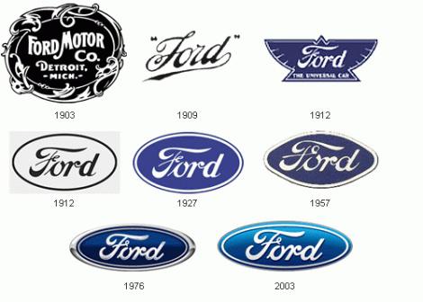
FordNaprimer logo car Ford, despite the fact that the logo of car factories rarely undergo significant changes, was not always so, as we know it.
At the beginning of the history of the famous car logo was black and white, very artsy and fintiflyushechkah. It has developed an assistant engineer at the plant. Logo that still exists today, but as history. It is hardly ever used and still little has changed - removed trinkets.
Blue oval appeared in 1928, in 1976 he became attached to any and all cars coming down from Ford's assembly line, and a more modern look to the blue oval was the 100th anniversary of Ford Motors in 2003.
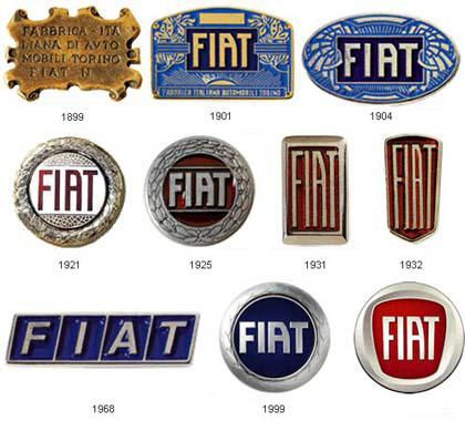
FIATKompaniya was founded in 1899. Fiat - an acronym for Fabbrica Italiana Automobili Torino (Italian Automobile Factory of Turin). In addition, this abbreviation can be translated from Latin as a separate word, is often used in church everyday life - "Let there be." The company logo is extremely simple, all its changes can be attributed to the change of registration. He became the round, the acquired form of panel board, modern logo combines both of these forms. It is interesting that most of its history, the logo was a combination of a metal (white) and blue. It seems like shades of blue - the most common color in the automotive industry, BMW recall, Ford and Volkswagen. They say that the creator of the original font and design was inspired by the neon sign factory, seen at night.
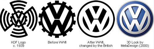
VolkswagenPervy "people's car" was established in Germany on behalf of Hitler in 1938. Logo "Volkswagen" was developed by employees of the company Porsche, Franz Xaver Raymshpissom and selected after an open competition. Letters «W» and «V», combined in a monogram, label products plant in its history. After the plant was in the possession of the British, the logo has been inverted, and later became the background is not black and blue.
Skoda
The logo with the famous "winged arrow" was first used in 1926. Its origin is shrouded in mystery; sometimes the author of the image (schematic drawing of the head of an Indian in traditional headdress with five feathers) is said commercial director of Skoda Plzen T. Maglic.
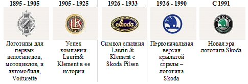
In 2011 ŠKODA logo has changed again:
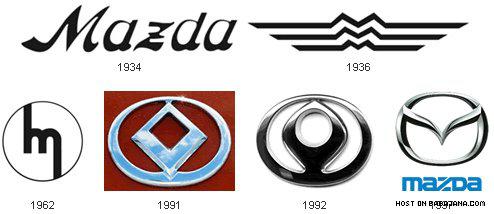
MazdaIstoriya Mazda begins in 1920, when it was called the Tokyo Factory of cork and the cork produced for the needs of the First World War. In 1927 she started to produce cars, and after World War II, the company was named Mazda. In 1936, the logo was designed in the shape of the letter "M" made up of wavy lines, this emblem was drawn up on the basis of the logo of Hiroshima. In 1962, the logo was changed, it was based was still a Latin letter "M", but no longer in the horizontal and vertical composition. In 1991 the emblem was developed, which in a highly modified form now present. In the opinion of creators, this logo is the wings, the sun and the circle of light. Modern logo Mazda called "owl", it stylized "M" looks like a stretched wings - or the head of an owl, but some of this emblem is called "tulip", as similar to the flower bud.
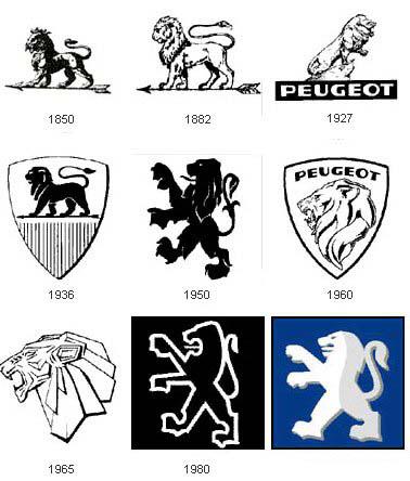
PeugeotNachalo concern Peugeot - 1812. Decades concern manufactures steel products, then bicycles, the first car off the assembly line in 1889. Peugeot logo is derived from a heraldic sign, and was developed for the Peugeot jeweler and engraver Justin Blazer, based on the flag of the province in which the plant was originally located Pezho.V different periods of the lion is portrayed completely, only the head. In 1927, the lion turned to the right, that meant a break with the rules of heraldry, and acquired the features of a living picture of a lion and not geraldicheskgo character - but later returned to the logo from stamp style. In 1950 acquired the lion is clearly aggressive traits - he stood up on his hind legs, jaws opened. In this form, the logo remains still. Interestingly, the color scheme of the Peugeot proved to be stereotyped, it is white, and blue, as in the case of Volkswagen, BMW, Ford, Fiat. It seems that it is really the most popular color combination for car logos.
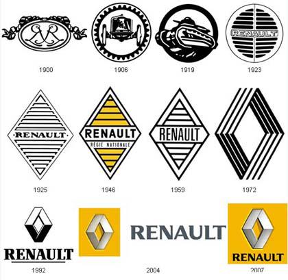
RenaultPervy logo, used on the company's products, composed of the initials of the three brothers Renaud: Louis, Ferdinand and Marcel. During the First World War, Renault produced light tanks for the army of the Allies. In 1925 there was a diamond logo, which was finalized in 1972 and, as such, with minor changes, survived to this day. Separately, it is worth noting the color scheme: yellow is a color of Reno, a rare color for the car brand.
Toyoda - Toyota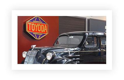
Good luck - and easy to pronounce the name - has played a big role in creating the Toyota brand in 1936. In the book «Toyota: The history of the first 50 years," explains how the company's founder Kiichiro Toyoda (Kiichiro Toyoda) «launched a call for proposals of the new logo Toyoda. Applications turned out more than 20 000. The application was the winner of the letters in katakana design that conveyed a sense of speed ... "Toyoda" has become a "Toyota", because in terms of design that was aesthetically pleasing, and because the number of strokes needed to write, equal eight. A 8 - a lucky number portends increasing prosperity ».
But Toyota's first logo, made in 1936:

Mitsubishi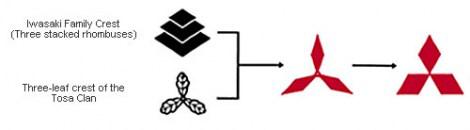
Mitsubishi logo is a fusion of sorts Iwasaki family crest (three diamonds) and Tosa (three oak leaves growing from a single point). Yataro Iwasaki was from the family sold its nobility, and after the Meiji Restoration he got the ship's business Tosa. Two generations later, Kayota Iwasaki repurpose business and created a car company Mitsubishi Motors.
The name Mitsubishi means "three diamonds", or "three diamonds", the word "hishi" (when connecting the first syllable ozvonchaetsya by the rules of Japanese phonetics and "Chi" is transformed into "B") means "chestnut" is used to denote rhomboid shape. Since the creation of logo remained unchanged.
American ingenuity
The origin of the so-called "bow-tie» Chevrolet could be called one of the strangest. Louis Chevrolet (Louis Chevrolet) said that the inspiration for the famous emblem served as a pattern on the wallpaper in his room in a Paris hotel, when he went there in 1908. And this story could all believe if it were not for his wife Chevrolet. Later she told me that her husband once saw a newspaper advertisement in which the logo was used a similar form.
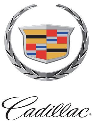
Coat Cadillac - is the emblem of the French military commander and explorer Antoine de la Mothe Cadillac (Antoine de la Mothe Cadillac), who founded the city of Detroit in 1701. Over the years, he simplified and gave him a swift look, but the basic style has remained the same. "It is so special that you will never want to change it," says Anne Marie Webb (Anne Marie Webb), design manager of GM's Global Brand Identity. When you change one of the logos GM, Webb always thinks elements "that make it recognizable and strong." But at the same time, cultural differences must also be taken into account. For Buick emblem of the three panels in the world is represented in monochrome, except for China, where the logo includes a red, blue and gray. "For China's color gives greater premium," explains Webb.
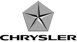
Changing times can also bring big changes to the logo. For more than 80 years, Chrysler has used an impressive amount nameplate. But in 1962, Chairman of the Board of Directors of Chrysler Lynn Townsend (Lynn Townsend) wanted to have the brand was more modern and less fussy logo. According to the archives of Chrysler, Townsend selected the five-pointed star of the 700 proposed options. Many people think that the logo symbolizes the company's five divisions. But it is not. It just looked cool. Now again another Chrysler logo. The brand often changes them.
Lawyers, Latin and Udacha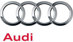
Logos of some car companies owe their existence to the obligations imposed by law, and economies of scale. In 1909, after leaving the company that bears his name, August Horch (August Horch) established a second car company in Zwickau, Germany. But since his name has already been used, Jorge serious problems. But he could not legally give his new company after himself. But after he translated his name into Latin, it became legal. «Horch» means "listen" or «audi» in Latin. Four interconnected rings appeared in 1932, when four Borja for survival automaker merged under the corporate flag of Auto Union. These manufacturers are Audi, DKW, Wanderer and appreciate the irony, Horch.
Volvo
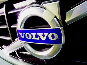
The name Volvo also has Latin roots. It means "I roll" and is taken from the name brand balls, which he wore until the moment when it was attached to the Swedish automaker in 1924.
As the company's logo was selected antique iron symbol is a circle with an arrow located on a diagonal toward the upper right corner.
Symbol of iron is one of the oldest and most well-known image in Western culture. In the Roman Empire, the sign represented the militant and invincible god Mars, who fought only iron weapons.
Use of the iron as the emblem of the car is symbolic: first, VOLVO immediately associated with the achievements of the Swedish steel industry, and secondly, this emblem always perceived as a sign of reliability, high quality and durability.
The diagonal stripe running across the radiator grille, which was originally performed only as a mounting point for the nameplate, but now it is "almost the same identifier of the brand, as well as our symbol," says Daniel Johnston (Daniel Johnston), Product Communications Manager at Volvo Cars North America .
Statues, Stars and intelligent machines
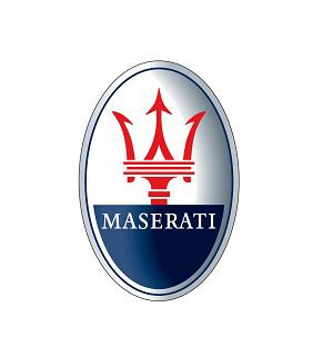
Inspiration to find a name and logo creation can come from a careful and accurate research among consumers, loopholes in the law or, in some cases, out of sight on the environment. Maserati brothers when creating his trident got inspiration from the statue of Neptune, which stood in the central park of Bologna, where the headquarters of the company. Maserati Trident signed under it was painted by the artist Mario, who was also the only one of seven brothers Maserati, which has never been occupied by the design or manufacture of machinery.
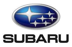
The inspiration for the name of Subaru's literally came down from heaven. Or, to be more precise, the Japanese name of the Centre of the stars in the constellation Taurus, which we call the Pleiades. Six stars visible to the naked eye, and - in accordance with corporate identity - this corresponds to the six companies that merged to form Fuji Heavy Industries, parent company Subaru. Hyundai name has an even simpler explanation. With the Korean word translated as "modern" and the company's logo is a stylized letter "H", which in turn represents the two men. Peoples - businesses and consumers - shake hands.

Name Smart («smart»), it would seem, it speaks for itself, and for English-speaking people do not need any translation. But actually an acronym for Swatch (the famous Swiss watch company, which has been a partner at an early stage), Mercedes (the current curator of the brand) and Art («Art"). Company logo stands for compactness means the letter C («compact»), as well as the avant-garde thinking through the boom.
Pioneers avtomobilestroeniya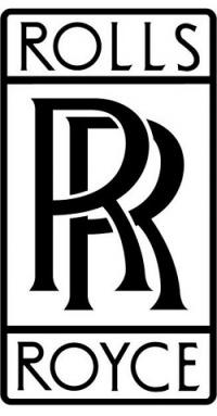
The tragedy played a major role in the popular myth of the famous logo of the letter R dual British luxury brand Rolls Royce. The company's founders, Sir Henry Royce and Charles Stewart Rolls, originally used red letters in the logo, which combines the initials of their surnames. Legend has it that the color changed to black, when Sir Henry Royce died in 1933, to honor his memory. In fact, black letters began as a result of a deliberate decision of both the founders - to give greater prestige and luxury.
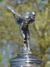
Another iconic emblem of Rolls Royce - «Spirit of Ecstasy" hood ornament figure for a woman who almost does not fly, and her cloak fluttering in the wind. With its appearance it is also related tragedy, but this time it's not a myth. The first "Spirit of Ecstasy" appeared in 1911, it created the Charles Sykes (Charles Sykes), and served as the model for Miss Eleanor Thornton, secretary of Baron Montagu, who was a close friend of Charles Rolls. In 1915, Eleanor died in the voyage to India, and for almost a hundred years, it represents the spirit of delight portrait of a Rolls-Royce.
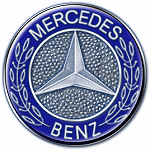
Some car logo originated much earlier than the moment when to start their own era of machines. For example, a three-beam star Mercedes-Benz is widely known as a symbol of the fact that engines manufactured by the company are used on land, in the sky and on the water. But the star first appeared in a letter to the founder of the Mercedes-Benz, Gottlieb Daimler (Gottlieb Daimler), to his wife. This star, he outlined the location of the new home of his family in the German city of Deutz. His sons adapted the character under the logo of the company in 1910.
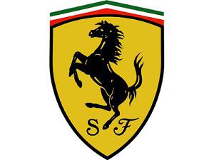
One of the most famous logos of all time - prancing horse Ferrari - first appeared on military aircraft, which is controlled by Francesco Baracca, an aviator and hero of the First World War. In 1923, Enzo Ferrari (Enzo Ferrari), met with the parents of Francesco after the race and they asked him to use the image on his prancing horse racing car - good luck and as a tribute to the memory of Francesco, who died shortly before the end of the war. By the horse was added yellow background (the official color of Enzo Ferrari's hometown, Modena, Italy), as well as to change the direction of the tail, it began to look up.
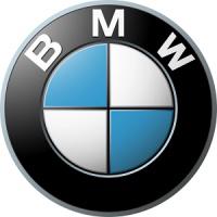
BMW, the myth (and smart marketers) took over several generations, linking the company's logo with the aviation theme. "The German advertising agency in the 1920s created an advertisement that showed a range of BMW in front of the rotating propeller aircraft, and thus reflect the origin of the company as a manufacturer of aircraft engines. And then it turned into a myth, "said Dave Buchko (Dave Buchko), the representative of BMW North America. And despite the fact that BMW actually produces engines for aircraft, white and blue logo is the color of the Bavarian flag, not a propeller and sky.
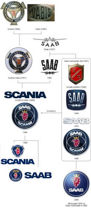
SAABKak and BMW, Saab was originally a manufacturer of aircraft in 1937, the company was called Svenska Aeroplan Aktiebolaget («The Swedish company for the production of airplanes"). After the end of World War II, SAAB started producing cars. The first car, a prototype was developed and tested in an atmosphere of secrecy, the test drive was performed on deaf abandoned stretches of road.
The company's logo is based on the image of a mythical animal, a griffin, a body of a lion and the head and wings of an eagle, and that animal was the logo Vabis-Scania, the truck manufacturer, which merged with the company Saab. Griffin - a heraldic sign of the province Scania.
Plot twists
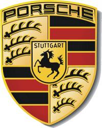
When it comes to the origin of the iconic logo from the same company car can be two versions of the same story. And it hides from us the truth about the Porsche and the logo of the German manufacturer of sports cars. According to the representative of Porsche Cars North America, a very powerful car distributor Max Hoffman (Max Hoffman) met with Ferry Porsche (Ferry Porsche) in the New York restaurant in 1951. During the discussion, Hoffman insisted Porsche that his car needed a powerful logo, something special and very elegant. A rough sketch was made in the same place and at the same time, on a napkin.
But the story told in the Porsche Germany differs from this colorful story.
So what most automakers, but some brands had to go a long way to select the rebranding of its visual image.
FordNaprimer logo car Ford, despite the fact that the logo of car factories rarely undergo significant changes, was not always so, as we know it.
At the beginning of the history of the famous car logo was black and white, very artsy and fintiflyushechkah. It has developed an assistant engineer at the plant. Logo that still exists today, but as history. It is hardly ever used and still little has changed - removed trinkets.
Blue oval appeared in 1928, in 1976 he became attached to any and all cars coming down from Ford's assembly line, and a more modern look to the blue oval was the 100th anniversary of Ford Motors in 2003.

FIATKompaniya was founded in 1899. Fiat - an acronym for Fabbrica Italiana Automobili Torino (Italian Automobile Factory of Turin). In addition, this abbreviation can be translated from Latin as a separate word, is often used in church everyday life - "Let there be." The company logo is extremely simple, all its changes can be attributed to the change of registration. He became the round, the acquired form of panel board, modern logo combines both of these forms. It is interesting that most of its history, the logo was a combination of a metal (white) and blue. It seems like shades of blue - the most common color in the automotive industry, BMW recall, Ford and Volkswagen. They say that the creator of the original font and design was inspired by the neon sign factory, seen at night.

VolkswagenPervy "people's car" was established in Germany on behalf of Hitler in 1938. Logo "Volkswagen" was developed by employees of the company Porsche, Franz Xaver Raymshpissom and selected after an open competition. Letters «W» and «V», combined in a monogram, label products plant in its history. After the plant was in the possession of the British, the logo has been inverted, and later became the background is not black and blue.

Skoda

The logo with the famous "winged arrow" was first used in 1926. Its origin is shrouded in mystery; sometimes the author of the image (schematic drawing of the head of an Indian in traditional headdress with five feathers) is said commercial director of Skoda Plzen T. Maglic.

In 2011 ŠKODA logo has changed again:

MazdaIstoriya Mazda begins in 1920, when it was called the Tokyo Factory of cork and the cork produced for the needs of the First World War. In 1927 she started to produce cars, and after World War II, the company was named Mazda. In 1936, the logo was designed in the shape of the letter "M" made up of wavy lines, this emblem was drawn up on the basis of the logo of Hiroshima. In 1962, the logo was changed, it was based was still a Latin letter "M", but no longer in the horizontal and vertical composition. In 1991 the emblem was developed, which in a highly modified form now present. In the opinion of creators, this logo is the wings, the sun and the circle of light. Modern logo Mazda called "owl", it stylized "M" looks like a stretched wings - or the head of an owl, but some of this emblem is called "tulip", as similar to the flower bud.

PeugeotNachalo concern Peugeot - 1812. Decades concern manufactures steel products, then bicycles, the first car off the assembly line in 1889. Peugeot logo is derived from a heraldic sign, and was developed for the Peugeot jeweler and engraver Justin Blazer, based on the flag of the province in which the plant was originally located Pezho.V different periods of the lion is portrayed completely, only the head. In 1927, the lion turned to the right, that meant a break with the rules of heraldry, and acquired the features of a living picture of a lion and not geraldicheskgo character - but later returned to the logo from stamp style. In 1950 acquired the lion is clearly aggressive traits - he stood up on his hind legs, jaws opened. In this form, the logo remains still. Interestingly, the color scheme of the Peugeot proved to be stereotyped, it is white, and blue, as in the case of Volkswagen, BMW, Ford, Fiat. It seems that it is really the most popular color combination for car logos.

RenaultPervy logo, used on the company's products, composed of the initials of the three brothers Renaud: Louis, Ferdinand and Marcel. During the First World War, Renault produced light tanks for the army of the Allies. In 1925 there was a diamond logo, which was finalized in 1972 and, as such, with minor changes, survived to this day. Separately, it is worth noting the color scheme: yellow is a color of Reno, a rare color for the car brand.

Toyoda - Toyota

Good luck - and easy to pronounce the name - has played a big role in creating the Toyota brand in 1936. In the book «Toyota: The history of the first 50 years," explains how the company's founder Kiichiro Toyoda (Kiichiro Toyoda) «launched a call for proposals of the new logo Toyoda. Applications turned out more than 20 000. The application was the winner of the letters in katakana design that conveyed a sense of speed ... "Toyoda" has become a "Toyota", because in terms of design that was aesthetically pleasing, and because the number of strokes needed to write, equal eight. A 8 - a lucky number portends increasing prosperity ».
But Toyota's first logo, made in 1936:

Mitsubishi

Mitsubishi logo is a fusion of sorts Iwasaki family crest (three diamonds) and Tosa (three oak leaves growing from a single point). Yataro Iwasaki was from the family sold its nobility, and after the Meiji Restoration he got the ship's business Tosa. Two generations later, Kayota Iwasaki repurpose business and created a car company Mitsubishi Motors.
The name Mitsubishi means "three diamonds", or "three diamonds", the word "hishi" (when connecting the first syllable ozvonchaetsya by the rules of Japanese phonetics and "Chi" is transformed into "B") means "chestnut" is used to denote rhomboid shape. Since the creation of logo remained unchanged.
American ingenuity

The origin of the so-called "bow-tie» Chevrolet could be called one of the strangest. Louis Chevrolet (Louis Chevrolet) said that the inspiration for the famous emblem served as a pattern on the wallpaper in his room in a Paris hotel, when he went there in 1908. And this story could all believe if it were not for his wife Chevrolet. Later she told me that her husband once saw a newspaper advertisement in which the logo was used a similar form.

Coat Cadillac - is the emblem of the French military commander and explorer Antoine de la Mothe Cadillac (Antoine de la Mothe Cadillac), who founded the city of Detroit in 1701. Over the years, he simplified and gave him a swift look, but the basic style has remained the same. "It is so special that you will never want to change it," says Anne Marie Webb (Anne Marie Webb), design manager of GM's Global Brand Identity. When you change one of the logos GM, Webb always thinks elements "that make it recognizable and strong." But at the same time, cultural differences must also be taken into account. For Buick emblem of the three panels in the world is represented in monochrome, except for China, where the logo includes a red, blue and gray. "For China's color gives greater premium," explains Webb.

Changing times can also bring big changes to the logo. For more than 80 years, Chrysler has used an impressive amount nameplate. But in 1962, Chairman of the Board of Directors of Chrysler Lynn Townsend (Lynn Townsend) wanted to have the brand was more modern and less fussy logo. According to the archives of Chrysler, Townsend selected the five-pointed star of the 700 proposed options. Many people think that the logo symbolizes the company's five divisions. But it is not. It just looked cool. Now again another Chrysler logo. The brand often changes them.
Lawyers, Latin and Udacha

Logos of some car companies owe their existence to the obligations imposed by law, and economies of scale. In 1909, after leaving the company that bears his name, August Horch (August Horch) established a second car company in Zwickau, Germany. But since his name has already been used, Jorge serious problems. But he could not legally give his new company after himself. But after he translated his name into Latin, it became legal. «Horch» means "listen" or «audi» in Latin. Four interconnected rings appeared in 1932, when four Borja for survival automaker merged under the corporate flag of Auto Union. These manufacturers are Audi, DKW, Wanderer and appreciate the irony, Horch.
Volvo

The name Volvo also has Latin roots. It means "I roll" and is taken from the name brand balls, which he wore until the moment when it was attached to the Swedish automaker in 1924.
As the company's logo was selected antique iron symbol is a circle with an arrow located on a diagonal toward the upper right corner.
Symbol of iron is one of the oldest and most well-known image in Western culture. In the Roman Empire, the sign represented the militant and invincible god Mars, who fought only iron weapons.
Use of the iron as the emblem of the car is symbolic: first, VOLVO immediately associated with the achievements of the Swedish steel industry, and secondly, this emblem always perceived as a sign of reliability, high quality and durability.
The diagonal stripe running across the radiator grille, which was originally performed only as a mounting point for the nameplate, but now it is "almost the same identifier of the brand, as well as our symbol," says Daniel Johnston (Daniel Johnston), Product Communications Manager at Volvo Cars North America .
Statues, Stars and intelligent machines

Inspiration to find a name and logo creation can come from a careful and accurate research among consumers, loopholes in the law or, in some cases, out of sight on the environment. Maserati brothers when creating his trident got inspiration from the statue of Neptune, which stood in the central park of Bologna, where the headquarters of the company. Maserati Trident signed under it was painted by the artist Mario, who was also the only one of seven brothers Maserati, which has never been occupied by the design or manufacture of machinery.

The inspiration for the name of Subaru's literally came down from heaven. Or, to be more precise, the Japanese name of the Centre of the stars in the constellation Taurus, which we call the Pleiades. Six stars visible to the naked eye, and - in accordance with corporate identity - this corresponds to the six companies that merged to form Fuji Heavy Industries, parent company Subaru. Hyundai name has an even simpler explanation. With the Korean word translated as "modern" and the company's logo is a stylized letter "H", which in turn represents the two men. Peoples - businesses and consumers - shake hands.

Name Smart («smart»), it would seem, it speaks for itself, and for English-speaking people do not need any translation. But actually an acronym for Swatch (the famous Swiss watch company, which has been a partner at an early stage), Mercedes (the current curator of the brand) and Art («Art"). Company logo stands for compactness means the letter C («compact»), as well as the avant-garde thinking through the boom.
Pioneers avtomobilestroeniya

The tragedy played a major role in the popular myth of the famous logo of the letter R dual British luxury brand Rolls Royce. The company's founders, Sir Henry Royce and Charles Stewart Rolls, originally used red letters in the logo, which combines the initials of their surnames. Legend has it that the color changed to black, when Sir Henry Royce died in 1933, to honor his memory. In fact, black letters began as a result of a deliberate decision of both the founders - to give greater prestige and luxury.

Another iconic emblem of Rolls Royce - «Spirit of Ecstasy" hood ornament figure for a woman who almost does not fly, and her cloak fluttering in the wind. With its appearance it is also related tragedy, but this time it's not a myth. The first "Spirit of Ecstasy" appeared in 1911, it created the Charles Sykes (Charles Sykes), and served as the model for Miss Eleanor Thornton, secretary of Baron Montagu, who was a close friend of Charles Rolls. In 1915, Eleanor died in the voyage to India, and for almost a hundred years, it represents the spirit of delight portrait of a Rolls-Royce.

Some car logo originated much earlier than the moment when to start their own era of machines. For example, a three-beam star Mercedes-Benz is widely known as a symbol of the fact that engines manufactured by the company are used on land, in the sky and on the water. But the star first appeared in a letter to the founder of the Mercedes-Benz, Gottlieb Daimler (Gottlieb Daimler), to his wife. This star, he outlined the location of the new home of his family in the German city of Deutz. His sons adapted the character under the logo of the company in 1910.

One of the most famous logos of all time - prancing horse Ferrari - first appeared on military aircraft, which is controlled by Francesco Baracca, an aviator and hero of the First World War. In 1923, Enzo Ferrari (Enzo Ferrari), met with the parents of Francesco after the race and they asked him to use the image on his prancing horse racing car - good luck and as a tribute to the memory of Francesco, who died shortly before the end of the war. By the horse was added yellow background (the official color of Enzo Ferrari's hometown, Modena, Italy), as well as to change the direction of the tail, it began to look up.

BMW, the myth (and smart marketers) took over several generations, linking the company's logo with the aviation theme. "The German advertising agency in the 1920s created an advertisement that showed a range of BMW in front of the rotating propeller aircraft, and thus reflect the origin of the company as a manufacturer of aircraft engines. And then it turned into a myth, "said Dave Buchko (Dave Buchko), the representative of BMW North America. And despite the fact that BMW actually produces engines for aircraft, white and blue logo is the color of the Bavarian flag, not a propeller and sky.
SAABKak and BMW, Saab was originally a manufacturer of aircraft in 1937, the company was called Svenska Aeroplan Aktiebolaget («The Swedish company for the production of airplanes"). After the end of World War II, SAAB started producing cars. The first car, a prototype was developed and tested in an atmosphere of secrecy, the test drive was performed on deaf abandoned stretches of road.
The company's logo is based on the image of a mythical animal, a griffin, a body of a lion and the head and wings of an eagle, and that animal was the logo Vabis-Scania, the truck manufacturer, which merged with the company Saab. Griffin - a heraldic sign of the province Scania.

Plot twists

When it comes to the origin of the iconic logo from the same company car can be two versions of the same story. And it hides from us the truth about the Porsche and the logo of the German manufacturer of sports cars. According to the representative of Porsche Cars North America, a very powerful car distributor Max Hoffman (Max Hoffman) met with Ferry Porsche (Ferry Porsche) in the New York restaurant in 1951. During the discussion, Hoffman insisted Porsche that his car needed a powerful logo, something special and very elegant. A rough sketch was made in the same place and at the same time, on a napkin.
But the story told in the Porsche Germany differs from this colorful story.