579
The building is like an optical illusion

Remaining stationary, the facade of the Academy of music, theatre and dance in Dilbeek, designed by Spanish architect Carlos Arroyo, with the participation of the Bureau ELD Partnership, changes depending on the angle of view.
The Academy opened in September 2012, located on the outskirts of the small town of Wolfstan, in the area between the quarter of private houses with traditional pitched roofs and timber area. The nearby building Vestlandske cultural center, designed by architect and artist Hoppenbrouwers Alfons (Alfons Hoppenbrouwers). All this is not secondary information because the architecture of the new object is largely due to his environment.
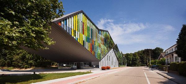
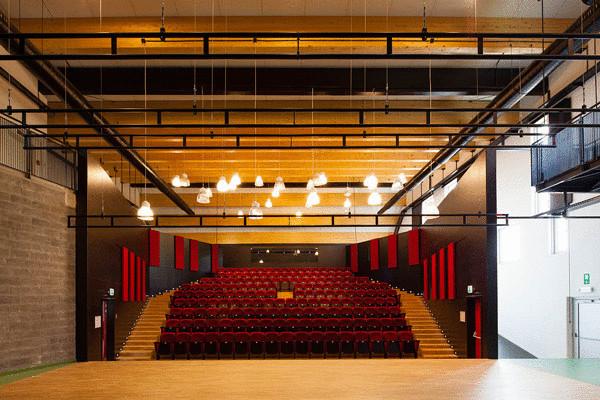
On the plan of the building with a total area of 3554 square meters is a rectangle, divided lengthwise into two parts, the technical corridor. Formally, this division is noticeable, if you pay attention to the top of the building. It splits into strips, with breaks mimicking the pitched roofs of surrounding houses. Two volume combined with the third console, the trailing end of the building. This is a great concert hall covering the height of three of the four floors. The Academy concert hall is General admission, therefore, these volumes are combined with perspective and composition, and layout. The entrance area is protected from rain powerful console.
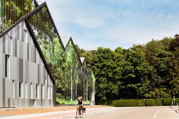
At first glance it may seem that in front of the media or kinetic the main façade, which transformered, submitting computer software. In fact, Carlos Arroyo and his colleagues have managed to achieve that while remaining unchanged, the facade looks different depending on which side you look at it. This is a real optical illusion. If the gaze is directed perpendicular to the plane of the facade, you see a bright color abstraction based on an artist's palette of Hoppenbrouwers.
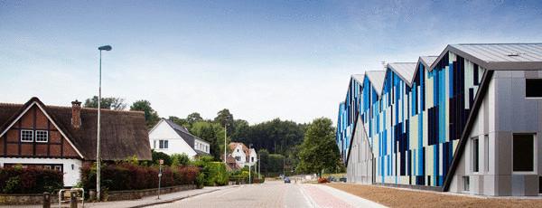
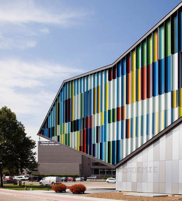
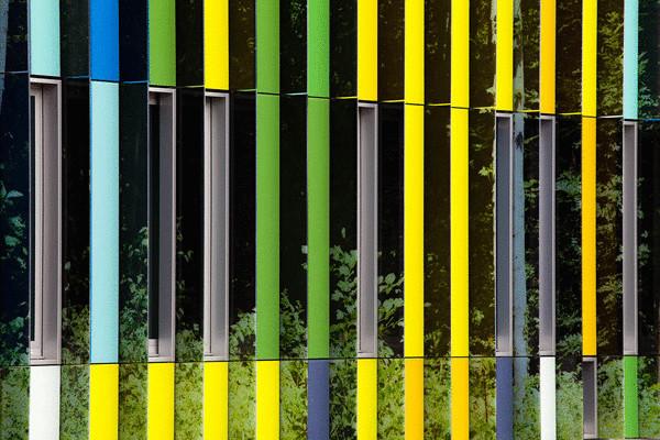
If you go left, you can admire a landscape with trees, bushes and fragments of the sky that seemed to be reflected in the mirrored panel. Moving in the opposite direction, you distinguish another color composition in cool blue, blue and white tones, the so-called mineral abstraction. The opposite facade is covered with metal panels of white, light gray and dark gray colors.
An optical illusion made possible by a sophisticated decoration of the main facade (it is developed with the help of special programs), covered with metal plates of different colors, superimposed flatwise and secured to the rib, that is, horizontal and vertical. The vertical plate is painted differently with the two parties "responsible" for the side views and horizontal, those flat superimposed on the front for the front view.
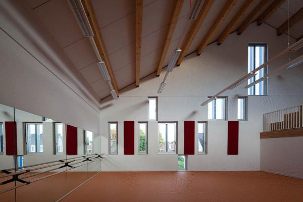
Specific planning (floor, separated by a portal on the unequal parts) allowed architects to design musical, ballet and theatrical classes of different size and configuration. Color scheme almost each premises specific navigation element inside the building. The main finishing material of the concert hall became a tree.
Source: /users/104
