724
The color of the apron for kitchen: how to choose
Undertaking the repairs in the kitchen, a focus on the choice of Wallpaper and the kitchen, considering kitchen apron is not such an important design element. Although the apron gives the kitchen design integrity and completeness.
Let's see how to choose the apron that he looked fine in the updated interior of Your kitchen. Choose the color of the apron under the Wallpaper of the walls or under shades of kitchen units, bright or neutral.
The color of the apron can match the color of the Wallpaper in the following cases:
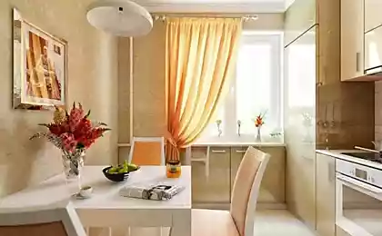
You want to make the kitchen more neutral colors: light beige, sand, light gray, cream;
if set and the wall completely different colors and You need to link them together, the apron to match the Wallpaper would be great to combine them.
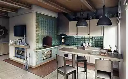
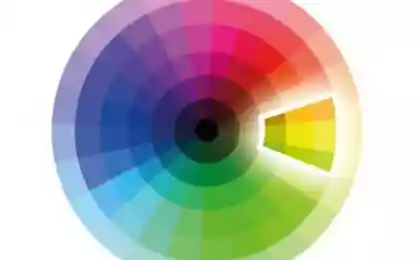
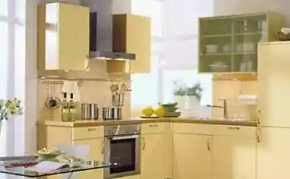
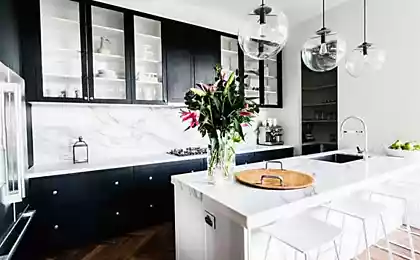
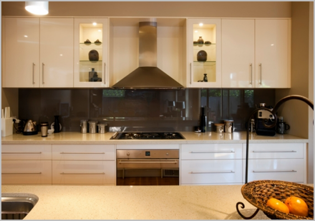
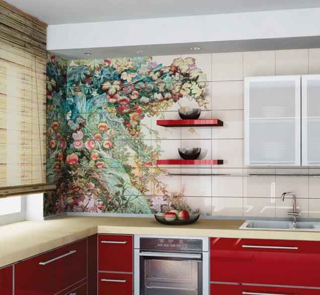
The ideal solution would be to pick up the apron under the kitchen color kitchen. In this case, there are many color options: he could be in the tone of the cabinets, countertops or even contrasting colors.
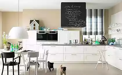
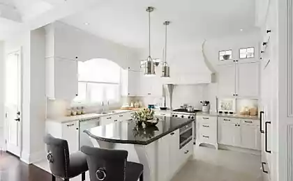
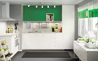
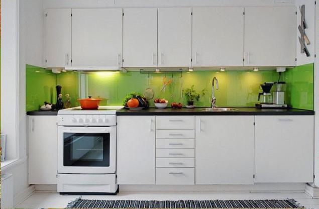
If the main color of the kitchen white to liven up a rather monotonous interior, the apron is better to make a bright contrasting color. For example, it may be turquoise or green, although white goes well with all the bright colors, it all depends on Your preferences. A bright accent color, like an apron in the kitchen, it is important to maintain multiple accessories of the same color (vases, napkins). When choosing accessories should comply with the measure, otherwise you can turn the refined interior in complete bad taste.
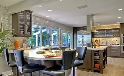
Under color set to choose the color of the apron is a bit more difficult as you must consider the compatibility of colors and the texture of the material of the headset and apron.
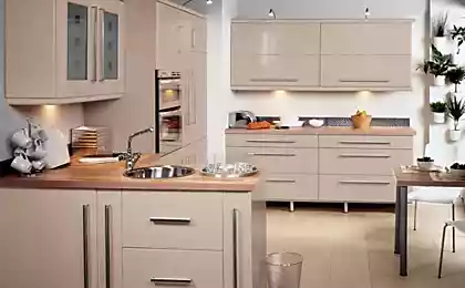
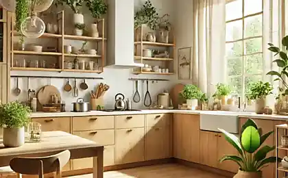
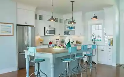
Under Suite in beige colors you can choose the apron of contrasting colors. This will make the kitchen more lively and interesting. If You want a kitchen in pastel colours, you can pick up an apron in the color of the lockers. Looks interesting apron similar in texture, color or pattern of the countertop.
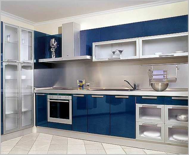
Set, made in blue color, looks good with a gray apron. You can also make an apron beige, light coffee or cream color, which, thanks to the warm tone of cold blue will make the kitchen more welcoming.
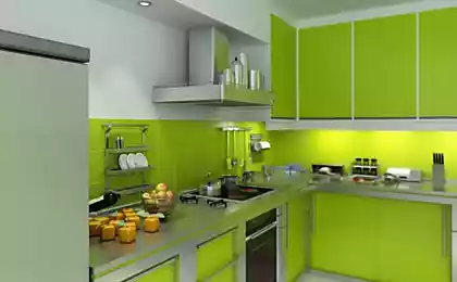
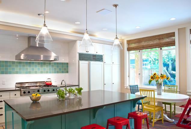
Kitchen green color will perfectly match with the apron in the same color but a different shade — a darker, or lighter. It is also possible to dilute such a rich color pastel colors (cream, beige or sulfur).
If You are sure that you will be able to choose any color apron, then the surest solution is to choose for the apron bright colors discreet, as they are well in tune with different colors.
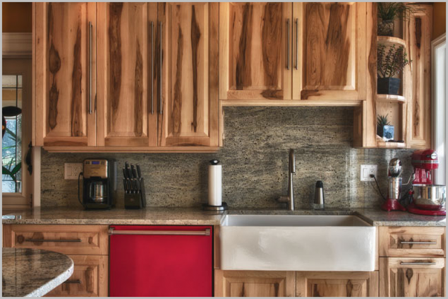
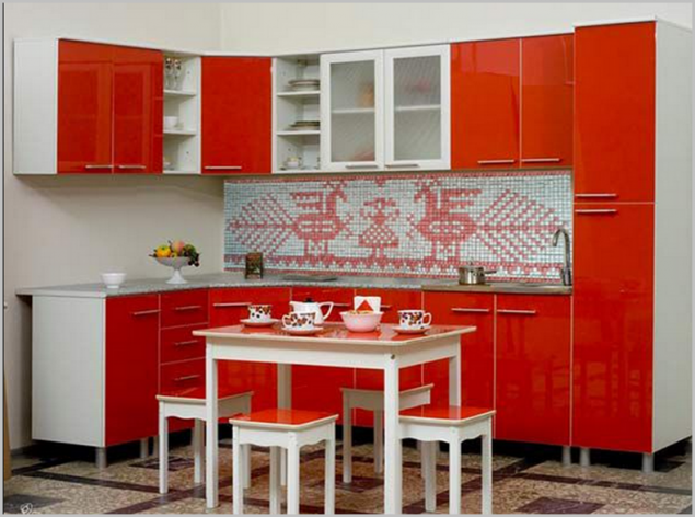
Looks interesting, when the apron is made in light color, and area at the stove or the sink, selected a beautiful ornament. Apron, laid in a pattern of tiles of one color will give the kitchen a personality.
Bright apron may eventually get bored, then it's easy to update, sticking on him funny vinyl sticker, which can be changed periodically.
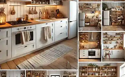
Usually the apron is made of tiles or changing the kitchen units, to replace it will be hard enough and a light apron is also a good fit in new kitchen interior, what is an advantage of it. published
P. S. And remember, only by changing their consumption — together we change the world! ©
Join us in Facebook , Vkontakte, Odnoklassniki
Source: styldoma.ru/interer/tsvet-fartuka-dlya-kuhni
Let's see how to choose the apron that he looked fine in the updated interior of Your kitchen. Choose the color of the apron under the Wallpaper of the walls or under shades of kitchen units, bright or neutral.

The color of the apron can match the color of the Wallpaper in the following cases:
You want to make the kitchen more neutral colors: light beige, sand, light gray, cream;
if set and the wall completely different colors and You need to link them together, the apron to match the Wallpaper would be great to combine them.
The ideal solution would be to pick up the apron under the kitchen color kitchen. In this case, there are many color options: he could be in the tone of the cabinets, countertops or even contrasting colors.

If the main color of the kitchen white to liven up a rather monotonous interior, the apron is better to make a bright contrasting color. For example, it may be turquoise or green, although white goes well with all the bright colors, it all depends on Your preferences. A bright accent color, like an apron in the kitchen, it is important to maintain multiple accessories of the same color (vases, napkins). When choosing accessories should comply with the measure, otherwise you can turn the refined interior in complete bad taste.

Under color set to choose the color of the apron is a bit more difficult as you must consider the compatibility of colors and the texture of the material of the headset and apron.
Under Suite in beige colors you can choose the apron of contrasting colors. This will make the kitchen more lively and interesting. If You want a kitchen in pastel colours, you can pick up an apron in the color of the lockers. Looks interesting apron similar in texture, color or pattern of the countertop.

Set, made in blue color, looks good with a gray apron. You can also make an apron beige, light coffee or cream color, which, thanks to the warm tone of cold blue will make the kitchen more welcoming.
Kitchen green color will perfectly match with the apron in the same color but a different shade — a darker, or lighter. It is also possible to dilute such a rich color pastel colors (cream, beige or sulfur).

If You are sure that you will be able to choose any color apron, then the surest solution is to choose for the apron bright colors discreet, as they are well in tune with different colors.
Looks interesting, when the apron is made in light color, and area at the stove or the sink, selected a beautiful ornament. Apron, laid in a pattern of tiles of one color will give the kitchen a personality.

Bright apron may eventually get bored, then it's easy to update, sticking on him funny vinyl sticker, which can be changed periodically.

Usually the apron is made of tiles or changing the kitchen units, to replace it will be hard enough and a light apron is also a good fit in new kitchen interior, what is an advantage of it. published
P. S. And remember, only by changing their consumption — together we change the world! ©
Join us in Facebook , Vkontakte, Odnoklassniki
Source: styldoma.ru/interer/tsvet-fartuka-dlya-kuhni