692
News Outdoor has replaced face. The new corporate identity and the concept of "Attention to people - people's attention"
The largest operator of outdoor advertising - News Outdoor announced the change of identity. The new corporate identity, according to the company, is a reflection of a new business philosophy. At a press conference held today at the office of News Outdoor, the management companies have announced a new development strategy and presented a new corporate identity.
The essence of the new strategy - attention to the man. Advertisers need contact with consumers, and the city authorities - the loyalty of the residents. And consumers, and a resident of the city - a man. Therefore, the focus of attention of News Outdoor is aimed at a person, and all actions - the fact, to create a comfortable accommodation and information urban environment.
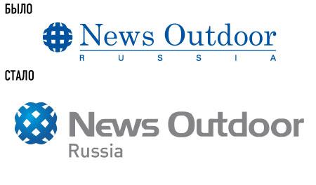
As described in the company's website, corporate identity and a new logo designed by the studio Direct Design. Creative control is exercised by independent marketing partnership NBBK.
Previously, the image corresponded to News Outdoor company operating strictly within the B2B sector - formal, professional, reliable.
Today, when the company is open to dialogue with the society and is aware of its role in the lives of people, in fact, becomes the company B2C.
What is the practical benefit of the residents of the city can bring the company? News Outdoor helps people navigate the world of brands and the city in general.
What is the emotional benefit of the residents can bring the company? If the design can be harmoniously matched to the urban environment, and the design of the posters will be carried out in a professional manner, then people will get positive emotions, as the quality of the visual environment affects a person's mood.
These two aspects are reflected in the new identity.
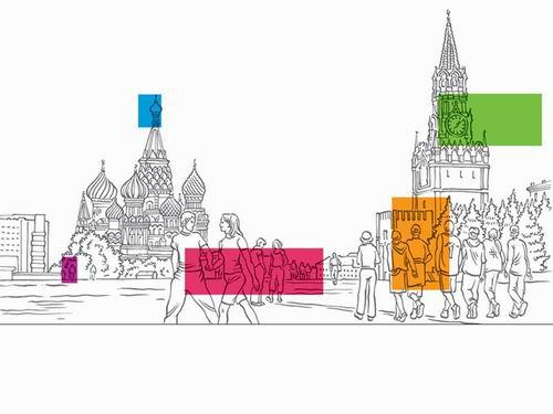
The basis of our corporate identity are the cityscapes with the obligatory presence of people and bright colored spots. Engineering drawings - live hand graph. Proportions spots repeat the proportions of formats.
This approach is consistent with the company's new vision:
- News Outdoor - part of the urban landscape;
- News Outdoor - effective navigation system that helps people navigate both in the cities and in the brands, products, services;
- News Outdoor focuses people's attention on certain messages.

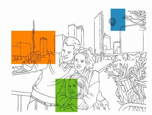
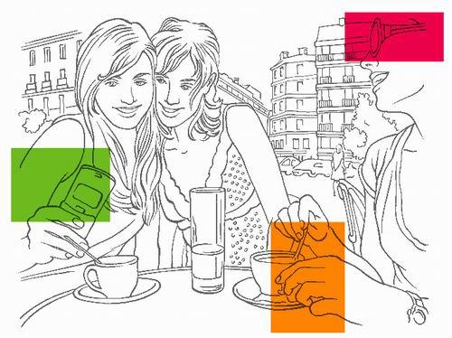
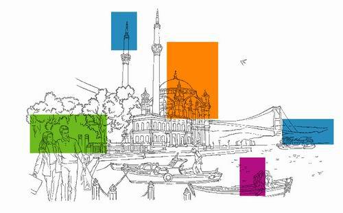
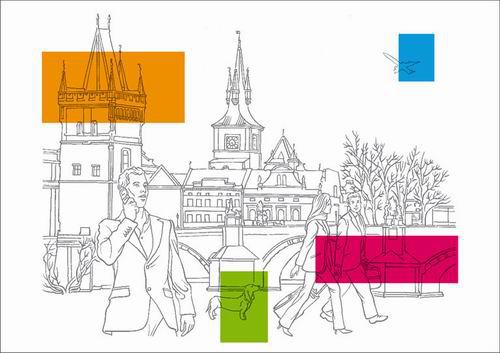
The new style reflects the practical and emotional benefit of residents. Manual schedule gives the feeling of warmth and humanity, and to convey emotions. Multi-colored spots are isolated and emphasize the role that News Outdoor wants to play in the city.
The new corporate style, there are two types of urban landscapes: neutral (universal), which can be used in any region, and the landscape of a particular city.
The new positioning is reflected in the slogan "Attention to people - people's attention." If you think about the people and bring benefit to residents, the answer is a positive attitude. If a person applies to advertising positively and the efficiency of its growing. Thus attracting the attention of people, the company benefits customers. This idea reflects the slogan.
It was also decided to change the company logo. Association of the old logo with the professionalism, strength, classic shift to the new logo on the modernity and friendliness while maintaining the aspect of power.
As a result of the modification "ball" has become more open and friendly with the addition of the effect of 3D. The new lettering is much easier to read and remember. Well you can see the name of the country.
In general, the new logo looks stylish, modern and attractive.
The new corporate identity was approved in News Corp and will be used not only in Russia, but in all 13 countries where there is now News Outdoor Group.
Natalya Semina,
Director of Corporate Communications News Outdoor Russia
Designers and creatives like to say a brief, so creative. Indeed, good creative task - is the cornerstone of success. Not by accident is that the correct creative task - it's almost art.
Deciding to approach the issue seriously and thoroughly, we asked to help us with the brief and creative control of an independent marketing partnership NBBK, with whom we are working more on a number of projects. Behind our colleagues 15 years of working with brands largest transnational corporations Mars, Nestle et al., As well as the most striking recent projects - rebranded "Beeline».
Of course, no less serious, we reacted to the choice of a design studio, which is why appealed to the Direct Design.
The process of developing the corporate identity was not easy. The first five options we have rejected. They were interesting, but not quite conform to the brief. In the second stage it was suggested three visual solutions. We have chosen the story of the landscapes. This is exactly what we needed.
In the process of refining the style we are faced with difficulties in choosing an illustrator. It is necessary that the drawing was made by thin lines, without shadows and zashtrihovok. In this urban landscape is to be traced quite clearly. But the most important - people. We need real people, drawing should convey human emotion. That this was the most difficult to achieve.
CYRIL Obukhov,
independent marketing partnership NBBK
In order to re-brand, you need to understand why the company exists, the role played in the life of society, its customers and partners. Corporate identity should reflect this understanding.
Based on the new positioning of News Outdoor - «Attention to the people," it was composed creative task. We had a certain vision of what should express style, but no one could have imagined how it would be expressed in the chart. This difficult task was entrusted Leonid Feigin - one of the best designers in Russia. As a result, we got a great product of European level.
Leonid Feigin,
creative director of Studio Direct Design
First we need to analyze the existing corporate identity News Outdoor and see whether it is the problems that have arisen in the process of self-awareness of the brand.
As a result, we found that the sign of News Outdoor has some disadvantages: the classic font and many subtle elements. The first thing I had to do - is to find the right font. We have offered a clearer, more modern, industrial, outdoor version. In addition, we tipped the existing symbol by 45 degrees and made it big. As a result, he became a very pleasant, friendly, like a button, key, ball, toy.
But then it began the most interesting - the work on the graphics part. It is the company's view of reality: the city - a beautiful complex organism, and advertising included in it, is a part of city life. To emphasize this outlook, we have drawn a line fine art portraits of cities, and residents living situation.
But where, in fact, News Outdoor? We took a major proportion of formats, making them bright colors and laid the squares on the places in the landscape, which seemed to us accentual. For example, young men go girl, held hands, it is important for them - highlight hands. It turns out that News Outdoor aims to beautify the landscape, highlight it in the most important thing is to be useful and to be visible, that is, to attract attention.
Each employee will be able to see these landscapes something personal, which makes the company more family, more beloved.
The slogan was developed jointly. It reflects the concept of the company's behavior is not only the market, but in life in general: "Attention to people - people's attention." "Warning" - a keyword communications company. News Outdoor - a company that attracts people's attention and spreads.
via # image2256655
The essence of the new strategy - attention to the man. Advertisers need contact with consumers, and the city authorities - the loyalty of the residents. And consumers, and a resident of the city - a man. Therefore, the focus of attention of News Outdoor is aimed at a person, and all actions - the fact, to create a comfortable accommodation and information urban environment.


As described in the company's website, corporate identity and a new logo designed by the studio Direct Design. Creative control is exercised by independent marketing partnership NBBK.
Previously, the image corresponded to News Outdoor company operating strictly within the B2B sector - formal, professional, reliable.
Today, when the company is open to dialogue with the society and is aware of its role in the lives of people, in fact, becomes the company B2C.
What is the practical benefit of the residents of the city can bring the company? News Outdoor helps people navigate the world of brands and the city in general.
What is the emotional benefit of the residents can bring the company? If the design can be harmoniously matched to the urban environment, and the design of the posters will be carried out in a professional manner, then people will get positive emotions, as the quality of the visual environment affects a person's mood.
These two aspects are reflected in the new identity.
The basis of our corporate identity are the cityscapes with the obligatory presence of people and bright colored spots. Engineering drawings - live hand graph. Proportions spots repeat the proportions of formats.
This approach is consistent with the company's new vision:
- News Outdoor - part of the urban landscape;
- News Outdoor - effective navigation system that helps people navigate both in the cities and in the brands, products, services;
- News Outdoor focuses people's attention on certain messages.


The new style reflects the practical and emotional benefit of residents. Manual schedule gives the feeling of warmth and humanity, and to convey emotions. Multi-colored spots are isolated and emphasize the role that News Outdoor wants to play in the city.
The new corporate style, there are two types of urban landscapes: neutral (universal), which can be used in any region, and the landscape of a particular city.
The new positioning is reflected in the slogan "Attention to people - people's attention." If you think about the people and bring benefit to residents, the answer is a positive attitude. If a person applies to advertising positively and the efficiency of its growing. Thus attracting the attention of people, the company benefits customers. This idea reflects the slogan.
It was also decided to change the company logo. Association of the old logo with the professionalism, strength, classic shift to the new logo on the modernity and friendliness while maintaining the aspect of power.
As a result of the modification "ball" has become more open and friendly with the addition of the effect of 3D. The new lettering is much easier to read and remember. Well you can see the name of the country.
In general, the new logo looks stylish, modern and attractive.
The new corporate identity was approved in News Corp and will be used not only in Russia, but in all 13 countries where there is now News Outdoor Group.
Natalya Semina,
Director of Corporate Communications News Outdoor Russia
Designers and creatives like to say a brief, so creative. Indeed, good creative task - is the cornerstone of success. Not by accident is that the correct creative task - it's almost art.
Deciding to approach the issue seriously and thoroughly, we asked to help us with the brief and creative control of an independent marketing partnership NBBK, with whom we are working more on a number of projects. Behind our colleagues 15 years of working with brands largest transnational corporations Mars, Nestle et al., As well as the most striking recent projects - rebranded "Beeline».
Of course, no less serious, we reacted to the choice of a design studio, which is why appealed to the Direct Design.
The process of developing the corporate identity was not easy. The first five options we have rejected. They were interesting, but not quite conform to the brief. In the second stage it was suggested three visual solutions. We have chosen the story of the landscapes. This is exactly what we needed.
In the process of refining the style we are faced with difficulties in choosing an illustrator. It is necessary that the drawing was made by thin lines, without shadows and zashtrihovok. In this urban landscape is to be traced quite clearly. But the most important - people. We need real people, drawing should convey human emotion. That this was the most difficult to achieve.
CYRIL Obukhov,
independent marketing partnership NBBK
In order to re-brand, you need to understand why the company exists, the role played in the life of society, its customers and partners. Corporate identity should reflect this understanding.
Based on the new positioning of News Outdoor - «Attention to the people," it was composed creative task. We had a certain vision of what should express style, but no one could have imagined how it would be expressed in the chart. This difficult task was entrusted Leonid Feigin - one of the best designers in Russia. As a result, we got a great product of European level.
Leonid Feigin,
creative director of Studio Direct Design
First we need to analyze the existing corporate identity News Outdoor and see whether it is the problems that have arisen in the process of self-awareness of the brand.
As a result, we found that the sign of News Outdoor has some disadvantages: the classic font and many subtle elements. The first thing I had to do - is to find the right font. We have offered a clearer, more modern, industrial, outdoor version. In addition, we tipped the existing symbol by 45 degrees and made it big. As a result, he became a very pleasant, friendly, like a button, key, ball, toy.
But then it began the most interesting - the work on the graphics part. It is the company's view of reality: the city - a beautiful complex organism, and advertising included in it, is a part of city life. To emphasize this outlook, we have drawn a line fine art portraits of cities, and residents living situation.
But where, in fact, News Outdoor? We took a major proportion of formats, making them bright colors and laid the squares on the places in the landscape, which seemed to us accentual. For example, young men go girl, held hands, it is important for them - highlight hands. It turns out that News Outdoor aims to beautify the landscape, highlight it in the most important thing is to be useful and to be visible, that is, to attract attention.
Each employee will be able to see these landscapes something personal, which makes the company more family, more beloved.
The slogan was developed jointly. It reflects the concept of the company's behavior is not only the market, but in life in general: "Attention to people - people's attention." "Warning" - a keyword communications company. News Outdoor - a company that attracts people's attention and spreads.
via # image2256655
Andrew Bilzho created a creative advertising campaign for Google in RuNet
The characters of "Star Wars" came to the US airport for advertising theme parks Walt Disney.

