515
OGC reveals new logo, blushing with shame
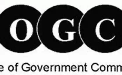
On the creation of a new logo has been spent 14,000 pounds, but apparently no one in the agency have thought to turn it into bok.Kak said the publication Telegraph, the logo of the Ministry of State for Trade (Office of Government Commerce) was supposed to symbolize the commitment to improve the management body of the quality standards of trade .
But contrary to expectations, the logo has caused a burst of laughter and a lot of teasing emails from mandarins in other departments.
According to internal sources, the graphic image has been applied to mouse pads and pens before the presentation of the logo to workers who noticed a blunder in the first few seconds.
The team, of course, got rid of all the gifts in the office, bearing the new logo.
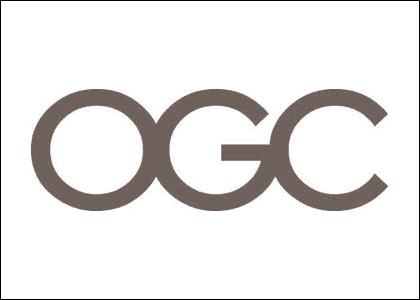
But looks like the logo, if the flip:
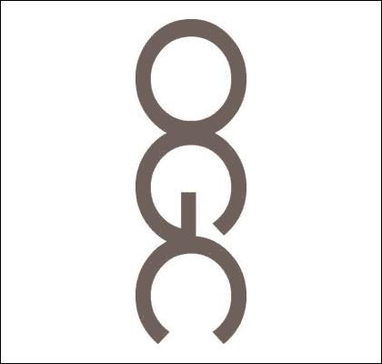
OGC representative explained: "In fact, the form of an inverted logo has caused some giggles on the part of our employees, but when we look at the issue, we decided that it is the overall effect of a combination of letters and the logo is not inappropriate for our company».
The ministry was created during the early reign of Tony Blair, who wanted to increase the cost effectiveness of the state. Now OGC 564 employee in the state, the head office in Norwich and several offices in London, Leeds and Edinburgh. Brand expert Michael Hamilton said that, despite the fact that the ambiguity of the logo was not intentional, it can definitely be a plus for the ministry.
via # image1556255


Roller Niko Biotime all such a balance, harmony, balance
Leo Burnett Moscow has given express nature