791
How much is the brand (9 photos)
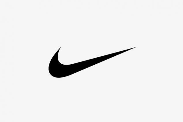
Logo Nike - «Swoosh" (eng. Whistle, traffic at high speed). In 1971, the co-founder Phil Knight instructed to develop a graphic design student Carolyn Nike logo Davidson. When she finished, Knight said: "He did not really like ... but I think that I still enjoy it." For his work, Carolyn got $ 35.
In 1983, as a thank you for the work of Phil Knight gave Davidson a gold ring with a diamond-shaped logo and the company's stock is in the amount of $ 600 000.
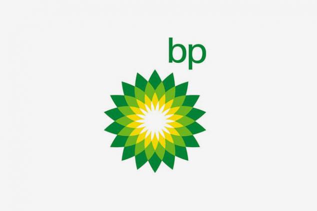
In 2001, BP hired the creative agency Landor Associates, the advertising agency Ogilvy & Mather and kosultantov public relations Ogilvy PR to those BP changed the old logo "Green Shield" to the new " Helios "and conducted a campaign accompanying the event. Logo, green and yellow sunflower, epitomizes the energy in many of its manifestations, and is accompanied by the slogan «Beyond Petroleum (more than oil)." All the rebranding cost $ 211 million
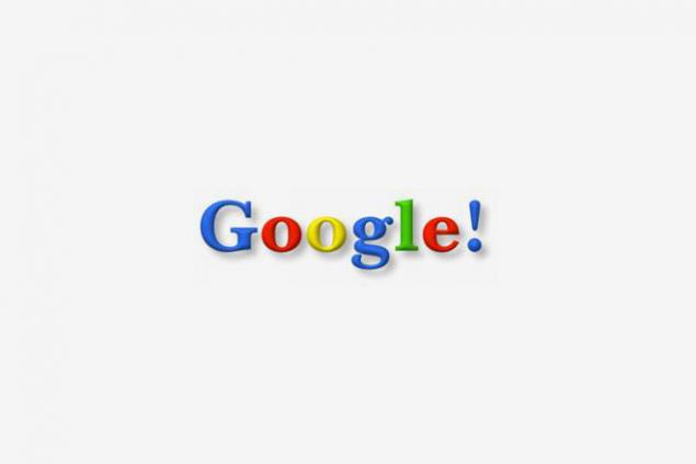
Logo Google does not cost us a penny. In 1998, it created Sergey Brin. Later, the logo has changed several times, but its main elements remained the same.
Logo Google does not cost us a penny. In 1998, it created Sergey Brin. Later, the logo has changed several times, but its main elements remained the same.
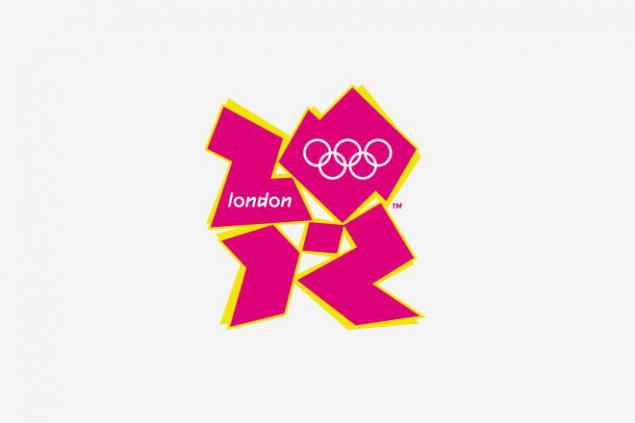
The logo, designed by Wolf Olins for the 2012 Olympics in London was worth about $ 625 000. According to an official release, it is a "non-traditional bold, incredibly inspiring and surprisingly controversial reflection of the present and the severity of London».
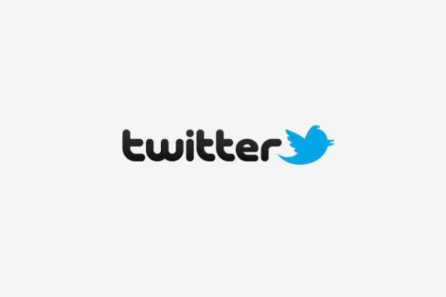
Twitter logo purchased through microstock iStockphoto, paying him $ 6. Its creator Simon Oxley said he did not even think that Twitter is using its design, is one of the company's employees are not contacted him for permission to revive the bird.
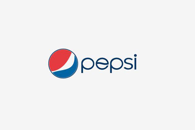
In 2008, Pepsi paid $ 1 million for the rebranding conducted by Arnell Group. Shift all the logos and labels in the world worth $ 1, 2 billion.
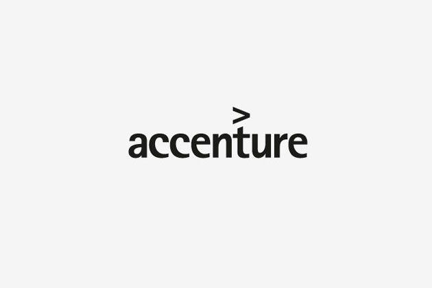
In 2000, Landor Associate created a logo, the only real element of "design" which is the angle bracket on the letter "t", signifying the company's commitment to move forward. A lower-case letters should emphasize the openness and friendliness. For the logo Accenture company paid $ 100 million (I do not understand what's the catch - or is it a publicity stunt, or some version of Money Laundering)
When, in 1997, the BBC began moving in the direction of the Internet and digital television, the British designer Martin Lamb Nair thought it was the right time to settle the matter with the logo, making something common to all channels and media. Prior to that, each channel BBC and the media have their logo.
The old logo was a slanted colored cubes and underscores. This caused problems with pixels on a computer screen and printed four-color image was expensive. Lamb Nair straightened cubes, put underscores, change the font to Gill Sans and made one-color logo. It cost $ 1.8 million
In 1983, as a thank you for the work of Phil Knight gave Davidson a gold ring with a diamond-shaped logo and the company's stock is in the amount of $ 600 000.

In 2001, BP hired the creative agency Landor Associates, the advertising agency Ogilvy & Mather and kosultantov public relations Ogilvy PR to those BP changed the old logo "Green Shield" to the new " Helios "and conducted a campaign accompanying the event. Logo, green and yellow sunflower, epitomizes the energy in many of its manifestations, and is accompanied by the slogan «Beyond Petroleum (more than oil)." All the rebranding cost $ 211 million

Logo Google does not cost us a penny. In 1998, it created Sergey Brin. Later, the logo has changed several times, but its main elements remained the same.

Logo Google does not cost us a penny. In 1998, it created Sergey Brin. Later, the logo has changed several times, but its main elements remained the same.

The logo, designed by Wolf Olins for the 2012 Olympics in London was worth about $ 625 000. According to an official release, it is a "non-traditional bold, incredibly inspiring and surprisingly controversial reflection of the present and the severity of London».

Twitter logo purchased through microstock iStockphoto, paying him $ 6. Its creator Simon Oxley said he did not even think that Twitter is using its design, is one of the company's employees are not contacted him for permission to revive the bird.

In 2008, Pepsi paid $ 1 million for the rebranding conducted by Arnell Group. Shift all the logos and labels in the world worth $ 1, 2 billion.

In 2000, Landor Associate created a logo, the only real element of "design" which is the angle bracket on the letter "t", signifying the company's commitment to move forward. A lower-case letters should emphasize the openness and friendliness. For the logo Accenture company paid $ 100 million (I do not understand what's the catch - or is it a publicity stunt, or some version of Money Laundering)

When, in 1997, the BBC began moving in the direction of the Internet and digital television, the British designer Martin Lamb Nair thought it was the right time to settle the matter with the logo, making something common to all channels and media. Prior to that, each channel BBC and the media have their logo.
The old logo was a slanted colored cubes and underscores. This caused problems with pixels on a computer screen and printed four-color image was expensive. Lamb Nair straightened cubes, put underscores, change the font to Gill Sans and made one-color logo. It cost $ 1.8 million