1426
Company logos
Each product we see the logo of the manufacturer. We have become so accustomed to their mind that they no longer think about what they mean. But to develop the logos of major companies out of any one year and not even one million dollars, and quite often in a simple picture is a special, hidden meaning.
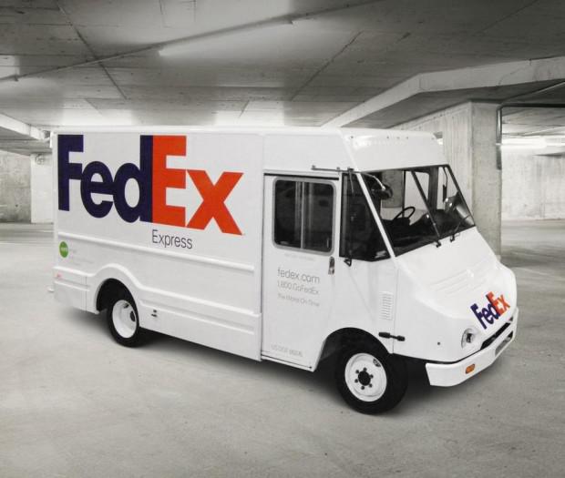
1. Company logo «Fedex» apparently quite simple - big purple letters and saturated orange. It would seem primitive. But it was not there. Take a closer look. The letters "E" and "X" in the logo form a arrow. In her few people pay attention, but on a subconscious level, it works just fine, and evokes a feeling of speed and professionalism of the company.
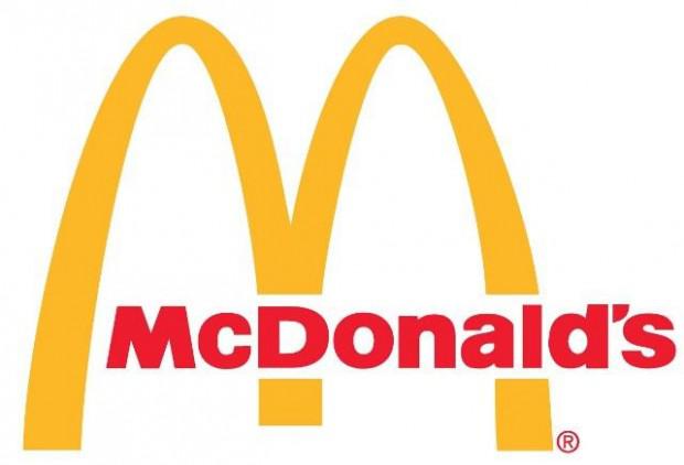
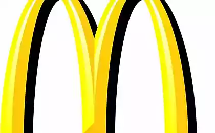
2. Many believe that to create a logo fast food chain Mcdonald's just take the first letter of the name "M", it increased and painted in gold color. It is only partly true. This emblem is the psychological aspect. According to Freud this form associated with the nursing woman's breasts.
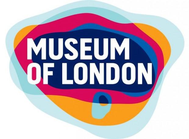
3. The Museum of London, you can learn about the history of the city from ancient times to the present day. Therefore, they have the appropriate logo. Each layer - the geographic boundaries of the city at different times. Justified and the use of bright colors - to attract young people.
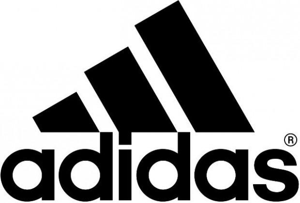
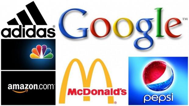
4. The name of the network of sports shops «Adidas» derived from the name of their founder Adolf Dassler. The logo has changed several times, but has always included a three strips. At the moment they are inclined to form a triangle - the mountain. It's a symbolic depiction of the obstacles that must be overcome all the athletes.
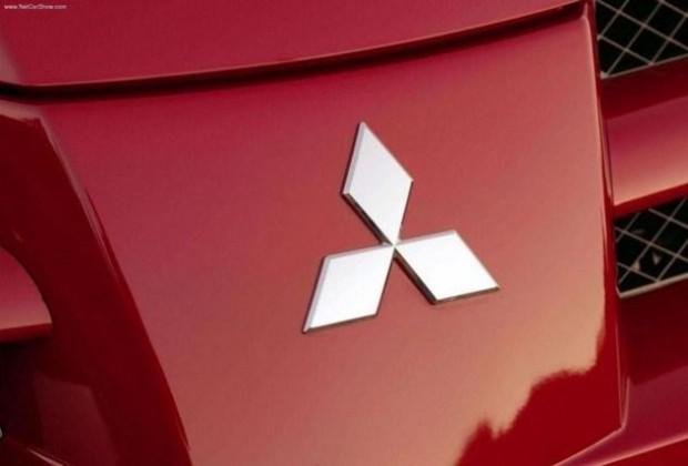
5. In 1800, the merger of two shipping companies formed a company «Mitsubishi». The logo of the new company has been created on the basis of previous - three oak leaves and three diamonds. And translated «Mitsubishi» as "three diamonds". The red color of the logo symbolizes the confidence of the company as their products.
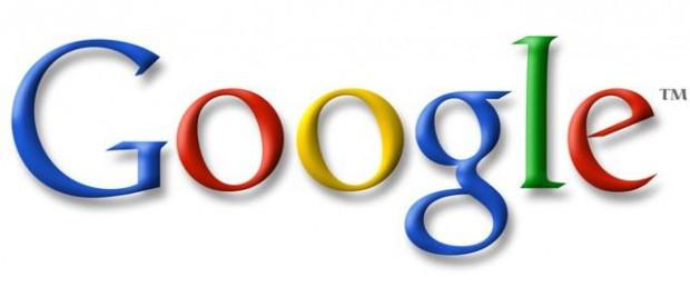
6. Logo «Google» consists only of letters, painted in different colors. But it has a direct bearing on the image of the company. The goal of the designers was to create a simple logo without extra effects to convey the fact that this is a dynamic company with a rather playful character.
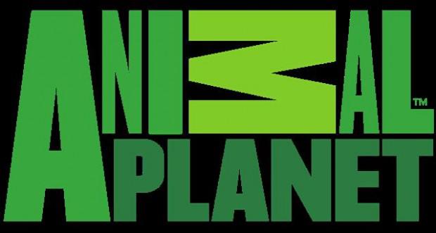
7. The logo Animal Planet, designed in 2008, the founders used different shades of green and turned over one letter is not accidental. It symbolizes the jungle and primitive instincts. And are designed for different target audiences.
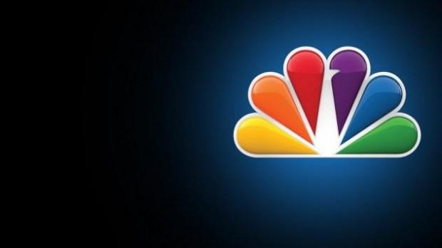
8. Many people know that the logo is uncool NBC peacock's tail. But why did this happen? This is due to the fact that when making design study, NBC owned company electronics- Radio Corporation of America (RCA), and was only arranged production of the first color TV. The logo had to pass all the advantages of a new generation of TVs. Logo in the form of butterflies and rainbows were rejected immediately as insufficiently creative. As a result, the choice fell on the tail of the peacock and the slogan «NBC proud of its new color TV" (paraphrased expression "proud as a peacock").
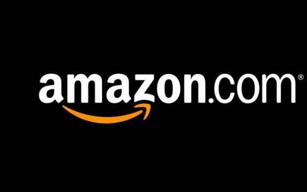
9. Logo Amazon site looks simple. But he has a hidden meaning. The orange arrow represents the satisfied smile, perfect online shopping customers. In addition, note the location of the arrows - from "A" to «Z». This is the first and last letters of the Latin alphabet. This is a hidden allusion to the fact that the site you can find everything you need.
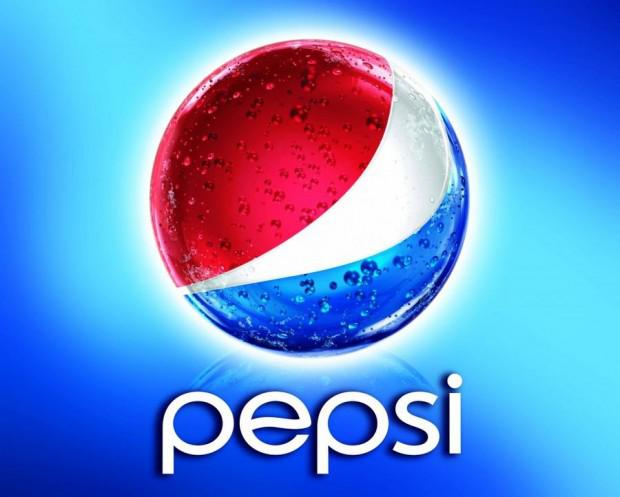
10. PepsiCo has repeatedly changed its logo. To date, it has the form of a circle composed of two halves of different colors (red and blue) and white split wavy line. The colors have been used as intended on the American flag. The Agency, which is developing the logo, recently provided a report of 27 pages that explains the full meaning of the logo. It is connected with the Pythagorean theorem, the magnetic field of the Earth, the theory of relativity, etc.
Source: daypic.ru/design/178707