1236
Stories of great logos
How to finish, I would say.
To study the history of the great logos of well-known brands - it is a fascinating, highly entertaining, not devoid of humor and sarcasm.
Every large company from time to time have to give your logo in line with the times, the philosophy of the brand, as well as their own goals. On the main visual image can trace the history of the company, as well as global marketing and design. And sometimes it's desire to advance is fraught with interesting or funny stories.
Nestle company thrown out of the nest of the third chick in accordance with the new paradigm of the development of European and American family. At Panda WWF once had eyes, and in the Starbucks logo was naked female breast. The first Apple logo was a complex, but very clumsy engraving and thick fish from long-forgotten vodilas Nokia logo in the river behind the house founder.
AdMe.ru carefully examined the question of how the case with identity for different companies at different times.
Wikipedia
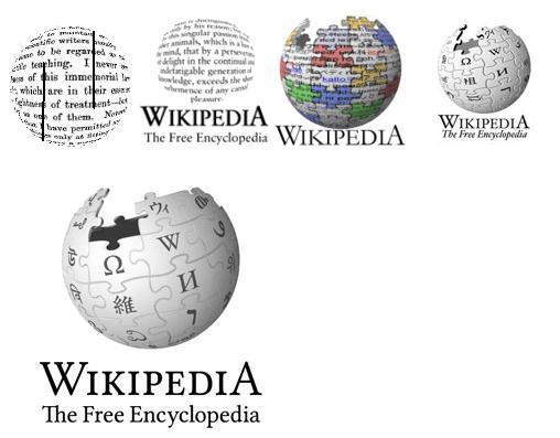
In May 2010, Wikipedia has introduced 3D-model of its famous logo of a globe puzzle. After several attempts to create a real souvenir Globe puzzle on Wikipedia reflect on the creation of a virtual 3D world, completely covered with signs written alphabets in the world. On the creation of 3D-models 3D-logo work animator, art director and graphic designer Philip Metschan, previously worked at Industrial Light, Magic and Pixar.
In addition to being a globe made three-dimensional, change the font Hoefler on Linux Libertine and abandoned italics. All this is done in order to facilitate the work of the volunteers involved in the adaptation of Wikipedia and its logo for 250 languages.
In general, the history of the Wiki-globe looks like this:
WWF
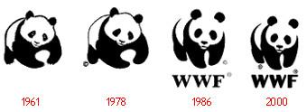
Panda logo on the main champions of saving the planet and endangered species are not always looked round and very harmonious small animals. From 1961 to 1986 she was depicted either playfully falls on the front paws, or scoops the food for themselves, or simply clumsy. Moreover, at the beginning of the symbol WWF had eyes.
In 1986, the panda has acquired its final form, and completion of the logo was carried out only once - in 2000, WWF has used the new font.
Metro Goldwyn Mayer
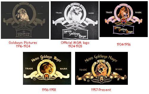
One of the first Hollywood film companies, experiencing today a significant financial difficulty, never changed once and for all the selected image - a lion roaring in the "frame" of the film. The only change is the name of the mark, and also the protagonist. The logo MGM for 95 years has had time to growl five different lions, the latter has growl '54.
HP
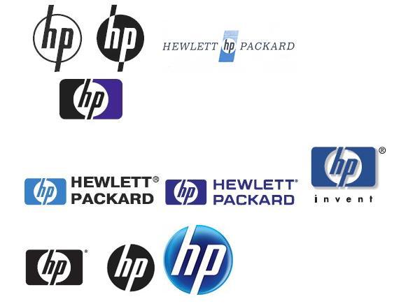
Hewlett Packard has modified its logo and dorihtovyval 8 times in 72 years of existence, but have not gone on from where I started. Since 1939, since the release of the company's first product, the tone generator, and the end of the 60s HP used two peer logo. The first, consisting of simple lines, was easily applied to the metal housings of different equipment. The second looked good in print.
Post-harvest the search for the font color and has led to the fact that in 2009, HP cut the tails of letters from the logo of the sample of 1938 and painted circle in the blue gradient.
General Electric
The company was formed in 1892 after the merger of Thomas Edison and Thomson-Houston Electric Company.
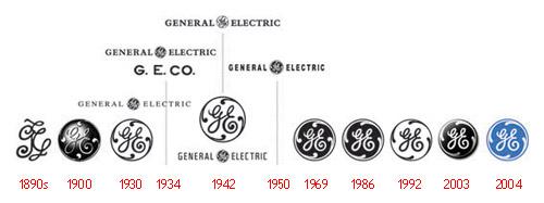
The font in the modern logo similar to the font of the first, despite nearly 120 years of history GE. Over time, the acronym has acquired a circle with floral ornaments, which over the years only to refine and modernize. In the first half of the XX century were trying to fit in a transcript logo - the full name of General Electric. Then from the decryption completely abandoned - it has no need, a company in the world know almost everything. The current logo was made in Wollf Olins. British designers have added blue and refused volume. At the same time at GE it adopted a new slogan that defines today all communications energy giant - «Imagination At Work» («imagination works»).
Lego
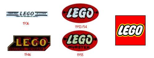
Cult Danish Lego constructor always called - so-called toy, reducing the phrase «leg godt» - «play well." The first logo of the company appeared in 1936, two years after the start of work. The logo is very difficult to call it - rather, it is simply typed text. After 10 years in the logo have tried to beat the box shape and the shape of parts, and after 7 years it began to discern the features of what the logo will eventually.
Nestle
The name of the Swiss holding company that produces cosmic number of items of food is not translated as "nest". It's just the name of the founder Henri Nestlé, so the first version of the logo is no nest was not in sight. Only later in the company thought that the name of the founder of more than similar to the English word «nest», which translates as "nest". Since then, it has become a symbol of the company and the epitome of the family philosophy. Overlooking the nest Nestle related a funny story: before the logo was one mother and three chicks. Two chicks there was after the marketing company conducted a study and found that the most frequent number of children in one family - two. Consequently, if you throw a chick out of the nest, the logo will resonate in the hearts of far more mothers.

Yamaha
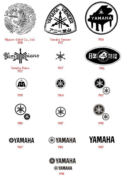
The manufacturer of motorcycles, musical instruments and hi-end audio equipment with the logo of plenty enough for a hundred years that have passed since then, as the Torakusu Yamaha designed his first reed organ in 1887. One thing remained unchanged - three crossed fork, forming a complex three-beam star. Only in the first embodiment, a tuning fork, a symbol of perfect sound was one instance. Its holding in its beak phoenix, reflects the complexity of which had to overcome Yamaha, building your business.
CBS
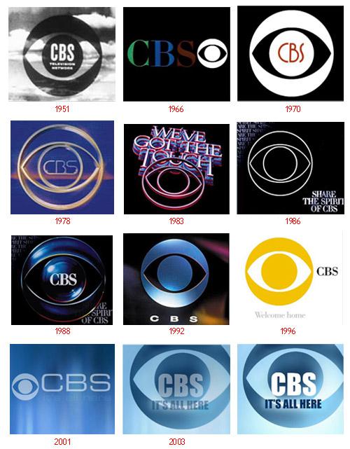
Despite the abundance of changes to the graphic image telebrodkastera in 60 years, a schematic representation of the eye nowhere and never out of it did not go away. Even barely changed in appearance - even after more than half a century, this "eye" still looks modern.
BBC
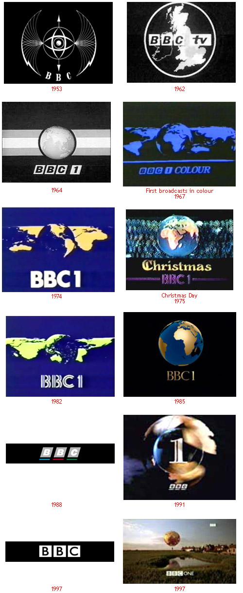
But British broadcasters do not have a single recognizable "visual", except for the actual letters of BBC, who once did not look for more than a half-century history of the company. Now it is a minimalist typography, inscribed in three white square.
Boeing
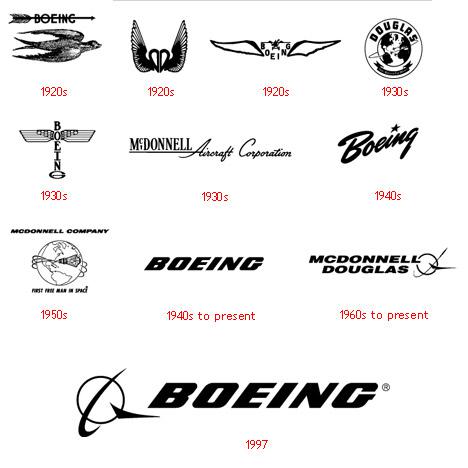
The logo aircraft manufacturers Boeing has repeatedly visited all somehow related to flight, one after another - the swallow, wings, wings again, globe, wings again, and once again the star globe. As a result, in 1997, Boeing focused on the schematic image of the globe and is a schematic image of the wings at the bottom right.
Adobe Systems
In 1982, forty years of programmers and Xerox John Warnock Charles Geschke suddenly resigned and formed a company to produce software. They named it Adobe, after the creek that flows behind the house Warnock. It is clear that John and Charles had to save on everything that does not go to the dogs, and do not leave the family destitute. Therefore, the logo they ordered not design bureau and asked to draw his wife Warnock - Marv.

Apple Inc.
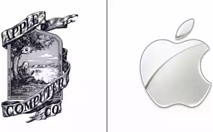
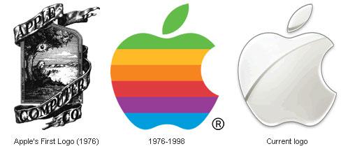
A little known fact about a very well-known company - in 1976, Apple was founded not only the two Steve (Jobs and Wozniak) and Ronald one. Ronald Wayne has invested in the company 10% of the initial capital (800 dollars) and came up with the first logo for the company - it was shild with Newton sitting under an apple tree. Sign of twine almost heraldic tape on which proudly flaunted Apple Computer & Co. One would like to say a logo, a co-founder. Ronald Wayne and Steve worked exactly two weeks. Then he took his 800 bucks - he believed that Apple - it's too risky undertaking, and did not want to throw capital.
Computer Apple I was sold slowly, Jobs decided that something should be changed, and started with the logo. Polosatenkoe Apple invented the designer Rob Janoff of the Regis McKenna Agency. It served for 23 years before becoming a monochrome and "haytechnym" a year after the return of Jobs to the company.
Canon
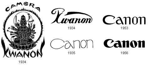
In 1930, Japan Goro Yoshida and his half-brother, Saburo Uchida created a company with nothing telling us the name of Precision Optical Instruments Laboratory in Japan. Four years later, the development led to the creation of their first camera, which they called Kwanon, in honor of the thousand-Buddhist deity of mercy. The logo all one thousand hands would not fit, but as they could - upihali. Added flames and quickly got a picture of the ancient books, rather than the logo.
Company registered to protect their brand a lot of words that are similar in sound to Kwanon. One of them - already known to us Canon - eventually replace the original name. Existing logo Canon products for over 50 years, and it still looks modern.
Fedex
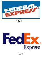
Federal Express logo first appeared in 1973, it did not have any of our usual rate, it does not stand out. In 1994, after the official introduction acronym, coined Leader Lyndon sign that the move recognizes now virtually the entire world.
At first glance, the logo is very simple and nice, but there is one detail - the little arrow pointing to the right, formed by the letters E and x. Many do not see it, but those who know it exists, can no longer ignore it. This arrow - one of the most striking examples of the use of the subconscious in advertising, it symbolizes forward movement and thinking.
Google
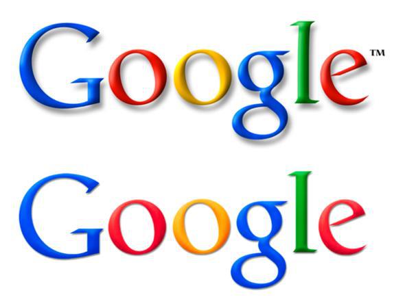
12 years ago, final year students of the University of Stanford, Larry Page and Sergey Brin came up with a new search engine and named it ... not Google. They called it BackRub, thereby indicating its ability to analyze «back links». But very soon they changed the name of the engine on Google. It's a bit reworked the word "googol", denoting the last of having at least some sense of the numbers - yedinichku with a hundred zeros.
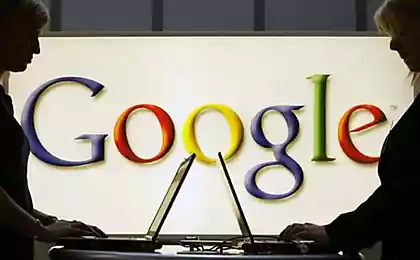
The first logo of Google Sergey Brin came up with himself, learning to work with the free graphics package GIMP. A little later he added the exclamation point, apparently, trying to pass as a unit then terribly popular Yahoo! search engine The current logo for the ninth year - old logo has been brought to mind a professor at the Faculty of Arts of the University of Stanford.
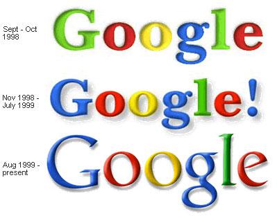
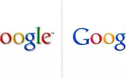
In May 2010, Google virtually eliminate shadows from the logo, and he began to look much fresh.
IBM
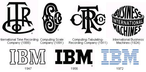
IBM's history began as a result of an intricate and long association of various companies - ITR, CSC, CTR. They almost baroque logo as shown here. In 1924 reshuffle finally ended, and reopen the company called - International Business Machines.
At the end of the 40s IBM finally switched to the main activity today - computers (before they were engaged, even machines for cutting meat). And in commemoration of such a radical change, IBM introduced a new logo - an extremely simple and intuitive. In contrast to the extravaganza that which they had before.
The last major change occurred with the logo in 1972 - "to transfer the speed and dynamism" monolithic raspolosovat letters and painted in blue color.
Kodak
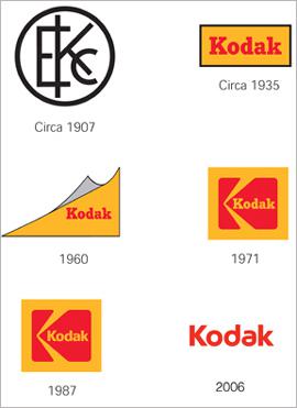
The first cameras Kodak appeared in 1888. The slogan of the campaign was as follows: «You press the button, we do the rest» / «You nazhimaetet the button, we do the rest." In the distant 1900s, Kodak was one of the first who made attempts to integrate the name and image of the company into a symbol. In the 1930s, the logo appeared familiar yellow and red. In the 60 appeared in the logo, and rounding the corners, from which 10 years later abandoned. During 1971-2006 years the logo has not changed significantly. And in 2006 we simplified the logo, giving it thus a more modern look.
LG
Originally it was two separate organizations: cosmetics company Lucky Chemical Industrial (1947) and electronic zavodzavod GoldStar (since 1958). After the merger, the company received the name Lucky Goldstar, and in 1995 changed its Electronics.Segodnya for LG LG - a huge South Korean conglomerate, which includes companies such as LG Chemicals, LG Telecom, and even a baseball team LG Twins. All of them share a common slogan Life is Good («Life is good!"). MasterCard
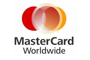
In 1966, 17 bankers united in Interbank Card Association (ICA), which became a symbol of the Latin «i». In 1969 the bank was renamed to Master Charge, and the logo, there are two overlapping circles. Symbolic «i» placed in the lower right corner. In 1979, Master Charge renamed MasterCard, and the letter «i» has disappeared from the logo at all. In 1990, there were horizontal stripes as a symbol of inter-relationships.

In 2006, a subsidiary of MasterCard International changed its name to MasterCard Worldwide, and also introduced a new logo.
The two circles in the logo was added a third, somewhat off-center to the right. According to the company, these geometric figures reflect the unique three-pronged business model - franchising, processing and consulting.
For payment system logo, thank God, have not changed.
Microsoft
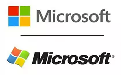
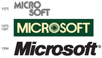
In 1975, the year of foundation of the company its name was «Micro-soft». That's right, with a hyphen, which is subsequently removed, creating a logo with a favorite while it is impossible to typography disco.
After 7 years of disco went out of fashion, including in the design, and Microsoft introduced a new logo with the central letter O in the form of a stylized eye. Employees Blibbet called him and loved him so much that when the logo changed in 1987, one of the employees organized a campaign "Save Blibbeta." Glazik not returned, but went to the small concessions - in the cafeteria for employees began to make "Blibbet burgers."
Logo 1987 version is a fact the same as what we see now. Designer Scott Baker came up with that witty people immediately called Pac-Man, because all the same means about very similar to the character of the same name from the old, but many of your favorite computer games.
Motorola
The company Motorola - who would have thought! - There are already 80 years old. Since the beginning of the 30s she engaged in production of car phones, and 50 years later moved on to commercial production polutorakilogrammovyh cell phones.
Initially, the name of the company, which is nothing more than the word "motor", combined with the popular while the suffix "ol" wrote curly script, and shaped as letters M in the form in which we know it today appeared in 1955. Announcing the change treydmarka the company stated that "two soaring peaks of the triangular form an arch in the form of abstract M, symbolizing the progressive leadership of opinion."

Mozilla Firefox
In 2002, the companies are not engaged in the goods or services for children could still occur here such logos as this fabulous bird (although they still appear). Dave Hyatt and Blake Ross created a free web browser Phoenix. Which they immediately renamed to Firebird and immediately renamed in Mozilla Firefox.
In 2003, the guys almost filled up the letters of John Hicks Hicksdesign, interface designer, who was suffering from a terrible branding. After some time, Mozilla has invited him to make a new Identity and got famous logo, which they say can be seen even from space.

Nike
Swoosh Nike, which is perhaps the most recognizable sign in the world, came up with the University of Portland student Caroline Davidson in 1971. She paid him $ 35, even taking into account the prices of those years it - a penny. Logo design is almost not changed in 37 years - only changed the spelling of the brand, and now all gone.

Nokia
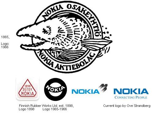
In 1865, Knut Fredrik Idestam founded in the southwest of Finland, pulp and paper factory. Agree, very strange start for the company, now known mobile phones. Name Nokia company began to wear after she moved to the riverbank Nokianvirta the city, in fact, Nokia. Incidentally, the word «Nokia» in Finnish refers to dark, very furry animal, something like a weasel.
Pepsi
In 1893, a few years after the invention pharmacist Pemberton drink with coca leaves, the other a young pharmacist from North Carolina, Caleb Bredhem experimenting with different components (in particular pepsin) and got a drink «Brad's drink», enjoyed strong demand in its pharmacy .
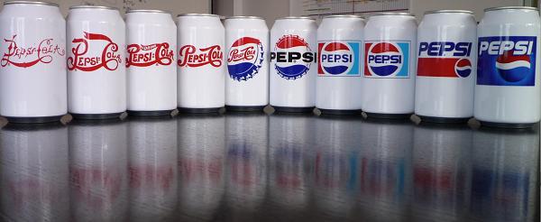
After 5 years, Caleb had had to buy for $ 100 the name of Pepsi-Cola, which has already registered it a failed competitor. At the same time, a neighbor Bredhema invented the first logo for Pepsi.
Since then, the logo has changed more than once, and now we see every day pretty striped three-dimensional sphere. By the way, Coca-Cola, unlike his main rival, the logo is not fundamentally changed not once, but only "Restayl" the very first writing.
Coca Cola
The main competitor of Pepsi all the years of the war quietly watched for throwing red and blue, occasionally drawing subtle restyling its centennial logo. In the history of Coca Cola there is only one "shameful moment" when they literally for several months tried to introduce a new writing in 1980, but quickly gave up the idea.
While all. Source.
Source:
To study the history of the great logos of well-known brands - it is a fascinating, highly entertaining, not devoid of humor and sarcasm.
Every large company from time to time have to give your logo in line with the times, the philosophy of the brand, as well as their own goals. On the main visual image can trace the history of the company, as well as global marketing and design. And sometimes it's desire to advance is fraught with interesting or funny stories.
Nestle company thrown out of the nest of the third chick in accordance with the new paradigm of the development of European and American family. At Panda WWF once had eyes, and in the Starbucks logo was naked female breast. The first Apple logo was a complex, but very clumsy engraving and thick fish from long-forgotten vodilas Nokia logo in the river behind the house founder.
AdMe.ru carefully examined the question of how the case with identity for different companies at different times.
Wikipedia
In May 2010, Wikipedia has introduced 3D-model of its famous logo of a globe puzzle. After several attempts to create a real souvenir Globe puzzle on Wikipedia reflect on the creation of a virtual 3D world, completely covered with signs written alphabets in the world. On the creation of 3D-models 3D-logo work animator, art director and graphic designer Philip Metschan, previously worked at Industrial Light, Magic and Pixar.
In addition to being a globe made three-dimensional, change the font Hoefler on Linux Libertine and abandoned italics. All this is done in order to facilitate the work of the volunteers involved in the adaptation of Wikipedia and its logo for 250 languages.
In general, the history of the Wiki-globe looks like this:

WWF
Panda logo on the main champions of saving the planet and endangered species are not always looked round and very harmonious small animals. From 1961 to 1986 she was depicted either playfully falls on the front paws, or scoops the food for themselves, or simply clumsy. Moreover, at the beginning of the symbol WWF had eyes.
In 1986, the panda has acquired its final form, and completion of the logo was carried out only once - in 2000, WWF has used the new font.

Metro Goldwyn Mayer
One of the first Hollywood film companies, experiencing today a significant financial difficulty, never changed once and for all the selected image - a lion roaring in the "frame" of the film. The only change is the name of the mark, and also the protagonist. The logo MGM for 95 years has had time to growl five different lions, the latter has growl '54.

HP
Hewlett Packard has modified its logo and dorihtovyval 8 times in 72 years of existence, but have not gone on from where I started. Since 1939, since the release of the company's first product, the tone generator, and the end of the 60s HP used two peer logo. The first, consisting of simple lines, was easily applied to the metal housings of different equipment. The second looked good in print.
Post-harvest the search for the font color and has led to the fact that in 2009, HP cut the tails of letters from the logo of the sample of 1938 and painted circle in the blue gradient.

General Electric
The company was formed in 1892 after the merger of Thomas Edison and Thomson-Houston Electric Company.
The font in the modern logo similar to the font of the first, despite nearly 120 years of history GE. Over time, the acronym has acquired a circle with floral ornaments, which over the years only to refine and modernize. In the first half of the XX century were trying to fit in a transcript logo - the full name of General Electric. Then from the decryption completely abandoned - it has no need, a company in the world know almost everything. The current logo was made in Wollf Olins. British designers have added blue and refused volume. At the same time at GE it adopted a new slogan that defines today all communications energy giant - «Imagination At Work» («imagination works»).

Lego
Cult Danish Lego constructor always called - so-called toy, reducing the phrase «leg godt» - «play well." The first logo of the company appeared in 1936, two years after the start of work. The logo is very difficult to call it - rather, it is simply typed text. After 10 years in the logo have tried to beat the box shape and the shape of parts, and after 7 years it began to discern the features of what the logo will eventually.

Nestle
The name of the Swiss holding company that produces cosmic number of items of food is not translated as "nest". It's just the name of the founder Henri Nestlé, so the first version of the logo is no nest was not in sight. Only later in the company thought that the name of the founder of more than similar to the English word «nest», which translates as "nest". Since then, it has become a symbol of the company and the epitome of the family philosophy. Overlooking the nest Nestle related a funny story: before the logo was one mother and three chicks. Two chicks there was after the marketing company conducted a study and found that the most frequent number of children in one family - two. Consequently, if you throw a chick out of the nest, the logo will resonate in the hearts of far more mothers.

Yamaha
The manufacturer of motorcycles, musical instruments and hi-end audio equipment with the logo of plenty enough for a hundred years that have passed since then, as the Torakusu Yamaha designed his first reed organ in 1887. One thing remained unchanged - three crossed fork, forming a complex three-beam star. Only in the first embodiment, a tuning fork, a symbol of perfect sound was one instance. Its holding in its beak phoenix, reflects the complexity of which had to overcome Yamaha, building your business.

CBS
Despite the abundance of changes to the graphic image telebrodkastera in 60 years, a schematic representation of the eye nowhere and never out of it did not go away. Even barely changed in appearance - even after more than half a century, this "eye" still looks modern.

BBC
But British broadcasters do not have a single recognizable "visual", except for the actual letters of BBC, who once did not look for more than a half-century history of the company. Now it is a minimalist typography, inscribed in three white square.

Boeing
The logo aircraft manufacturers Boeing has repeatedly visited all somehow related to flight, one after another - the swallow, wings, wings again, globe, wings again, and once again the star globe. As a result, in 1997, Boeing focused on the schematic image of the globe and is a schematic image of the wings at the bottom right.

Adobe Systems
In 1982, forty years of programmers and Xerox John Warnock Charles Geschke suddenly resigned and formed a company to produce software. They named it Adobe, after the creek that flows behind the house Warnock. It is clear that John and Charles had to save on everything that does not go to the dogs, and do not leave the family destitute. Therefore, the logo they ordered not design bureau and asked to draw his wife Warnock - Marv.

Apple Inc.
A little known fact about a very well-known company - in 1976, Apple was founded not only the two Steve (Jobs and Wozniak) and Ronald one. Ronald Wayne has invested in the company 10% of the initial capital (800 dollars) and came up with the first logo for the company - it was shild with Newton sitting under an apple tree. Sign of twine almost heraldic tape on which proudly flaunted Apple Computer & Co. One would like to say a logo, a co-founder. Ronald Wayne and Steve worked exactly two weeks. Then he took his 800 bucks - he believed that Apple - it's too risky undertaking, and did not want to throw capital.
Computer Apple I was sold slowly, Jobs decided that something should be changed, and started with the logo. Polosatenkoe Apple invented the designer Rob Janoff of the Regis McKenna Agency. It served for 23 years before becoming a monochrome and "haytechnym" a year after the return of Jobs to the company.

Canon
In 1930, Japan Goro Yoshida and his half-brother, Saburo Uchida created a company with nothing telling us the name of Precision Optical Instruments Laboratory in Japan. Four years later, the development led to the creation of their first camera, which they called Kwanon, in honor of the thousand-Buddhist deity of mercy. The logo all one thousand hands would not fit, but as they could - upihali. Added flames and quickly got a picture of the ancient books, rather than the logo.
Company registered to protect their brand a lot of words that are similar in sound to Kwanon. One of them - already known to us Canon - eventually replace the original name. Existing logo Canon products for over 50 years, and it still looks modern.

Fedex
Federal Express logo first appeared in 1973, it did not have any of our usual rate, it does not stand out. In 1994, after the official introduction acronym, coined Leader Lyndon sign that the move recognizes now virtually the entire world.
At first glance, the logo is very simple and nice, but there is one detail - the little arrow pointing to the right, formed by the letters E and x. Many do not see it, but those who know it exists, can no longer ignore it. This arrow - one of the most striking examples of the use of the subconscious in advertising, it symbolizes forward movement and thinking.

12 years ago, final year students of the University of Stanford, Larry Page and Sergey Brin came up with a new search engine and named it ... not Google. They called it BackRub, thereby indicating its ability to analyze «back links». But very soon they changed the name of the engine on Google. It's a bit reworked the word "googol", denoting the last of having at least some sense of the numbers - yedinichku with a hundred zeros.
The first logo of Google Sergey Brin came up with himself, learning to work with the free graphics package GIMP. A little later he added the exclamation point, apparently, trying to pass as a unit then terribly popular Yahoo! search engine The current logo for the ninth year - old logo has been brought to mind a professor at the Faculty of Arts of the University of Stanford.

In May 2010, Google virtually eliminate shadows from the logo, and he began to look much fresh.

IBM
IBM's history began as a result of an intricate and long association of various companies - ITR, CSC, CTR. They almost baroque logo as shown here. In 1924 reshuffle finally ended, and reopen the company called - International Business Machines.
At the end of the 40s IBM finally switched to the main activity today - computers (before they were engaged, even machines for cutting meat). And in commemoration of such a radical change, IBM introduced a new logo - an extremely simple and intuitive. In contrast to the extravaganza that which they had before.
The last major change occurred with the logo in 1972 - "to transfer the speed and dynamism" monolithic raspolosovat letters and painted in blue color.

Kodak
The first cameras Kodak appeared in 1888. The slogan of the campaign was as follows: «You press the button, we do the rest» / «You nazhimaetet the button, we do the rest." In the distant 1900s, Kodak was one of the first who made attempts to integrate the name and image of the company into a symbol. In the 1930s, the logo appeared familiar yellow and red. In the 60 appeared in the logo, and rounding the corners, from which 10 years later abandoned. During 1971-2006 years the logo has not changed significantly. And in 2006 we simplified the logo, giving it thus a more modern look.

LG
Originally it was two separate organizations: cosmetics company Lucky Chemical Industrial (1947) and electronic zavodzavod GoldStar (since 1958). After the merger, the company received the name Lucky Goldstar, and in 1995 changed its Electronics.Segodnya for LG LG - a huge South Korean conglomerate, which includes companies such as LG Chemicals, LG Telecom, and even a baseball team LG Twins. All of them share a common slogan Life is Good («Life is good!"). MasterCard
In 1966, 17 bankers united in Interbank Card Association (ICA), which became a symbol of the Latin «i». In 1969 the bank was renamed to Master Charge, and the logo, there are two overlapping circles. Symbolic «i» placed in the lower right corner. In 1979, Master Charge renamed MasterCard, and the letter «i» has disappeared from the logo at all. In 1990, there were horizontal stripes as a symbol of inter-relationships.

In 2006, a subsidiary of MasterCard International changed its name to MasterCard Worldwide, and also introduced a new logo.
The two circles in the logo was added a third, somewhat off-center to the right. According to the company, these geometric figures reflect the unique three-pronged business model - franchising, processing and consulting.
For payment system logo, thank God, have not changed.

Microsoft
In 1975, the year of foundation of the company its name was «Micro-soft». That's right, with a hyphen, which is subsequently removed, creating a logo with a favorite while it is impossible to typography disco.
After 7 years of disco went out of fashion, including in the design, and Microsoft introduced a new logo with the central letter O in the form of a stylized eye. Employees Blibbet called him and loved him so much that when the logo changed in 1987, one of the employees organized a campaign "Save Blibbeta." Glazik not returned, but went to the small concessions - in the cafeteria for employees began to make "Blibbet burgers."
Logo 1987 version is a fact the same as what we see now. Designer Scott Baker came up with that witty people immediately called Pac-Man, because all the same means about very similar to the character of the same name from the old, but many of your favorite computer games.

Motorola
The company Motorola - who would have thought! - There are already 80 years old. Since the beginning of the 30s she engaged in production of car phones, and 50 years later moved on to commercial production polutorakilogrammovyh cell phones.
Initially, the name of the company, which is nothing more than the word "motor", combined with the popular while the suffix "ol" wrote curly script, and shaped as letters M in the form in which we know it today appeared in 1955. Announcing the change treydmarka the company stated that "two soaring peaks of the triangular form an arch in the form of abstract M, symbolizing the progressive leadership of opinion."

Mozilla Firefox
In 2002, the companies are not engaged in the goods or services for children could still occur here such logos as this fabulous bird (although they still appear). Dave Hyatt and Blake Ross created a free web browser Phoenix. Which they immediately renamed to Firebird and immediately renamed in Mozilla Firefox.
In 2003, the guys almost filled up the letters of John Hicks Hicksdesign, interface designer, who was suffering from a terrible branding. After some time, Mozilla has invited him to make a new Identity and got famous logo, which they say can be seen even from space.

Nike
Swoosh Nike, which is perhaps the most recognizable sign in the world, came up with the University of Portland student Caroline Davidson in 1971. She paid him $ 35, even taking into account the prices of those years it - a penny. Logo design is almost not changed in 37 years - only changed the spelling of the brand, and now all gone.

Nokia
In 1865, Knut Fredrik Idestam founded in the southwest of Finland, pulp and paper factory. Agree, very strange start for the company, now known mobile phones. Name Nokia company began to wear after she moved to the riverbank Nokianvirta the city, in fact, Nokia. Incidentally, the word «Nokia» in Finnish refers to dark, very furry animal, something like a weasel.

Pepsi
In 1893, a few years after the invention pharmacist Pemberton drink with coca leaves, the other a young pharmacist from North Carolina, Caleb Bredhem experimenting with different components (in particular pepsin) and got a drink «Brad's drink», enjoyed strong demand in its pharmacy .
After 5 years, Caleb had had to buy for $ 100 the name of Pepsi-Cola, which has already registered it a failed competitor. At the same time, a neighbor Bredhema invented the first logo for Pepsi.
Since then, the logo has changed more than once, and now we see every day pretty striped three-dimensional sphere. By the way, Coca-Cola, unlike his main rival, the logo is not fundamentally changed not once, but only "Restayl" the very first writing.

Coca Cola
The main competitor of Pepsi all the years of the war quietly watched for throwing red and blue, occasionally drawing subtle restyling its centennial logo. In the history of Coca Cola there is only one "shameful moment" when they literally for several months tried to introduce a new writing in 1980, but quickly gave up the idea.
While all. Source.
Source:
