818
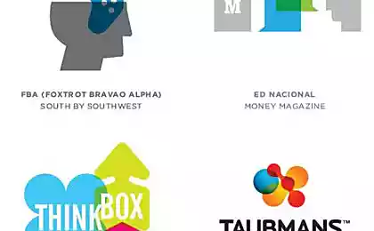
15 logos that need to look twice

Considered logos are working very cool - they flirt with the audience. And it's really fun - to look into the details, the authors admire the wit and the ability to invest more in low.
Website has collected 15 examples of smart and concise logo, which will have to look twice. And for their establishment would like to just go and kiss the designers.
Web devushki

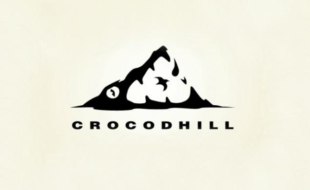
Recreation center "Krokodholm"
Piano bar "11"

Walnut ice cream "Squirrel"

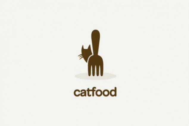
Cat korm
Beer Canada

Safari Afrike

Sushi Bar "8 fish"

Beauty "Narcissistic peacock"

Food innovatsii

Veterinary klinika

Dance Studio ADA

90% 28,317,608
Delfinariy

Golf Course "Spartan"

you also like:
30 smart logos
via www.adme.ru/tvorchestvo-dizajn/30-umnyh-logotipov-700760/
