2450
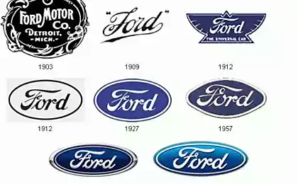
Evolution of the logo
These brands are known throughout the world, and we do not even need any labels to understand what kind of picture "bitten apple" hidden IT-giant Apple, but for the image of the boomerang, which, incidentally, was conceived as a wing, iconic Nike. Nevertheless, the logos of popular brands and corporations were not always so, as we know them now, so I propose to your attention this post.
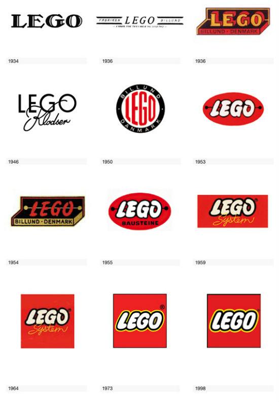
Under the name Lego was initially sold wooden handmade toys, and later, in 1947, the company started production of plastic designers, thanks to which the brand is known until now.
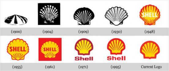
Logo Petroleum Corporation Shell - one of the most recognizable logos in the world. The company was named in honor of the shop, which sold among other boxes decorated with seashells. Until 1948, it was the emblem of Shell shell mussels, after - scallop shell.
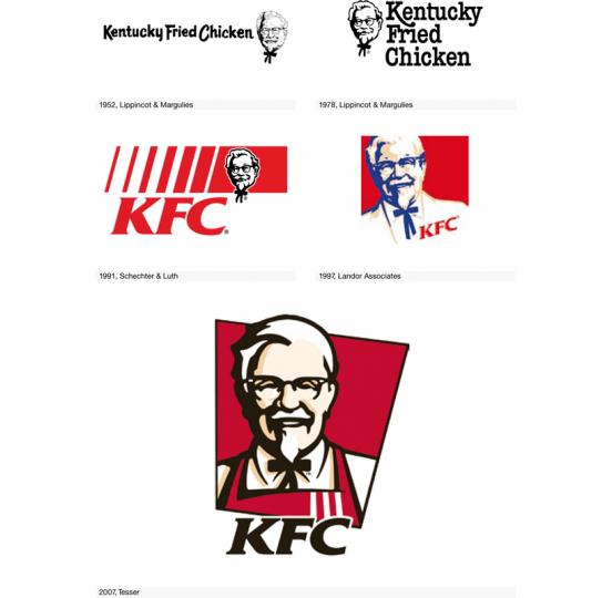
The face of KFC brand was and still is its founder Harland David Sanders, better known as Colonel Sanders, who died in 1980.
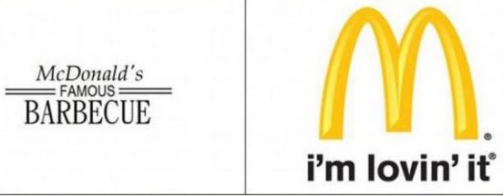
McDonald's was founded in 1940 by brothers as a MacDonalds restaurant barbecue. His fate we are all well aware.
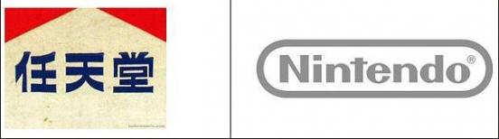
Nintendo has just been obliged to change their logo to a more understandable for Western consumers, after its video games have become popular outside of Japan.
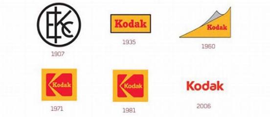
It is strange that the first Kodak logo has become difficult to read the emblem in an Art Deco style, as creator of George Eastman sought to give their offspring a short and succinct name that would be easy to read and pronounce. Later all trademark logo became a simple and concise, it is a pity that after 130 years of domination in the global market company went bankrupt and even admitted that for many years held under its headquarters in Rochester nuclear reactor.
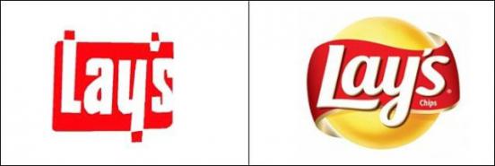
Lay's
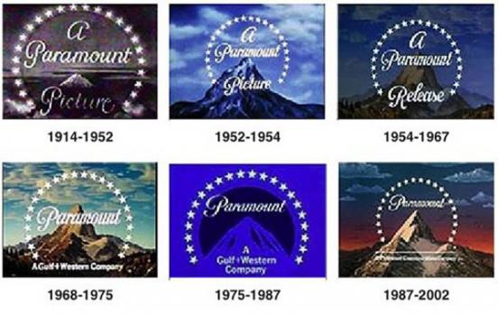
Evolution logo Paramount Pictures from 1914 to the present times.
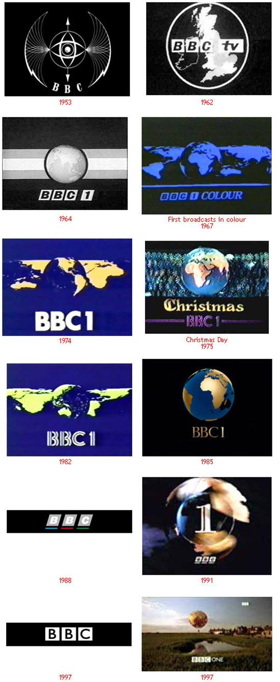
BBC
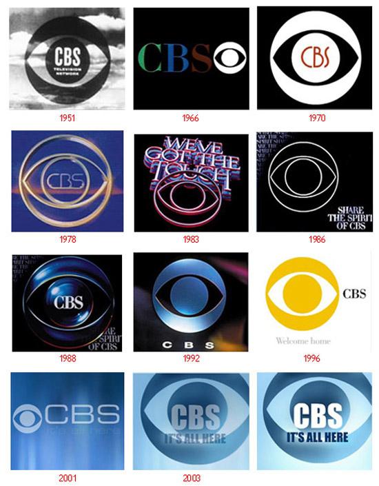
How many would not have changed the logo teleradiomagnata CBS, its logo since its foundation was an eye that sees everything.
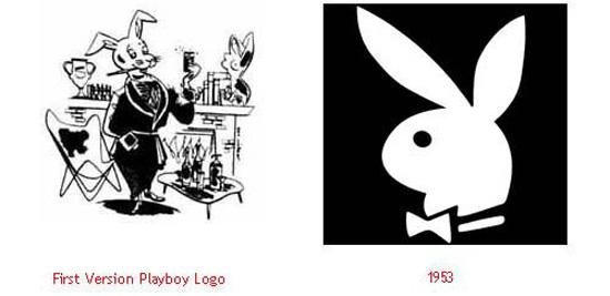
The first Playboy emblem was not so successful, as the logo of the magazine today.
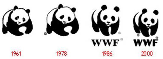
Continuing the animal theme - the logo of the World Wildlife Fund.
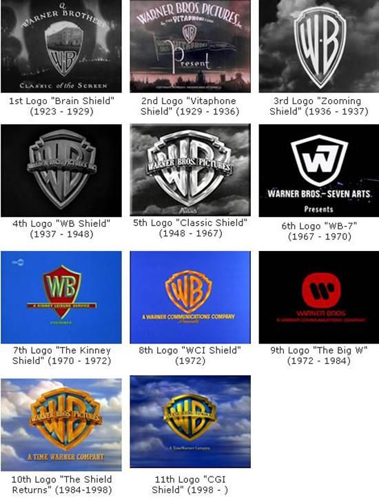
Concern Warner Brothers was founded by four brothers, and since its founding brand logo was a shield that only rarely changed. Sometimes beyond recognition.
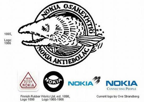
I am glad that now on my phone flaunts a simple and laconic inscription Nokia, instead of this terrible fish comes from in 1966.
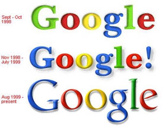
Over time, the Google logo has not changed.
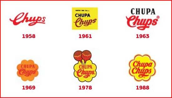
I think many people know that its popularity Chupa Chups is obliged to Salvador Dali, this is the genius of surrealist created a logo in the shape of daisies in 1969.
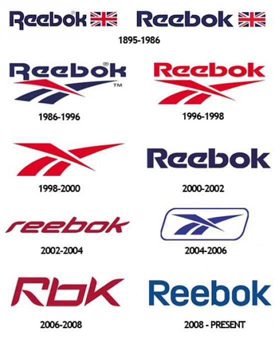
Until 1986, the emblem of Reebok was the British flag, then had to change the logo of the corporation, as the British government imposed a ban on the use of national symbols for advertising purposes. In place of the flag came "vector", thanks to which the Reebok brand is known to this day.
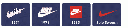
The symbol of the Nike brand since its inception has been the emblem called «swoosh» - a word that has no specific equivalent in Russian (the closest translation for "whiz"). The logo symbolizes the wing of the Greek goddess of victory Nike, after whom is named the brand. Based on this we say the wrong name of the company and the right to be like that - "Nike».
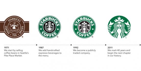
The symbol of the coffee shop chain Starbucks is a two-tailed mermaid, and the company has borrowed its name from a novel by Herman Melville "MobiDik", named after one of the heroes of the book - Starbuck.
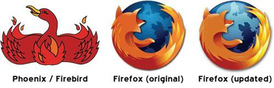
The browser, known to us as Firefox, originally was called Phoenix and Firebird and had its logo. Then, because of a conflict of trademarks, it was renamed to Firefox and received a logo with a picture of a red fox, embracing the planet.
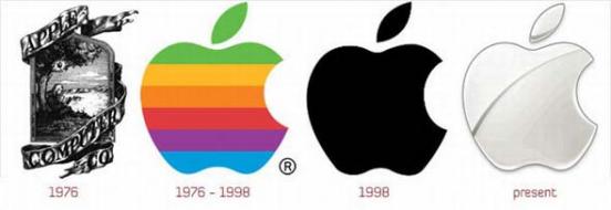
One of the most famous brands in the world was created in the mid 70s. Then on the company's logo was depicted sitting under an apple tree, Isaac Newton. But the picture was too complicated, and to promote the brand needed a more laconic character. They are something, and become an apple that has become famous all over the world.
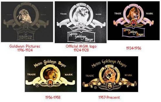
Logo Metro Goldwyn Mayer. All the same lion, but every year more colorful and brighter.
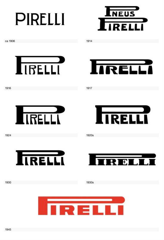
Tire manufacturer Pirelli
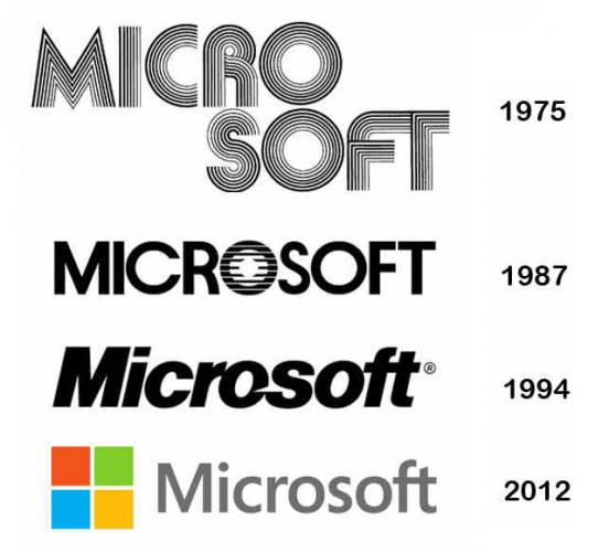
Microsoft
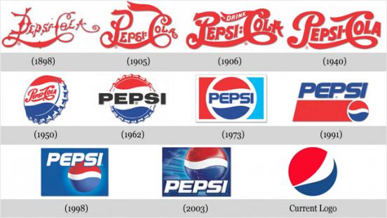
Pepsi logo has gone through a lot. It all started with ornate font, which every year becomes more legible, then the logo has turned into the cork from the bottle, and finally become what we know it now - three-color circle, symbolizing the traditional colors of Pepsi. Today's logo is very different from the classic version, and not for the better.
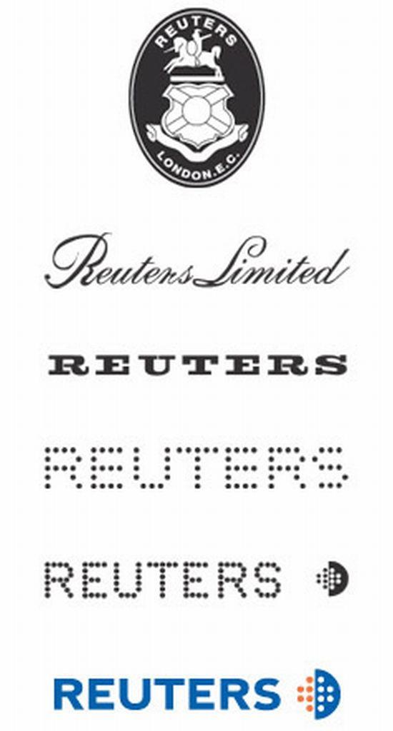
Evolution of the logo of the international news agency Reuters
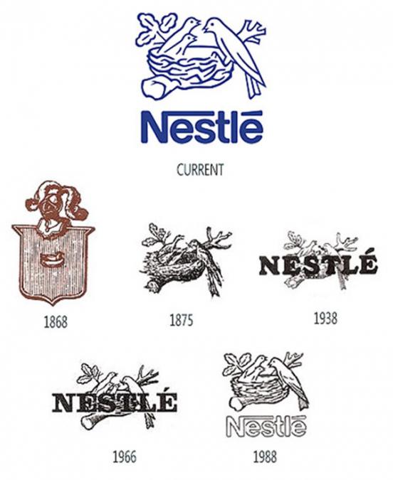
Nestle company was founded by the Swiss Henri Nestle. The first logo was a brand family coat of arms with the image of Henri bird's nest. Later, coat of arms disappeared, but with a bird's nest and three chicks left. In 1988, during the regular slot rebranding for uncertain reasons, deprived of one chick.
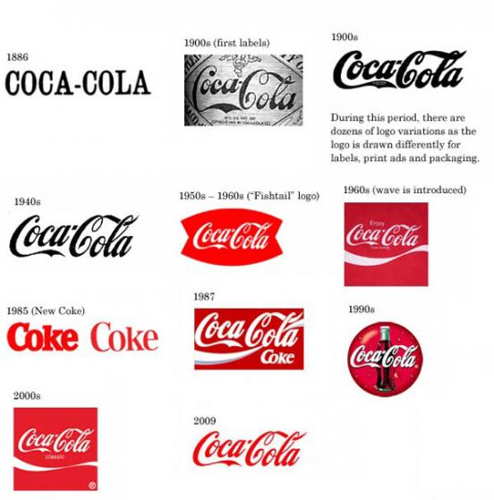
Perhaps the most famous logo in the world in the mid-40's got beautiful recognizable characters, and in the early 50s screaming in red, have been preserved to this day.
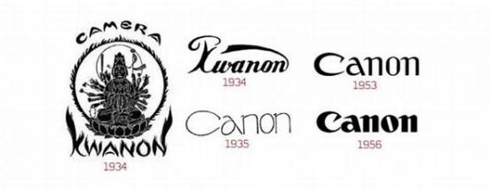
Canon
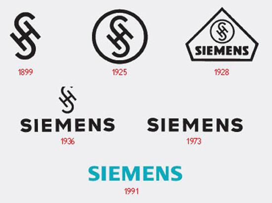
Early Siemens logo something reminded me of the Nazi swastika.
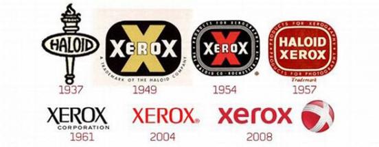
Xerox
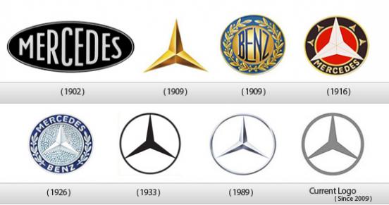
Three-beam star, designed the logo Mercedes-Benz in 1909, symbolizes success and excellence of the brand on land, in water and in the air (at the time Daimler company also produces and aircraft equipment), and also means that the car is the same convenient and safe for the driver, passengers and mechanics.

Under the name Lego was initially sold wooden handmade toys, and later, in 1947, the company started production of plastic designers, thanks to which the brand is known until now.
Logo Petroleum Corporation Shell - one of the most recognizable logos in the world. The company was named in honor of the shop, which sold among other boxes decorated with seashells. Until 1948, it was the emblem of Shell shell mussels, after - scallop shell.

The face of KFC brand was and still is its founder Harland David Sanders, better known as Colonel Sanders, who died in 1980.

McDonald's was founded in 1940 by brothers as a MacDonalds restaurant barbecue. His fate we are all well aware.

Nintendo has just been obliged to change their logo to a more understandable for Western consumers, after its video games have become popular outside of Japan.

It is strange that the first Kodak logo has become difficult to read the emblem in an Art Deco style, as creator of George Eastman sought to give their offspring a short and succinct name that would be easy to read and pronounce. Later all trademark logo became a simple and concise, it is a pity that after 130 years of domination in the global market company went bankrupt and even admitted that for many years held under its headquarters in Rochester nuclear reactor.

Lay's

Evolution logo Paramount Pictures from 1914 to the present times.

BBC

How many would not have changed the logo teleradiomagnata CBS, its logo since its foundation was an eye that sees everything.

The first Playboy emblem was not so successful, as the logo of the magazine today.

Continuing the animal theme - the logo of the World Wildlife Fund.

Concern Warner Brothers was founded by four brothers, and since its founding brand logo was a shield that only rarely changed. Sometimes beyond recognition.

I am glad that now on my phone flaunts a simple and laconic inscription Nokia, instead of this terrible fish comes from in 1966.

Over time, the Google logo has not changed.

I think many people know that its popularity Chupa Chups is obliged to Salvador Dali, this is the genius of surrealist created a logo in the shape of daisies in 1969.

Until 1986, the emblem of Reebok was the British flag, then had to change the logo of the corporation, as the British government imposed a ban on the use of national symbols for advertising purposes. In place of the flag came "vector", thanks to which the Reebok brand is known to this day.

The symbol of the Nike brand since its inception has been the emblem called «swoosh» - a word that has no specific equivalent in Russian (the closest translation for "whiz"). The logo symbolizes the wing of the Greek goddess of victory Nike, after whom is named the brand. Based on this we say the wrong name of the company and the right to be like that - "Nike».

The symbol of the coffee shop chain Starbucks is a two-tailed mermaid, and the company has borrowed its name from a novel by Herman Melville "MobiDik", named after one of the heroes of the book - Starbuck.

The browser, known to us as Firefox, originally was called Phoenix and Firebird and had its logo. Then, because of a conflict of trademarks, it was renamed to Firefox and received a logo with a picture of a red fox, embracing the planet.

One of the most famous brands in the world was created in the mid 70s. Then on the company's logo was depicted sitting under an apple tree, Isaac Newton. But the picture was too complicated, and to promote the brand needed a more laconic character. They are something, and become an apple that has become famous all over the world.

Logo Metro Goldwyn Mayer. All the same lion, but every year more colorful and brighter.

Tire manufacturer Pirelli

Microsoft

Pepsi logo has gone through a lot. It all started with ornate font, which every year becomes more legible, then the logo has turned into the cork from the bottle, and finally become what we know it now - three-color circle, symbolizing the traditional colors of Pepsi. Today's logo is very different from the classic version, and not for the better.

Evolution of the logo of the international news agency Reuters

Nestle company was founded by the Swiss Henri Nestle. The first logo was a brand family coat of arms with the image of Henri bird's nest. Later, coat of arms disappeared, but with a bird's nest and three chicks left. In 1988, during the regular slot rebranding for uncertain reasons, deprived of one chick.

Perhaps the most famous logo in the world in the mid-40's got beautiful recognizable characters, and in the early 50s screaming in red, have been preserved to this day.

Canon

Early Siemens logo something reminded me of the Nazi swastika.

Xerox

Three-beam star, designed the logo Mercedes-Benz in 1909, symbolizes success and excellence of the brand on land, in water and in the air (at the time Daimler company also produces and aircraft equipment), and also means that the car is the same convenient and safe for the driver, passengers and mechanics.