1112
Corporate logos
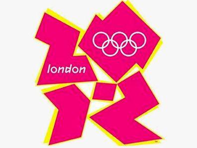
Logo - this is one of the key elements of corporate identity. That it will create in people's minds the association with your brand, so the logo should be good. However, despite the seeming simplicity of the logos - it's not so easy, and many brands do not cope with the task. The proof of this - a selection of 15 corporate logo-flops by Business Insider. London 2012
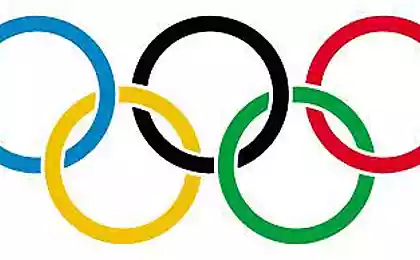
When the organizing committee of the Olympic Games in London, presented the logo to the public, whose development cost 400 000 pounds, enthusiasm, to put it mildly, was not followed. Someone thought that it depicts sexual pleasures of one of the young heroine of the animated series "The Simpsons" (Lisa). Someone dreamed modified swastika. Iranians, on the contrary, he recalled some Zionist symbol - so that even the country boycotted the Games.
Youth Commission of the Catholic Church
This logo was created in 1973 for the Catholic Church. "Given all the subsequent scandals in the molestation of minors by priests - is just uzhac" - write the authors of an article in Business Insider.

Arlington Pediatric Center
No, really, who are the people who approve such logos? Who, by the way, the logo on the site has changed, it was certainly better, but not much.

Sunrise Sushi
In fact, it's not what you think, and the sun rising over the Japanese tea house. The logo of this, however, did not prosper.

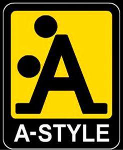
A-Style
It looks like a logo of some controlling organization. In fact, this is the logo of the Italian clothing manufacturer was created specifically - even before there was actually a product (actually, clothing). And when the image was a real virus on the Net, the company began selling T-shirts.
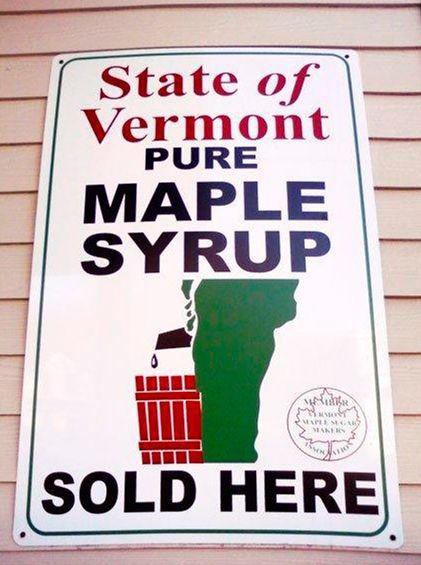
Vermont Maple Syrup
On the one hand - no one to blame that on the map of Vermont looks like someone's feet in profile. On the other - it does not mean that it is necessary to use the geographical contours of the logo.
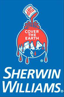
Sherwin Williams
At the time, Coca-Cola wanted to teach the world to sing. Apparently, the company Sherwin Williams would like to fill the world of blood-red paint. This sinister logo was created in 1906.
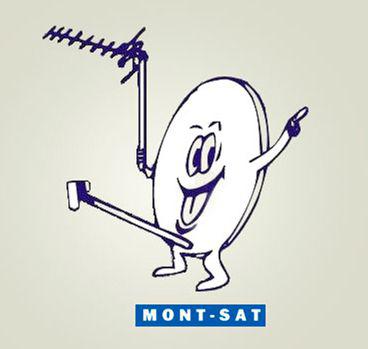
Mont-Sat
Hand on heart, even here and say nothing special. Distinguished Polish company to install satellite dishes.
Pharmacy Kudawara
Oh, those Japanese. Why they needed to beat the letter K in the name of the pharmacy in this way, it is absolutely impossible to understand.

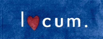
Locum
The guys from the Swedish management company Locum, apparently did not know what it means in the English word «cum». The language barrier - an insidious thing.
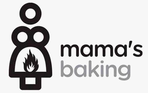
Mamochkin bakery
Just a failed Greek Cafe logo. Oedipus complex is detected.
Kids Exchange
Just "Eats, Blogs", where instead of the fateful comma missing gaps.

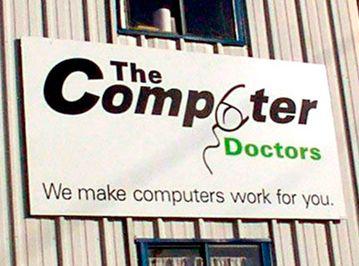
Computer Doctors
Computer Doctor - so it's a mouse. But you also thought that in the logo there something else?
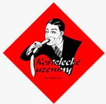
Kosteletskie sausages
Again, no comments - distinguished Czech plant Kostelecký Uzeniny. In fairness, logo throughout this story is not important - you will only see this their advertising.
Jazz dance lessons for children
There is a little more complicated than in the previous cases. To understand why this logo is extremely unfortunate, take a closer look closely to the silhouettes of dancing children.

Source: www.cossa.ru
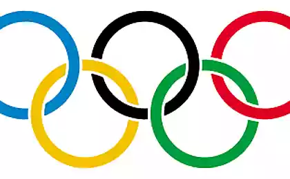
When the organizing committee of the Olympic Games in London, presented the logo to the public, whose development cost 400 000 pounds, enthusiasm, to put it mildly, was not followed. Someone thought that it depicts sexual pleasures of one of the young heroine of the animated series "The Simpsons" (Lisa). Someone dreamed modified swastika. Iranians, on the contrary, he recalled some Zionist symbol - so that even the country boycotted the Games.

Youth Commission of the Catholic Church
This logo was created in 1973 for the Catholic Church. "Given all the subsequent scandals in the molestation of minors by priests - is just uzhac" - write the authors of an article in Business Insider.

Arlington Pediatric Center
No, really, who are the people who approve such logos? Who, by the way, the logo on the site has changed, it was certainly better, but not much.

Sunrise Sushi
In fact, it's not what you think, and the sun rising over the Japanese tea house. The logo of this, however, did not prosper.

A-Style
It looks like a logo of some controlling organization. In fact, this is the logo of the Italian clothing manufacturer was created specifically - even before there was actually a product (actually, clothing). And when the image was a real virus on the Net, the company began selling T-shirts.

Vermont Maple Syrup
On the one hand - no one to blame that on the map of Vermont looks like someone's feet in profile. On the other - it does not mean that it is necessary to use the geographical contours of the logo.

Sherwin Williams
At the time, Coca-Cola wanted to teach the world to sing. Apparently, the company Sherwin Williams would like to fill the world of blood-red paint. This sinister logo was created in 1906.

Mont-Sat
Hand on heart, even here and say nothing special. Distinguished Polish company to install satellite dishes.

Pharmacy Kudawara
Oh, those Japanese. Why they needed to beat the letter K in the name of the pharmacy in this way, it is absolutely impossible to understand.

Locum
The guys from the Swedish management company Locum, apparently did not know what it means in the English word «cum». The language barrier - an insidious thing.

Mamochkin bakery
Just a failed Greek Cafe logo. Oedipus complex is detected.

Kids Exchange
Just "Eats, Blogs", where instead of the fateful comma missing gaps.

Computer Doctors
Computer Doctor - so it's a mouse. But you also thought that in the logo there something else?

Kosteletskie sausages
Again, no comments - distinguished Czech plant Kostelecký Uzeniny. In fairness, logo throughout this story is not important - you will only see this their advertising.

Jazz dance lessons for children
There is a little more complicated than in the previous cases. To understand why this logo is extremely unfortunate, take a closer look closely to the silhouettes of dancing children.

Source: www.cossa.ru