779
Top 7 most expensive and unsuccessful change of Logos
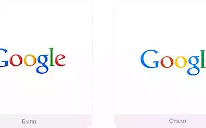
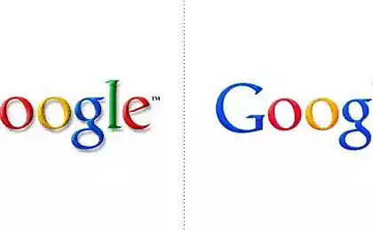
The ratio of different companies all over the world for their characters varies widely. Some do not change logos for decades. Others, on the contrary, redraws them almost every year. Take, for Google. It seems that only last spring reworked its search engine logo as it is today again suddenly decided to experiment. Now the company's emblem looks like.
Guide Google changes remained fairly "This update is especially important, because it reflects our philosophy and a variety of services", -. According to the press service of
. However, not all well-known companies so lucky with the upgrade of its emblems. We have compiled for you a few examples of the most expensive and not very successful transformations known logos.
< Pepsi
Cost - $ 1 million
PepsiCo company several times changed the logo "Pepsi" popular beverage Throughout its history. The last transformation occurred in 2008. However, in Russia a new sign began to be used only in 2014 - one of the last
. Initially, the new logo creators repelled by the idea of replacing the white waves on the kind of smile. The output will get the same wave, only slightly sagging and presented from a different angle.
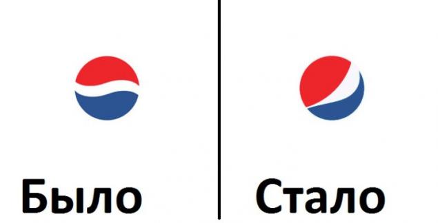
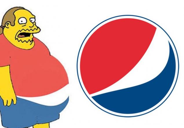
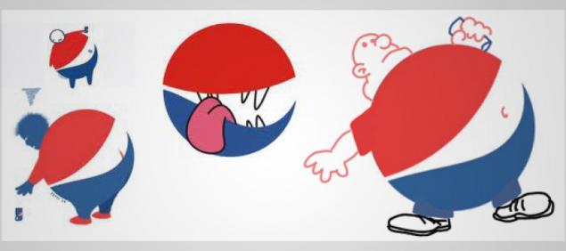
Consumers have met a new logo without much enthusiasm. In the first months of Internet zapestril numerous parodies of the new sign of the product. Here are some of the most popular.
Tropicana
Cost - $ 137 million
Drink Pepsi - is not the only thing over which designers have experimented PepsiCo. Not so long ago undergone alteration appearance of another company's product - Tropicana juices. The familiar orange with a plastic tube designers replaced with transparent glass cup with juice. A very Tropicana inscription placed side - in inconspicuous place
.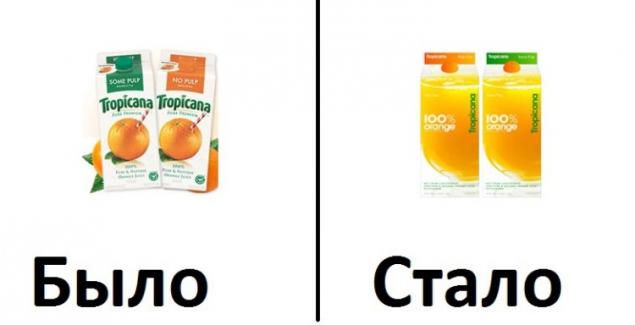
As is the case with the "smile» Pepsi consumers innovation is not appreciated. Already in the first months after the redesign juice sales fell 20%. The result of the failed conversion was the return to the good old orange with a straw.
< British Petroleum
The cost - 211 million dollars
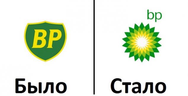
Green shield with a yellow border, and the letters «BP» served British Petroleum British energy company as a logo for 70 years. In the early 2000s management of the organization to reflect on the changes. The designers were tasked to create a logo that would reflect the new image of BP - not just oil, but energy companies
. As a result, the new symbol of British Petroleum was the "sun-flower", supposedly giving credit to the sun god Helios from Greek mythology. However, not everyone appreciated the positive message of the company. For example, environmentalists from international organizations have accused BP of hypocrisy and said that the new logo does not reflect what is actually involved in the company.
GAP
Cost - $ 100 million
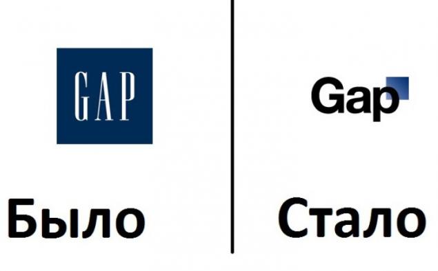
Before Christmas 2010, GAP company management - the largest US clothing retailer - suddenly decided to change the logo, which served the company faithfully for over 20 years
. Simple blue square with «GAP» white lettering replaced. The new logo was a derived black on a white background the word «GAP» with a blue square in the corner. However, consumers did not appreciate innovation. The Internet company bombarded by negative feedback, and leadership was forced to admit defeat. In its official statement, the retailer said it had made a mistake and had to return to the old, familiar to all logo. money back, of course, could not be spent on the creation of a new mark.
BBC
Price - 1, 8 million dollars
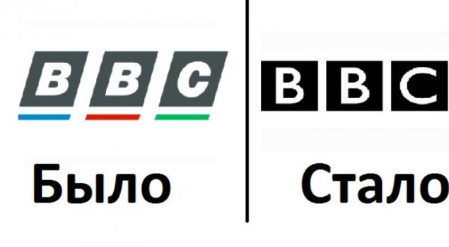
British Broadcasting Corporation BBC in its history logo changed five times. The last transformation occurred in 1997. Old mark, representing a three slanted letters with colored dashes, turned into a two-tone. Letters straightened and bars disappeared. New minimalistic design failed to impress the audience, too insignificant viewers seemed to change. However, to abandon strict logos, functioning to this day, the corporation did not.
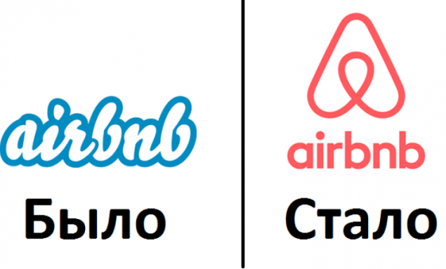
< Airbnb
Cost - unknown
The cost of developing a new logo of the popular online guide service on Airbnb rental housing keeps a secret. However, we know that over its production in the works as many as 50 designers for as much as 12 months.
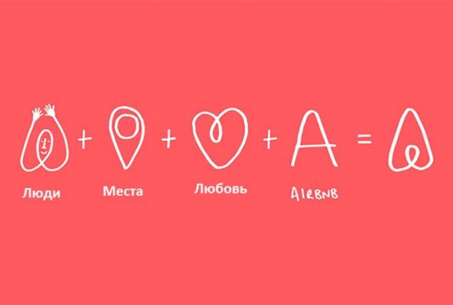
A year of hard work professionals turned blue lettering, made fancy font, formulated with a simple inscription and ambiguous squiggles. The latter, incidentally, provoked a big scandal.
Users of the service and simply indifferent observers have accused the company of using "vulgar signs" in its new logo. The fact that too impressionable audiences could see nothing in the composition as human genitalia. And some users from Russia and all logos compared with the known pattern of Russian President Vladimir Putin, "Cat. Rear View ", which he painted during his visit to Kurgan №7 school in 2013.
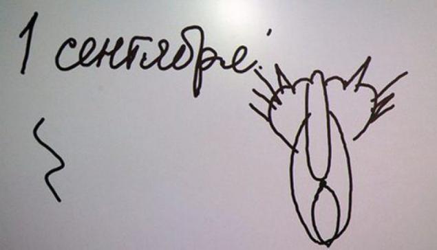
As a result, the company on Twitter poured angry and mocking message, logo poured mud. Social networks have become a total parody of the logo originality varying degrees. The company's management met with a barrage of criticism calmly. Online service is available explained the meaning of the new logo.
Moscow Metro
Cost - 1 ruble
In Russia, the most notable story of this kind in recent years was the transformation of the logo of the Moscow Metro. Creation date of the letter "M" is engaged in the design studio Art Lebedev. The new logo was presented to the public September 9, 2014.
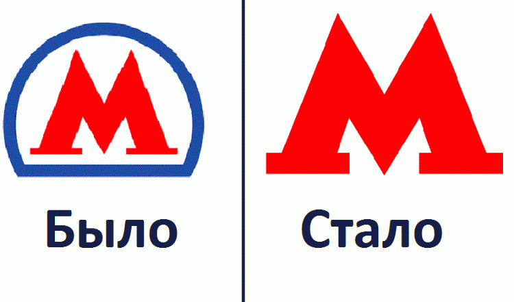
Before the development of the concept of a new logo, according to the City Department of Transportation, conducted a poll among Muscovites, who agreed that the main thing in a sign of Moscow subway - is the letter "M»
. Talking about the originality and significance of the new sign in the transport department said that it "reflects the interconnectedness of all modes of transport and reminds the point icon on the mobile map».
< 232 million or 1 ruble
However, to trace the relationship and grasp the subtle sense of a new logo could not all simple residents of the capital. But Muscovites did not disregard the value of innovation. In the first days after the demonstration logo information appeared in the media that a project has been allocated 232 million rubles.
However, later in the City Hall said that the sum was put not only to redraw the red letters, and "to improve the image of public transport of the capital." According to officials, the very "M" designers have drawn for the symbolic price of 1 ruble.
Loading ... Loading ...
Liked? Share with your friends!
Loading ... Loading ...

Guide Google changes remained fairly "This update is especially important, because it reflects our philosophy and a variety of services", -. According to the press service of
. However, not all well-known companies so lucky with the upgrade of its emblems. We have compiled for you a few examples of the most expensive and not very successful transformations known logos.
< Pepsi
Cost - $ 1 million
PepsiCo company several times changed the logo "Pepsi" popular beverage Throughout its history. The last transformation occurred in 2008. However, in Russia a new sign began to be used only in 2014 - one of the last
. Initially, the new logo creators repelled by the idea of replacing the white waves on the kind of smile. The output will get the same wave, only slightly sagging and presented from a different angle.

Consumers have met a new logo without much enthusiasm. In the first months of Internet zapestril numerous parodies of the new sign of the product. Here are some of the most popular.


Tropicana
Cost - $ 137 million
Drink Pepsi - is not the only thing over which designers have experimented PepsiCo. Not so long ago undergone alteration appearance of another company's product - Tropicana juices. The familiar orange with a plastic tube designers replaced with transparent glass cup with juice. A very Tropicana inscription placed side - in inconspicuous place
.

As is the case with the "smile» Pepsi consumers innovation is not appreciated. Already in the first months after the redesign juice sales fell 20%. The result of the failed conversion was the return to the good old orange with a straw.
< British Petroleum
The cost - 211 million dollars

Green shield with a yellow border, and the letters «BP» served British Petroleum British energy company as a logo for 70 years. In the early 2000s management of the organization to reflect on the changes. The designers were tasked to create a logo that would reflect the new image of BP - not just oil, but energy companies
. As a result, the new symbol of British Petroleum was the "sun-flower", supposedly giving credit to the sun god Helios from Greek mythology. However, not everyone appreciated the positive message of the company. For example, environmentalists from international organizations have accused BP of hypocrisy and said that the new logo does not reflect what is actually involved in the company.

GAP
Cost - $ 100 million

Before Christmas 2010, GAP company management - the largest US clothing retailer - suddenly decided to change the logo, which served the company faithfully for over 20 years
. Simple blue square with «GAP» white lettering replaced. The new logo was a derived black on a white background the word «GAP» with a blue square in the corner. However, consumers did not appreciate innovation. The Internet company bombarded by negative feedback, and leadership was forced to admit defeat. In its official statement, the retailer said it had made a mistake and had to return to the old, familiar to all logo. money back, of course, could not be spent on the creation of a new mark.
BBC
Price - 1, 8 million dollars

British Broadcasting Corporation BBC in its history logo changed five times. The last transformation occurred in 1997. Old mark, representing a three slanted letters with colored dashes, turned into a two-tone. Letters straightened and bars disappeared. New minimalistic design failed to impress the audience, too insignificant viewers seemed to change. However, to abandon strict logos, functioning to this day, the corporation did not.
< Airbnb
Cost - unknown
The cost of developing a new logo of the popular online guide service on Airbnb rental housing keeps a secret. However, we know that over its production in the works as many as 50 designers for as much as 12 months.
A year of hard work professionals turned blue lettering, made fancy font, formulated with a simple inscription and ambiguous squiggles. The latter, incidentally, provoked a big scandal.

Users of the service and simply indifferent observers have accused the company of using "vulgar signs" in its new logo. The fact that too impressionable audiences could see nothing in the composition as human genitalia. And some users from Russia and all logos compared with the known pattern of Russian President Vladimir Putin, "Cat. Rear View ", which he painted during his visit to Kurgan №7 school in 2013.

As a result, the company on Twitter poured angry and mocking message, logo poured mud. Social networks have become a total parody of the logo originality varying degrees. The company's management met with a barrage of criticism calmly. Online service is available explained the meaning of the new logo.

Moscow Metro
Cost - 1 ruble
In Russia, the most notable story of this kind in recent years was the transformation of the logo of the Moscow Metro. Creation date of the letter "M" is engaged in the design studio Art Lebedev. The new logo was presented to the public September 9, 2014.

Before the development of the concept of a new logo, according to the City Department of Transportation, conducted a poll among Muscovites, who agreed that the main thing in a sign of Moscow subway - is the letter "M»
. Talking about the originality and significance of the new sign in the transport department said that it "reflects the interconnectedness of all modes of transport and reminds the point icon on the mobile map».
< 232 million or 1 ruble
However, to trace the relationship and grasp the subtle sense of a new logo could not all simple residents of the capital. But Muscovites did not disregard the value of innovation. In the first days after the demonstration logo information appeared in the media that a project has been allocated 232 million rubles.
However, later in the City Hall said that the sum was put not only to redraw the red letters, and "to improve the image of public transport of the capital." According to officials, the very "M" designers have drawn for the symbolic price of 1 ruble.
Loading ... Loading ...
Liked? Share with your friends!
Loading ... Loading ...


Under the knife of the stars: what they are going fans to be like their idols
You will be surprised! 3 magic tricks with your body