Semishagovy test logo Paul Rand
While the dancer can ask yourself, "I wonder what Michael Jackson would think of my dance moves?" Or boxer can ask yourself, "I wonder what Muhammad Ali would have thought of my right Hook?", The designer will wonder: "What Paul Rand would think about my logo? »
By the end of the reading, you'll know exactly approve or disapprove Paul Rand to your logo.
Legend h4> 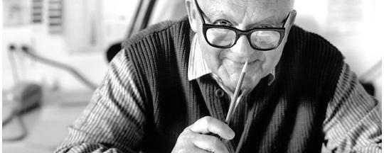
Paul Rand - an American art director and designer, best known for his corporate logo, including the logos for IBM, UPS, Enron, Morningstar, Inc., Westinghouse, ABC and NeXT-and Steve Jobs.
In fact, when Steve Jobs has hired Paul Rand to design the logo NeXT Computers, he hired him for 100 000 Jobs was unpleasantly surprised when Rand said that he would submit only one option.
Steve Jobs asked him if he wanted to come up with a few options, and Rand replied, "No, I will solve the problem for you, and you'll pay me. You do not have to use my decision. If you need other options - refer to other people ».
Rand came up with a detailed 100-page booklet brand, including the precise angle used for the logo (28 °) and a new company name - NeXT.
The fundamental criteria for this test is based on a logo that said Paul Rand, changing the world of logo design:

The main role of the logo is to identify and easy of its value. Its effectiveness depends on the distinctive features of visibility, adaptability, memorability, universality and eternity. Blockquote> Semishagovy test Rand Paul uses these attributes to assess the logo. The sequence of steps is as follows:
1. This is different?
2. It can be seen?
3. It is adaptive?
4. This memorability?
5. It is universally?
6. It is forever?
7. Once you have answered "yes" to all the questions above, ask the last question: This is just? B>
For each step, except the last, evaluations are on a scale from 1 to 10. For simplicity, the last step Grades 1 to 15. It is mathematically gives weight to the fact that the logo is the most important. The score of 75 is perfect, and anything below 60 - rejected.
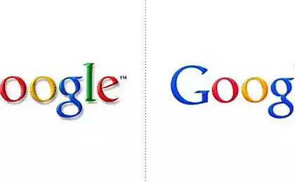
guinea pigs h4> The best way to see how this algorithm - to use an example. Let's use the old logo Bing (Internet search engine Microsoft).

Logo Bing was abolished and updated in September 2013, for obvious reasons. Let's apply the 7 steps to this logo, to find out why.
1. This is different? H4> Distinctiveness is unique and unlike anything else. What stands out in the crowd and it is difficult to confuse with anything else.
In our example, Bing uses a logo of a young, normal blue color - 80% of all logos are blue. Printing requires openness and breadth - it's good for the search engine, but he is an ordinary and flat and it will not work if they want to stand out as a competitor to Google.
Art elements in addition to the inscriptions not therefore make sense to transfer a lot of load is only a word. But there is nothing unique inscription. Yes, extensive letters use a lot of white space, but the characters appear to be fused, especially around the base of «i»
Loop «g» suddenly cut off, and the letter seems cold and incomplete.
If the eye «g» (a small serving feature at the top right) was thinner, it would look like the head of a bald man with wild hair sticking out, which makes me think of the age.
3/10
2. This can be seen? H4> Visible - means a significant or one that is easy to see. Due to the fact that the logo takes a generous amount of space, its high visibility. However, most of the designers are beginning to develop the logo in the black and white for optimal viewing regardless of the color. But deep yellow dot the «i» is lost when the logo becomes black and white - is lost to ensure personal, intimate touching «i». Always make sure that your logo looks good in black and white.
6/10
3. It is adaptive? H4> Adaptability means the ability to serve for various applications - T-shirt, a cup, the Internet, a truck on a road sign. You get the idea.
In our example, Bing logo embedded in the white space enough to look identifiable almost everywhere. The only argument against is that he will have problems with the incorporation of the square, or in any case where the required vertical harmony. Text roughly scaled horizontally, leaving no alternative to enter the square, such as a favicon, or a mobile application icon. Perhaps insulation «b» will work in the square, but it will also further reduce its distinctiveness because «b» - is bleak.
5/10
4. It memorability? H4> The purpose of the logo - to be unforgettable - that person feels the need for your business, your logo immediately come to mind. You can check it out Word Association
Here's what I got, respectively: beer, chips and a car. There are logos that use the word "beer", "chips" and "car"? No. They do not need it, because it is easily recognizable and memorable logos.
In this example, I did not get a "search engine", looking at the logo Bing. It is interesting to see how they fixed it with a new logo Bing, which we will discuss in a minute.
Plane Bing logo and lack of emotion make it difficult to remember.
2/10. B>
5. It is universally? H4> Universal logo carries the same value for a wide range of people. This is probably the hardest part in creating a logo, because everyone is different. As big global brands do?
Google uses color.
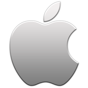
Apple uses the worldwide distribution of fruit and a neutral color.
Note:
As the search engine Bing logo had to demonstrate the power and complexity, but not at the cost of accessibility (everyone should feel comfortable using search engines). Design performs availability through easy, but does not report the reliability and depth of knowledge.
4/10
6. It forever? H4> The basic principles to keep in mind, creating an eternal logo - not to use the "hot" colors, "luxury" fonts or "cool" style. Fads change like the weather, but the sun always rises, and the sky is always blue. We find strong core of its design and cut the superfluous decoration. Minimalism - is an art to say more, say less.
Obsolete Bing logo good avoid bad taste and short-term shine, but over the top of the circle.
6/10
7. Question - The Holy Grail: It's just? H4> Paul Rand said , that logo should personify minimalism.
«logo can not survive if it is not designed with the utmost simplicity and restraint». Blockquote> The first 6 steps of the test Paul Rand's logo includes creating and adding to the outstanding qualities in your design, so it was a unique, durable, memorable etc. But this last step is to reduce discarding and unnecessary details, to present a clean and playful end product.
Here are two practical steps you can take to make sure that your logo is designed with simplicity:
Reduce it, and then sharply increase. The look and design of a strong logo will clear and pleasant, regardless of its size. Draw it by hand for ten seconds with a pencil. If you can easily do it, you have a simple logo.
The company valued at 15 billion. Dollars identified as a whole "tick" that says victory, sports shoes and a Greek goddess. Many consider him the greatest of all time logo.
Bing logo a little bit behind in this area. While he loses, without offering something startling or outstanding, it does provide a simple essence. But beware: over-simplicity can be met as a mindless and boring! B>
To find a balance between intuitive and simple logo and mindlessly boring, examines the history of the brand and work backwards from there. Who are the main characters? What are their strengths? What they have overcome the conflict? In what looks like a happy ending? Project the image of these concepts, and then start cutting it until you reach the main elements.
10/15
Total h4> To sum up points for the logo Bing, we get:
1. The distinctive 3
2. Visibility 6
3. Adaptability 5
4. Memorable 2
5. Versatility 4
6. Eternity 6
7. Easy (15) 10
Total: 36
36 explains why Microsoft put up with the release it to the public - it was enough decency to work, but not strong enough to live long.
The new logo Bing h4> In September 2013, Microsoft introduced a new logo Bing with significant improvements.

A couple of notes about what was done correctly in this logo:
Loop «g» like a smile (something that goes beyond cultural barriers) Add a strikingly bold symbol font allows to relax and breathe. In the new logo has subtleties (eg, the top bevel "b") based on the истории with a spotlight . Test logo Paul Rand can be applied to any logo. You saw how it was applied to the logo Bing. Now it's your turn to try it out and count their points. You have a strong logo or weak?
Source: habrahabr.ru/post/260219/