An effective logo design, part 3: the influence of geometry on the design of logos
Galileo knew about it. All ancient civilizations have left traces in the culture, knew it. Simple shapes are the basis of the geometry of the universe. People invented a lot of things, but did not come up with simpler forms us. We opened them, watching nature. Understand basic shapes and their functions has taught us orientation in space and time, inspired by the mathematics, technology, and the evolution of languages.
the universe can not be read until we have learned the language in which it was written. It is written in the language of mathematics, and its characters - triangles, circles and other geometric figures, without which man can not understand a single word.
- Galileo Galilei blockquote>Geometric Tools h4>

A set of simple forms used in the art of all cultures: the circle intersecting the line, triangle, square and a spiral. Cultural anthropologist Angela Arjen studied and recorded the common features arts for several decades and has found repetitive forms used in all kinds of art. She called them "five universal forms».

Each of the main forms has its own function, it combines form and purpose. The terms of freely rolling lines traveling to and intersect the triangle is reliable and indicates by itself, necessarily stable quadrilateral spiral curls with an elegant persistence. Do not let the simplicity of the forms to deceive themselves. They are so simple, and that is why they are scaled and used as the building blocks that make up the nature and the world created by human hands. And they are used to transmit messages to logos.
A bit of geometry h4> The purpose of the logo - to convey something to the client the most simple, yet comprehensive way. Simple shapes talk about the basic properties of the organization direct way, and are used in all types of design - graphics, interior, landscape, food, industrial and architectural.
For me, none of childhood experiences has not brought such confidence in their own research capabilities, as geometry.
- Richard Buckminster Fuller blockquote> Our senses are treated with a huge amount of information. And only a small part of her mind noticed, because the brain can not process an endless stream generated by the outside world. Due to the amount of information to digest most of it unconsciously.
Digital technology taken from us tactile sensations. But touching play an important role in knowledge of the world throughout history. Traditional drawing tools keep us in touch with the tangible world. So sometimes draw, spend time in nature without a specific purpose, experiment with geometry by hand to your development are multifaceted in nature and elegant in appearance. As reported by the geometry of the truth about the universe and how it works, and a designer who understands the basic forms of work can make subtle and at the same time strengthening the firm logo, to better transmit their message.

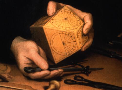
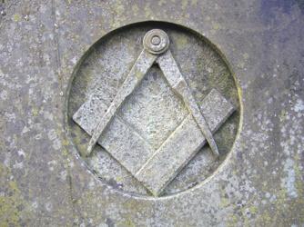
Basic geometry tools as simple as the forms they create. Compasses, pencil and ruler - all you need to create different geometric shapes.
Forms describe the functions that do not change depending on their size. In addition, the order of construction is similar to the order form of multidimensional space. Zero, one, two, three or four dimensions are also known as degree of freedom. Degrees of freedom is expressed gradual increase independence from the lower to the higher dimensions, starting with zero dimension, which corresponds to the circle.
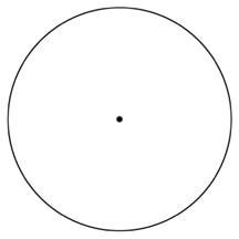
Circle: zero measurement h4> Geometry begins with the center, the source of an inclusive circle. The simple point is also a zero measurement. In the physical sense, a point represents the point in space, so it does not have freedom - or zero degrees of freedom. Starting point in which we set the compass, creates a circle that represents a form sufficiently independent to constantly roll and rotate in the physical world. It has no restrictions angular forms (although angles have their functions).

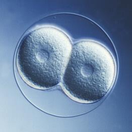
Circle - is the mother of all the pieces, since it is the archetype from which the rest of the drawn geometry. In nature, everything is the same: life begins in the form of a single cell or seed. The basic principle of the circle - the container that protects, supports, and gives life. It allows him to scale from tiny organisms and cells to the size of the planet that supports different kinds of life.

In geometry, the circle starts out as a simple point, surrounded by an infinite number of points, united in a circle. As the fertilized egg contains everything needed to create a living organism, and in the circle contains all the possibilities.
The logo means a lot of parts of a circle or individuals who will form a whole. The circle represents the uniting groups - groups, non-profit, global organizations and government agencies.

Logos: The Dallas Opera, PBS and AgriCultura i>
The Dallas Opera, PBS and AgriCultura - examples of circular patterns used in the logo for the transmission of basic information about the client. "O" in the logo Dallas Opera is one of the two capital letters in the title and at the same time is a template covering representing a diverse group of musicians that make up the organization. The style of the logo emphasizes grace and then music. The circle surrounding the PBS, covers the entire demographic group (denoted by repetitive images of the head), which is designed to broadcast companies. A hand and a sheet representing a network of farmers, the company AgriCultura, included in the terms describing their common goal.
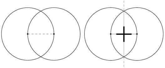
line: one dimension h4> The egg should be divided to become multicellular organisms, and the circle must be cloned to create the following geometric shapes. Placing the needle of a compass on the outer edge of the circle and drew the second round of the same diameter, we will copy the first. We will be able to combine their two together and push the center point to the line. The line can only move in one direction, forward or backward, and therefore it is only one degree of freedom.

And at the intersection of two circles is born another form. The second line connects the overlapping circles and intersects the first at an angle of 90 °. When two opposites come together they create a connection.

Intersecting at right angles in logos elements are opposites working together. The strength of the symbolism extends this concept, and this configuration can be useful to represent the association or joint efforts between the two different objectives.
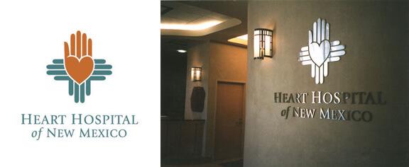
Crossing the line in the logo Hospital Heart Hospital of New Mexico support its purpose, which is to treat patients, balancing between life and death, and complements the more specific messages transmitted by design.

Historically, hospital intersecting line used as the basis of the logo. At the level of symbols, these institutions are at the crossroads of life and death. I used the historical symbol of the Sun, used by the Indians of Zia, who is depicted on the flag of New Mexico, and added heart and hand to complete the concept of the hospital.
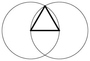
Transmit the idea of complementary opposites can also almond core from two overlapping circles. This form is called a vesica piscis (fish bladder) or mandorla and is a byproduct of the geometric process, which is used to build the connection between the two points.

Triangle: two dimensions h4> Once the point has become a line, you can take the next step, to construct a triangle. Two degrees of freedom - it is much more than one. A closed flat space gives the opportunity to move on two axes inside, not only forward and backward.

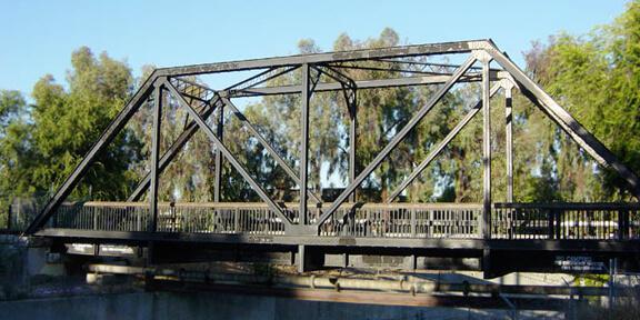
Triangle - a safe figure as he stands on the basis of, or combined with overturned copies. It is often used as a basis for structural support of buildings and bridges, or as part of the border in art. It is a form of geodesic domes, truss bridge, arched doorways (triangle with an arch at the top), and the shape of the pelvic bones, which allows people to walk on two legs.

Triangle puts a solid foundation in the point. From a philosophical point of view, he stands firmly on the ground and points to something invisible. It is obvious why the triangle is used as arrows - it leads from one thing toward the other. Because of this triangle is often used as a symbol of inspiration and aspiration. Top of the mountain - a metaphor for inspiration.

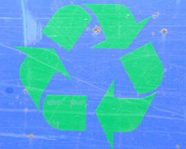
Recycling - the action in three parts. The coming into the world, the existence and then folding to a next target. Simply put, the triangle - a metaphor for the birth, life and death, or the beginning, middle and end. Recycling symbol expresses the sequence in the simplest way - triangular arrow covers three of the triangle.
Also, the triangle - the symbol of transformation, a mediator between the one-dimensional and three-dimensional space. All words starting with tri- or trans- («through» in Latin) refers to the force of the triangle and the safe space that allows you to make major changes or a certain movement. Life begins with a zero measurement of the single-celled egg. Then it is divided and converted into a multicellular embryo inside the safe triangle pelvis (the metaphor of the two measurements). After that it becomes a more complex three-dimensional form. Then life begins to go - and that's a metaphor for the four dimensions.

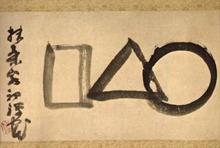
Calligraphy 19th-century Japanese Zen master Sengay Gibbon called "Universe", literally translated as "circle, triangle, square." The painting shows a universal process of separation and transformation of the whole - the process is read from right to left, as is customary in traditional Asian style.
Triangle built into the logo, can symbolize look outward, inspiration, a major change or movement. Note that many automakers include a triangle or three elements to describe their products.
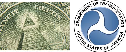
The triangle at the top of the unfinished pyramid on the dollar bill symbolize the hope inspired by the new country's security and the transformation of the past into a better future. Trёhnogy symbol in the logo of the Ministry of Transport refers to the ancient symbol triskelion, designating perpetual motion. The logo is also used and the circle, symbolizing the organization responsible for the movement in the whole country. Geometric symbols are simple, so you can use them together, increasing the value of the logo.

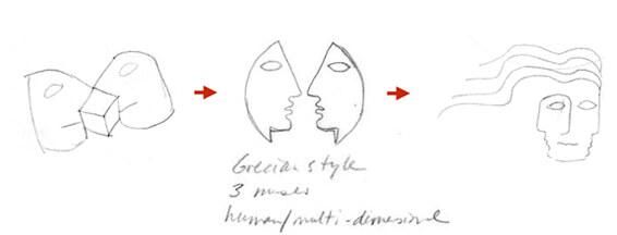
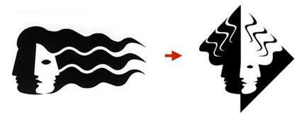
Designing a logo for MuSE (Multi-User Synthetic Environment, multiplayer artificial environment), I wanted to show the purpose of the client - the interpretation of the raw data in a clear visual format. For example, the surgeon to view the MRI image to get to a brain tumor; the program must pass a lot of tests, so as not to accidentally launch a rocket due to a lightning strike.


The logo used by the mythical muses. The triangular shape represents the transformation of numerical data into something more; Three shadow facial contours indicate the quality or depth, to visualize in two dimensions.
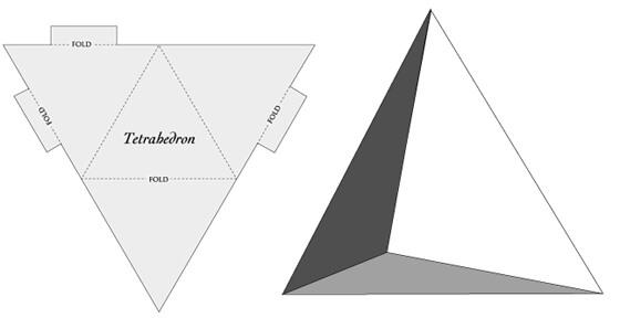
four-figure: three dimensions h4> The squares and rectangles - the least interesting of all the main forms, but they benefit. Adding a fourth point, the depth, creates a tetrahedron, or pyramid, with the axis z, u takes us into the three-dimensional world. We use the symbol of the quadripartite form to describe the four points of three-dimensional space, or three degrees of freedom.

The shape with four points represents stability. In nature, it occurs infrequently, but in the man-made things is the city's neighborhoods, parks, squares, buildings, building materials (bricks, tiles), windows, screens and paintings within. Even paper money unconsciously transmit value through a form. Historically, coins made of precious metals and their value can be determined by weighing. The cost of paper money vary quite strongly, because it depends on the market that can be manipulated.
Quadrilateral is a real, real world. It is rectangular, fortified and stable. This form is simple and boxy, and using its logos indicate that the client - direct and straightforward. Banks, lawyers, insurance and accounting firms, contractors often use this pattern to represent them as stable and reliable.

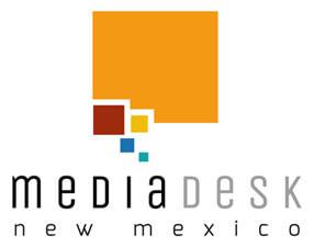
MediaDesk NM provides non-profit organizations access to communications services, so that they can concentrate on work with their communities. The visual elements were suggested title - media, desk (table), and New Mexico. Tables quadrangular shape New Mexico looks like a quadrangle. Small squares with large symbolize speech communication. Also, small squares represent the individual non-profit organizations that contribute to the overall stability.
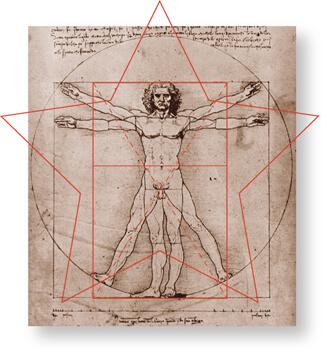
five-pointed star and its related form of spiral: the five degrees of freedom h4> The five points - the basis for the five-pointed stars and pentagons. Stars represent perfection: five-star restaurants, hotels and flags come to mind, as well as movie stars. In the human body the number five occurs several times - five processes of the body, the five fingers on his hands to use tools, five toes to move, the five basic senses.

If you have to look for food in nature, remember that fruits grown from the Five-Petalled inflorescences (apricots and pears) or a spiral of flowers (wild rose Vitamin C) is usually nutritious. But the six-petalled blossoms usually poisonous or have a medical application (poison and medicine - is the same in different proportions). Apples, cherries, peaches, pumpkins - all these flowers have five petals.

As food for the body is extremely important, it is not surprising that the five-pointed star represents the best of the best. Brands Converse and Starbucks - known examples of logos, using the stars as one of the elements that define themselves as the best. Stars rarely used in the works of culture, but they are strongly associated with spirals, which are much more common.
Stars like spirals and spirals like the stars h4> Star can be used as a template for the helix, one of the universal forms. A few turns of the triangular shoulder stars can be scaled to smaller and smaller dimensions, and their contours will draw a spiral. The ability of this form of spin and infinitely increase or decrease refers to the principle of regeneration.

The spiral represents the cyclicity of time in space, it is constantly repeated in the same time changes with each rotation. This is the fourth dimension, time and space.
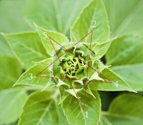
In nature, the five-pointed star and spiral also intertwined. They can be seen in sunflower. When viewed from above, the stars can be seen from the way the leaves grow plants, but the profile of these leaves are spirally around the stem. These two aspects work together to provide the best access to solar energy - so the shadows are minimized, as well as the flow of rainwater is routed directly to the roots.

Customers involved in creative activities and organizations that specialize in futurology and creative thinking well with this form.
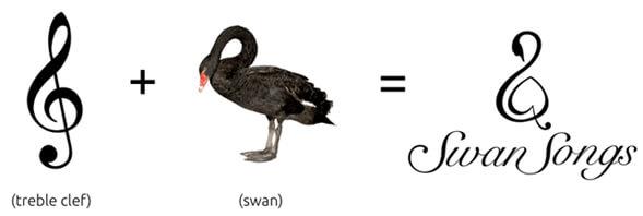
Swan Songs (Swan Song) - a non-profit collective of musicians who play for terminally ill people, and I knew immediately that the treble clef would include a form of a swan. The client chose an appropriate name, and I joined the swan, and music properties.

This logo not only includes the visual characteristics of the organization, but also with the help of the spiral denotes infinity - a metaphor for the existence of the eternal circle of life and regeneration. This logo conveys calming and positive attitude of his audience, and complements the lack of commercial benefits.
Conclusion h4> Who would have thought that a simple geometry contains such depth and such importance? It is very effective if it thoughtfully included in the logo. Geometric figures themselves have too many values to be alone logo, but universal values can support the general idea of the logo, which he must pass. Add a combination of symbols, metaphors and natural patterns - and your simple and elegant logo can convey a lot of information to his audience, and will be deposited in the memory.
Source: habrahabr.ru/post/262121/
