724
The design is still for the people: Alternative rebranding Railways
As you know, the world does not change by itself, if you have something does not suit, it's time to take and make their own way. Equitable principles "rejecting - offer" applied Oleg Lukyanov, the art director of "layout via copy and COPY», as part of a rebranding of an alternative Russian Railways to the British Higher School of Design. B>
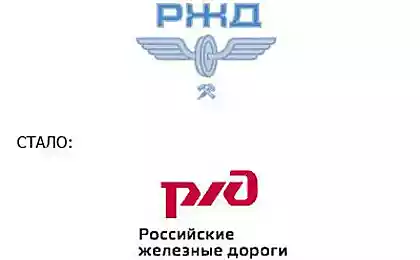
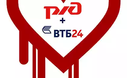
"Today, all the major brands of the Russian state unfriendly to its primary audience - that is, to us, a simple mail users, railway or public transport. New rebranding Railways is the only confirms in my opinion, an unreadable Cyrillic logo-puzzle international company emphasizes Railways disrespect to their own passengers. Why not create an alternative - a dynamic style of visual communication, talking to a customer in his own language and clear drifting all the necessary information? I think a half billion passengers per year deserve such an attitude to itself "- says Oleg Lukyanov.
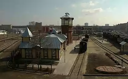
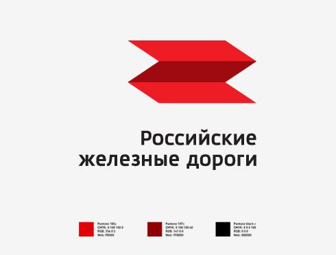
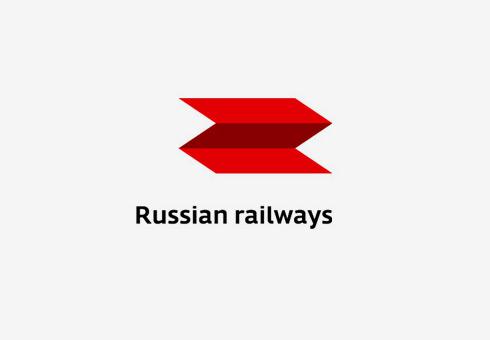
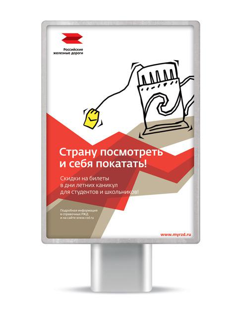
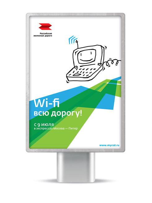
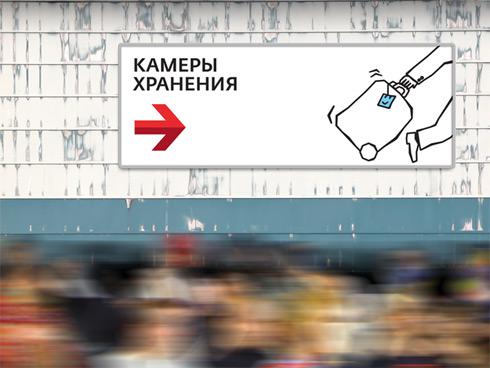
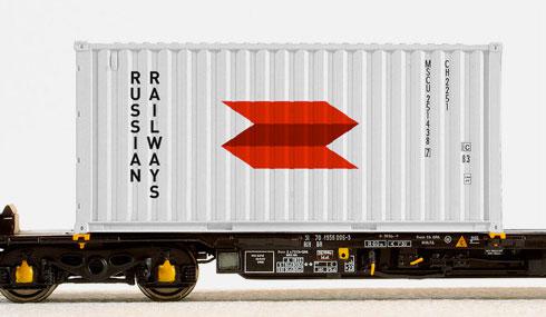
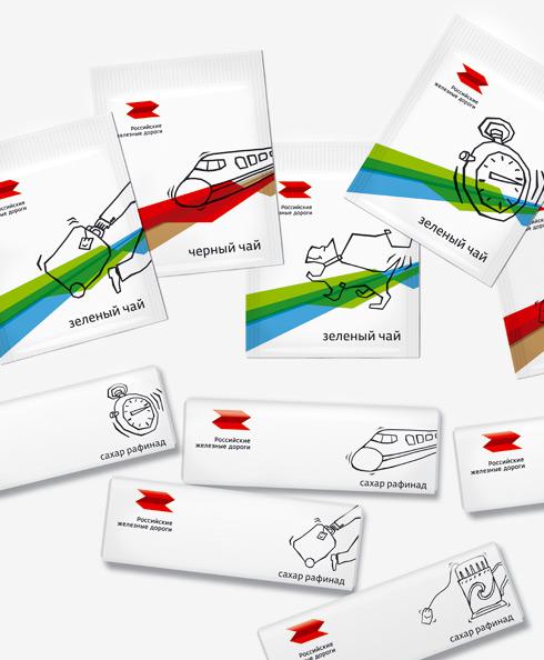
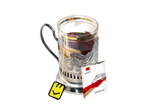
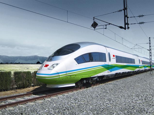
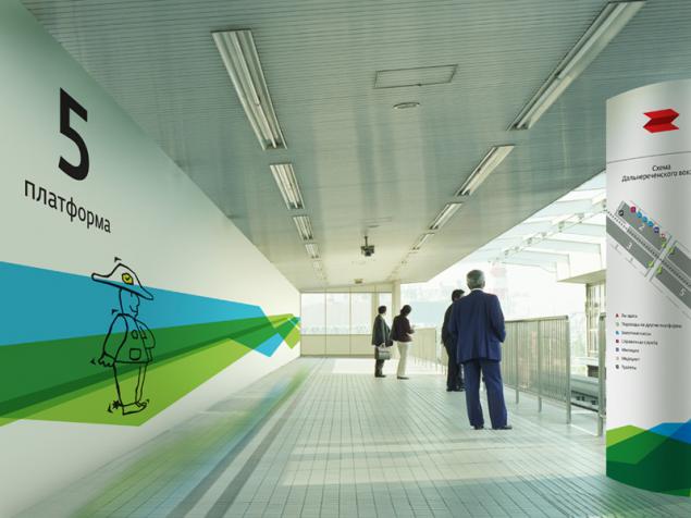
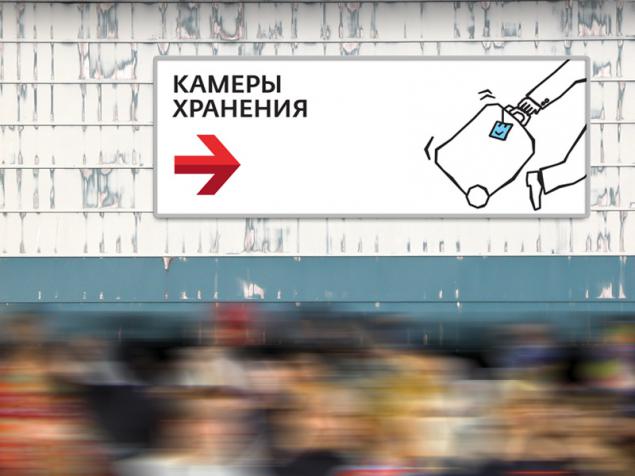
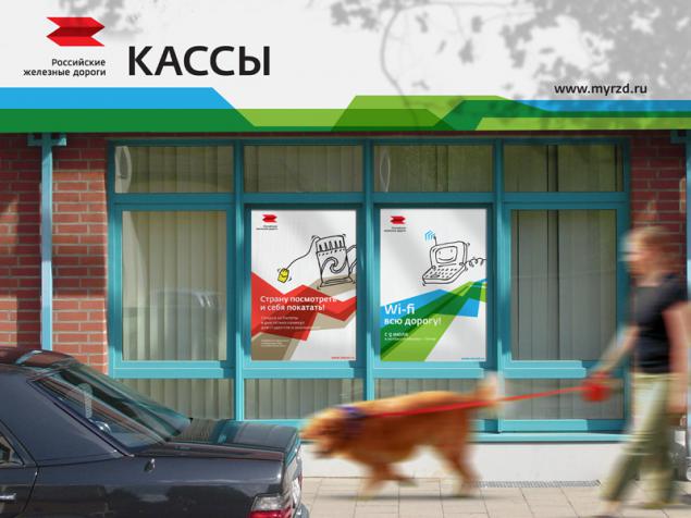
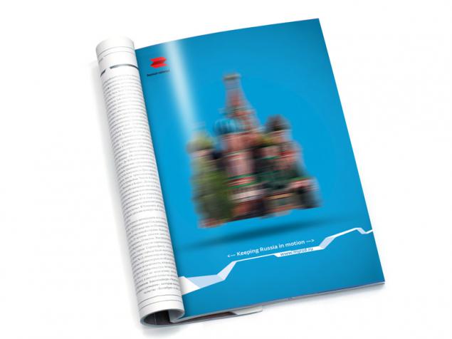
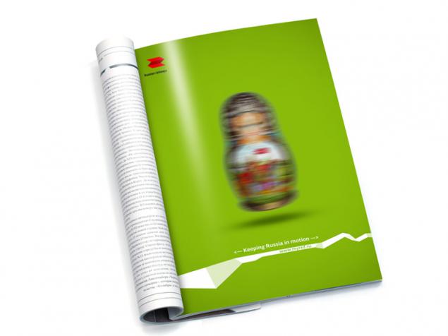
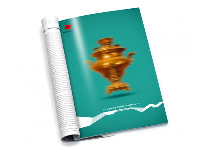
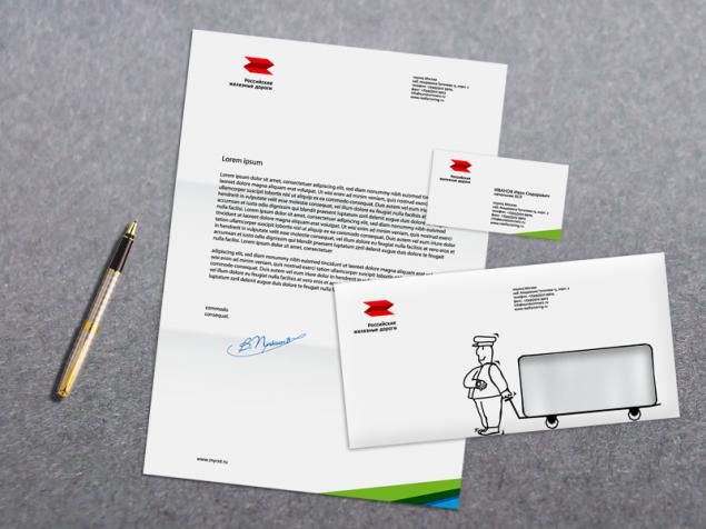
The project has created a new logo RZD (Russian and English), visual communication materials for outdoor, samples of merchandise Railways (including gulls and saharok), as well as examples of navigation in stations. For the convenience of the presentation of a new logo and visual style of communication works site www.myrzd.ru.
P.S. Thesis defended at the highest score with distinction, and the public reaction - is expected.
via # image1653405
"Today, all the major brands of the Russian state unfriendly to its primary audience - that is, to us, a simple mail users, railway or public transport. New rebranding Railways is the only confirms in my opinion, an unreadable Cyrillic logo-puzzle international company emphasizes Railways disrespect to their own passengers. Why not create an alternative - a dynamic style of visual communication, talking to a customer in his own language and clear drifting all the necessary information? I think a half billion passengers per year deserve such an attitude to itself "- says Oleg Lukyanov.
The project has created a new logo RZD (Russian and English), visual communication materials for outdoor, samples of merchandise Railways (including gulls and saharok), as well as examples of navigation in stations. For the convenience of the presentation of a new logo and visual style of communication works site www.myrzd.ru.


P.S. Thesis defended at the highest score with distinction, and the public reaction - is expected.
via # image1653405