677
Changing the face or "image - everything!
Would you like to change the face?
Of course, very many large companies for their long history have changed their logos. But in some cases as part of the total re-branding has been changed not only "beautiful sign", but also feed, ideological content, positioning and the overall approach to business. And in some cases, re-branding severely affected later in life that we know companies. Here, perhaps, more diverse and interesting examples of solid rebranding.
Coca-Cola
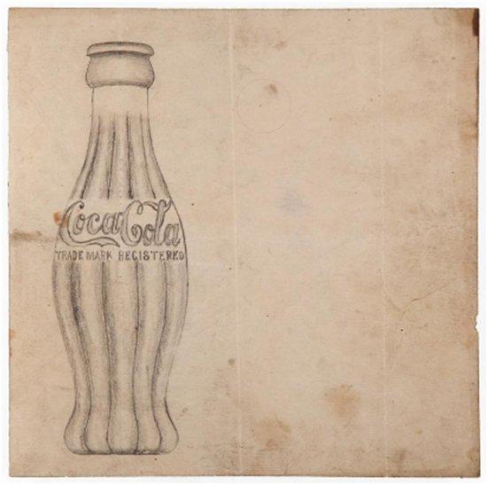
Probably, a pioneer of modern rebranding was the company Coca-Cola. The rebranding was not so much planned as forced. The demand for a drink in the United States grew by leaps and, of course, competitors are not asleep. Accordingly, the company decided to create a recognizable image of the drink. For a start, there was the famous sprawling inscription. Recognizable logo began to appear on the signboards of restaurants and bars, and contributed to the spread of the adherents of the new font. As part of the rebranding 1900 - 1910 «Coca-Cola» began to produce souvenirs, trays, clocks, car models with its logo - not all of those years working in this manner. However, unscrupulous competitors are not asleep, and now in a brazen began to copy not only the beverage itself, but also sweeping corporate font. Thus, a thorough rebranding «Coca-Cola» came to an end in 1915, when the light came the famous curly bottle. Since then, "kokakolny" design can not be confused with anyone else, and the company's image is much appreciated.
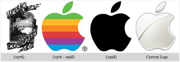
Apple
Yes, now I worship i-technique is similar to the new religion. But some 30 years ago, Apple's office is more like a bunch of hippies (and their competitors - Microsoft). However, the first logo from Apple was fucking beautiful. But that's Steve Jobs woodcut designer Ronald Wayne, the style of old, not happy - he wanted something more modern. Thus was born the iconic silhouette of an apple. Moreover, with the memorable logo rainbow appeared and branded fonts company. And, to avoid confusion silhouette of an apple with tomato, Jobs told the artists depict bitten place. It is noteworthy that, shortly after the case of total re-branding «Apple Computers» went to the mountain.
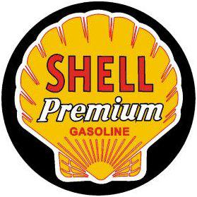
Royal Dutch Shell
I think those who were born in the 1980s, from childhood familiar logo Royal Dutch Shell - yellow shell on a red background. That's right, in the 1980s - 1990s, the logo appeared on many sports (not just racing) competition. But before 1950 on the activities of Royal Dutch Shell was known only to the people "in the subject." In 1948, the company has undergone thorough rebranding, and black and white realistic gravyurorakushka became yellow and less detailed. At the same time the company has made every effort to be recognized among the "mere mortals" - in heavy rotation on TV commercials were the first Shell (But then the genre of television advertising was in its infancy). The mission was completed successfully, and the oil and gas company became well-known throughout the world, even among children.
MTS
Though capitalism with brands come to our market not so long ago, there was already a lot of interesting examples of rebranding. One of the most visible and tangible in the world Russian rebranding conducted in 2005, the company MTS. If in the late 1990s - early 2000s adepts MTS promoted the theme "Leadership yellow shirts", then in 2006 to replace the yellow-red shade came the egg. The procedure began with the rebranding of introducing a single graphic design of all the businesses of the "Sistema Telecom". And now a new logo MTS was a two red square near. Rebranding in other countries where MTS was held later. And according to independent studies, the year that has passed since the re-branding, the brand awareness of the company increased from 84% to 91 highly visible result.

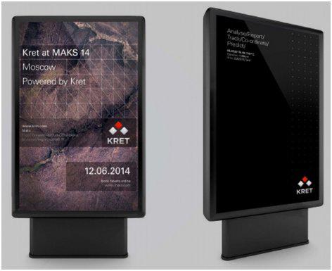
KRET
Another domestic example - the recent rebranding of concern "Radioelekronnye Technology" (KRET). Perhaps KRET is known only to the people "in the know", but the case with this concern out of the common, given that the domestic military industry before rebranding almost never was. It implements the project group "The Apostle" and a new design developed creative director of the British agency Charlie / Delta Craig Lyuison. In fact, corporate design at KRETovtsev did not exist before. Now, however, the group appeared and its logo, and its present site, and branding in general. Maybe now the "radio-electronic technology," the masses will learn in the same way as at the time learned about the "Royal Dutch Shell".
Hit-FM
Sometimes rebranding happens with radio stations. And it is absolutely incredible metamorphosis took place at the end of 2012 with the radio "Hit-FM». At the time, the station was quite a mouthpiece Galimov pop, periodically releases sbornichki like "One hundred pounds - a hundred hits" and Kirokorovy with "Colors" sang odes to the popular radio. Was so in 2000-2001-m, no one could not assume that the waves "Hit FMa" ever will hear The Beatles or the Rolling Stones - it seemed like a farce. But at the end of 2012 replaced the classic rock pop music from the airwaves - and now "Hit FM» can compete with radio stations like the same «Maximum». However, the pop radio station continues to exist in a live network and regional stations on the site.
Generally, we can cite many examples of unusual rebranding, but then the length of this post will be 2-3 kilometers. Perhaps you, too, there are interesting examples of rebranding in a variety of industries - from music to the military. Tell your options in the comments;)
Source:
Of course, very many large companies for their long history have changed their logos. But in some cases as part of the total re-branding has been changed not only "beautiful sign", but also feed, ideological content, positioning and the overall approach to business. And in some cases, re-branding severely affected later in life that we know companies. Here, perhaps, more diverse and interesting examples of solid rebranding.

Coca-Cola
Probably, a pioneer of modern rebranding was the company Coca-Cola. The rebranding was not so much planned as forced. The demand for a drink in the United States grew by leaps and, of course, competitors are not asleep. Accordingly, the company decided to create a recognizable image of the drink. For a start, there was the famous sprawling inscription. Recognizable logo began to appear on the signboards of restaurants and bars, and contributed to the spread of the adherents of the new font. As part of the rebranding 1900 - 1910 «Coca-Cola» began to produce souvenirs, trays, clocks, car models with its logo - not all of those years working in this manner. However, unscrupulous competitors are not asleep, and now in a brazen began to copy not only the beverage itself, but also sweeping corporate font. Thus, a thorough rebranding «Coca-Cola» came to an end in 1915, when the light came the famous curly bottle. Since then, "kokakolny" design can not be confused with anyone else, and the company's image is much appreciated.

Apple
Yes, now I worship i-technique is similar to the new religion. But some 30 years ago, Apple's office is more like a bunch of hippies (and their competitors - Microsoft). However, the first logo from Apple was fucking beautiful. But that's Steve Jobs woodcut designer Ronald Wayne, the style of old, not happy - he wanted something more modern. Thus was born the iconic silhouette of an apple. Moreover, with the memorable logo rainbow appeared and branded fonts company. And, to avoid confusion silhouette of an apple with tomato, Jobs told the artists depict bitten place. It is noteworthy that, shortly after the case of total re-branding «Apple Computers» went to the mountain.

Royal Dutch Shell
I think those who were born in the 1980s, from childhood familiar logo Royal Dutch Shell - yellow shell on a red background. That's right, in the 1980s - 1990s, the logo appeared on many sports (not just racing) competition. But before 1950 on the activities of Royal Dutch Shell was known only to the people "in the subject." In 1948, the company has undergone thorough rebranding, and black and white realistic gravyurorakushka became yellow and less detailed. At the same time the company has made every effort to be recognized among the "mere mortals" - in heavy rotation on TV commercials were the first Shell (But then the genre of television advertising was in its infancy). The mission was completed successfully, and the oil and gas company became well-known throughout the world, even among children.

MTS
Though capitalism with brands come to our market not so long ago, there was already a lot of interesting examples of rebranding. One of the most visible and tangible in the world Russian rebranding conducted in 2005, the company MTS. If in the late 1990s - early 2000s adepts MTS promoted the theme "Leadership yellow shirts", then in 2006 to replace the yellow-red shade came the egg. The procedure began with the rebranding of introducing a single graphic design of all the businesses of the "Sistema Telecom". And now a new logo MTS was a two red square near. Rebranding in other countries where MTS was held later. And according to independent studies, the year that has passed since the re-branding, the brand awareness of the company increased from 84% to 91 highly visible result.

KRET
Another domestic example - the recent rebranding of concern "Radioelekronnye Technology" (KRET). Perhaps KRET is known only to the people "in the know", but the case with this concern out of the common, given that the domestic military industry before rebranding almost never was. It implements the project group "The Apostle" and a new design developed creative director of the British agency Charlie / Delta Craig Lyuison. In fact, corporate design at KRETovtsev did not exist before. Now, however, the group appeared and its logo, and its present site, and branding in general. Maybe now the "radio-electronic technology," the masses will learn in the same way as at the time learned about the "Royal Dutch Shell".

Hit-FM
Sometimes rebranding happens with radio stations. And it is absolutely incredible metamorphosis took place at the end of 2012 with the radio "Hit-FM». At the time, the station was quite a mouthpiece Galimov pop, periodically releases sbornichki like "One hundred pounds - a hundred hits" and Kirokorovy with "Colors" sang odes to the popular radio. Was so in 2000-2001-m, no one could not assume that the waves "Hit FMa" ever will hear The Beatles or the Rolling Stones - it seemed like a farce. But at the end of 2012 replaced the classic rock pop music from the airwaves - and now "Hit FM» can compete with radio stations like the same «Maximum». However, the pop radio station continues to exist in a live network and regional stations on the site.
Generally, we can cite many examples of unusual rebranding, but then the length of this post will be 2-3 kilometers. Perhaps you, too, there are interesting examples of rebranding in a variety of industries - from music to the military. Tell your options in the comments;)

Source: