182
How to Repair the Khrushchev
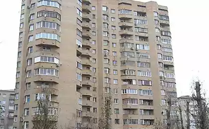
At the mention of the word “Khrushchevka” in my head immediately pops up the image of an old murdered apartment, where everything is littered with rubbish, the ceilings are cracked, and the toilet is more like a torture chamber. Of course, this is the worst option, but who among us has not seen such apartments? Today we're going to show you that even a dead one can be turned into a modern apartment.
DepositPhotos
Editorial "Site" share an idea with you Modern design of a one-room apartmentIt won’t be worth all the money in the world.
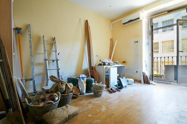
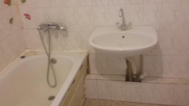
Initially, the apartment did not represent anything special: an old repair, a cracked ceiling, split tiles in the toilet. Initially, the bathroom was separate. A tiny toilet and bathroom, and a cluttered narrow corridor.
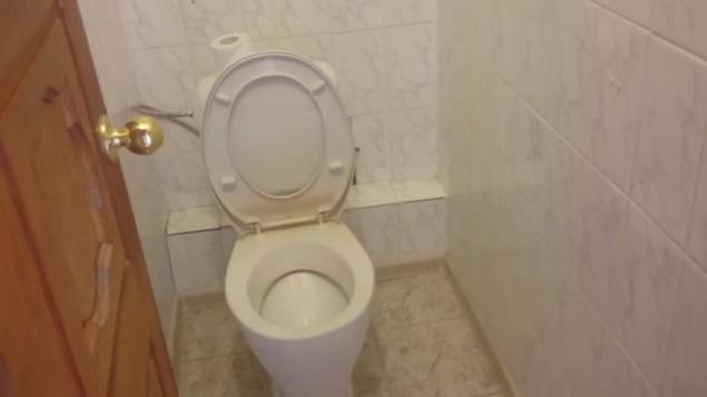
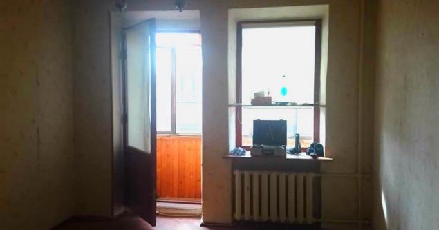
The new owners decided to make major repairs in the apartment, up to the replacement of doors, windows and floor. After the renovation, they received quite a decent apartment with a modern design, good furniture and a cozy interior. Well, let's see what happened.
The apartment is decorated in blue and white colors, looks very pleasant and unobtrusive. In the corridor there is a wardrobe for clothes and a bootstand. This will keep order, because the shoes will not stand under the feet and clutter the passage. To me, the hallway was pretty cute, and if you add jewelry to the wall on the right, it would be just lovely.
It is worth noting that the cabinet and cabinet were hand-painted, so there was no extra charge for the original design and color. You can't tell!
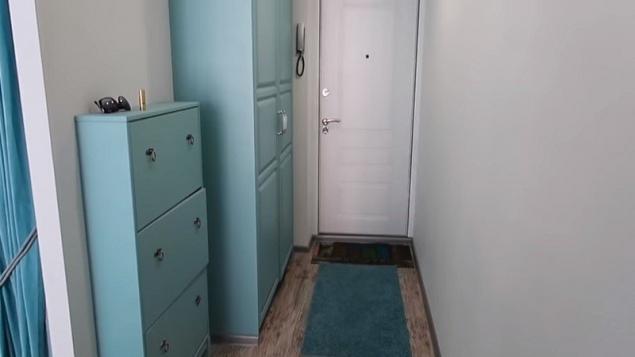
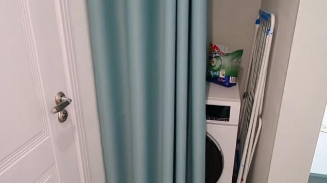
Further down the corridor, according to the idea, there was a storage room so that the place did not disappear in vain, there made a niche for a washing machine and a boiler. Covered it with a wonderful blue curtain under the color of the furniture. It should be noted that this is a very convenient and unusual move.
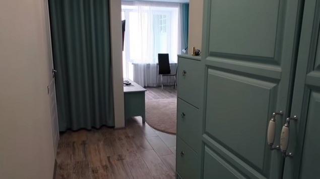
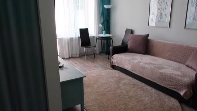
We'll move on to the living room. I remind you, it's a one-piece, but look how spacious it is. It seems to me that the secret is the absence of such a huge wall, which occupies half the room, which was so beloved in Soviet times. We see that in the hall there is only a small chest of blue color and a spacious sofa of a soft brown hue. He was given a rug and a cover.
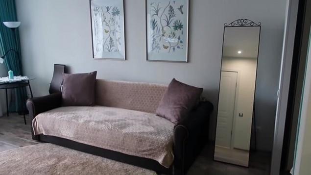
This is in order not to overload the room with one color. Above the sofa, the wall is decorated with pretty paintings, and on the side of the sofa there is a mirror. Every centimeter in an apartment should be used wisely.
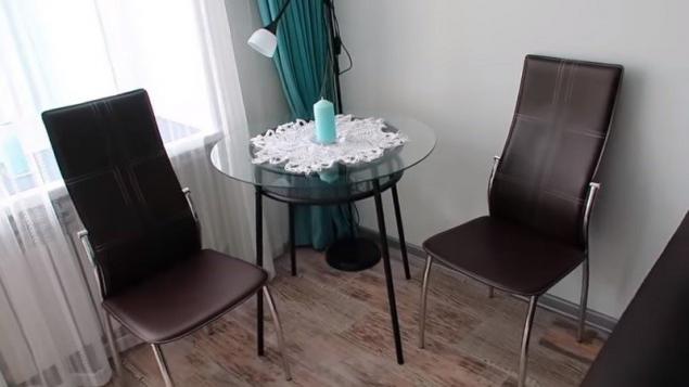
There is a coffee table in the corner where you can have lunch. In this apartment, he replaces the dining table, because there is simply no room for him in the kitchen.
Opposite the sofa stands a cabinet, and on the wall there is a TV. Note that there are no wires sticking out anywhere, they were stretched out in advance and hidden. So everything looks very neat.
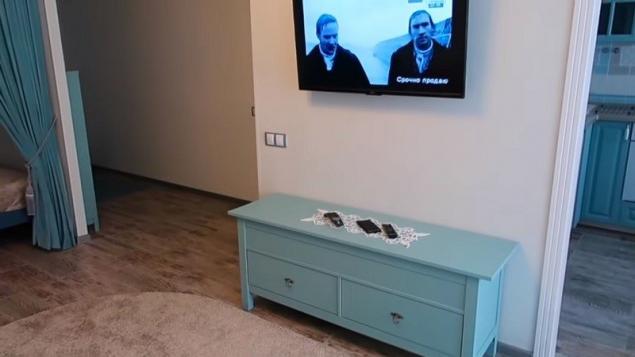
Beautiful room, a beautiful living room, where you can easily invite guests. But where is the bedroom, you ask? You might think this couch is the main bed, but it's not. For the bedroom there was a separate secluded place. Honestly, I'm excited about this idea. After all, instead of one large room you will get a room and a cozy bedroom.
4837.
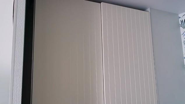
And now another surprise of this design. See the wall to the left of the bed? Well, there's a closet there. It is simply mounted in the wall, so it does not clutter the space.
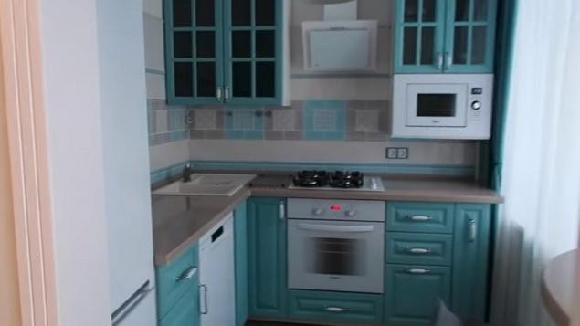
The kitchen is, as I said, very small. It fit only a refrigerator, stove and a couple of bedside tables. So I had to experiment with the rest of the technique. Right in the corner, under the lockers, there's a microwave. It turned out very well, in my opinion. The kitchen is also made in blue tones.
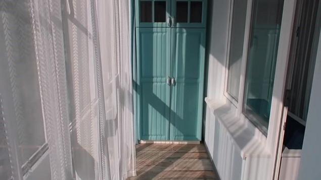
Next, we see a spacious balcony on which there is a comfortable wardrobe. It can store all those things that are not necessary in the house. In addition, the balcony is glazed and the windows are made in the floor, which adds space and light.
Now it's the bathroom's turn. The hosts decided to combine the bathroom to add some space. Honestly, it turned out stylish and quite spacious. The bathroom is made in warmer colors than the rest of the apartment, but does not stand out from the overall style.
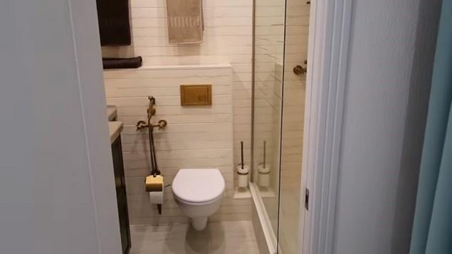
The shower is separated from the rest of the space by a glass partition. It is almost invisible, and therefore makes the room visually larger.
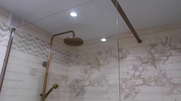
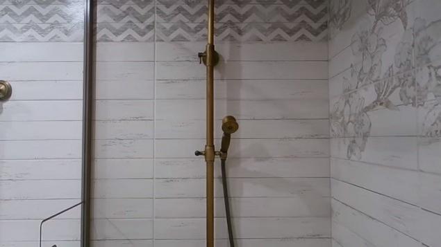
On the other side there is a sink and a mirror, as well as shelves and a towel dryer. Everything is done in tone, and also very functional.
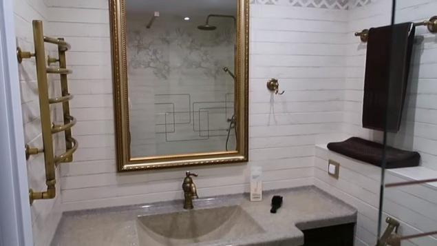
That's all we wanted to show in this apartment. It looks quite simple and at the same time elegant. I believe that a very good combination of shades was chosen, it turned out unobtrusively, the interior is not overloaded with one color. This is a great example of how you can turn an ordinary Khrushchev into a modern apartment.
The problem of small apartments is familiar to many, but there are always tricks that will help at least a little to fix the situation. For example, recently we shared techniques that will help visually enlarge the toilet.
And even earlier, we talked about 15 tricks that will help you to use the space in a small apartment as efficiently as possible.
Did you like the design of this apartment? Tell us in the comments!

DepositPhotos
Editorial "Site" share an idea with you Modern design of a one-room apartmentIt won’t be worth all the money in the world.
Initially, the apartment did not represent anything special: an old repair, a cracked ceiling, split tiles in the toilet. Initially, the bathroom was separate. A tiny toilet and bathroom, and a cluttered narrow corridor.


The new owners decided to make major repairs in the apartment, up to the replacement of doors, windows and floor. After the renovation, they received quite a decent apartment with a modern design, good furniture and a cozy interior. Well, let's see what happened.
The apartment is decorated in blue and white colors, looks very pleasant and unobtrusive. In the corridor there is a wardrobe for clothes and a bootstand. This will keep order, because the shoes will not stand under the feet and clutter the passage. To me, the hallway was pretty cute, and if you add jewelry to the wall on the right, it would be just lovely.
It is worth noting that the cabinet and cabinet were hand-painted, so there was no extra charge for the original design and color. You can't tell!

Further down the corridor, according to the idea, there was a storage room so that the place did not disappear in vain, there made a niche for a washing machine and a boiler. Covered it with a wonderful blue curtain under the color of the furniture. It should be noted that this is a very convenient and unusual move.


We'll move on to the living room. I remind you, it's a one-piece, but look how spacious it is. It seems to me that the secret is the absence of such a huge wall, which occupies half the room, which was so beloved in Soviet times. We see that in the hall there is only a small chest of blue color and a spacious sofa of a soft brown hue. He was given a rug and a cover.

This is in order not to overload the room with one color. Above the sofa, the wall is decorated with pretty paintings, and on the side of the sofa there is a mirror. Every centimeter in an apartment should be used wisely.

There is a coffee table in the corner where you can have lunch. In this apartment, he replaces the dining table, because there is simply no room for him in the kitchen.

Opposite the sofa stands a cabinet, and on the wall there is a TV. Note that there are no wires sticking out anywhere, they were stretched out in advance and hidden. So everything looks very neat.

Beautiful room, a beautiful living room, where you can easily invite guests. But where is the bedroom, you ask? You might think this couch is the main bed, but it's not. For the bedroom there was a separate secluded place. Honestly, I'm excited about this idea. After all, instead of one large room you will get a room and a cozy bedroom.
4837.
And now another surprise of this design. See the wall to the left of the bed? Well, there's a closet there. It is simply mounted in the wall, so it does not clutter the space.

The kitchen is, as I said, very small. It fit only a refrigerator, stove and a couple of bedside tables. So I had to experiment with the rest of the technique. Right in the corner, under the lockers, there's a microwave. It turned out very well, in my opinion. The kitchen is also made in blue tones.

Next, we see a spacious balcony on which there is a comfortable wardrobe. It can store all those things that are not necessary in the house. In addition, the balcony is glazed and the windows are made in the floor, which adds space and light.

Now it's the bathroom's turn. The hosts decided to combine the bathroom to add some space. Honestly, it turned out stylish and quite spacious. The bathroom is made in warmer colors than the rest of the apartment, but does not stand out from the overall style.

The shower is separated from the rest of the space by a glass partition. It is almost invisible, and therefore makes the room visually larger.


On the other side there is a sink and a mirror, as well as shelves and a towel dryer. Everything is done in tone, and also very functional.

That's all we wanted to show in this apartment. It looks quite simple and at the same time elegant. I believe that a very good combination of shades was chosen, it turned out unobtrusively, the interior is not overloaded with one color. This is a great example of how you can turn an ordinary Khrushchev into a modern apartment.
The problem of small apartments is familiar to many, but there are always tricks that will help at least a little to fix the situation. For example, recently we shared techniques that will help visually enlarge the toilet.
And even earlier, we talked about 15 tricks that will help you to use the space in a small apartment as efficiently as possible.
Did you like the design of this apartment? Tell us in the comments!
