785
How to create a website. Walkthrough
Five steps of website creation platform features Tilda Publishing, links to relevant resources and useful advice. 
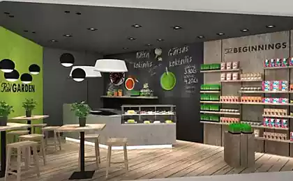
Nikita Obukhov, the Founder of Tilda Publishing, creative Director of Studio From to Create a good website is the problem. Therefore, we have written a guide that will help to make a website without a great team, within a reasonable time and for little money. All the achievements obtained over 15 years of experience in web design, we laid out on the shelves, squeezed and told how to apply them using Tilda Publishing platform that helps to make cool websites. Read, follow, do and you always succeed. 1 the Idea and structure of the website the Main idea and objective of the site. One page or several? The structure of the site, the main blocks. Think about what sections will be your website, what is the main idea and task. For example, the customer need a website for an architectural Bureau. On the surface understanding that needs to be their work and contacts. But we update: and what the Bureau is different from others? It turns out that the Bureau specializiruetsya on large, complex projects and is an expert in such orders. We conclude that it is not only good pictures with signatures, the desired text is quite detailed descriptions of the source data, process, explanation and justification of decisions. We also understand that a lot of projects, but show all is not necessary. Focus on the biggest. And another point, you need to tell about the people to explain why they are experts in their field.
Don't go in the direction of the animation, decorations and special effects, determine over the idea, the essence of which will affect the visitor emotionally, that it will impress and inspire. Example. Development of landing page for school of design. The page should explain to prospective students and their parents who is the designer.
Problem: Students want to be designers, but often do not understand the specificity of the profession, what are the trends in design than they are different.
Objective: to Help prospective students to understand the specializations and understand what suits them.
Idea: What if there are several major design disciplines: interaction design, graphic, industrial and to interview three of the coolest members? Personal stories are very emotional and good work. To tell what they live, how they succeeded, add cool pictures. People will be interested to read for themselves they will see that this man is close, he inspires his way of life. Open a text editor and create a structure in the form of a list. Rate amount and think whether it is possible to fit all information on one page. If a lot of information, the website have to do multipage. In this case, think what branches to take in the menu. Caveat: do not write the main page as the beginning of "tree". Let the "contact" page will have the same level as "home". This will help when you're doing navigation. A plain text editor or piece of paper — suitable tools in order to write a structure. 2 Study the Websites of competitors. Cross-category. Inspiring examples. The competitors ' sites. When you have decided on the idea of the site and its structure, view competitors ' sites and find good solutions. Evaluate not how they look, and content: what is in the menu that they placed on the home page, what sections on the website, what they write and how.
Cross-category. If you are doing website performance, view other performances. Can't find a good website performance, take a close category: website Opera or modern dance. If you want to talk about the football team, then you can use the techniques found on the website of the hockey team or Rugby. Your competitors may not have the style and look is bad, but if these guys are making money, so something works there. Your task is to figure out what. Inspiring examples. Even people with extensive experience in web design, I regularly review new sites, monitor trends, find inspiration in the work of colleagues. To be inspired is not to copy the cleaned, you just need to watch how looks like the modern Internet in General, what is now fashionable and cool.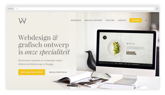
Examples of the main and internal pages good sites Listen to yourself and understand what you like. Can be good pictures, good typography or a combination of colors. Look for the expressive techniques that you can use in their work. Here you need to look at all of the sites in a row, without attachment to the specifics of your business.
Below, links to resources, which contains good examples.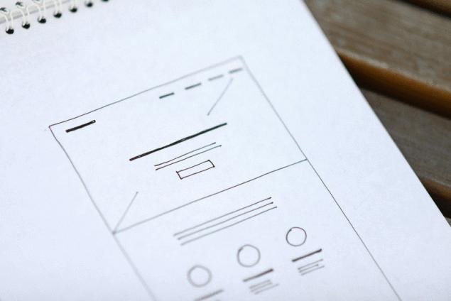
Cover. The thicker line is the header. Thin line — a brief description. Short strips from the top menu. 4 Contents Where to get information for the site. How to write the text for key points. The style of the text. Where to get information. Before moving on to the Tilde, you need to take care of the content, because without content, will need to redo everything. First collect all the materials that you have: presentations, brochures, publications. This will serve as a starting point. First of all, answer the question: "Why am I good?" If you make a website for ordering, that's a very good move to interview your client. Turn on the recorder and just talk to the person, ask questions — nothing specific, just show interest, find out what your customer like customers.
Transcribe the recording yourself or hire a contractor. It costs about 20 rubles per minute, to find a person on youdo.com For a small additional fee, the text edit and you finally get a letter. All texts write in a text editor and not on the website. Do not write text during a page design or website. In a text editor a lot faster edit: something to cut, copy, move. To design is much easier when the text is ready.
How to write the text for the site. If you write the text yourself, you can use the following scheme:
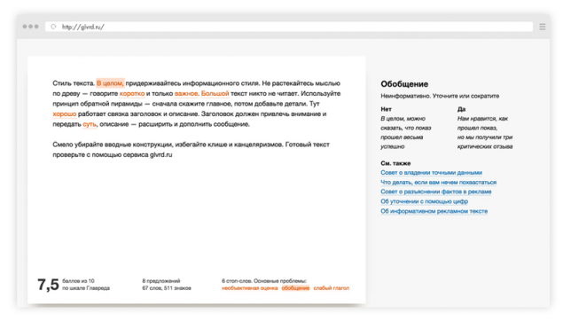
Feel free to remove the introductory design, avoid clichés and kantselyarizmami. The text check using the service glvrd.ru — it helps to clear the text from the verbal garbage that tries to match the information style.
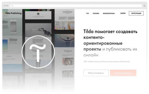
General advice: if you do not know how to write, hire a copywriter. It is relatively inexpensive. He will interview you and give you the text. Just don't forget to ask immediately cut it three times. 5 Design Section "Created with Tilda". Selection and adaptation of the template. Navigation on the site. Where to get good pictures for the site. What to do with the logo. Third-party services and special functions. The selection of font and font pairs. How to make a website stylish. Publishing a website. Testing. Sign up with Tilda, if you still haven't.
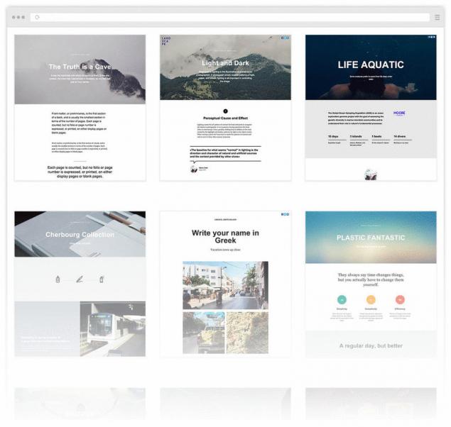
Examine the list of templates. Select one, and edit it. A template is a model of good design and an example of using blocks. The choice of template does not limit your creativity — at any time you can change it beyond recognition and even to start with a clean slate.
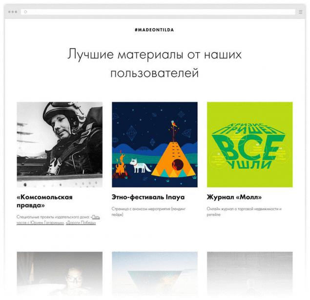
See the section madeontilda. Here are examples of ready-made websites made by other users.
Open the block library and build the website based on the prototype that you have drawn. Do not edit the text in the Tilde, first make a design. If you don't have photos, use high-quality samples that are close in style, then replace. Video guide of main functions: basic editing functions, the settings of the unit. Navigation. Add menu, make sure that it is visually good: not too big, not overload the entire page. Menu items should not be much, preferably no more than 5. Boldly enlarges the sections. Names take short. Three words as the menu item is clearly not suitable. They should be read at first sight.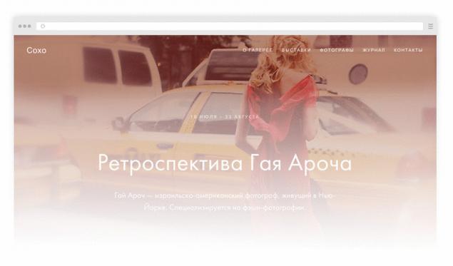
Five is the optimal number for menu items. Cover (first screen) deserves special attention. If there's a quality picture and original, catchy title, the first impression will be successful.
Where to get a good photo. Photos are important, without them nothing happens. No photos, no website. Do not use kliparty photos. Handshake of businessmen and smiling Housewives — yesterday, these photos don't work. Better take a picture of themselves and their colleagues than to search for ready-made the pictures for "successful businessman". Hire a photographer or Illustrator. Famous illustrators and photographers are expensive, but there are plenty of relatively inexpensive professionals, they are happy for you to work and you at once will be good content for the website.
If you need icons or use thenounproject fortawesome.github.io thenounproject.com fortawesome.github.io Logo. The logo should be horizontal. Vertical logos in web do not work well. As a rule, the logo is in the menu, and it should not take up much space on the screen. If you do not have a logo, just write the name of the project to any non-system font, like Futura or Proxima. Do not suffer, do not bother with the logo if you are on a tight budget. Now it's not as important as the overall impression of the website. Think about the photos and the General style. Third-party services newsletter Subscription — Mailchimp
The collection of contact details — Google Forms
Timeline of events — Timeline.knightlab
Interactive maps Storymap.knightlab
Sound — SoundCloud
Selling tickets for the event — Timepad
Interactive image — Thinglink
Feedback — Uservoice
Making money Yandex Money or PayPal
Online store — Ecwid or Shopify
In General, if you have some specific function, use the "insert html code". If you need a unique item, you will have to order it from programmers. Font. Be sure to connect a proprietary font, it affects communication. Now everything is kept on the content, so the font itself and ask you a signature style. Each font has a character, so try to pick a font that matches the content.
As a rule, it is only one font. But if you want to create a nice contrast, use of font pairs: a font without serif and serif typefaces. Examples of good font combinations:
The surest way is to take a different headset of the same family, for example, PT sans and PT serif, and accuracy. After you have made all the blocks, see that website looked nice and neat. Align the indentation, make headers uniform, make sure the font size in the text is the same everywhere. Make sure that the site has enough free space.
Make sure that the page enough "air" around text and images have space, they do not stick together and do not interfere with each other. Try to be ascetic. The simpler you make, the less mistakes and the site will stylish. Use brand colors. But this does not mean you have to paint all in different colors. On the contrary, follow the rule that 90% is black and white and 10% a active color. One color the complementary color is the best option. Three cannot be used. Two very carefully.

If no experience in the design and there quite nothing, write content, do version page with Tilda and hire a designer for a limited time. A professional designer will quickly lead page in order, and you will significantly reduce the cost than if I ordered a website from scratch. If you are a designer, ask your friend's designer to watch and comment that you did it. A fresh look is always immediately give feedback.
Publishing a website. Connect domain. To do this in the project settings list the address, and the Registrar where the domain was purchased, one line, specify the IP.
Don't forget about the statistics. Sign up for Google Analytics or Yandex Metrics, get the code and enter it in the settings.
Take care of how it will look your site in the results on search sites or social networks — fill in the site name and description. Each page will provide a small photo and then you will be sharing your page is well-designed.
Testing. You made a website, now you need to get the first reviews. Share the site with your colleagues or friends, ask what they think. Send the link to your customers and ask their opinions. published by P. S. And remember, only by changing their consumption — together we change the world! ©
Source: tilda.education/how-to-build-website?utm_source=facebook&utm_medium=cpc&utm_campaign=fbpost

Nikita Obukhov, the Founder of Tilda Publishing, creative Director of Studio From to Create a good website is the problem. Therefore, we have written a guide that will help to make a website without a great team, within a reasonable time and for little money. All the achievements obtained over 15 years of experience in web design, we laid out on the shelves, squeezed and told how to apply them using Tilda Publishing platform that helps to make cool websites. Read, follow, do and you always succeed. 1 the Idea and structure of the website the Main idea and objective of the site. One page or several? The structure of the site, the main blocks. Think about what sections will be your website, what is the main idea and task. For example, the customer need a website for an architectural Bureau. On the surface understanding that needs to be their work and contacts. But we update: and what the Bureau is different from others? It turns out that the Bureau specializiruetsya on large, complex projects and is an expert in such orders. We conclude that it is not only good pictures with signatures, the desired text is quite detailed descriptions of the source data, process, explanation and justification of decisions. We also understand that a lot of projects, but show all is not necessary. Focus on the biggest. And another point, you need to tell about the people to explain why they are experts in their field.
Don't go in the direction of the animation, decorations and special effects, determine over the idea, the essence of which will affect the visitor emotionally, that it will impress and inspire. Example. Development of landing page for school of design. The page should explain to prospective students and their parents who is the designer.
Problem: Students want to be designers, but often do not understand the specificity of the profession, what are the trends in design than they are different.
Objective: to Help prospective students to understand the specializations and understand what suits them.
Idea: What if there are several major design disciplines: interaction design, graphic, industrial and to interview three of the coolest members? Personal stories are very emotional and good work. To tell what they live, how they succeeded, add cool pictures. People will be interested to read for themselves they will see that this man is close, he inspires his way of life. Open a text editor and create a structure in the form of a list. Rate amount and think whether it is possible to fit all information on one page. If a lot of information, the website have to do multipage. In this case, think what branches to take in the menu. Caveat: do not write the main page as the beginning of "tree". Let the "contact" page will have the same level as "home". This will help when you're doing navigation. A plain text editor or piece of paper — suitable tools in order to write a structure. 2 Study the Websites of competitors. Cross-category. Inspiring examples. The competitors ' sites. When you have decided on the idea of the site and its structure, view competitors ' sites and find good solutions. Evaluate not how they look, and content: what is in the menu that they placed on the home page, what sections on the website, what they write and how.
Cross-category. If you are doing website performance, view other performances. Can't find a good website performance, take a close category: website Opera or modern dance. If you want to talk about the football team, then you can use the techniques found on the website of the hockey team or Rugby. Your competitors may not have the style and look is bad, but if these guys are making money, so something works there. Your task is to figure out what. Inspiring examples. Even people with extensive experience in web design, I regularly review new sites, monitor trends, find inspiration in the work of colleagues. To be inspired is not to copy the cleaned, you just need to watch how looks like the modern Internet in General, what is now fashionable and cool.

Examples of the main and internal pages good sites Listen to yourself and understand what you like. Can be good pictures, good typography or a combination of colors. Look for the expressive techniques that you can use in their work. Here you need to look at all of the sites in a row, without attachment to the specifics of your business.
Below, links to resources, which contains good examples.
- httpster.net
- awwwards.com
- siteinspire.com
- onepagelove.com

Cover. The thicker line is the header. Thin line — a brief description. Short strips from the top menu. 4 Contents Where to get information for the site. How to write the text for key points. The style of the text. Where to get information. Before moving on to the Tilde, you need to take care of the content, because without content, will need to redo everything. First collect all the materials that you have: presentations, brochures, publications. This will serve as a starting point. First of all, answer the question: "Why am I good?" If you make a website for ordering, that's a very good move to interview your client. Turn on the recorder and just talk to the person, ask questions — nothing specific, just show interest, find out what your customer like customers.
Transcribe the recording yourself or hire a contractor. It costs about 20 rubles per minute, to find a person on youdo.com For a small additional fee, the text edit and you finally get a letter. All texts write in a text editor and not on the website. Do not write text during a page design or website. In a text editor a lot faster edit: something to cut, copy, move. To design is much easier when the text is ready.

How to write the text for the site. If you write the text yourself, you can use the following scheme:
- Write a short text about yourself, your company. This should be one sentence that clearly and succinctly articulates what you do. For example, the Tilde — a service that helps you create impressive website without technical skills.
- Write a slightly more detailed text. Explain what you do. Write just as if you told it to a friend over a Cup of coffee — the most understandable language.
- Highlight three main pieces — why I love you or your product.
- Describe benefits. Tell us what your product solves the customer's problem, give details.
- Think of the headlines. Good reception is a formal headings, like "Team", "Contacts", etc to change on the emotional. For example, instead of "news" to write "Be aware" instead of "Contacts" — "Say Hello".
- Take reviews. Ask your most loyal customers to say a few words about you. Works fine.
- Think of three key numbers, people like numbers. But try to have meaningful, understandable and something reported to the user. Avoid abstract values, such as: served 1,000 customers, drank 200 liters of coffee, has sold 38 000 Teddy bears. A good example: a 7.5 average score of IELTS among our graduates. 3 minutes — copied the movie from one device to another using the application.
- Show command, if it is strong. Personality is always interesting, real people trust more than the abstract company.
- Tell us about partners or customers, if they can be proud of.
- Specify the specialization. If your bar is stocked with craft beer, check it separately.
Feel free to remove the introductory design, avoid clichés and kantselyarizmami. The text check using the service glvrd.ru — it helps to clear the text from the verbal garbage that tries to match the information style.

General advice: if you do not know how to write, hire a copywriter. It is relatively inexpensive. He will interview you and give you the text. Just don't forget to ask immediately cut it three times. 5 Design Section "Created with Tilda". Selection and adaptation of the template. Navigation on the site. Where to get good pictures for the site. What to do with the logo. Third-party services and special functions. The selection of font and font pairs. How to make a website stylish. Publishing a website. Testing. Sign up with Tilda, if you still haven't.

Examine the list of templates. Select one, and edit it. A template is a model of good design and an example of using blocks. The choice of template does not limit your creativity — at any time you can change it beyond recognition and even to start with a clean slate.

See the section madeontilda. Here are examples of ready-made websites made by other users.

Open the block library and build the website based on the prototype that you have drawn. Do not edit the text in the Tilde, first make a design. If you don't have photos, use high-quality samples that are close in style, then replace. Video guide of main functions: basic editing functions, the settings of the unit. Navigation. Add menu, make sure that it is visually good: not too big, not overload the entire page. Menu items should not be much, preferably no more than 5. Boldly enlarges the sections. Names take short. Three words as the menu item is clearly not suitable. They should be read at first sight.

Five is the optimal number for menu items. Cover (first screen) deserves special attention. If there's a quality picture and original, catchy title, the first impression will be successful.
Where to get a good photo. Photos are important, without them nothing happens. No photos, no website. Do not use kliparty photos. Handshake of businessmen and smiling Housewives — yesterday, these photos don't work. Better take a picture of themselves and their colleagues than to search for ready-made the pictures for "successful businessman". Hire a photographer or Illustrator. Famous illustrators and photographers are expensive, but there are plenty of relatively inexpensive professionals, they are happy for you to work and you at once will be good content for the website.
If you need icons or use thenounproject fortawesome.github.io thenounproject.com fortawesome.github.io Logo. The logo should be horizontal. Vertical logos in web do not work well. As a rule, the logo is in the menu, and it should not take up much space on the screen. If you do not have a logo, just write the name of the project to any non-system font, like Futura or Proxima. Do not suffer, do not bother with the logo if you are on a tight budget. Now it's not as important as the overall impression of the website. Think about the photos and the General style. Third-party services newsletter Subscription — Mailchimp
The collection of contact details — Google Forms
Timeline of events — Timeline.knightlab
Interactive maps Storymap.knightlab
Sound — SoundCloud
Selling tickets for the event — Timepad
Interactive image — Thinglink
Feedback — Uservoice
Making money Yandex Money or PayPal
Online store — Ecwid or Shopify
In General, if you have some specific function, use the "insert html code". If you need a unique item, you will have to order it from programmers. Font. Be sure to connect a proprietary font, it affects communication. Now everything is kept on the content, so the font itself and ask you a signature style. Each font has a character, so try to pick a font that matches the content.
As a rule, it is only one font. But if you want to create a nice contrast, use of font pairs: a font without serif and serif typefaces. Examples of good font combinations:

The surest way is to take a different headset of the same family, for example, PT sans and PT serif, and accuracy. After you have made all the blocks, see that website looked nice and neat. Align the indentation, make headers uniform, make sure the font size in the text is the same everywhere. Make sure that the site has enough free space.

Make sure that the page enough "air" around text and images have space, they do not stick together and do not interfere with each other. Try to be ascetic. The simpler you make, the less mistakes and the site will stylish. Use brand colors. But this does not mean you have to paint all in different colors. On the contrary, follow the rule that 90% is black and white and 10% a active color. One color the complementary color is the best option. Three cannot be used. Two very carefully.

If no experience in the design and there quite nothing, write content, do version page with Tilda and hire a designer for a limited time. A professional designer will quickly lead page in order, and you will significantly reduce the cost than if I ordered a website from scratch. If you are a designer, ask your friend's designer to watch and comment that you did it. A fresh look is always immediately give feedback.
Publishing a website. Connect domain. To do this in the project settings list the address, and the Registrar where the domain was purchased, one line, specify the IP.
Don't forget about the statistics. Sign up for Google Analytics or Yandex Metrics, get the code and enter it in the settings.
Take care of how it will look your site in the results on search sites or social networks — fill in the site name and description. Each page will provide a small photo and then you will be sharing your page is well-designed.
Testing. You made a website, now you need to get the first reviews. Share the site with your colleagues or friends, ask what they think. Send the link to your customers and ask their opinions. published by P. S. And remember, only by changing their consumption — together we change the world! ©
Source: tilda.education/how-to-build-website?utm_source=facebook&utm_medium=cpc&utm_campaign=fbpost


Lentils: cooking secrets + 2 the amazing recipe
Created a system that can turn a person's thoughts in text messages