420
Breaking the stereotypes: a riot of colors in the interior
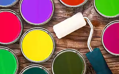
We are all accustomed to the pastel tones in the interior. Bright colors seem to be a risky option, besides not always appropriate, so if they are present in the apartment, mainly as small accessories, pleasant, but not as important for the image of the room.
However, I believe that from old fears it's time to get rid of: bright colors can also play the first fiddle in the design of buildings. All you need to do, is to learn to use them.
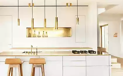
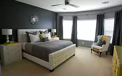
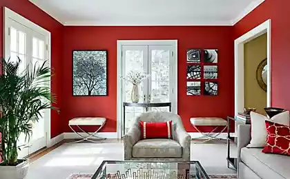
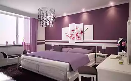
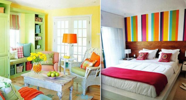
Bright colors add to the interior dynamism, the feeling that time does not stand still, and rushes forward. They are not always suitable for decoration bedroom, because it is better to focus on peace and comfort, but for the kitchen or the living room of crimson and orange can be a real boon.
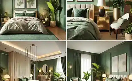
Often when making a room bright, first select the base color, which will be the basis of the composition and set the tone for the entire room. The classical variant is to make a bright wall. For these purposes it is better not to use Wallpaper, but to resort to conventional paint. Colors are rather rich in themselves, so it makes no sense to overload the space with some unusual patterns.
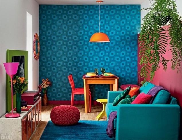
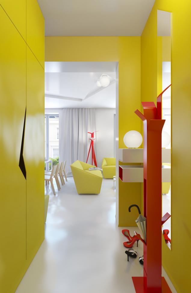
You can paint all the walls or only one or two of them, leaving the rest white. Another option: apply a solid coating, and, for example, to distinguish between a plane obliquely, leaving the top triangle white and the lower bright.
The base color can and should be complementary: for example, for light green surface add the purple stripes using shades of these same colors in the decor of the room. However, I think that is more a good solid coating that will allow freer play with color when choosing the decor items.
Try also to hang on the white walls picture in colors that are harmonized with the colored area. Such a graceful "roll" will look excellent in any room.
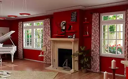
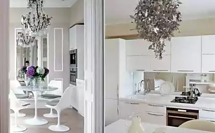
More rare but very beautiful and unusual course to make colored ceiling. In this case, it is better to leave walls white or put them a different, quite a contrast to the ceiling paint
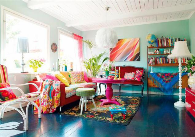
Variant with white walls is easier to implement: you don't have to choose a harmonious combination of colors. Many bright colors are not very fond of the close proximity to other equally saturated hues, so this is the case when the porridge with oil quite a really to spoil.
Importantly — in any case do not do the walls and ceiling the same color. You can get the effect of "shrinking" rooms, which would be a moral pressure on you. Neutral white, on the contrary, smooth out tension and allow the color to develop.
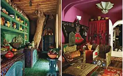
As for the situation room, you can introduce other colors without regard to the base: as it becomes the primary, urgent need to repeat it in any other elements of the interior no.
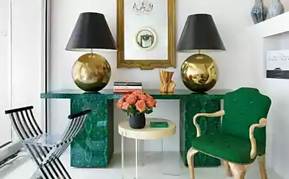
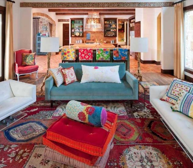
Conversely, you can combine colors of two shades, one of which will be the base. In this case, it is, of course, must be repeated several times, however, to give enough space for the erection of a second color.
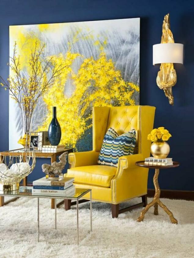
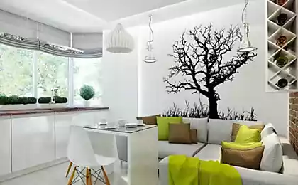
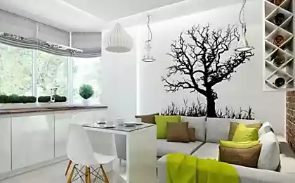
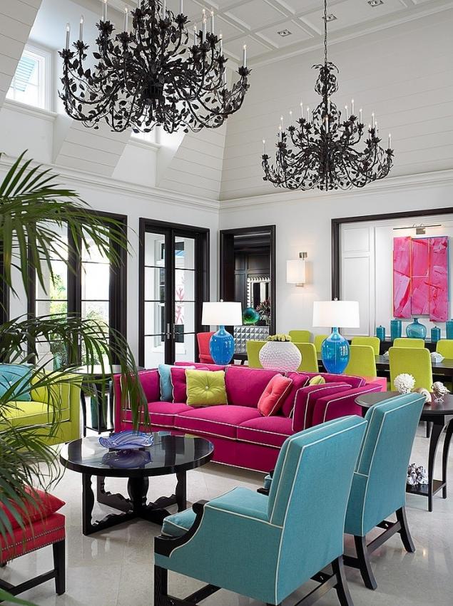
Don't let the furniture to blend in against the wall: pick up for her the other bright color or leave it black and white, adding color with small accessories — textiles, decorative pillows, lamps.
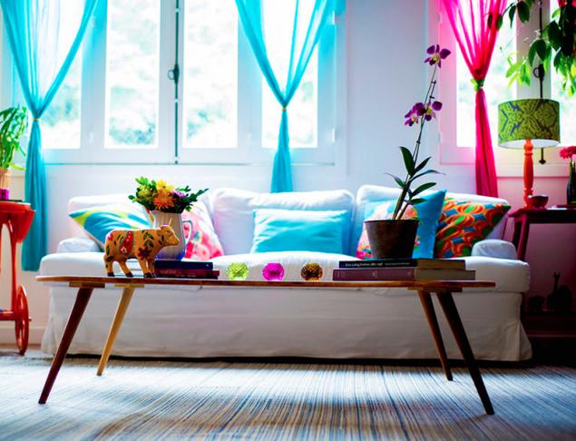
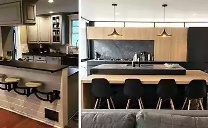
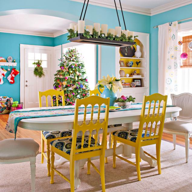
For example, in the living room or the kitchen you can put a white table, surrounding it with bright chairs. And bright sofas and chairs enliven the bright carpet placed on the floor between them. published
P. S. And remember, only by changing their consumption — together we change the world! ©
Join us in Facebook , Vkontakte, Odnoklassniki
Source: kvartblog.ru/blog/yarkie-tsveta-v-interiere-uchimsya-ih-kombinirovat
However, I believe that from old fears it's time to get rid of: bright colors can also play the first fiddle in the design of buildings. All you need to do, is to learn to use them.

Bright colors add to the interior dynamism, the feeling that time does not stand still, and rushes forward. They are not always suitable for decoration bedroom, because it is better to focus on peace and comfort, but for the kitchen or the living room of crimson and orange can be a real boon.

Often when making a room bright, first select the base color, which will be the basis of the composition and set the tone for the entire room. The classical variant is to make a bright wall. For these purposes it is better not to use Wallpaper, but to resort to conventional paint. Colors are rather rich in themselves, so it makes no sense to overload the space with some unusual patterns.

You can paint all the walls or only one or two of them, leaving the rest white. Another option: apply a solid coating, and, for example, to distinguish between a plane obliquely, leaving the top triangle white and the lower bright.
The base color can and should be complementary: for example, for light green surface add the purple stripes using shades of these same colors in the decor of the room. However, I think that is more a good solid coating that will allow freer play with color when choosing the decor items.

Try also to hang on the white walls picture in colors that are harmonized with the colored area. Such a graceful "roll" will look excellent in any room.
More rare but very beautiful and unusual course to make colored ceiling. In this case, it is better to leave walls white or put them a different, quite a contrast to the ceiling paint

Variant with white walls is easier to implement: you don't have to choose a harmonious combination of colors. Many bright colors are not very fond of the close proximity to other equally saturated hues, so this is the case when the porridge with oil quite a really to spoil.
Importantly — in any case do not do the walls and ceiling the same color. You can get the effect of "shrinking" rooms, which would be a moral pressure on you. Neutral white, on the contrary, smooth out tension and allow the color to develop.

As for the situation room, you can introduce other colors without regard to the base: as it becomes the primary, urgent need to repeat it in any other elements of the interior no.
Conversely, you can combine colors of two shades, one of which will be the base. In this case, it is, of course, must be repeated several times, however, to give enough space for the erection of a second color.

Don't let the furniture to blend in against the wall: pick up for her the other bright color or leave it black and white, adding color with small accessories — textiles, decorative pillows, lamps.

For example, in the living room or the kitchen you can put a white table, surrounding it with bright chairs. And bright sofas and chairs enliven the bright carpet placed on the floor between them. published

P. S. And remember, only by changing their consumption — together we change the world! ©
Join us in Facebook , Vkontakte, Odnoklassniki
Source: kvartblog.ru/blog/yarkie-tsveta-v-interiere-uchimsya-ih-kombinirovat