648
The company has developed Imagedesign trademark logo and X5 Retail Group
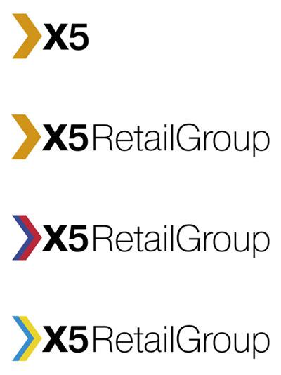
X5 Group - the managing company of the combined retail network "Crossroads" and "Pyaterochka". It is the largest multi-format retail company in Russia in 2006, he became the leader of the Russian roznitsy.Kak any company, X5 RETAIL GROUP were necessary basic elements of the visual identity for - a sign and logo. They are engaged in the development of the company Imadesign. The main challenge we faced in the process, became the main characteristics of the broadcasting company: reliability, solidity, leadership. Besides the sign and logo were to reflect the dedication, optimism and dynamic development of the company.
The result is a logo, supported by familiar, reminiscent of the boom tail and graphically follow the contours of the letter X. The motive of the boom was elected not by accident - it is this way could not be better reflects the business activity of the company, aimed at achieving the set goals. As the font of the logo was chosen Helvetica - laconic and strict grotesque, well reflecting the reliability and solidity of the company.
In general, corporate unit turned rapid, dynamic and truly leadership. Color solution provides the necessary sign of optimistic, adding the image of openness and friendliness. Besides the main orange sign has other colors of the mark: the colors of the Russian tricolor and Ukrainian flag that used offices X5 RETAIL GROUP in Russia and Ukraine.
Creative teamwork
Creative Director: Erken Kagarov
Art Director: Vladimir Trushkin
Designer: Erken Kagarov
Project Manager: Anna Ryumin
via # image2722855
The result is a logo, supported by familiar, reminiscent of the boom tail and graphically follow the contours of the letter X. The motive of the boom was elected not by accident - it is this way could not be better reflects the business activity of the company, aimed at achieving the set goals. As the font of the logo was chosen Helvetica - laconic and strict grotesque, well reflecting the reliability and solidity of the company.
In general, corporate unit turned rapid, dynamic and truly leadership. Color solution provides the necessary sign of optimistic, adding the image of openness and friendliness. Besides the main orange sign has other colors of the mark: the colors of the Russian tricolor and Ukrainian flag that used offices X5 RETAIL GROUP in Russia and Ukraine.

Creative teamwork
Creative Director: Erken Kagarov
Art Director: Vladimir Trushkin
Designer: Erken Kagarov
Project Manager: Anna Ryumin
via # image2722855


Fiat wrong with advertising. Demand for the Grande Punto has not met expectations
"Video International" closely on the air. Mediaseller interested in channels with an audience of less than 1%