1462
Success or failure?
To an untrained reader understand the canons of modern tramvaestroeniya will explain a few things (I warn you once - will have plenty of pictures and diagrams Alstom, did not consider for advertising - they just have a lot).
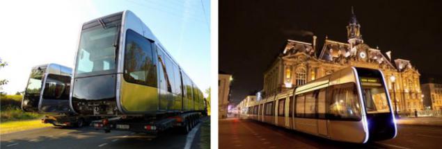
The layout of the low-floor tram modular Alstom.
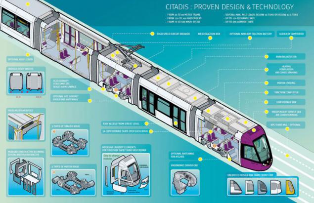
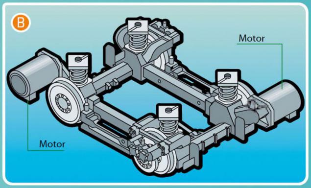
Most modern low-floor city trams (floor height from ground level is in the range of 20 - 35 cm, which allows you to conveniently enter the tram with a slightly raised "platform" stop. Inside the tram designers are trying to do without steps, especially in the central aisle. To do this, use the special bogie wheels which either are not connected with each other by a common shaft or wheels have a sufficiently small diameter and the shaft, respectively goes low. Thus, in the central aisle floor remains "low" and directly over the wheels mounted on the catwalk passenger seat. If in the area of trucks still have to raise the floor - use the ramps.
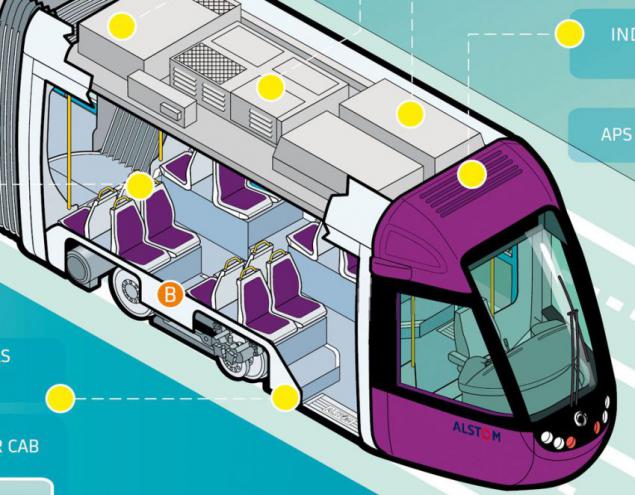
Modern trams are built in a modular fashion. Their length and width may even change depending on the operating conditions. Body shell is made of welded steel or aluminum profiles outside the body trim metal or composite panels. Optimize production - a cross-section of the body throughout its length does not change, so all the blanks - doors, windows, pillars and panels have the exact same shape and curvature, which significantly reduces production costs.
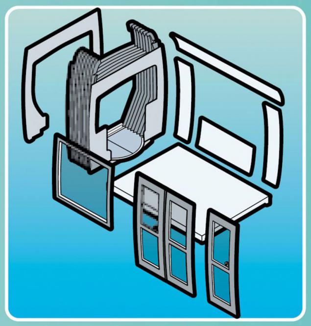
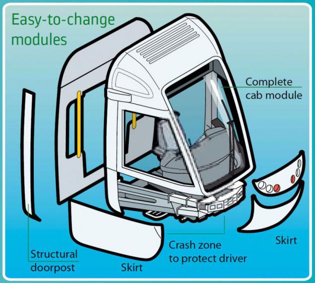
Since the trams because unification become "sausages of different lengths" (hello Chris Bangle), the main methods of individualization are unique to each city cab modules ("head") and the lateral surface of the body supergraphics.

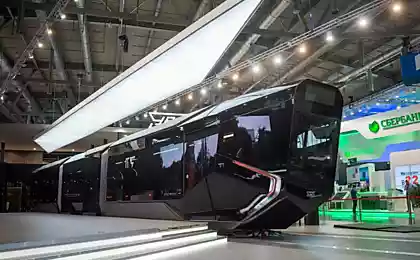
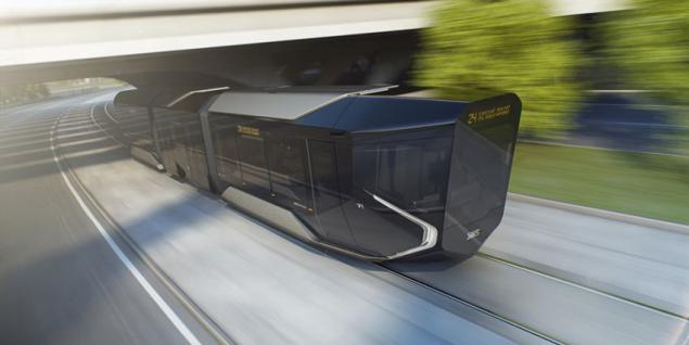
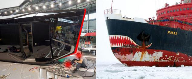
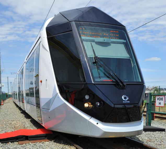
Now back to the object of our study design. The first thing that catches your eye - just the cab. Reverse slope windshield According to the authors can improve the overview for the driver. In profile, the tram reminds icebreaker, whose nose has to press down under him and split the floe - unforgivable mistake of designing for urban transport!
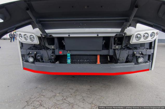
Any object: the man, the motorcyclist, passenger car in case of accident will be the substitution of a multi-ton colossus. In railway technology, as well as from the main truck accepted standard which implies the installation of the underride guard - low-lying beams, which does not allow objects to be crushed under the cab. In R1 everything seemed done with a view to the back!
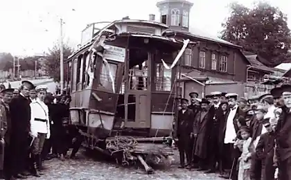
Now consider what happens to the tram itself at the head-on collision. Consider a few examples from real life. This slide one tram collided with another. Result - bumper "on the replacement, there may be hidden damage».
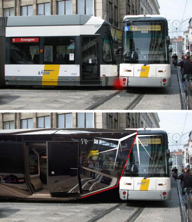
R1 in a similar situation will produce blow! top! edge of the windshield - the result - the glass into pieces, the frame under the cab replacement! In the absence of bumper and side easily removable "security belt" in R1 anyone, even a minor collision will result in damage to the car frame and replace all of its windows (not a secret that the best glass destructive action is shot butt).
The result is a small collision. Only damaged easily replaceable bumper, the car does not prolong a tram.
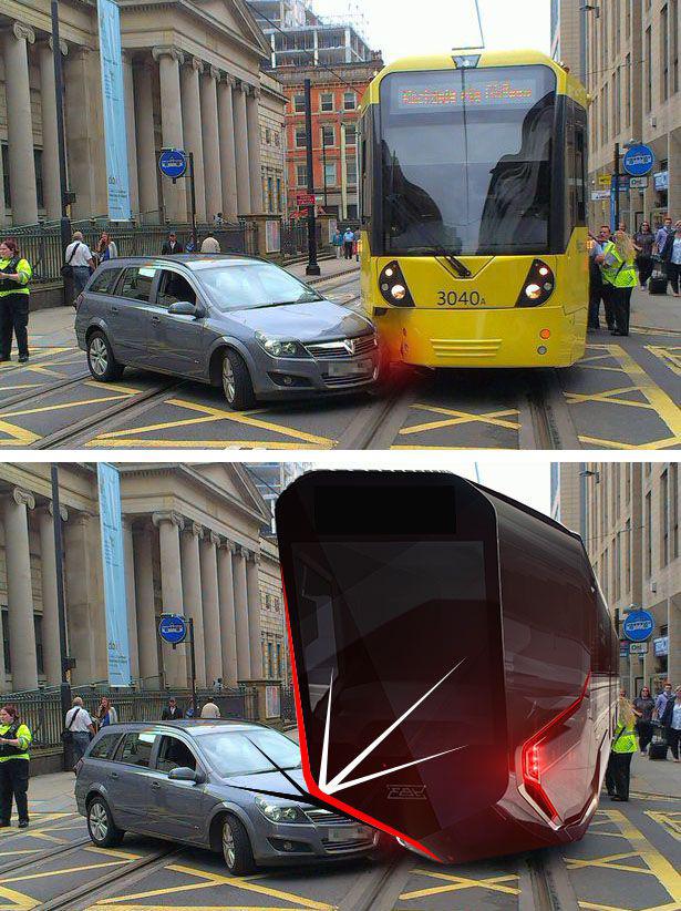
Sharp, not sheltered corners glass cockpit, extremely dangerous for pedestrians. The same goes for the speakers 'paws' headlights.
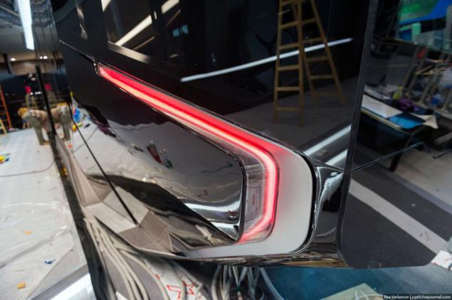
Once we are talking about themselves and headlamps, note that the price of this product is very high. Most Western counterparts costs quite cheap standard modules (although there are rare exceptions).
Simple lights

And complex
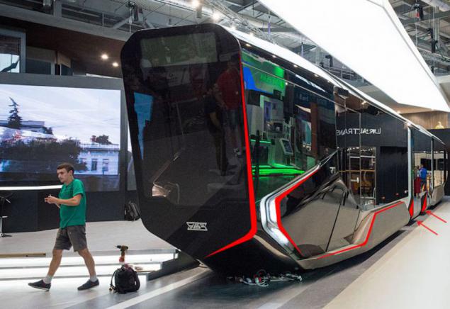
We turn to the side facade. As I wrote in the beginning of the modern trams are built in a modular fashion with a constant cross-section of the body (to reduce production costs) - here the situation is different. Ability to create design variations for different cities is limited to a very characteristic obsession plastics sidewall. In the lower part of the body pretty much unique in shape (which is considerably raises the costs) and traumatic protruding elements - whether developed or bogie frame decorative profiles. The doors of the central module in the lower part also significantly protrude from the body volume. "Bevel" taken from the lower part of the body shows a significant reduction of useful floor space of the cabin.
Go to the front door. The door is not uniform, and has a unique shape. Unjustifiable extravagance.
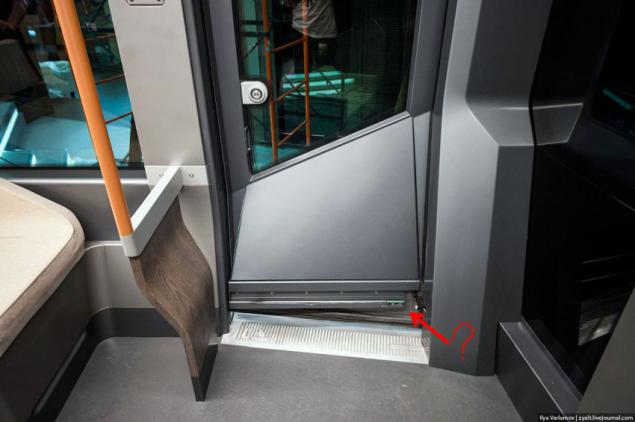
Sill, continuing on the sidewall of the body is not clearly indicates the entry zone, on the other hand, introduces passenger confusing - is it possible to get up to it or not?
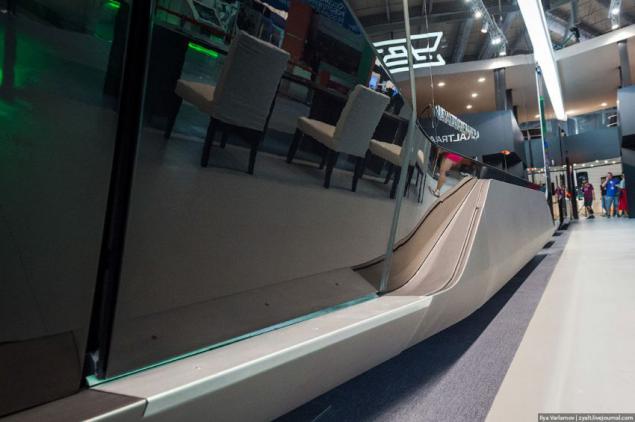
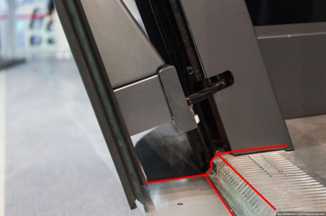
External and internal threshold skid pad forms a step in which you can easily stumble. Input pad anti-framed picture with such a direction that just promotes slip feet.
Playground chains in Alstom Citadis
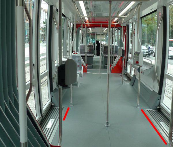
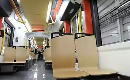
Inside, there are also many reasons for criticism. On the narrower the bottom of the floor I said, however, we continue to see examples of irrational use of space. The biggest question is zone carts. As noted in the post Ilya Varlamov presented here are not the final form of trolleys - they take up a lot of space in length, which was the reason for the installation of longitudinal sofas.
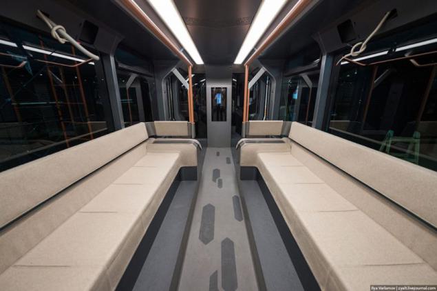
Sofas were on the podium, feet of seated passengers were on a narrow step: wear your shoes will wipe shin standing people.
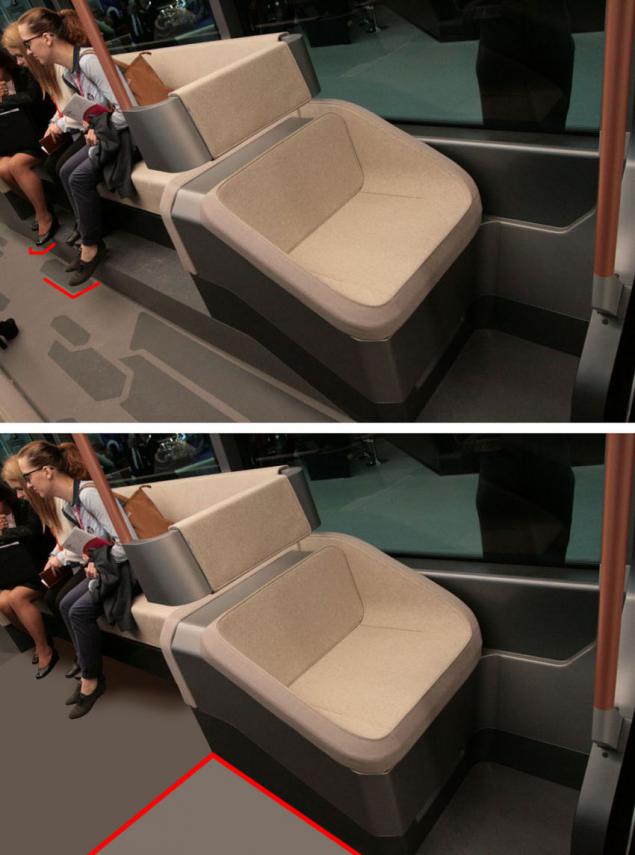
It is dangerous to go in rush hour you will not find free space on the floor - very narrow aisle - certainly stepped on the foot of standing passengers. The solution is simple - the ramp, but your tram stop being 100% low-floor, but passengers will have a comfortable spacious grounds.
Another example of irrational use of space is a massive chair mounted at the ends of the longitudinal sofas (layout 1 + 1).
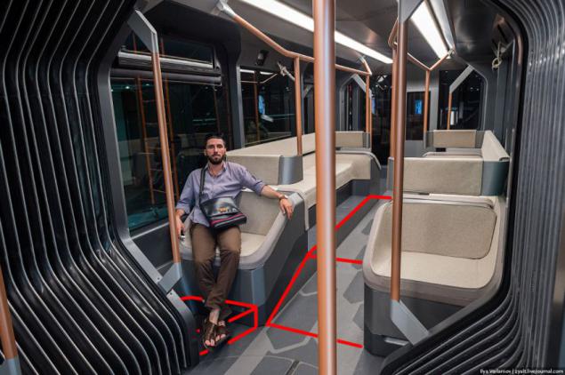
They resemble their size home chair with wide armrests. Their width allows to stay ... one passenger, although a standard width of 2500 mm body are usually placed on two chairs on each side (2 + 2).
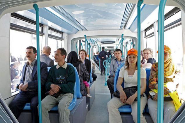
Of course, not necessarily to put some chairs, although unification saves money, it is possible to design a comfortable sofa for two, expanding the space of the seat due to the elimination of large armrests.
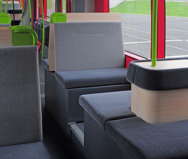
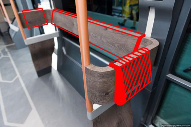
In the area for standing passengers stops back should have a slight slope, and not be strictly vertical, in addition they provide better soft pads.
In conclusion I would like to note that, in spite of external showiness, the project was highly controversial and ill-conceived. In its implementation in its present form, I put a big question. In a statement, the total cost of the finished tram half the foreign models also hard to believe considering the apparent neglect of reasonable economies of unification of elements of the bodywork.
The success or failure of it - you decide!
P.S. As an example, the work on the design in a savings want to recommend to my readers the article "Antilogan" Sergei Znaemskogo in the new issue of "Auto Review", which tells about the Citroen C4 Cactus: as a budget car for ideology, against the background of the whole economy and optimization was twice more close to the consumer qualities and characteristics of Renault Logan - more largely due to the bright and "complex" design.
P.P.S. Example angular design of Alstom
Source: nevolia.net
Strange animals
LG G Watch: A complete analysis of iFixit (and 9 out of 10 on a scale to be repaired)

