944
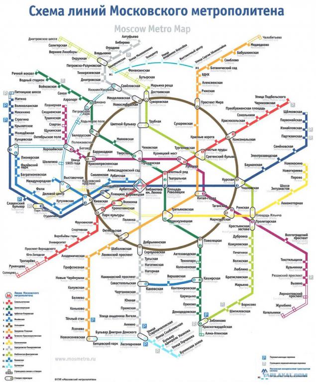
In the Moscow subway began to hang the updated diagram.
At the end of September in Moscow metro began to hang the updated diagram. According to the press service of the subway, design has become more concise and more like their Western counterparts. The lines become thinner labels - contrast. In addition, the scheme has disappeared from the Moscow River.
Citizens criticized the new scheme: one - for the unrecognizable others - for design errors. The Village collected responses to the new scheme and questioned her about their designers. The scheme was found 12 deficiencies. Most of them - just carelessness, but there are those who make the scheme difficult to understand. Taken from here The Village
Will be 12 photos
1. No river
In the previous scheme the Moscow River not present as a transport artery and as a reference point: to understand, in what Beach is, it was easier to figure out how to get to where you need to. Without the river scheme has become less informative.
2. There is no reference to the terrain
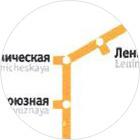
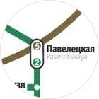
Driving completely lost binding to real Moscow. If you believe its scale, from "Kropotkinskaya" to "Tretyakov" as much of the "China Town" to "Lubyanka." Also, odd lines are bent: for example, from "Leninsky Prospekt", "red" branch turns sharply, although in life goes in a straight line to the "warm mill."
3. No stations and airports
That scheme was removed from the train stations and airports, it is considered one of the main mistakes of designers of the new scheme: tourists often only thanks to these markings and can figure out how to get to "Aeroexpress". Instead, the scheme outlined current and projected intercept parking, which, of course, also important, but not as train stations and airports. Especially as the icon of parking is not always lined by resection with the station name.
4. abandon the traditional appearance
The updated scheme really visually similar to their Western counterparts, but completely unrecognizable to the Muscovites, who are used to the traditional style. The familiar spider raspolzsya, "gray" branch, which is usually located in the middle of the circuit, went to the left. Passengers will have to actually re-learn scheme.
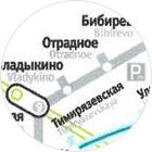
5. The circuit is filled unevenly
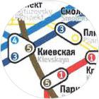
In one part of the circuit, for example in the "Pipe", "Sukharevskaya" and "Dostoevsky", plenty of storage space, while on the "Arbat" to "Kutuzov" - chaos and confusion: they intertwine just four lines, including the projected continued Kalinin.
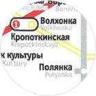
6. Inscriptions on a diagonal
and on top of the circuit
Art director of "RIA Novosti" Ilya Ruderman said in an interview with The Village, which, among other things, he appeared confused on the new scheme lettering diagonally. Now, to get a grasp of the station names Skytrain or the monorail, it is necessary to tilt the head. In addition, the new scheme is much more overwriting lines (mainly on the ring), which are more difficult to read.

7. Outlines of letters
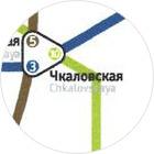
Apparently, the designers of the new scheme and does not decide whether to make the white outline of a station name: for example, "Chkalov" is printed without any circuit, and "Turgenevskaya" (and this applies to the Latin name of the station) - with white stroke. The same applies to Barrikadnaya and adjacent to it Begovaya.
8. Sticking
It's hard to figure out what can be justified by the creators of the scheme if they are not taken care of, so that nothing is sticking out of nowhere. And sticking a lot of things: the line continues after the end (for example, "purple" branch in the north), and serifs with stations go beyond the lines.
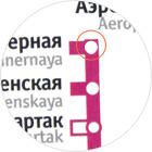
9. Uneven text
In the scheme there is no uniform standard text-align: float with respect to the inscription of the corresponding notches.
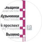
10. The curves and uneven turns
"Lime" line refracts to "Chkalov" and goes on smoothly. In addition, the stations are hidden under the mark turns rough branches.
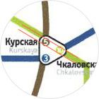
11. Intersection with stations
apart
Most designers agreed that if the scheme designers decided to designate the station serif, the latter had to turn in one direction. The fact that the names of the stations look in different directions, not only violates the harmony, but also makes the scheme less clear.
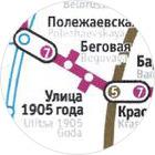
12 plants under construction are similar to the existing
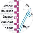
Many noted that the new scheme is not clear to any of stations can be reached, and which are being built. For example, the future continuation of the Lublin-Dmitrov line is no less convincing than the nearby monorail line. Or station "Spartacus," which looks quite valid.
All!
Source: ">