1453
About navigation in the metro
Let's talk about navigation in the metro, the topic is very important.
Every day millions of people use the subway, it is important that everything worked like clockwork.
Now navigate in the Moscow subway, no constantly lifts up his head, trying to understand where to go, on which platform to go, the whole procedure takes a long time - this is unacceptable.
Let us first recall how to construct the navigation in the Moscow subway today, and then look at some interesting solutions that could be used to develop a new navigation.
For example, in Shchukino person gets on the subway ... he meets a mysterious enough navigation. To understand which way to go is impossible. Where a tram is not clear. At the station, there is no map of the area.
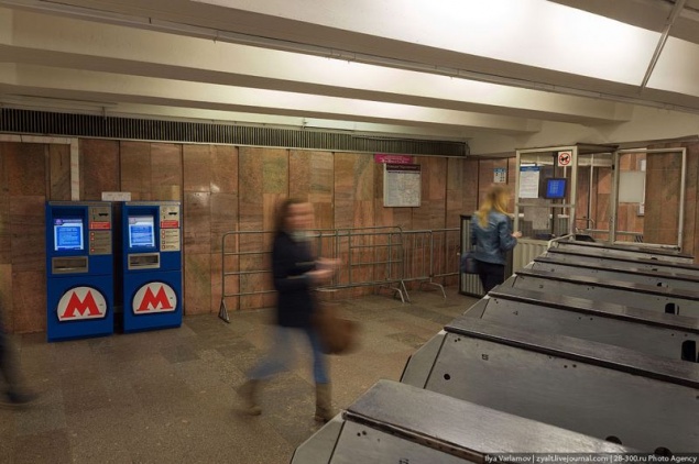
Common lobby usual subway station ... There are no maps of the area, it is impossible to know what and how to go there trams. There is absolutely no information, which would help to navigate the area. She's not even Russian, not to mention English. But most people who come to the area "teleported" it is on the metro. Driving lines hanging behind bars at the top, it is impossible to use it.
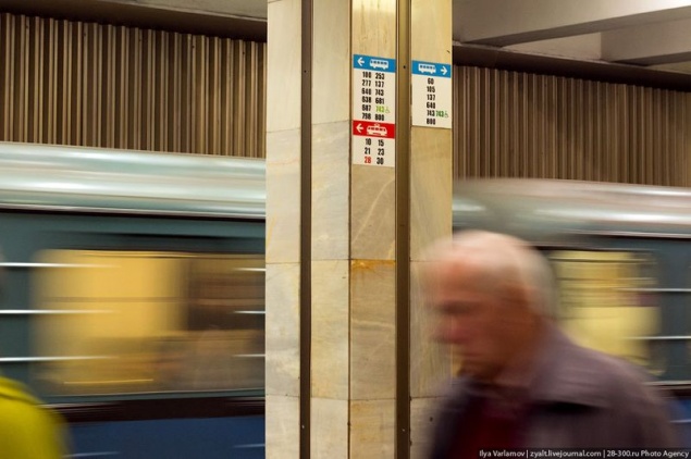
Another circuit lines hanging on the Information column. Hang it in such a way to deliver maximum pain and suffering passengers. Approach it is possible only after passing through the turnstiles. But in the lobby there was a lot of room for huge advertising posters. This, of course, important.
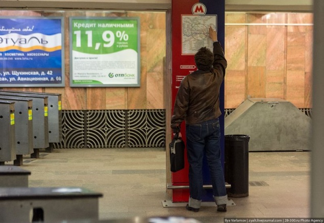
We can say that the normal navigation in the Moscow subway there. Now let's see what we can do about it.
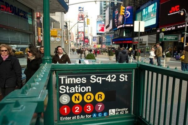
Let's start with the entrance to the station. Here is an example from New York. It is immediately evident on any line and station can be reached.
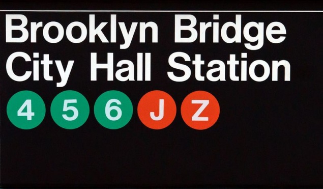
This is the entrance to the subway to Manhattan. Now we have to understand where any line, any transplant is from this station, you need at least down to the lobby. In New York, all at once it is clear even in the street.
And this is the entrance to the metro Philadelphia - blue line, it includes painted blue.
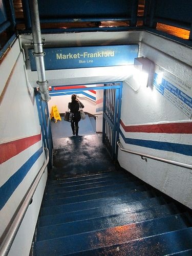
The navigation should be increased emphasis on line. We transitions to the "Theater", instead of a line "2". It is very complicated to navigate in global terms, because a person chooses the first line, and then they choose the station. Now he has to remember which station at what lines
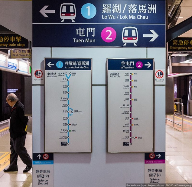
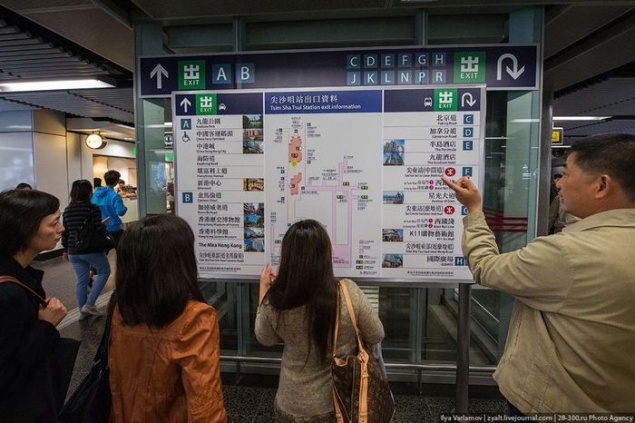
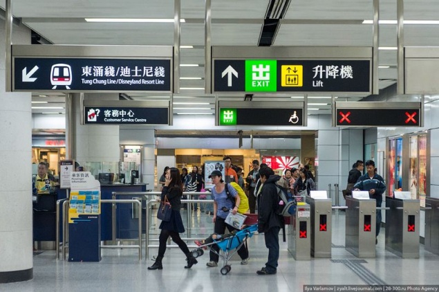
An interesting solution to the Hong Kong subway exits and marking stations. They complement the standard schemes photographs. To the left and right output circuit pictures where that is.
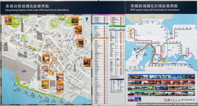
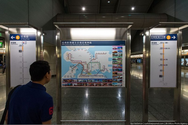
Very handy when hanging the scheme once the descent to the station. On the left is indicated where the train goes with a platform. We are now just transfer station, which is very inconvenient.
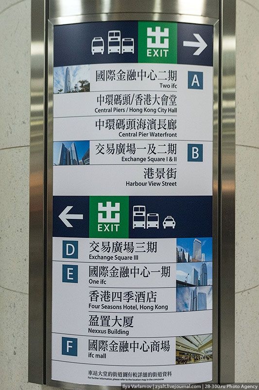
Marking out of the subway in Hong Kong. Each output is labeled. It is very convenient can be used for routing. We are saying "get out of the first car in the center, up the stairs, to the left, and then the first exit to the right." It is much easier to say, "You need a way out" B ". Additional outputs are marked photos. I was in the top ten of subways and such a system seems most comfortable. This Hong Kong.
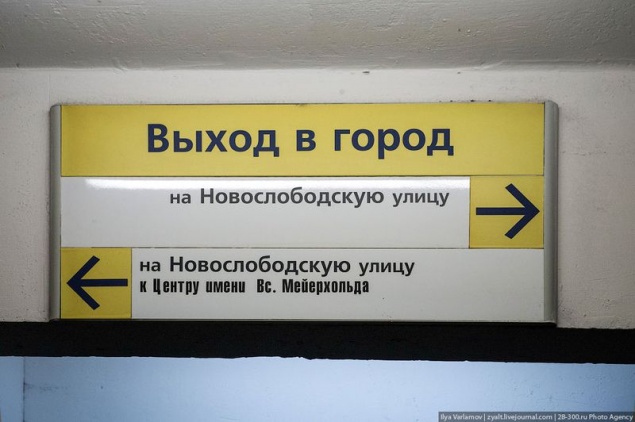
Here in our navigation subway. Try to figure out where you need to go if you are here for the first time. Despite the fact that I live in Moscow, constantly confused in the outputs of the transition. I can imagine what problems immigrants and foreigners.
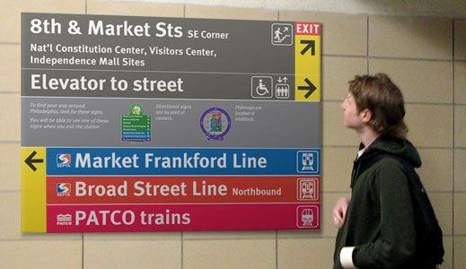
Navigation in Philadelphia. Good decision immediately indicated by the color lines. They are clearly visible and immediately clear where to go.
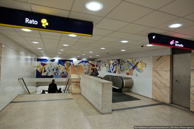
In Lisbon, the additional line marked pictures.
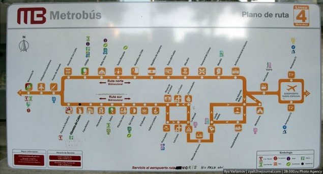
And in Mexico City each station has an icon.
Voice obyasleniya need to cut back and make concise. For example, the fact that the doors are closed, all over the world - is sound. Familiar understood by all. We are "Sliding Doors." The extra information from which you can get rid of.
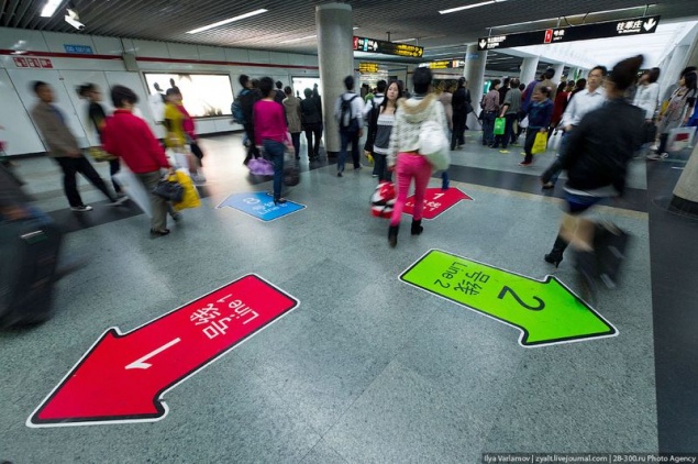
Moscow is not used very important resource space stations - their gender. And it can do a lot of things. On the floor, you can paint areas to transitions such an arrow while moving passengers more comfortable hanging pointers. Similarly, you can specify the direction of "the center" and "from the heart" - on the periphery of that man, down to the station, immediately knew where to go. Here's how it is implemented in Shanghai.
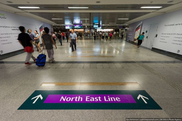
But Singapore's subway.
It is important to indicate the place of opening of doors.
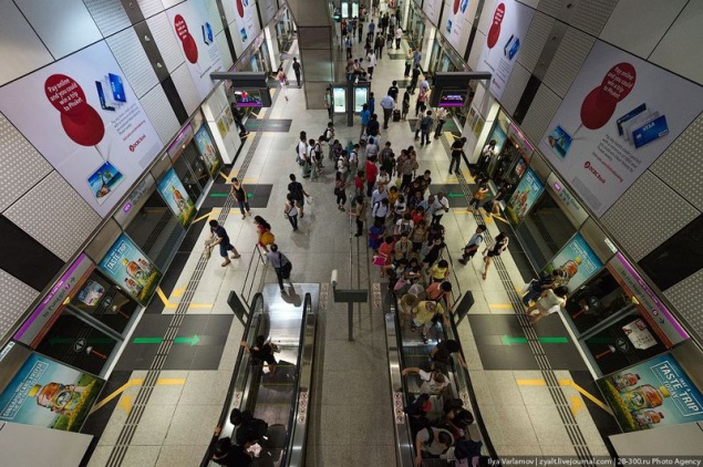
This will help people to correctly line up, waiting for the train that will speed up the disembarkation of passengers. Separately indicate the zone to exit passengers to there were people. In the photo Singapore.
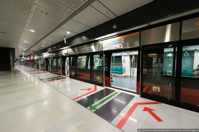
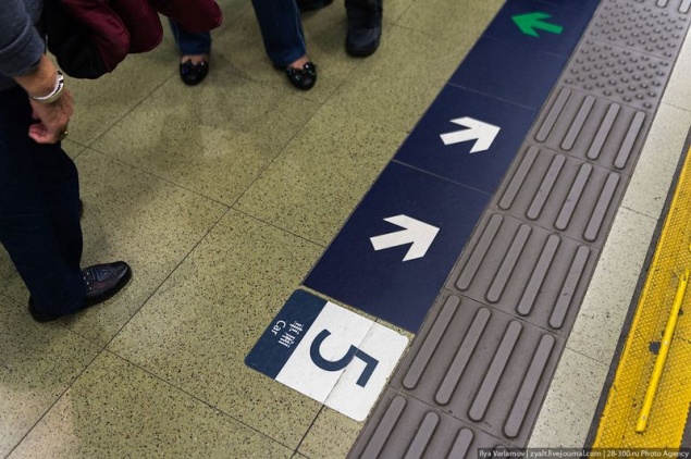
The platform can immediately indicate the number of the car. This is useful for passengers who plan their optimum route. For example, Yandex-metro in the construction of the route directly advises, what better car to sit. But no indication how to find the right car at the station clearly. An example of Hong Kong.
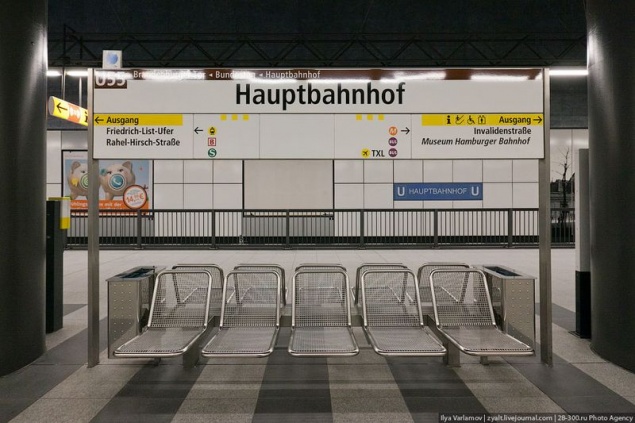
The stations need normal information boards, which will be detailed map and subway map. Now, to see the map, you need to go up to the lobby. Generally metro scheme sorely lacking on the platforms. Here is an example of the Berlin Underground:
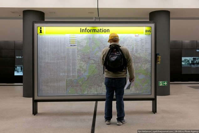
Accommodation options schemes at stations.
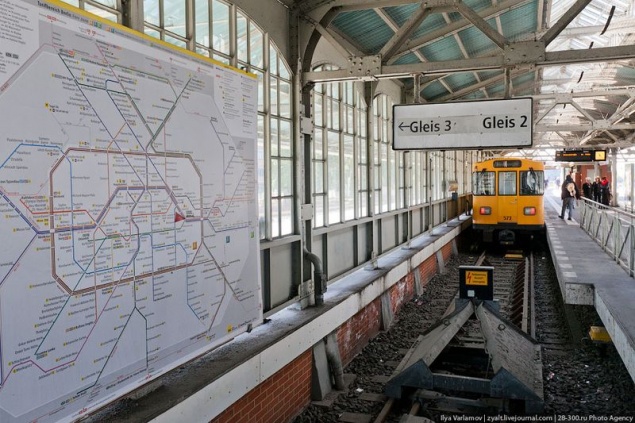
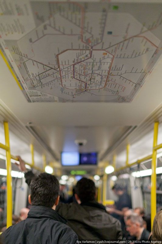
Since I started talking about the schemes, in wagons it can be hung on the ceiling.
Information board indicating outputs in Berlin.
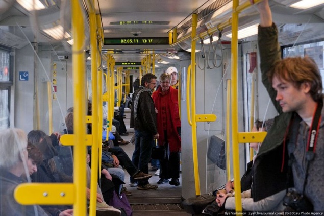
Separately it is necessary to pay attention to electronic destination sign on a train. In any city in the world hanging light strip on which they write the next station, it is necessary, in particular for deaf people, and the rest will be useful. We have the old trolley buses are supplemented by these strips, but the subway trains can not overpower. While the price of the two strips on the wagon is 10 thousand rubles in all.
And, of course, all navigation transport must be united.
In the commentary throw good examples of navigation in transport.
Source: zyalt.livejournal.com
Every day millions of people use the subway, it is important that everything worked like clockwork.
Now navigate in the Moscow subway, no constantly lifts up his head, trying to understand where to go, on which platform to go, the whole procedure takes a long time - this is unacceptable.
Let us first recall how to construct the navigation in the Moscow subway today, and then look at some interesting solutions that could be used to develop a new navigation.

For example, in Shchukino person gets on the subway ... he meets a mysterious enough navigation. To understand which way to go is impossible. Where a tram is not clear. At the station, there is no map of the area.

Common lobby usual subway station ... There are no maps of the area, it is impossible to know what and how to go there trams. There is absolutely no information, which would help to navigate the area. She's not even Russian, not to mention English. But most people who come to the area "teleported" it is on the metro. Driving lines hanging behind bars at the top, it is impossible to use it.

Another circuit lines hanging on the Information column. Hang it in such a way to deliver maximum pain and suffering passengers. Approach it is possible only after passing through the turnstiles. But in the lobby there was a lot of room for huge advertising posters. This, of course, important.

We can say that the normal navigation in the Moscow subway there. Now let's see what we can do about it.
Let's start with the entrance to the station. Here is an example from New York. It is immediately evident on any line and station can be reached.

This is the entrance to the subway to Manhattan. Now we have to understand where any line, any transplant is from this station, you need at least down to the lobby. In New York, all at once it is clear even in the street.

And this is the entrance to the metro Philadelphia - blue line, it includes painted blue.

The navigation should be increased emphasis on line. We transitions to the "Theater", instead of a line "2". It is very complicated to navigate in global terms, because a person chooses the first line, and then they choose the station. Now he has to remember which station at what lines

An interesting solution to the Hong Kong subway exits and marking stations. They complement the standard schemes photographs. To the left and right output circuit pictures where that is.

Very handy when hanging the scheme once the descent to the station. On the left is indicated where the train goes with a platform. We are now just transfer station, which is very inconvenient.

Marking out of the subway in Hong Kong. Each output is labeled. It is very convenient can be used for routing. We are saying "get out of the first car in the center, up the stairs, to the left, and then the first exit to the right." It is much easier to say, "You need a way out" B ". Additional outputs are marked photos. I was in the top ten of subways and such a system seems most comfortable. This Hong Kong.

Here in our navigation subway. Try to figure out where you need to go if you are here for the first time. Despite the fact that I live in Moscow, constantly confused in the outputs of the transition. I can imagine what problems immigrants and foreigners.

Navigation in Philadelphia. Good decision immediately indicated by the color lines. They are clearly visible and immediately clear where to go.

In Lisbon, the additional line marked pictures.

And in Mexico City each station has an icon.

Voice obyasleniya need to cut back and make concise. For example, the fact that the doors are closed, all over the world - is sound. Familiar understood by all. We are "Sliding Doors." The extra information from which you can get rid of.
Moscow is not used very important resource space stations - their gender. And it can do a lot of things. On the floor, you can paint areas to transitions such an arrow while moving passengers more comfortable hanging pointers. Similarly, you can specify the direction of "the center" and "from the heart" - on the periphery of that man, down to the station, immediately knew where to go. Here's how it is implemented in Shanghai.

But Singapore's subway.

It is important to indicate the place of opening of doors.

This will help people to correctly line up, waiting for the train that will speed up the disembarkation of passengers. Separately indicate the zone to exit passengers to there were people. In the photo Singapore.

The platform can immediately indicate the number of the car. This is useful for passengers who plan their optimum route. For example, Yandex-metro in the construction of the route directly advises, what better car to sit. But no indication how to find the right car at the station clearly. An example of Hong Kong.

The stations need normal information boards, which will be detailed map and subway map. Now, to see the map, you need to go up to the lobby. Generally metro scheme sorely lacking on the platforms. Here is an example of the Berlin Underground:

Accommodation options schemes at stations.

Since I started talking about the schemes, in wagons it can be hung on the ceiling.

Information board indicating outputs in Berlin.


Separately it is necessary to pay attention to electronic destination sign on a train. In any city in the world hanging light strip on which they write the next station, it is necessary, in particular for deaf people, and the rest will be useful. We have the old trolley buses are supplemented by these strips, but the subway trains can not overpower. While the price of the two strips on the wagon is 10 thousand rubles in all.

And, of course, all navigation transport must be united.
In the commentary throw good examples of navigation in transport.
Source: zyalt.livejournal.com
