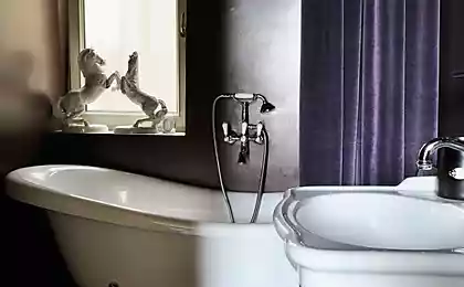
175
An example of the interior of a studio apartment
The word “odnushka” rarely evokes positive associations. This is a one-bedroom apartment where only one person can be comfortable. But the bold design experiment we're going to show you is going to change the way you think about these little apartments.
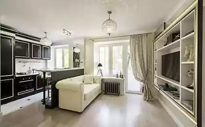
Editorial "Site" presents to your attention the interior, which proves that from the usual Khrushchev and boring dwelling you can get studio It's just a designer jewel.
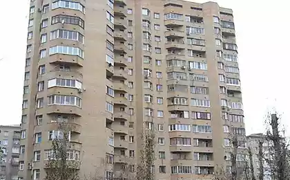
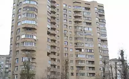
The interior of the studio apartment Designers got crucifix 1960 built, and the space of 30 square meters. m. had to be used to the fullest. The kitchen was no exception.
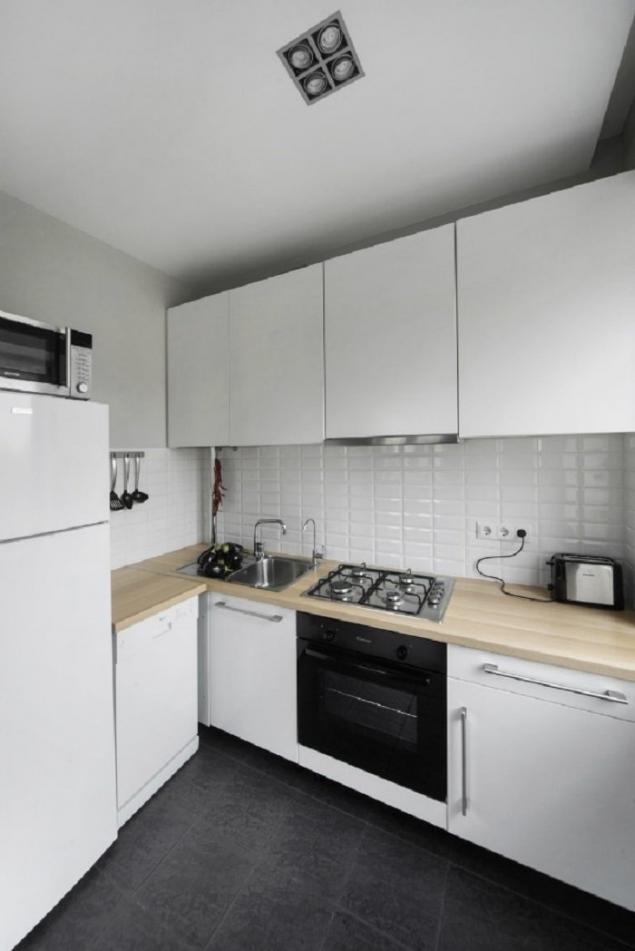
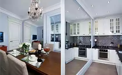
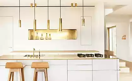
Using local lighting, you can make the kitchen cozy and visually expand it.
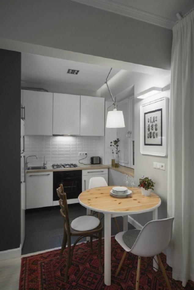
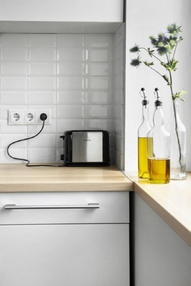
Decoration in the kitchen should be restrained.
The dining room is a small table for three, located on the border between the kitchen and our only room.
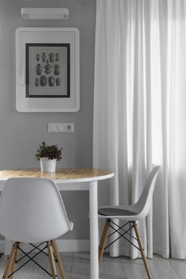
The forced measure in such small apartments is the use of space to the maximum, and in our case this condition is met!
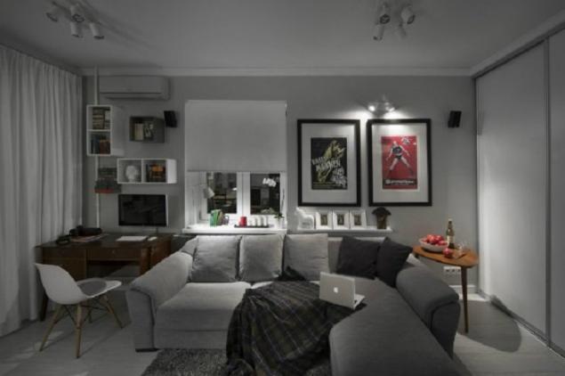
Clean shades of walls balance the rich color of posters.
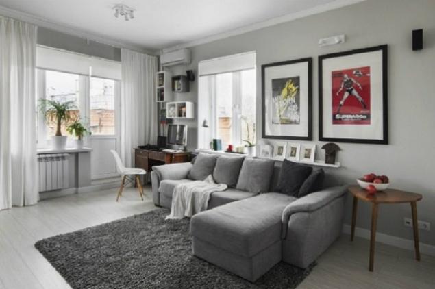
Thoughtful layout and light walls allow you to create the impression of a large open space.
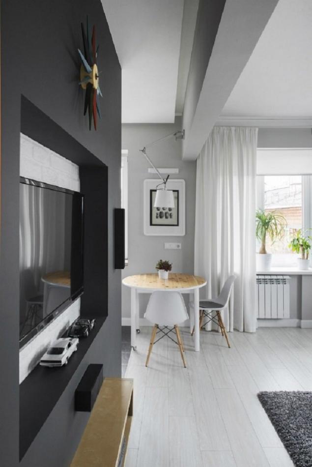
And empty walls can be filled with neat shelves and stylish paintings. But we must not forget the sense of proportion.
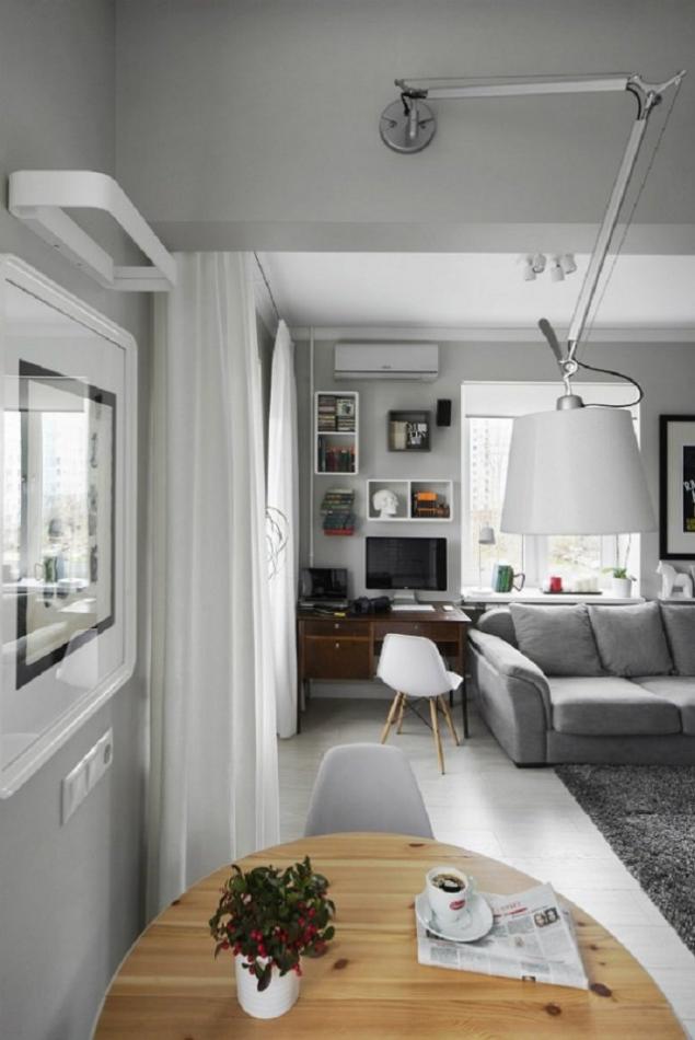
The workplace is located right here in our living room/bedroom and looks very concise!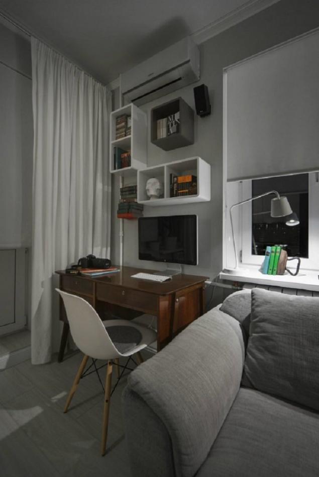
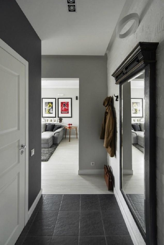
The hallway, as a place in which guests first get, repeats the familiar style of design of the entire apartment. The newcomer will feel comfortable here from the first second.
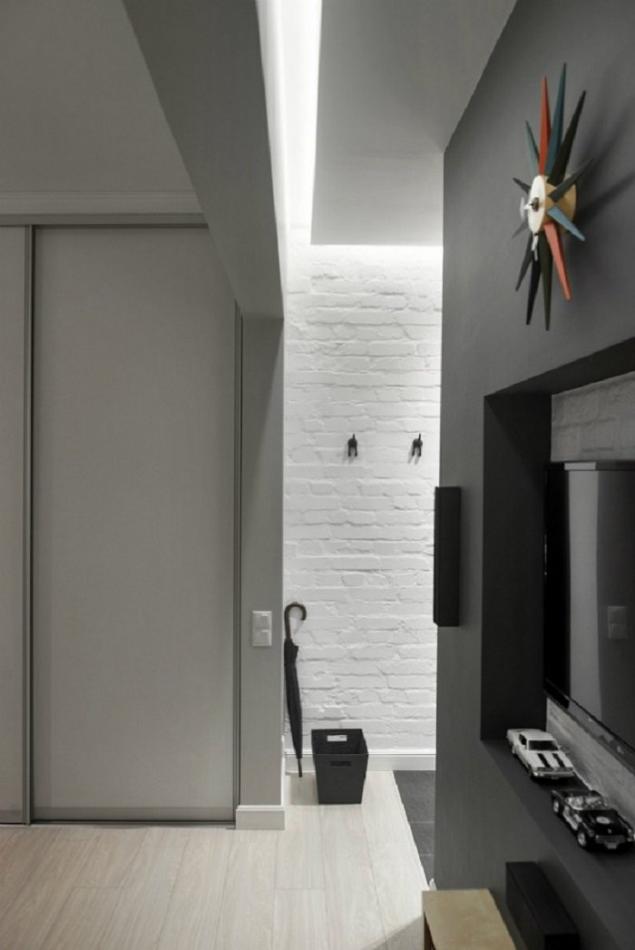
Massive mirror is not only convenient to use, but also performs the main task - visually expands the living space.
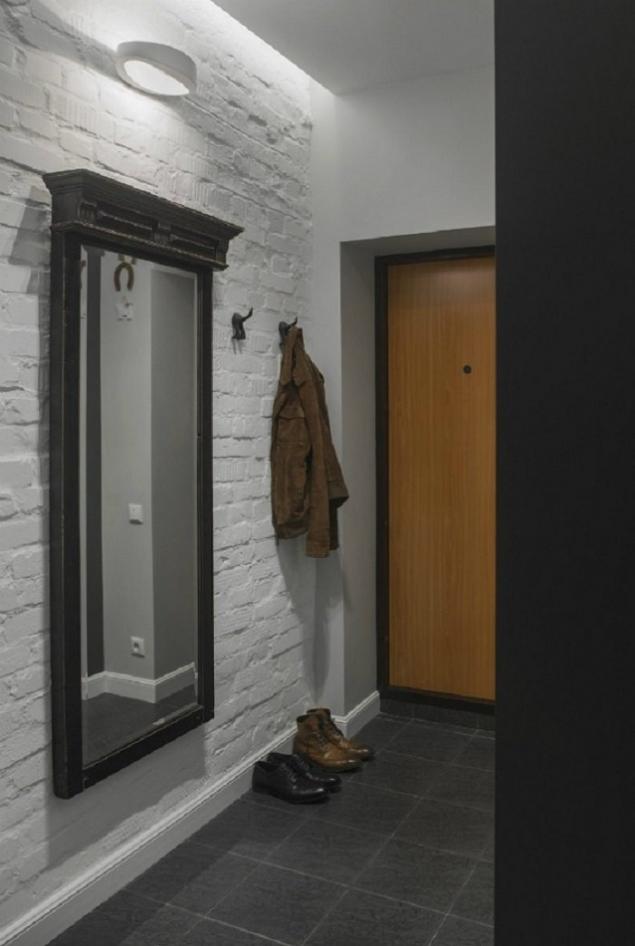
Even in the daytime, there is enough light in the corridor to put yourself in order.
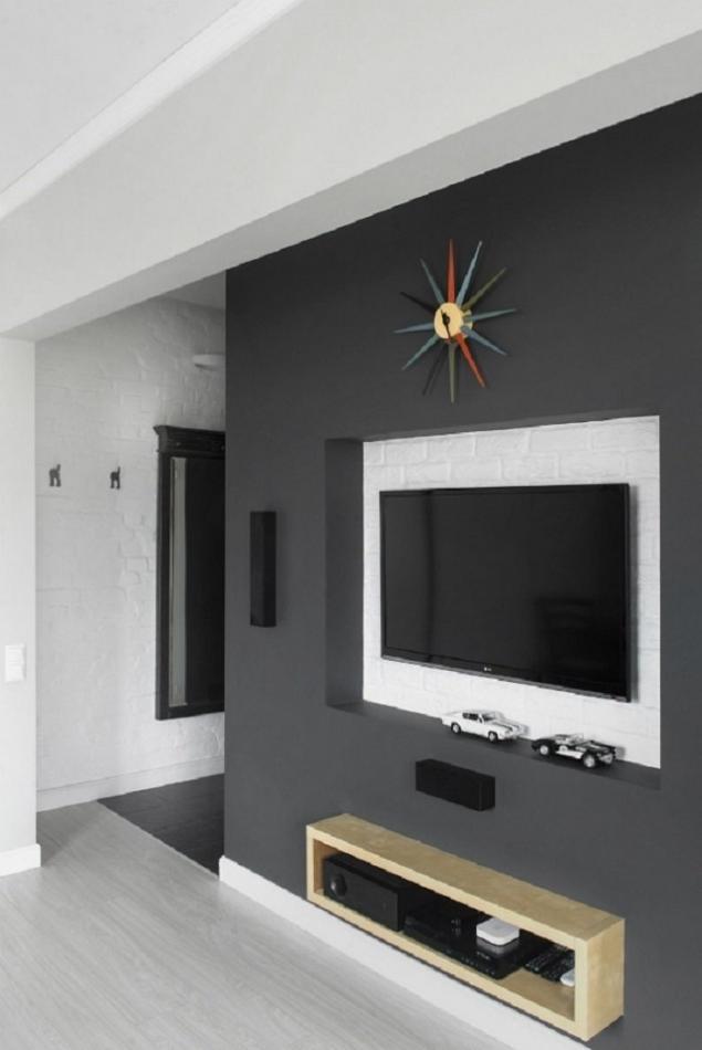
Unusual watches and a niche in the wall for the TV has become a must-have attribute of every modern apartment.
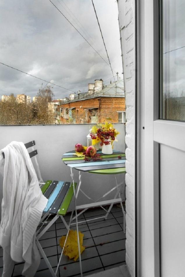
The balcony is decorated in the form of a place for rest, where it is especially pleasant to spend quiet evenings.
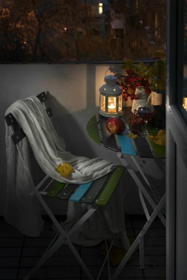
The table and chair are brightly colored, which slightly distinguishes them from other furniture in the apartment.
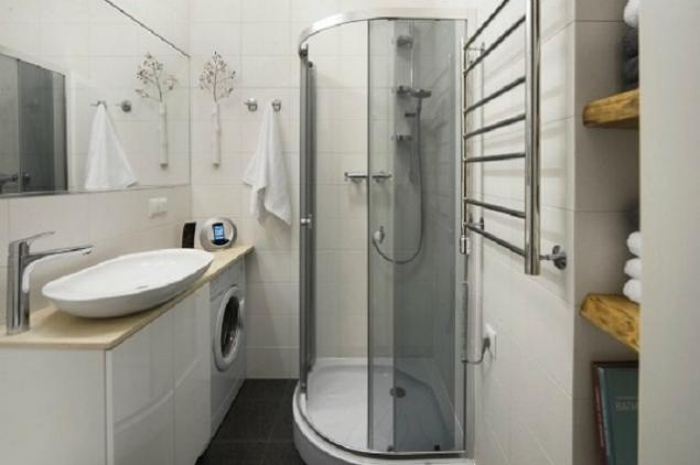
A bright and spacious bathroom like this will always be a pleasure to visit.
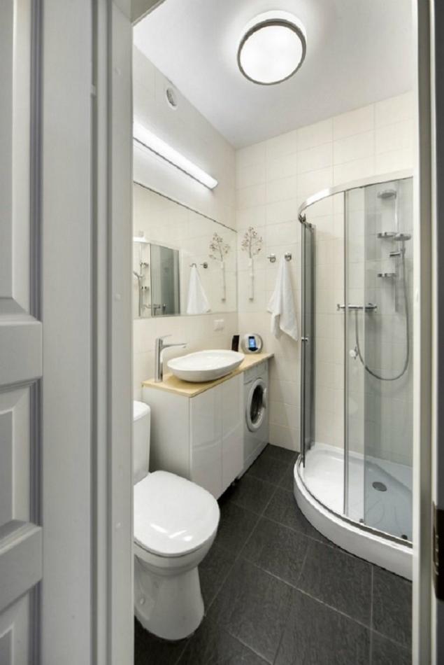
When there are no extra details, the room looks much more neat.
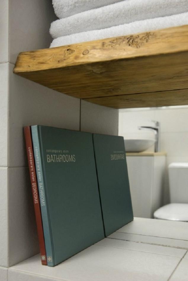
A couple of books in the bathroom is an unusual move, but it looks very appropriate.
As you can see, the experiment was more than successful! The apartment looks beautiful and spacious. And most importantly, now owners of small apartments have a great example of how to change your nest. After all, there is absolutely no need to crowd in narrow passageways and piles of furniture that still remembers your grandmother.
Do not forget to share with your friends photos of the unforgettable interior, and also share your opinion on how to look like. studio-house.
Editorial "Site" presents to your attention the interior, which proves that from the usual Khrushchev and boring dwelling you can get studio It's just a designer jewel.
The interior of the studio apartment Designers got crucifix 1960 built, and the space of 30 square meters. m. had to be used to the fullest. The kitchen was no exception.

Using local lighting, you can make the kitchen cozy and visually expand it.

Decoration in the kitchen should be restrained.

The dining room is a small table for three, located on the border between the kitchen and our only room.

The forced measure in such small apartments is the use of space to the maximum, and in our case this condition is met!

Clean shades of walls balance the rich color of posters.

Thoughtful layout and light walls allow you to create the impression of a large open space.

And empty walls can be filled with neat shelves and stylish paintings. But we must not forget the sense of proportion.

The workplace is located right here in our living room/bedroom and looks very concise!

The hallway, as a place in which guests first get, repeats the familiar style of design of the entire apartment. The newcomer will feel comfortable here from the first second.

Massive mirror is not only convenient to use, but also performs the main task - visually expands the living space.

Even in the daytime, there is enough light in the corridor to put yourself in order.

Unusual watches and a niche in the wall for the TV has become a must-have attribute of every modern apartment.

The balcony is decorated in the form of a place for rest, where it is especially pleasant to spend quiet evenings.

The table and chair are brightly colored, which slightly distinguishes them from other furniture in the apartment.

A bright and spacious bathroom like this will always be a pleasure to visit.

When there are no extra details, the room looks much more neat.

A couple of books in the bathroom is an unusual move, but it looks very appropriate.

As you can see, the experiment was more than successful! The apartment looks beautiful and spacious. And most importantly, now owners of small apartments have a great example of how to change your nest. After all, there is absolutely no need to crowd in narrow passageways and piles of furniture that still remembers your grandmother.
Do not forget to share with your friends photos of the unforgettable interior, and also share your opinion on how to look like. studio-house.
I made chicken fillets in an unusual way! Well, a very juicy dish...
The Bible of star beauties: 18 simple rules for perfect appearance
