562
Planning the kitchen of your dreams: tips
The matter is so serious that it requires the utmost attention and prudence. So jokes aside. You design not just one of the rooms, and your future lifestyle.
1. Wall cabinets set at a minimum distance of 50 to 70 cm from the working surface. The hood is recommended to be installed at a distance of 65 cm (electric cookers), 75 cm (for gas stoves) for good air circulation and the rapid disappearance of smoke.
2. In the case of parallel type of cuisine, leave a minimum space of 1 m 20 cm, to be able to access the various items and furniture, as well as for free movement.
3. At an angular location of the kitchen, never place the boxes on the corner, as there is a risk that they cannot be opened. The same advice applies for the dishwasher and the oven.
4. Leave space between the wall and the last box (hanging or floor) to easily open the door. This space will be filled with wires or pipes.
5. Leave a space of at least 90 cm between the kitchen and dining table for free movement.
6. Plan a free space between the stove and sink (min 50 cm).
7. Do not install lower cabinets with drawers close to the stove — small children can get them up to the plate and get burned.
8. Do not install outlets next to the sink.
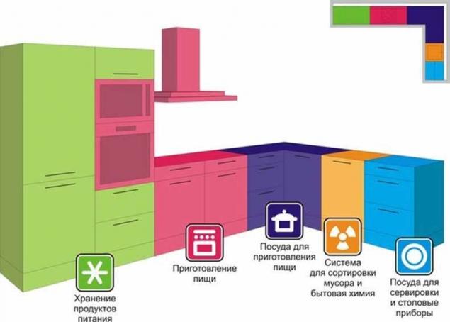
Working area – the heart of the kitchen; here are places for food storage, tables for butchering and cooking. The question arises, how this is all reasonable to place? According to the experts, refrigerator, sink and stove should not coexist with each other and with tables. They form the so-called work triangle: storage – butchering – cooking. Comfortable area work triangle should not exceed 7 square meters, otherwise you will have a hard time running from plate to the sink and the refrigerator. Not should it be less than 4 square feet – this will create a tightness.
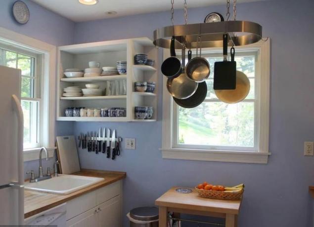
In efforts for the beautification of the external appearance we should not forget about the internal content. For example, large dishes you prefer to be placed in deep drawers under the stove, and the products that occupy a large volume, at the cutting tables. Don't forget that installing a double socket on each working surface will greatly facilitate your life, for while in one place to boil the kettle and with a crash popping up the toast, next you grind coffee, or whip eggs for omelets. The sink and dishwasher (and if space allows, and washing), install near any water, so preventive works do not become burdensome. Look for double (triple) sink – with an abundance of crockery and Cutlery they are the most comfortable. Lighting should be directed along the wall cabinets on the bottom, and background.
Please note if there are too many in your version of the project of homogeneous materials and long parallel lines? May be it is better to revive the strictness of appearance, having provided angular shelves, tiered Seating stands or open just one or two open shelves. And finally, about the corner cabinets. Rotating, they are so convenient, economical in terms of cost of effort to procure this or that item that you won't stop to wonder how it's possible to do without them?
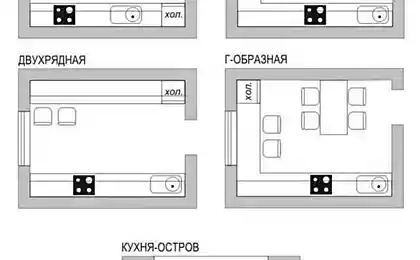
By carefully analyzing their demands to the kitchen, you will face the problem of accommodation on its territory. It is no secret that the main shortcoming of our model of housing is its minimality. Don't despair, there are six basic types of kitchen design allowing the in this situation to seek comfort, here they are: one and two lines, L-shaped (corner); U-shaped (in the form of a rectangular trapezoid) and two combined, the so-called ‘island’ and ‘Peninsula’. More about this you can read here.
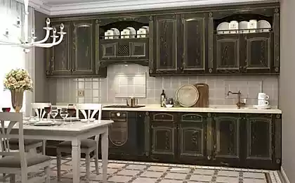
The kitchen is in one line
designed for 1 or 2 people, set under conditions of very limited space, a working area it is half of the entire area, so if you decide to combine it with a dining room, install sliding or folding dining table, otherwise the passage area will be minimal and, of course, extremely inconvenient.
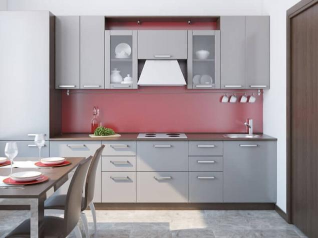
Also, this layout can be used in the multi-purpose room ‘kitchen-dining-living’, in this case, the whole kitchen will be located in one part of the room, the other will be used for eating and relaxing (more the theme of combining kitchen and dining room we will be back in one of our future articles).
Kitchen in two lines – simple and compact in layout.
The rational location of stove and sink on one side, the refrigerator and the cabinets on the other. The optimal distance between opposing lines is not less than 1.2 metres, otherwise you may encounter bent to the other closet. This plan also assumes the presence of mobile tables or, in fact, served.
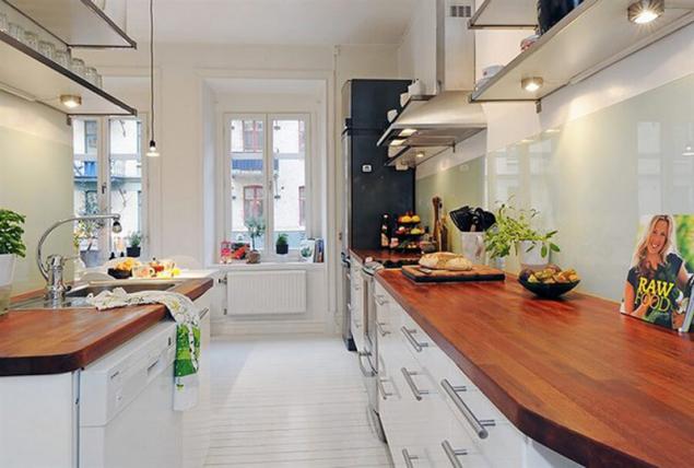
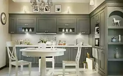
– L – the layout is exceptional in terms of creating a convenient work triangle, furniture and equipment in this case are placed along two adjacent walls. Dining table can be placed easily without damage to the passageway. This option is suitable for almost all applications, except, perhaps narrow.
– U – design best of all, convenient and safe, since furniture and appliances are installed along three walls. Here is no through traffic. If such planning area of the passage is a little less than half of the working area, it allows you to use the kitchen as a dining room. For a large kitchen or kitchen-dining room will fit a combined scheme: a corner work area plus, in the continuation of the line, perpendicular kitchen or dining table. In kitchens-dining rooms short perpendicular line divides the working table and dining areas, with properly chosen length of the table, the harmony matching of the working area and dining zone of passage is not impaired. You can use the U-layout and small kitchen (5-8kV.m.), then the distance between the ends should be at least 1.5-2 meters.
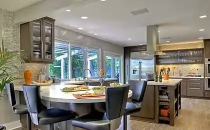
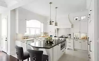
The so – called ‘Peninsula’ and ’island’ are suitable only for large kitchens (16 sq. m.). Kitchen island includes angular or U-shaped pattern with an extra work surface in the middle. ‘The island’ looks very elegant, but requires very elaborate plan to avoid unnecessary walking.
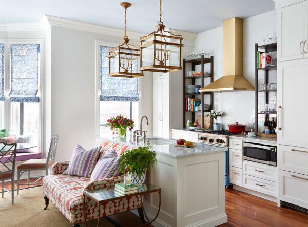
In conclusion, it is necessary to dwell on the problems associated with the redevelopment of our favorite ’tipovushek’. If you live in the ‘Khrushchev’, then surely unhappy tiny razmerchik we are interested in the subject. But of course, there are several solutions to the problem, as small to do more.
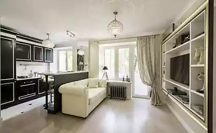
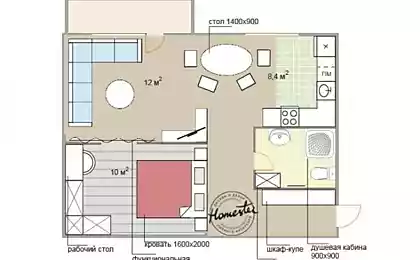
First. Get rid of the door or make it retractable. It would be nice to remove one of the walls, (or at least part of it) in order to connect two small space and turn them into a single functional area.
At the modern level of development of the art of construction and design is not so difficult even in the ’Khrushchev’ to make a great eat-in kitchen. This option is most roads in relation to money, but also the most COMFORTABLE!
If finances, as they say, busy vocal frills, stick to a carefully conceived layout. In ’Khrushchev’ fit corner (optimal for 3 or more residents), and in one line types of planning.
In the corner option is genius in its simplicity, would be the acquisition of a folding table, or a construction from unoccupied work area wall racks like a bar, recliner, just in case, the canteen surface. Corner designs do not forget about the different types of movable shelves (more on that in a later article) that will make sing the heart of the most that neither is a demanding mistress.
If you live by the principle ’simplicity rules!’, ogranichtes open racks. For kitchens in one line technical solution will be narrow and tall shelves on the opposite wall and a small table can be accommodated at the window.
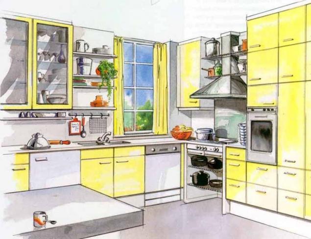
Typical dishes some block masterpieces abound such as small kitchenettes, moreover, inconsistent. Can you advise the owners of these architectural creations to meet the interior in light colours, which will increase the volume. The straight lines of your ’baby’ will also create the illusion of more space. Necessary diversity in the interior ’kitchen crumbs’ can be achieved by using various compact multifunction equipment.
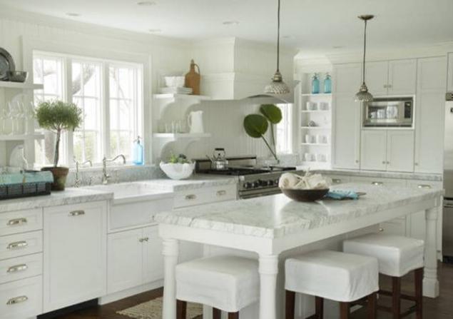
Oddly enough, the layout problem have large kitchens, where it is extremely difficult creating an atmosphere of a single space. It is often crushed into small areas and creates a sense of discomfort. The designers in this case, the recommended layout of the kitchen island. In the center of the square may be stove, Breakfast bar and sink. The optimum size for the island – 1200 x 1200 mm, minimum 600 to 900 mm. ’Island’ may be not only square, but curved.
One of the rules of the interior States that with the convenient layout of the kitchen area without dining space should be between 8 to 10 square meters. Unfortunately, our typical kitchen modest size. Only the hands of a talented designer will transform your kitchen into an attractive and original. For this you only need to apply in good repair and construction company. published
P. S. And remember, only by changing their consumption — together we change the world! ©
Join us in Facebook , Vkontakte, Odnoklassniki
Source: vse-svoe.com/?p=4894
1. Wall cabinets set at a minimum distance of 50 to 70 cm from the working surface. The hood is recommended to be installed at a distance of 65 cm (electric cookers), 75 cm (for gas stoves) for good air circulation and the rapid disappearance of smoke.
2. In the case of parallel type of cuisine, leave a minimum space of 1 m 20 cm, to be able to access the various items and furniture, as well as for free movement.
3. At an angular location of the kitchen, never place the boxes on the corner, as there is a risk that they cannot be opened. The same advice applies for the dishwasher and the oven.
4. Leave space between the wall and the last box (hanging or floor) to easily open the door. This space will be filled with wires or pipes.
5. Leave a space of at least 90 cm between the kitchen and dining table for free movement.
6. Plan a free space between the stove and sink (min 50 cm).
7. Do not install lower cabinets with drawers close to the stove — small children can get them up to the plate and get burned.
8. Do not install outlets next to the sink.

Working area – the heart of the kitchen; here are places for food storage, tables for butchering and cooking. The question arises, how this is all reasonable to place? According to the experts, refrigerator, sink and stove should not coexist with each other and with tables. They form the so-called work triangle: storage – butchering – cooking. Comfortable area work triangle should not exceed 7 square meters, otherwise you will have a hard time running from plate to the sink and the refrigerator. Not should it be less than 4 square feet – this will create a tightness.

In efforts for the beautification of the external appearance we should not forget about the internal content. For example, large dishes you prefer to be placed in deep drawers under the stove, and the products that occupy a large volume, at the cutting tables. Don't forget that installing a double socket on each working surface will greatly facilitate your life, for while in one place to boil the kettle and with a crash popping up the toast, next you grind coffee, or whip eggs for omelets. The sink and dishwasher (and if space allows, and washing), install near any water, so preventive works do not become burdensome. Look for double (triple) sink – with an abundance of crockery and Cutlery they are the most comfortable. Lighting should be directed along the wall cabinets on the bottom, and background.
Please note if there are too many in your version of the project of homogeneous materials and long parallel lines? May be it is better to revive the strictness of appearance, having provided angular shelves, tiered Seating stands or open just one or two open shelves. And finally, about the corner cabinets. Rotating, they are so convenient, economical in terms of cost of effort to procure this or that item that you won't stop to wonder how it's possible to do without them?
By carefully analyzing their demands to the kitchen, you will face the problem of accommodation on its territory. It is no secret that the main shortcoming of our model of housing is its minimality. Don't despair, there are six basic types of kitchen design allowing the in this situation to seek comfort, here they are: one and two lines, L-shaped (corner); U-shaped (in the form of a rectangular trapezoid) and two combined, the so-called ‘island’ and ‘Peninsula’. More about this you can read here.
The kitchen is in one line
designed for 1 or 2 people, set under conditions of very limited space, a working area it is half of the entire area, so if you decide to combine it with a dining room, install sliding or folding dining table, otherwise the passage area will be minimal and, of course, extremely inconvenient.

Also, this layout can be used in the multi-purpose room ‘kitchen-dining-living’, in this case, the whole kitchen will be located in one part of the room, the other will be used for eating and relaxing (more the theme of combining kitchen and dining room we will be back in one of our future articles).
Kitchen in two lines – simple and compact in layout.
The rational location of stove and sink on one side, the refrigerator and the cabinets on the other. The optimal distance between opposing lines is not less than 1.2 metres, otherwise you may encounter bent to the other closet. This plan also assumes the presence of mobile tables or, in fact, served.

– L – the layout is exceptional in terms of creating a convenient work triangle, furniture and equipment in this case are placed along two adjacent walls. Dining table can be placed easily without damage to the passageway. This option is suitable for almost all applications, except, perhaps narrow.
– U – design best of all, convenient and safe, since furniture and appliances are installed along three walls. Here is no through traffic. If such planning area of the passage is a little less than half of the working area, it allows you to use the kitchen as a dining room. For a large kitchen or kitchen-dining room will fit a combined scheme: a corner work area plus, in the continuation of the line, perpendicular kitchen or dining table. In kitchens-dining rooms short perpendicular line divides the working table and dining areas, with properly chosen length of the table, the harmony matching of the working area and dining zone of passage is not impaired. You can use the U-layout and small kitchen (5-8kV.m.), then the distance between the ends should be at least 1.5-2 meters.
The so – called ‘Peninsula’ and ’island’ are suitable only for large kitchens (16 sq. m.). Kitchen island includes angular or U-shaped pattern with an extra work surface in the middle. ‘The island’ looks very elegant, but requires very elaborate plan to avoid unnecessary walking.

In conclusion, it is necessary to dwell on the problems associated with the redevelopment of our favorite ’tipovushek’. If you live in the ‘Khrushchev’, then surely unhappy tiny razmerchik we are interested in the subject. But of course, there are several solutions to the problem, as small to do more.
First. Get rid of the door or make it retractable. It would be nice to remove one of the walls, (or at least part of it) in order to connect two small space and turn them into a single functional area.
At the modern level of development of the art of construction and design is not so difficult even in the ’Khrushchev’ to make a great eat-in kitchen. This option is most roads in relation to money, but also the most COMFORTABLE!
If finances, as they say, busy vocal frills, stick to a carefully conceived layout. In ’Khrushchev’ fit corner (optimal for 3 or more residents), and in one line types of planning.
In the corner option is genius in its simplicity, would be the acquisition of a folding table, or a construction from unoccupied work area wall racks like a bar, recliner, just in case, the canteen surface. Corner designs do not forget about the different types of movable shelves (more on that in a later article) that will make sing the heart of the most that neither is a demanding mistress.
If you live by the principle ’simplicity rules!’, ogranichtes open racks. For kitchens in one line technical solution will be narrow and tall shelves on the opposite wall and a small table can be accommodated at the window.

Typical dishes some block masterpieces abound such as small kitchenettes, moreover, inconsistent. Can you advise the owners of these architectural creations to meet the interior in light colours, which will increase the volume. The straight lines of your ’baby’ will also create the illusion of more space. Necessary diversity in the interior ’kitchen crumbs’ can be achieved by using various compact multifunction equipment.

Oddly enough, the layout problem have large kitchens, where it is extremely difficult creating an atmosphere of a single space. It is often crushed into small areas and creates a sense of discomfort. The designers in this case, the recommended layout of the kitchen island. In the center of the square may be stove, Breakfast bar and sink. The optimum size for the island – 1200 x 1200 mm, minimum 600 to 900 mm. ’Island’ may be not only square, but curved.
One of the rules of the interior States that with the convenient layout of the kitchen area without dining space should be between 8 to 10 square meters. Unfortunately, our typical kitchen modest size. Only the hands of a talented designer will transform your kitchen into an attractive and original. For this you only need to apply in good repair and construction company. published
P. S. And remember, only by changing their consumption — together we change the world! ©
Join us in Facebook , Vkontakte, Odnoklassniki
Source: vse-svoe.com/?p=4894
This plant cleans the joints and cures the intestinal infection!
As an orphan from Leningrad became one of the richest women in the world
