569
How to choose color for interior design: 10 tips
Color is one main aspect that sets the mood throughout the interior, so his choice should be approached with special attention.
This can often confound, but these 10 tips will help you make the right choice.
1. Pay attention to your wardrobe
Closet is a great source of inspiration for color selection. Giving preference to any color in clothing, we try to emphasize their strengths, to show your character. We subconsciously choose the colors that make us feel better. So your favorite colors can be safely transferred to the interior.
2. Use the rule of three colors
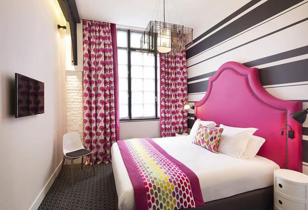
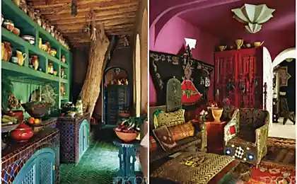
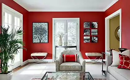
Get lost in a huge variety of colors? Remember the Golden rule of three colors: choose three shades and repeat them in different design elements.
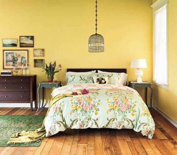
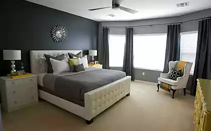
3. Remember the 60/30/10 ratio the Ratio of colors in the space should correspond to the formula of 60/30/10, where:
As a rule,
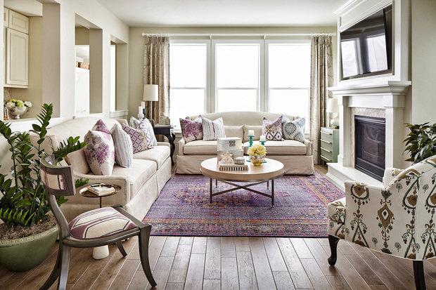
4. Make a variety with similar shades
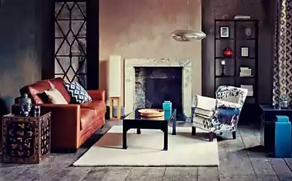
Interior using only three colors may be too fresh. To avoid this, but at the same time not to create a chaos of color, add in the color scheme of lighter or darker shades of the colors already used.
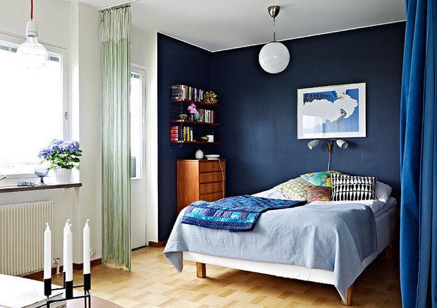
5. Balance warm and cool tones
Always harmonious interior combines warm and cool colors. Rich, warm, color should complement two cool, light tones, and Vice versa, a bold and bright cool color needed to soften the sun warm shades.
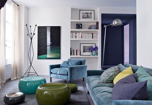
6. Use proven color combinations
If you are afraid to miss with a combination of colors, consult the color wheel. You can be absolutely sure in several ways:
7. Remember about the weight of different colors
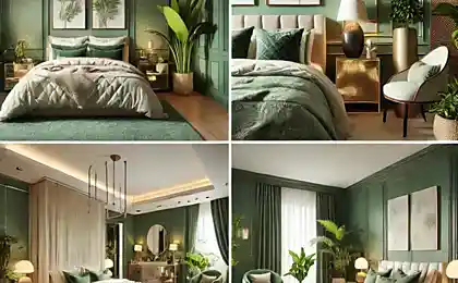
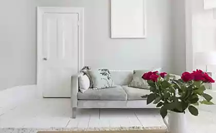
The choice of color depends on the size and configuration of the room. Soft muted shades and simple patterns allow the space look more spacious and free due to the fact that they have little visual weight. Therefore, they are ideal for small spaces.
Conversely, more bold, bright and saturated colors, as well as large patterns, suitable for spacious rooms, because it adds visual weight.
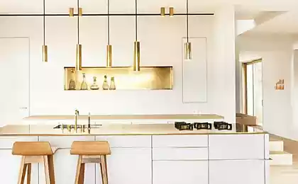
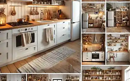
8. Do not forget that every material and texture has colour
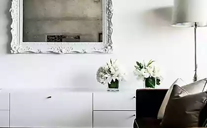
Hardwood floors, brick wall, chrome fittings and gilded frame for mirrors – every detail in the space has its own color, which needs to be considered.
Too wide variety of colors can transform the interior in chaos, and the last straw could be such a seemingly minor detail, such as the color of the handles of cabinets in the kitchen, not suitable to other metal elements.
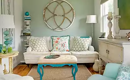
9. Remember harmony
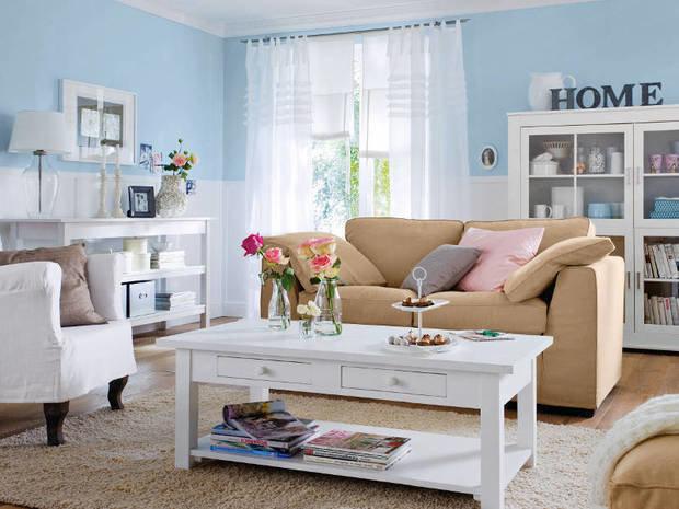
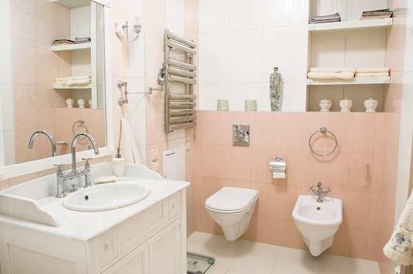
The interior is harmonious, when darker shades are on the bottom and bright at the top. Even in bright Scandinavian interiors floors darker walls, by analogy with nature, where land is always darker than the sky.
Also interesting: How to combine furniture of different styles
5 design techniques that you can replicate at home
10. Create a directory swatches
Create your own Swatch book of colors and shades when you select colors, materials, upholstery and decor items. It is quite difficult to remember the correct hue, but with samples you will always be able to easily navigate the stores.published

Author: Lana Zolotar
Source: www.inmyroom.ru/posts/13201-kak-vybrat-cvet-dlya-interera-10-poleznyh-sovetov
This can often confound, but these 10 tips will help you make the right choice.
1. Pay attention to your wardrobe
Closet is a great source of inspiration for color selection. Giving preference to any color in clothing, we try to emphasize their strengths, to show your character. We subconsciously choose the colors that make us feel better. So your favorite colors can be safely transferred to the interior.

2. Use the rule of three colors
Get lost in a huge variety of colors? Remember the Golden rule of three colors: choose three shades and repeat them in different design elements.

3. Remember the 60/30/10 ratio the Ratio of colors in the space should correspond to the formula of 60/30/10, where:
- 60% need to take a basic, dominant color,
- 30% – secondary color
- 10% remains for color accents.
As a rule,
- the dominant color is the wall
- secondary – upholstery,
- accent – accessories and decor items.

4. Make a variety with similar shades
Interior using only three colors may be too fresh. To avoid this, but at the same time not to create a chaos of color, add in the color scheme of lighter or darker shades of the colors already used.

5. Balance warm and cool tones
Always harmonious interior combines warm and cool colors. Rich, warm, color should complement two cool, light tones, and Vice versa, a bold and bright cool color needed to soften the sun warm shades.

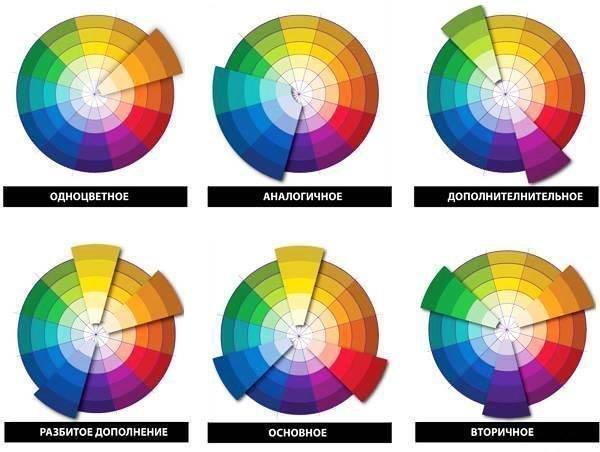
6. Use proven color combinations
If you are afraid to miss with a combination of colors, consult the color wheel. You can be absolutely sure in several ways:
- complimentary,
- equidistant,
- similar
- monochrome schemes.

7. Remember about the weight of different colors
The choice of color depends on the size and configuration of the room. Soft muted shades and simple patterns allow the space look more spacious and free due to the fact that they have little visual weight. Therefore, they are ideal for small spaces.
Conversely, more bold, bright and saturated colors, as well as large patterns, suitable for spacious rooms, because it adds visual weight.

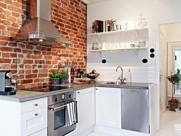
8. Do not forget that every material and texture has colour
Hardwood floors, brick wall, chrome fittings and gilded frame for mirrors – every detail in the space has its own color, which needs to be considered.
Too wide variety of colors can transform the interior in chaos, and the last straw could be such a seemingly minor detail, such as the color of the handles of cabinets in the kitchen, not suitable to other metal elements.

9. Remember harmony
The interior is harmonious, when darker shades are on the bottom and bright at the top. Even in bright Scandinavian interiors floors darker walls, by analogy with nature, where land is always darker than the sky.

Also interesting: How to combine furniture of different styles
5 design techniques that you can replicate at home
10. Create a directory swatches
Create your own Swatch book of colors and shades when you select colors, materials, upholstery and decor items. It is quite difficult to remember the correct hue, but with samples you will always be able to easily navigate the stores.published

Author: Lana Zolotar
Source: www.inmyroom.ru/posts/13201-kak-vybrat-cvet-dlya-interera-10-poleznyh-sovetov


This simple technique for eyes is an excellent prevention of glaucoma and cataracts
Paul Graham: Where to live now in order to succeed