939
Cost effective advertising. Social advertising Denver Water uses only part of the media, but effective
Only in Denver this summer, and only you can see social concern naked man-sandwich. For only in Denver promoting urban social programs of hooligans engaged Sukle Advertising + Design.Denver Water, City program on Education denvertsah solicitous attitude to water from the tap has become famous worldwide for outdoor and print ads designed Sukle Advertising + Design a few years ago.
Laconic materialization message of «Use Only What You Need» (Use only as much as necessary) has won many prizes and became the textbook.
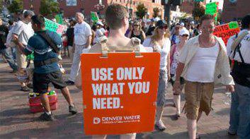
Denver - is the vysokoraspolozhenny (1, 580 m above sea level) among the largest cities in the United States. In the event of rising water levels in the oceans, it does not threaten the fate of New Orleans. However, while that of Denver, Colorado, is experiencing a shortage of water rather than the surplus. B>
Since 2002, Denver Waters, responsible for water supply, reduce annual water consumption residents 1, 2-million city at 20 percent. Continuing the trend of water saving, the company launched a social advertising campaign with a budget of 500, 000 dollars. Its main message - to remind people of the city to practice reasonable use of water.
The campaign, which took place in July 2008:
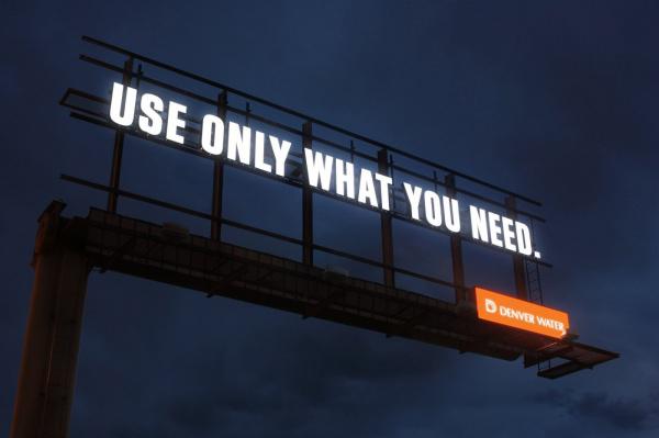
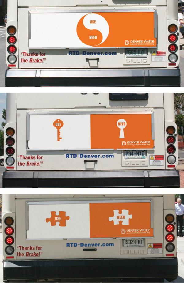
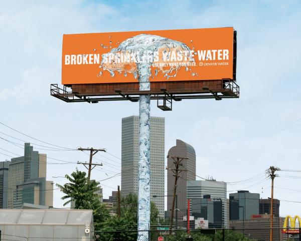
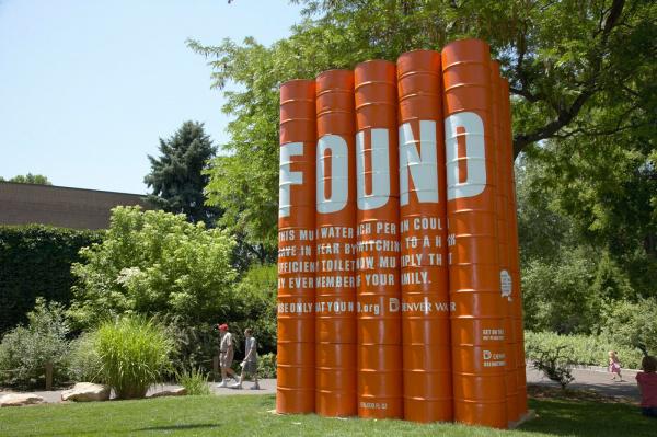
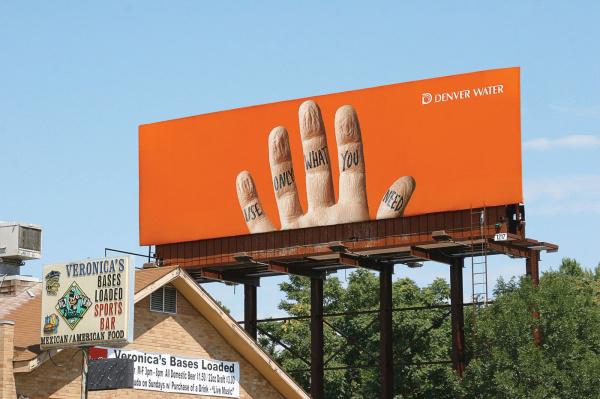
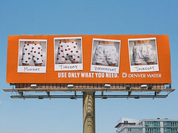
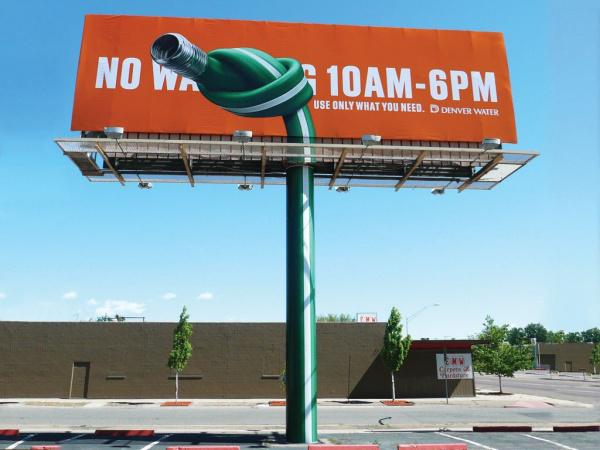
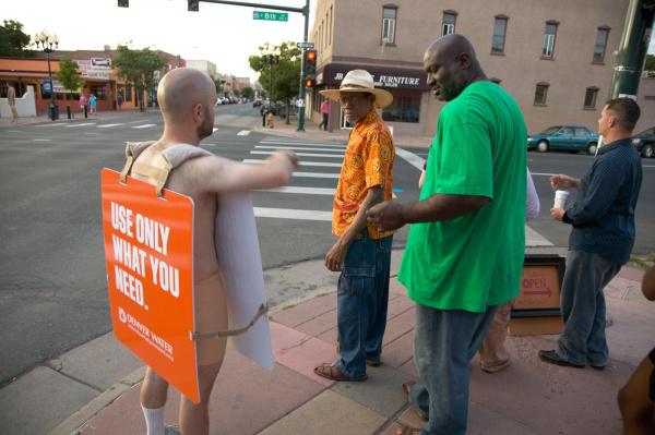
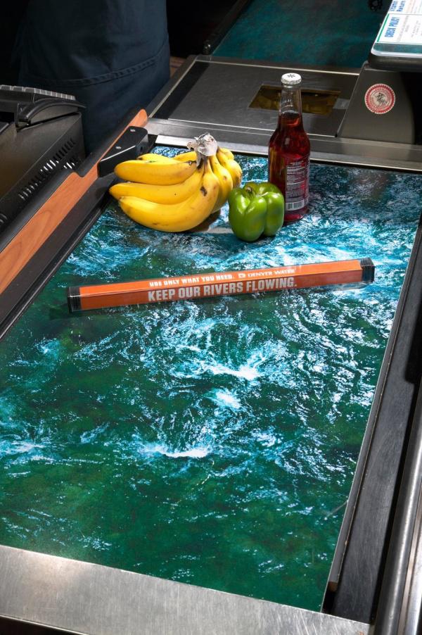

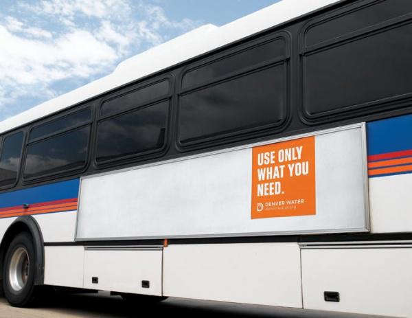
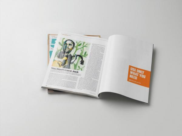
Local agency Sukle Advertising & Design has developed a simple and easily understood concept. «Use only what you need» (Use only what you need) - reads the billboard four times smaller than the supporting structure for the billboard. In addition to billboards, the campaign uses as carriers prints and transit advertising. In print and transit advertising all the space unoccupied directly to advertising messages, painted white.
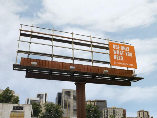
"We deliberately went out to use less space than usually allows a newspaper or a billboard. Thanks to this advertisement makes a stronger impression, "- said Mike Tsukl (Mike Sukle), president and creative director of the agency.
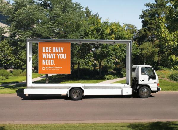
"For billboards we just removed everything that was not necessary to place the poster. The general view was even more extraordinary due to the open design of the shield: a poster like passes through the skeleton structure ».
It would seem that in advertising the wrong place does not happen. Would not the standard sizes of boards for three-six and sixty to thirty - and this would not be enough. But Sukle Advertising gone by violating the traditions and traditional ideas.
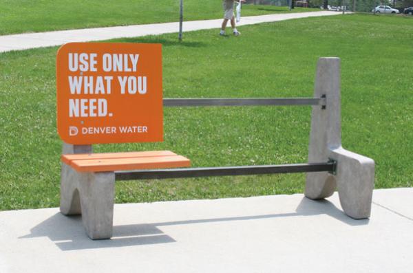
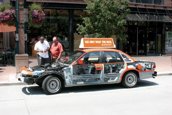
"You know, advertisers tend to ensure that the use of every square centimeter. Therefore, our advertising looks refreshing and attracts attention, "- says Mr. Tsukl. - "The idea to get rid of all the excess we liked. We took one taxi, placed on the roof of the car, as usual, advertising, sent the car to the garage and took off all unnecessary. And now it is a taxi, or rather his skeleton (you can even see him running engine), goes through the streets of the city. "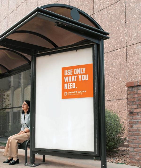
"From a professional point of view, the simplest idea is given the hardest. And, I think, such a simple partial idea is always the most creative. We often see a lot of advertising, which uses first-class and luxury image fanciful illustrations, and so on. But in this campaign, which is a conversation between the customer and its target audience, minimalism is very appropriate ».
"In addition, we always believe that the idea - this is important. If the idea itself is strong, its performance can be quite simple. Of course, simple does not mean that the advertisement must be ordinary and mediocre. We were able to combine and simplicity and singularity. But, as I said, the main thing - it's a report ideas ».
As part of the campaign Denver Waters also plans to distribute to restaurants and bars 20, 000 coasters for glasses and beer mugs with all sorts of advice with a touch of humor, like "Be a real man - shave dry».
via # image6054855
Laconic materialization message of «Use Only What You Need» (Use only as much as necessary) has won many prizes and became the textbook.

Denver - is the vysokoraspolozhenny (1, 580 m above sea level) among the largest cities in the United States. In the event of rising water levels in the oceans, it does not threaten the fate of New Orleans. However, while that of Denver, Colorado, is experiencing a shortage of water rather than the surplus. B>
Since 2002, Denver Waters, responsible for water supply, reduce annual water consumption residents 1, 2-million city at 20 percent. Continuing the trend of water saving, the company launched a social advertising campaign with a budget of 500, 000 dollars. Its main message - to remind people of the city to practice reasonable use of water.
The campaign, which took place in July 2008:


Local agency Sukle Advertising & Design has developed a simple and easily understood concept. «Use only what you need» (Use only what you need) - reads the billboard four times smaller than the supporting structure for the billboard. In addition to billboards, the campaign uses as carriers prints and transit advertising. In print and transit advertising all the space unoccupied directly to advertising messages, painted white.

"We deliberately went out to use less space than usually allows a newspaper or a billboard. Thanks to this advertisement makes a stronger impression, "- said Mike Tsukl (Mike Sukle), president and creative director of the agency.
"For billboards we just removed everything that was not necessary to place the poster. The general view was even more extraordinary due to the open design of the shield: a poster like passes through the skeleton structure ».
It would seem that in advertising the wrong place does not happen. Would not the standard sizes of boards for three-six and sixty to thirty - and this would not be enough. But Sukle Advertising gone by violating the traditions and traditional ideas.

"You know, advertisers tend to ensure that the use of every square centimeter. Therefore, our advertising looks refreshing and attracts attention, "- says Mr. Tsukl. - "The idea to get rid of all the excess we liked. We took one taxi, placed on the roof of the car, as usual, advertising, sent the car to the garage and took off all unnecessary. And now it is a taxi, or rather his skeleton (you can even see him running engine), goes through the streets of the city. "

"From a professional point of view, the simplest idea is given the hardest. And, I think, such a simple partial idea is always the most creative. We often see a lot of advertising, which uses first-class and luxury image fanciful illustrations, and so on. But in this campaign, which is a conversation between the customer and its target audience, minimalism is very appropriate ».
"In addition, we always believe that the idea - this is important. If the idea itself is strong, its performance can be quite simple. Of course, simple does not mean that the advertisement must be ordinary and mediocre. We were able to combine and simplicity and singularity. But, as I said, the main thing - it's a report ideas ».

As part of the campaign Denver Waters also plans to distribute to restaurants and bars 20, 000 coasters for glasses and beer mugs with all sorts of advice with a touch of humor, like "Be a real man - shave dry».


via # image6054855


