1229
18 Unusual world map, that force you to look at the earth on the new
The map shows places where you come if drilled Earth naskvoz.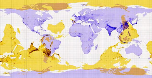
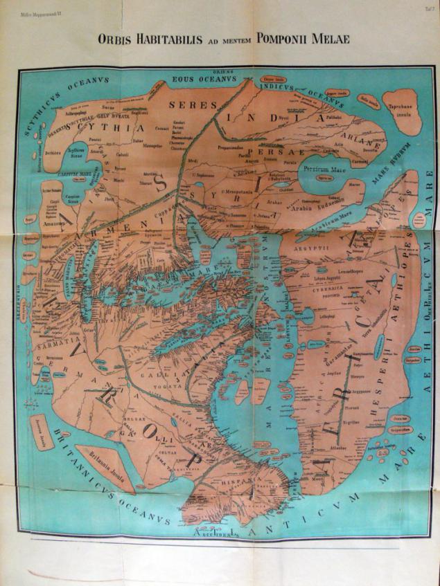
World map drawn in 43 after Christ.
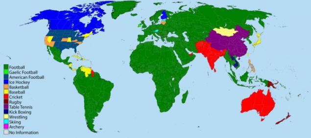
A map showing the most popular sport in the country.
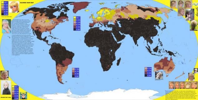
Yellow color on the card - the number of blondes / blond per capita.
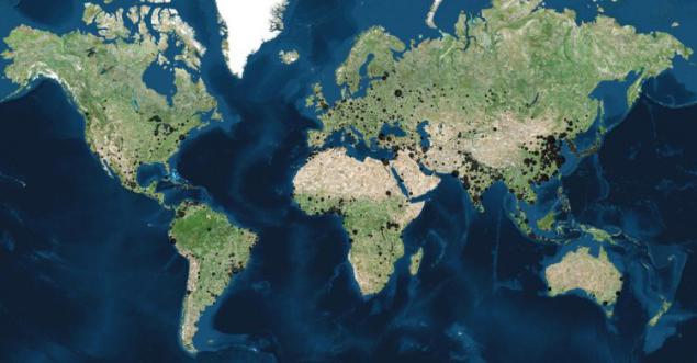
Black points - a town with a population of over 100, 000 people. The larger point - the populous city.
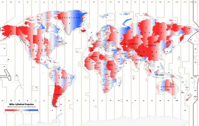
Map which shows the difference between the official and solar time.
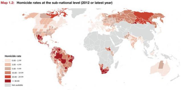
This map shows the number of murders in 2012.
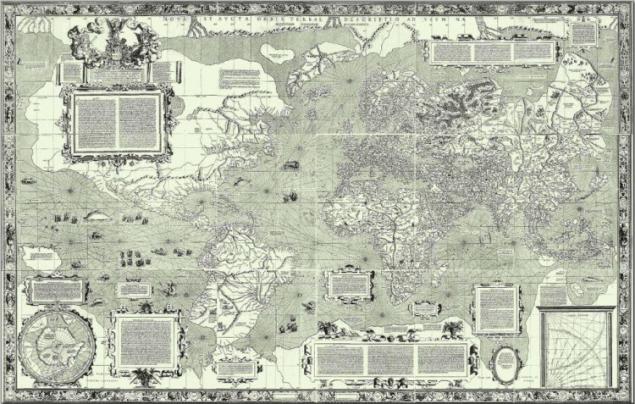
Mercator, 1569.
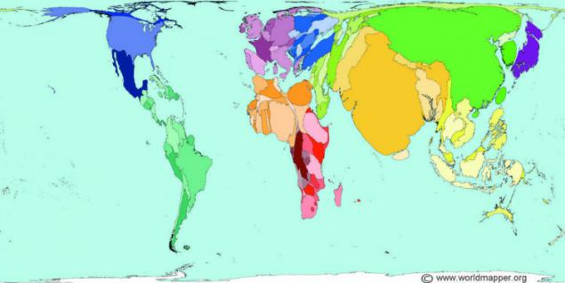
So it would look strange if the country's territory corresponds to the number of people living in them.
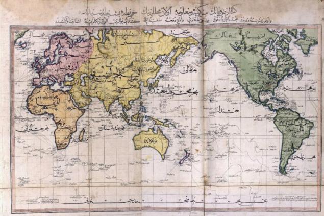
World map drawn by the Ottoman Empire in 1803.
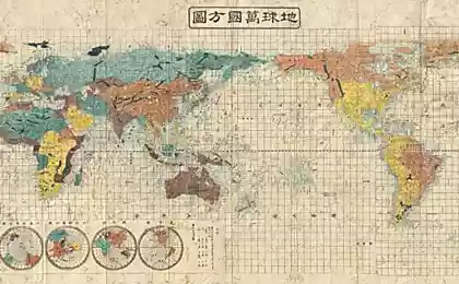
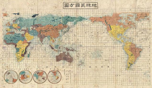
World map drawn by Japan in 1853.
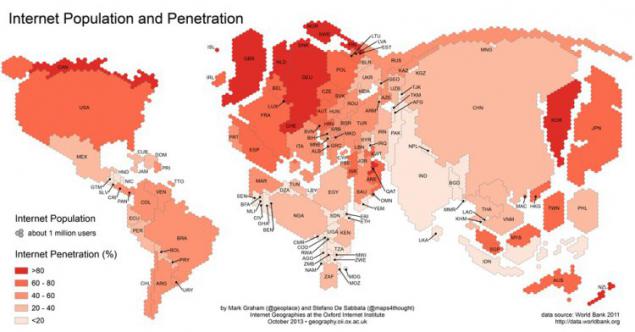
The map displayed in popularity and spread of the Internet in a given country.
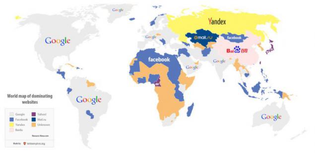
The most popular websites in the countries.
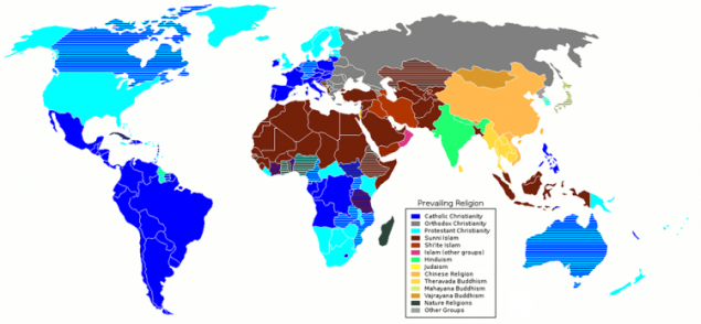
Map religions.
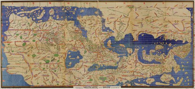
World map made in 1154.
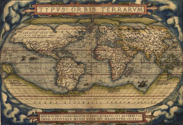
Ortelius Map of the World, made in 1564. Abraham Ortelius - creator of the first world atlas.
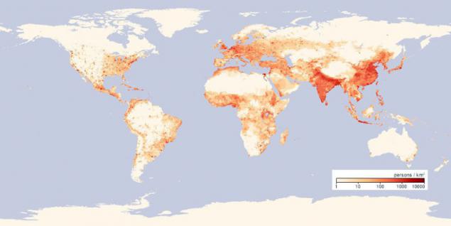
A map which shows the population density in the world.
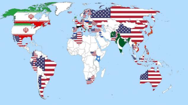
These countries have asked a simple question: "Who do you see as a global enemy №1"?

World map drawn in 43 after Christ.

A map showing the most popular sport in the country.

Yellow color on the card - the number of blondes / blond per capita.

Black points - a town with a population of over 100, 000 people. The larger point - the populous city.

Map which shows the difference between the official and solar time.

This map shows the number of murders in 2012.

Mercator, 1569.

So it would look strange if the country's territory corresponds to the number of people living in them.

World map drawn by the Ottoman Empire in 1803.

World map drawn by Japan in 1853.

The map displayed in popularity and spread of the Internet in a given country.

The most popular websites in the countries.

Map religions.

World map made in 1154.

Ortelius Map of the World, made in 1564. Abraham Ortelius - creator of the first world atlas.

A map which shows the population density in the world.

These countries have asked a simple question: "Who do you see as a global enemy №1"?

Deformation of feet in China-an one of the most horrible world traditions
25 Reasons You Should Drop the Australia from your plans FOREVER
