682
20 receptions photos, studying which you will take pictures like a Pro
There are no regimented rules, just General, the most famous advice on how to build an effective and dramatic composition in photo frame. Site publishes a practical guide to photography written by Irish photographer, Barry O Carroll and illustrated by its pictorial works.
The rule of thirds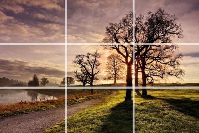
Photo source: Boredpanda.tomato is very simple: you divide the frame into 9 equal rectangles, 3 horizontally and 3 vertically, as shown in the photo. Many camera manufacturers have included the ability to display this grid in preview mode in real time. Check the manual of your camera to enable this feature.
The idea is to place an important element of the frame along one or more lines or where the lines intersect. Our natural tendency is to place the main subject in the center. Placing it slightly off centre using the rule of thirds, creates a more attractive composition.
In this photograph the old town square in Prague, the photographer put the horizon along the upper third of the frame. Most of the buildings are in the middle third, and the area itself occupies the lower third of the frame. The spires of the churches located near the horizontal line to the right of the center of the frame.
Twenty two million six hundred seventy thousand nine hundred fifty three
Symmetry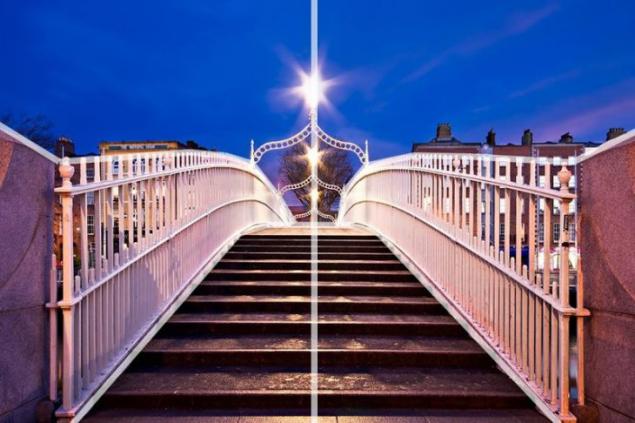
First, we advise you not to put the main object in the center of the frame, and now say the opposite! There are times when placement of the object in the center of the frame where it is justified and looks fine. Symmetrical scenes ideal for a centered composition. They will fit perfectly in a square.
This photograph of a bridge in Dublin was perfect for a centered composition.
You can use symmetry, asymmetry. In any case, this is a very powerful tool for composition. It is important to remember one thing — your frame should be the highlight, and that will attract the viewer's attention.
Footage of the reflection — a great opportunity to use symmetry in your composition. In this photo, we used both rules — the rule of thirds and symmetry. The tree is located to the right of center, and the reflection in the water provides symmetry. You can and should combine several of the principles of composition in a single photograph!
Forty two million eight hundred twenty eight thousand eight hundred eighty four
The blur and depth of field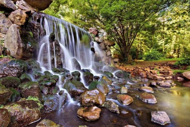
The defocus — use depth of field when the main semantic object of the photo shoot is in the field, and the remaining objects are blurred. This is a great way to add depth frame. Photos are 2D in nature, and this technique allows to achieve a 3D effect.
In this photo of the waterfall in the Netherlands, the stones in the river are perfectly clear and the background slightly out of focus. Add the sharpness of the foreground works especially well with wide angle lenses.
Fifty million nine hundred sixty nine thousand three hundred sixty six
Ninety two million seven hundred seventy five thousand one hundred eighty
Fifty two million one hundred eighteen thousand one hundred eighty eight
The footage is also filmed in Dublin. Front shot with great sharpness and the background is in blur. And another tip — go on a photo-hunt in early, even at 5 in the morning and you will be rewarded with spectacular views.
Frame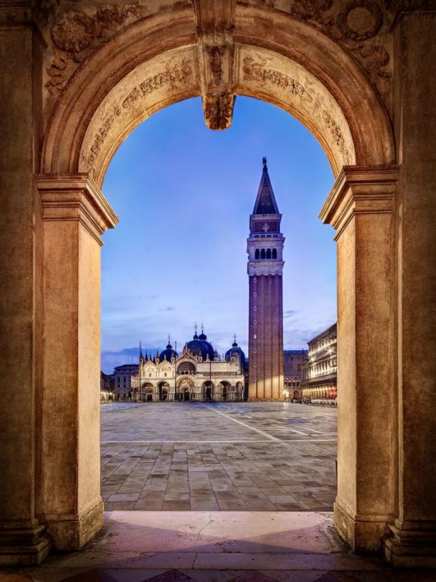
Frame inside the frame (or "frame by frame", or framing) is another effective way to image the depth of the composition. Pay attention to elements such as Windows, arches or overhanging branches. "Frame" does not necessarily have to surround the entire frame to make it spectacular.
In the photos taken on Piazza San Marco in Venice, the photographer used the arch as a frame for a Cathedral at the far end of the square. The use of the arch as the scenery was inherent in Renaissance art as a way of image depth and perspective.
Fifty seven million nine hundred four thousand eighty five
Another example of framing. Please note: despite the fact that the "frame" around the entire frame in this case, it still adds a sense of depth.
The use of "PIP" is a great opportunity to be creative in your compositions.
Line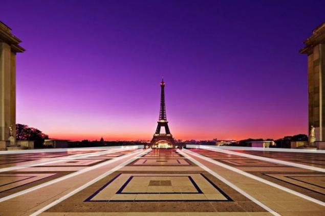
The lines work best as a guide: eyes clings to a line and follows it from left to right and from bottom to top. So you "lead" the viewer's eye through the frame, focusing attention on the desired points.
Five million four hundred twenty four thousand two hundred thirty eight
Guide lines do not necessarily have to be straight, as shown in the figure above. In fact, curved lines can be very attractive composite feature. In this case, the road leads the viewer's eye from the lower edge towards the tree. The photographer also used the rule of thirds while creating the snapshot.
Diagonals and triangles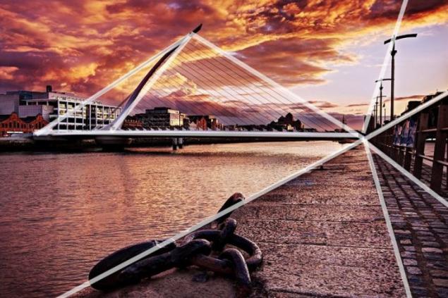
Often say that the triangles and diagonals add "dynamic tension" in the shot. This is one of the most effective compositional techniques is the diagonal composition. Its essence is simple: the main objects of the frame we have on the diagonal of the frame. For example, from the top left corner of the frame to the bottom right. This technique is good because such a composition continuously leads the viewer's eye through the entire photograph.
Thirty two million seven hundred fifty seven thousand nine hundred thirty one
Patterns and texture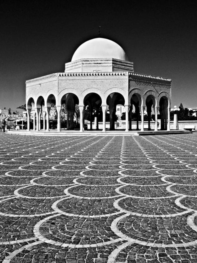
What is a pattern? If to speak about the pictures is repeating objects that can be used in the composition of the frame. Look around and you will see that there are a lot of patterns — particularly in the urban landscape. Think about this, next time you go for a walk with the camera.
The texture itself does not play a role. Plays the role of the light that falls on the texture and at the expense of shadow creates volume. If you are working with natural light, try to change the camera position — search for interesting camera angles and then the texture in the frame can make your photo original and memorable.
Eighty two million three hundred thirty nine thousand five hundred ninety four
In this photo, we really liked the texture of the stone. You might also notice that the arch creates a "frame per frame" around a man and a café on the other side of the arch.
The rule of odd objects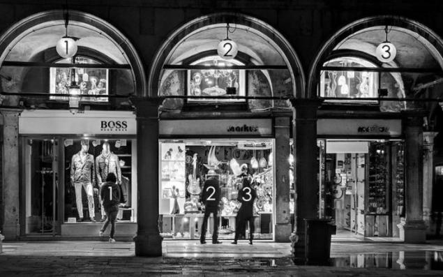
The rule is: the image is more visually appealing when the frame is present an odd number of items.
According to this theory, an even number of elements in the scene distracting because the viewer is not sure which of them to focus. An odd number of items looks more natural and easy for the eyes. Honestly, there are many cases when it is not, but it is definitely applicable in certain situations. What to do if you have four children? How to decide who to leave out of the frame? Seriously, of course this rule need to be broken!
The photo is an example of the use of odd objects. There are three arches, and the author is convinced that the two arches "not worked" so well. In addition, the frame three. This composition also uses the rule of "framing".
Thirty million eight thousand two hundred seventeen
This is a photograph of two Venetian gondoliers completely ignored the odd even fill rule. It's true, your attention can move between gondoliers. However, here it is in conversation, it attracts the eye, and the number of objects in this case does not matter.
Filling the frame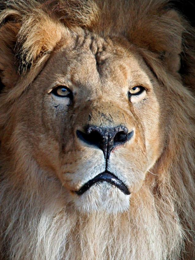
Filling the frame with your subject, leaving little or no leaving space around it, can be very effective in certain situations. This technique helps to focus on the main subject, the center of the composition without any distractions. It also allows the viewer to study details that would be impossible if you took the picture from a distance. In many cases it can help to get original and interesting composition.
In this photo favorite cat photographer, you'll notice that he completely filled the frame, and cropped the edges of the head and mane. It allows the viewer to really focus on the details, such as eyes or texture of fur. You might also notice that the author used the rule of thirds in this composition.
Twenty four million eight hundred five thousand fifty four
The Notre Dame Cathedral in Paris in this photo fills the frame, leaving very little space around the edges. It allowed to demonstrate the architectural details of the facade of the building.
More air or Leave free space in the frame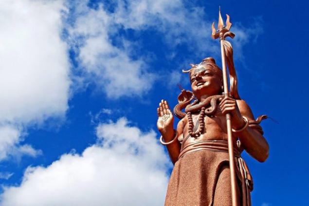
Leaving a lot of empty space (or air) around the subject, you will get very attractive images, with a sense of simplicity and minimalism. As filling the frame, this helps to focus the viewer on the main subject without distraction.
Photo of the giant statue of Lord Shiva in Mauritius is a good example of the use of space. The statue is obviously the center of the composition, but also left a lot of space filled with only air. It focuses on the statue, giving the main subject "room to breath", so to speak. The composition also creates a sense of simplicity. There is nothing superfluous. The statue is surrounded by sky, that's all. The photographer also used the rule of thirds by placing the statue on the right from the center of the frame.
Simplicity and minimalism
Simplicity itself can be a powerful tool of composition. They often say that "less is better". Simplicity often means getting shots with simple backgrounds that do not distract from the main subject. You can also create a simple composition by increasing the magnitude of the part of the subject and focusing on specific details.
This is a photograph of a magnified drop of dew on the leaves in the garden. It's so simple and beautiful. A good macro lens can be a very useful tool to create these images.
Eighteen million two hundred thirty seven thousand six hundred four
Here, too, everything is very minimalistic: tree at dawn, a simple and uncluttered background to focus attention on the tree. This photo uses the rule of "more air" to create a sense of simplicity and minimalism, as well as the rule of thirds and guiding lines in the composition.
"Isolate" the subject
To use shallow depth of field to highlight ("isolate") your subject is an effective way to simplify the composition. Blurring the background can detract from your main subject. This is a particularly useful technique for portraits. You can learn more about how to use different settings in the tutorials on using aperture, shutter speed and ISO.
In this photo the blurred background focuses attention on the portrait of the cat. This method is a great way to simplify the composition.
The choice of point shooting has a direct effect on the emotional perception of the image. For a portrait the best point at eye level. Keep the camera at your subject, otherwise you may get distorted proportions. Photographing children or animals, get down to their eye level.
Change the point of shooting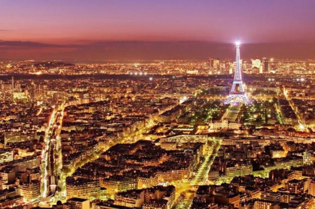
Perspective is the basis of everything. The camera (thus the point of shooting) you need to move not only horizontally but also vertically. One of the most common points of shooting — setting it at the level of the human eye: it was from this height we generally consider the observed object and therefore the shape of the object, its volume, perspective drawing and the ratio of the background is familiar to the eye.
Such a point of shooting we would call normal height. The image is almost not distorted. This view is ideal when it is important to pass an object from its natural proportions. Most of the photos in the world is done with a "normal" point shooting is the General rule. But not always the "normal" view can convey your creative ideas. Often for the implementation of a creative idea using the upper and lower survey points.
Seventy one million three hundred seven thousand seven hundred four
Perspective of the picture may change if the choose a different shooting point. When difficult to change the usual mapping objects front and long-range plans, in height. For example, a person of low growth may seem higher and slimmer. In sports stories lowest point of pickup emphasizes the height of the jump and adds to the picture dynamics. High point shooting contribute to the expressive display of wide area and identify locations of figures and objects in this space. Close to the object a high or low point shooting gives a special perspective a drawing frame, unusual perspective — the perspective.
Look for a combination of colors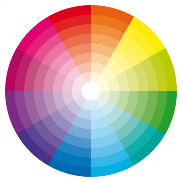
About using color as a compositional tool often overlooked. Color theory well-know graphic designers, fashion designers and interior designers. Certain color combinations complement each other, and can visually badly cut eye. The mutual arrangement of colors and shades implemented on the basis of the laws of color (color theory), and with their help, it is very convenient to pick up a harmonious combination. Look at the color wheel. You can see that colors are located in the segments of the circle. Colors that are opposite each other are called complimentary. The photographer should look for frames where these color combinations create an attractive and vibrant compositions.
Complementary colors — contrasting colors, which are located at opposite ends of the color wheel, opposite each other. Very well to use contrasting combinations, it is possible to highlight details, but it is not recommended to apply such a scheme for your text or in the preparation of the wardrobe.
Fifty five million thirty four thousand four hundred sixty
Ninety six million five hundred fifty seven thousand seven hundred thirteen
Direction and space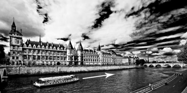
In this photo the boat is on the left side of the frame and moves from left to right. Please note that you need to give more space in front, to move the boat forward (to the right) than behind her. We can mentally imagine how the boat moves in this space, as it floats on the river. If the boat would be right on the right side of the frame, this "increase" would have pictures! The rule formulated like this: you need to leave a space for imaginary movement.
Seventy two million four hundred twenty four thousand six hundred nineteen
This rule can also be used when photographing people. A rule of direction and space suggests that the subject needs to look into the lens or his eye must fall on something in the frame. Take a look at the musician pictured above. The frame is made from the left side. If he was looking in another direction, at something outside the frame, that would look weird.
From left to right
Our brains are accustomed to reading from left to right, we also evaluate and the. Therefore, the semantic centre is better positioned on the right side of the frame. Therefore, the gaze and the object seem to move towards each other. In the composition always take this into account.
Balance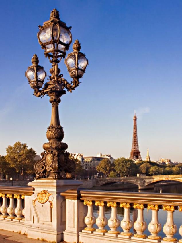
Balance or equilibrium is very important. The trick is balance of composition is that no hard and fast guidelines that will tell you all once and for all. Will have to be guided not only rules, but also an innate sense of balance.
The first composite benchmark was the "rule of thirds". This, of course, means that we often place the main subject of the photo away from the center of the frame along one of the vertical grid lines. But sometimes it can lead to disbalance, if you leave a kind of "emptiness" in the rest of the frame.
To overcome this, you can take a photo where the subject of secondary or lesser importance (or size) will be on the other side of the frame. It will balance the composition without taking too much attention from the main subject.
Look at the photo of a lamppost at the Alexander III bridge in Paris. He lamppost fills the left side of the frame. And the Eiffel tower at a distance balances it with the other hand.
One million three hundred fifty one thousand eighty seven
This photo was taken in Venice. It's the same thing. Decorative lamppost dominates on one side of the frame. And the tower of the Church (in the distance) provides a balance from the other side.
The juxtaposition of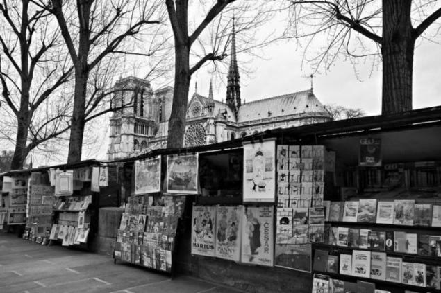
Juxtaposition is a very powerful tool in photography composition. Juxtaposition means inclusion in the frame of two or more items, which either contrast or complement each other. Both approaches can work very well, and play an important role in the photo — they help to tell the story.
Look at this photograph taken in Paris. At the bottom of the frame is a mess — the pictures hanging haphazardly. Towering above it all, stands the majestic Notre Dame Cathedral. This architectural gem is the embodiment of order and structure in contrast to the disheveled, but cute street images. They seem to be in contradiction, but still good "work" together. They show such a different Paris, tells the story of two different elements of the city.
Eighty one million one hundred one thousand four hundred ninety three
Old Citroen 2CV looks great on the background of a typical French café. The two elements complement each other.
Triangles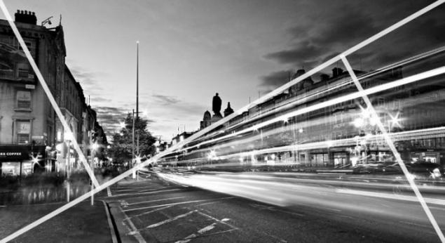
It's like the rule of thirds, but instead of a grid of rectangles, we divide the frame diagonal lines going from one corner to another. Then we add two more lines from other angles. The two smaller lines meet a big line at right angles, as shown below. This divides the frame into a number of triangles. As you can see, this method helps to make "dynamic tension", which we learned about rule No. 6. As with the rule of thirds, we use lines (triangles in this case) to help position the various elements in the frame. In the photo below, the diagonal illustrate the rule of triangles.
Ninety five million three hundred eighty four thousand one hundred eighty
The Golden section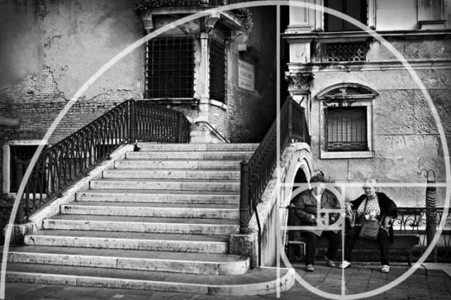
The Golden section was known in ancient Greece, its properties studied Euclid and Leonardo da Vinci. The simple description of the Golden ratio applied to photography is: the best point for the location of the subject approximately 1/3 of the horizontal or vertical border of frame. The location of important objects in these visual points looks natural and attracts the viewer's attention.
This is one of the basic concepts of composition, method of separation of the segment in the ratio a/C = B/a. Numerically it is expressed by the ratio 5 to 8, or more precisely 8/13 or 13/21. If the relationship between the sides of the rectangle is exactly such a rectangle is called "Golden." A simpler version of the Golden ratio — the rule of thirds. Remind me again: on the basis of the rule of thirds rectangle is broken not in the proportions of the Golden section, and its sides are divided into three equal parts. In accordance with the rule of thirds and harmonious composition creates the main plot elements in the intersection points of the lines dividing the frame into 9 rectangles. In most picturesque landscapes of the Renaissance, the horizon line divides the picture plane in accordance with the principle of the Golden section.
Forty eight million four hundred ten thousand two
Simply put, the Golden ratio that two quantities in the Golden ratio, their ratio is the same as the ratio of their sum to the larger of the two quantities.
Instead of the usual grid (rule of thirds), the frame is divided into a number of squares, as shown in the photo. You can then use the squares to mentally draw a spiral that looks like a snail shell. This Is The Fibonacci Spiral. The squares help to position elements in the frame, and the spiral gives us an idea about how the frame should look like from the point of view of dynamics. It is like an invisible guide line.
The author of this text acknowledges that he never consciously used the rule of the Golden section, but only intuitively. When he looked at your photos, I noticed that we have used it many times.
Hope you found this text useful and it will help you to go to the next level of photo skills. Rules you can remember and bring their use to perfection. But don't forget the main rule of a good photographer is not to follow any rules!
via www.boredpanda.com/guide-to-photography-composition-barry-o-carroll/
The rule of thirds

Photo source: Boredpanda.tomato is very simple: you divide the frame into 9 equal rectangles, 3 horizontally and 3 vertically, as shown in the photo. Many camera manufacturers have included the ability to display this grid in preview mode in real time. Check the manual of your camera to enable this feature.
The idea is to place an important element of the frame along one or more lines or where the lines intersect. Our natural tendency is to place the main subject in the center. Placing it slightly off centre using the rule of thirds, creates a more attractive composition.
In this photograph the old town square in Prague, the photographer put the horizon along the upper third of the frame. Most of the buildings are in the middle third, and the area itself occupies the lower third of the frame. The spires of the churches located near the horizontal line to the right of the center of the frame.
Twenty two million six hundred seventy thousand nine hundred fifty three
Symmetry

First, we advise you not to put the main object in the center of the frame, and now say the opposite! There are times when placement of the object in the center of the frame where it is justified and looks fine. Symmetrical scenes ideal for a centered composition. They will fit perfectly in a square.
This photograph of a bridge in Dublin was perfect for a centered composition.
You can use symmetry, asymmetry. In any case, this is a very powerful tool for composition. It is important to remember one thing — your frame should be the highlight, and that will attract the viewer's attention.
Footage of the reflection — a great opportunity to use symmetry in your composition. In this photo, we used both rules — the rule of thirds and symmetry. The tree is located to the right of center, and the reflection in the water provides symmetry. You can and should combine several of the principles of composition in a single photograph!
Forty two million eight hundred twenty eight thousand eight hundred eighty four
The blur and depth of field

The defocus — use depth of field when the main semantic object of the photo shoot is in the field, and the remaining objects are blurred. This is a great way to add depth frame. Photos are 2D in nature, and this technique allows to achieve a 3D effect.
In this photo of the waterfall in the Netherlands, the stones in the river are perfectly clear and the background slightly out of focus. Add the sharpness of the foreground works especially well with wide angle lenses.
Fifty million nine hundred sixty nine thousand three hundred sixty six
Ninety two million seven hundred seventy five thousand one hundred eighty
Fifty two million one hundred eighteen thousand one hundred eighty eight
The footage is also filmed in Dublin. Front shot with great sharpness and the background is in blur. And another tip — go on a photo-hunt in early, even at 5 in the morning and you will be rewarded with spectacular views.
Frame

Frame inside the frame (or "frame by frame", or framing) is another effective way to image the depth of the composition. Pay attention to elements such as Windows, arches or overhanging branches. "Frame" does not necessarily have to surround the entire frame to make it spectacular.
In the photos taken on Piazza San Marco in Venice, the photographer used the arch as a frame for a Cathedral at the far end of the square. The use of the arch as the scenery was inherent in Renaissance art as a way of image depth and perspective.
Fifty seven million nine hundred four thousand eighty five
Another example of framing. Please note: despite the fact that the "frame" around the entire frame in this case, it still adds a sense of depth.
The use of "PIP" is a great opportunity to be creative in your compositions.
Line

The lines work best as a guide: eyes clings to a line and follows it from left to right and from bottom to top. So you "lead" the viewer's eye through the frame, focusing attention on the desired points.
Five million four hundred twenty four thousand two hundred thirty eight
Guide lines do not necessarily have to be straight, as shown in the figure above. In fact, curved lines can be very attractive composite feature. In this case, the road leads the viewer's eye from the lower edge towards the tree. The photographer also used the rule of thirds while creating the snapshot.
Diagonals and triangles

Often say that the triangles and diagonals add "dynamic tension" in the shot. This is one of the most effective compositional techniques is the diagonal composition. Its essence is simple: the main objects of the frame we have on the diagonal of the frame. For example, from the top left corner of the frame to the bottom right. This technique is good because such a composition continuously leads the viewer's eye through the entire photograph.
Thirty two million seven hundred fifty seven thousand nine hundred thirty one
Patterns and texture

What is a pattern? If to speak about the pictures is repeating objects that can be used in the composition of the frame. Look around and you will see that there are a lot of patterns — particularly in the urban landscape. Think about this, next time you go for a walk with the camera.
The texture itself does not play a role. Plays the role of the light that falls on the texture and at the expense of shadow creates volume. If you are working with natural light, try to change the camera position — search for interesting camera angles and then the texture in the frame can make your photo original and memorable.
Eighty two million three hundred thirty nine thousand five hundred ninety four
In this photo, we really liked the texture of the stone. You might also notice that the arch creates a "frame per frame" around a man and a café on the other side of the arch.
The rule of odd objects

The rule is: the image is more visually appealing when the frame is present an odd number of items.
According to this theory, an even number of elements in the scene distracting because the viewer is not sure which of them to focus. An odd number of items looks more natural and easy for the eyes. Honestly, there are many cases when it is not, but it is definitely applicable in certain situations. What to do if you have four children? How to decide who to leave out of the frame? Seriously, of course this rule need to be broken!
The photo is an example of the use of odd objects. There are three arches, and the author is convinced that the two arches "not worked" so well. In addition, the frame three. This composition also uses the rule of "framing".
Thirty million eight thousand two hundred seventeen
This is a photograph of two Venetian gondoliers completely ignored the odd even fill rule. It's true, your attention can move between gondoliers. However, here it is in conversation, it attracts the eye, and the number of objects in this case does not matter.
Filling the frame

Filling the frame with your subject, leaving little or no leaving space around it, can be very effective in certain situations. This technique helps to focus on the main subject, the center of the composition without any distractions. It also allows the viewer to study details that would be impossible if you took the picture from a distance. In many cases it can help to get original and interesting composition.
In this photo favorite cat photographer, you'll notice that he completely filled the frame, and cropped the edges of the head and mane. It allows the viewer to really focus on the details, such as eyes or texture of fur. You might also notice that the author used the rule of thirds in this composition.
Twenty four million eight hundred five thousand fifty four
The Notre Dame Cathedral in Paris in this photo fills the frame, leaving very little space around the edges. It allowed to demonstrate the architectural details of the facade of the building.
More air or Leave free space in the frame

Leaving a lot of empty space (or air) around the subject, you will get very attractive images, with a sense of simplicity and minimalism. As filling the frame, this helps to focus the viewer on the main subject without distraction.
Photo of the giant statue of Lord Shiva in Mauritius is a good example of the use of space. The statue is obviously the center of the composition, but also left a lot of space filled with only air. It focuses on the statue, giving the main subject "room to breath", so to speak. The composition also creates a sense of simplicity. There is nothing superfluous. The statue is surrounded by sky, that's all. The photographer also used the rule of thirds by placing the statue on the right from the center of the frame.
Simplicity and minimalism

Simplicity itself can be a powerful tool of composition. They often say that "less is better". Simplicity often means getting shots with simple backgrounds that do not distract from the main subject. You can also create a simple composition by increasing the magnitude of the part of the subject and focusing on specific details.
This is a photograph of a magnified drop of dew on the leaves in the garden. It's so simple and beautiful. A good macro lens can be a very useful tool to create these images.
Eighteen million two hundred thirty seven thousand six hundred four
Here, too, everything is very minimalistic: tree at dawn, a simple and uncluttered background to focus attention on the tree. This photo uses the rule of "more air" to create a sense of simplicity and minimalism, as well as the rule of thirds and guiding lines in the composition.
"Isolate" the subject

To use shallow depth of field to highlight ("isolate") your subject is an effective way to simplify the composition. Blurring the background can detract from your main subject. This is a particularly useful technique for portraits. You can learn more about how to use different settings in the tutorials on using aperture, shutter speed and ISO.
In this photo the blurred background focuses attention on the portrait of the cat. This method is a great way to simplify the composition.
The choice of point shooting has a direct effect on the emotional perception of the image. For a portrait the best point at eye level. Keep the camera at your subject, otherwise you may get distorted proportions. Photographing children or animals, get down to their eye level.
Change the point of shooting

Perspective is the basis of everything. The camera (thus the point of shooting) you need to move not only horizontally but also vertically. One of the most common points of shooting — setting it at the level of the human eye: it was from this height we generally consider the observed object and therefore the shape of the object, its volume, perspective drawing and the ratio of the background is familiar to the eye.
Such a point of shooting we would call normal height. The image is almost not distorted. This view is ideal when it is important to pass an object from its natural proportions. Most of the photos in the world is done with a "normal" point shooting is the General rule. But not always the "normal" view can convey your creative ideas. Often for the implementation of a creative idea using the upper and lower survey points.
Seventy one million three hundred seven thousand seven hundred four
Perspective of the picture may change if the choose a different shooting point. When difficult to change the usual mapping objects front and long-range plans, in height. For example, a person of low growth may seem higher and slimmer. In sports stories lowest point of pickup emphasizes the height of the jump and adds to the picture dynamics. High point shooting contribute to the expressive display of wide area and identify locations of figures and objects in this space. Close to the object a high or low point shooting gives a special perspective a drawing frame, unusual perspective — the perspective.
Look for a combination of colors

About using color as a compositional tool often overlooked. Color theory well-know graphic designers, fashion designers and interior designers. Certain color combinations complement each other, and can visually badly cut eye. The mutual arrangement of colors and shades implemented on the basis of the laws of color (color theory), and with their help, it is very convenient to pick up a harmonious combination. Look at the color wheel. You can see that colors are located in the segments of the circle. Colors that are opposite each other are called complimentary. The photographer should look for frames where these color combinations create an attractive and vibrant compositions.
Complementary colors — contrasting colors, which are located at opposite ends of the color wheel, opposite each other. Very well to use contrasting combinations, it is possible to highlight details, but it is not recommended to apply such a scheme for your text or in the preparation of the wardrobe.
Fifty five million thirty four thousand four hundred sixty
Ninety six million five hundred fifty seven thousand seven hundred thirteen
Direction and space

In this photo the boat is on the left side of the frame and moves from left to right. Please note that you need to give more space in front, to move the boat forward (to the right) than behind her. We can mentally imagine how the boat moves in this space, as it floats on the river. If the boat would be right on the right side of the frame, this "increase" would have pictures! The rule formulated like this: you need to leave a space for imaginary movement.
Seventy two million four hundred twenty four thousand six hundred nineteen
This rule can also be used when photographing people. A rule of direction and space suggests that the subject needs to look into the lens or his eye must fall on something in the frame. Take a look at the musician pictured above. The frame is made from the left side. If he was looking in another direction, at something outside the frame, that would look weird.
From left to right

Our brains are accustomed to reading from left to right, we also evaluate and the. Therefore, the semantic centre is better positioned on the right side of the frame. Therefore, the gaze and the object seem to move towards each other. In the composition always take this into account.
Balance

Balance or equilibrium is very important. The trick is balance of composition is that no hard and fast guidelines that will tell you all once and for all. Will have to be guided not only rules, but also an innate sense of balance.
The first composite benchmark was the "rule of thirds". This, of course, means that we often place the main subject of the photo away from the center of the frame along one of the vertical grid lines. But sometimes it can lead to disbalance, if you leave a kind of "emptiness" in the rest of the frame.
To overcome this, you can take a photo where the subject of secondary or lesser importance (or size) will be on the other side of the frame. It will balance the composition without taking too much attention from the main subject.
Look at the photo of a lamppost at the Alexander III bridge in Paris. He lamppost fills the left side of the frame. And the Eiffel tower at a distance balances it with the other hand.
One million three hundred fifty one thousand eighty seven
This photo was taken in Venice. It's the same thing. Decorative lamppost dominates on one side of the frame. And the tower of the Church (in the distance) provides a balance from the other side.
The juxtaposition of

Juxtaposition is a very powerful tool in photography composition. Juxtaposition means inclusion in the frame of two or more items, which either contrast or complement each other. Both approaches can work very well, and play an important role in the photo — they help to tell the story.
Look at this photograph taken in Paris. At the bottom of the frame is a mess — the pictures hanging haphazardly. Towering above it all, stands the majestic Notre Dame Cathedral. This architectural gem is the embodiment of order and structure in contrast to the disheveled, but cute street images. They seem to be in contradiction, but still good "work" together. They show such a different Paris, tells the story of two different elements of the city.
Eighty one million one hundred one thousand four hundred ninety three
Old Citroen 2CV looks great on the background of a typical French café. The two elements complement each other.
Triangles

It's like the rule of thirds, but instead of a grid of rectangles, we divide the frame diagonal lines going from one corner to another. Then we add two more lines from other angles. The two smaller lines meet a big line at right angles, as shown below. This divides the frame into a number of triangles. As you can see, this method helps to make "dynamic tension", which we learned about rule No. 6. As with the rule of thirds, we use lines (triangles in this case) to help position the various elements in the frame. In the photo below, the diagonal illustrate the rule of triangles.
Ninety five million three hundred eighty four thousand one hundred eighty
The Golden section

The Golden section was known in ancient Greece, its properties studied Euclid and Leonardo da Vinci. The simple description of the Golden ratio applied to photography is: the best point for the location of the subject approximately 1/3 of the horizontal or vertical border of frame. The location of important objects in these visual points looks natural and attracts the viewer's attention.
This is one of the basic concepts of composition, method of separation of the segment in the ratio a/C = B/a. Numerically it is expressed by the ratio 5 to 8, or more precisely 8/13 or 13/21. If the relationship between the sides of the rectangle is exactly such a rectangle is called "Golden." A simpler version of the Golden ratio — the rule of thirds. Remind me again: on the basis of the rule of thirds rectangle is broken not in the proportions of the Golden section, and its sides are divided into three equal parts. In accordance with the rule of thirds and harmonious composition creates the main plot elements in the intersection points of the lines dividing the frame into 9 rectangles. In most picturesque landscapes of the Renaissance, the horizon line divides the picture plane in accordance with the principle of the Golden section.
Forty eight million four hundred ten thousand two
Simply put, the Golden ratio that two quantities in the Golden ratio, their ratio is the same as the ratio of their sum to the larger of the two quantities.
Instead of the usual grid (rule of thirds), the frame is divided into a number of squares, as shown in the photo. You can then use the squares to mentally draw a spiral that looks like a snail shell. This Is The Fibonacci Spiral. The squares help to position elements in the frame, and the spiral gives us an idea about how the frame should look like from the point of view of dynamics. It is like an invisible guide line.
The author of this text acknowledges that he never consciously used the rule of the Golden section, but only intuitively. When he looked at your photos, I noticed that we have used it many times.
Hope you found this text useful and it will help you to go to the next level of photo skills. Rules you can remember and bring their use to perfection. But don't forget the main rule of a good photographer is not to follow any rules!
via www.boredpanda.com/guide-to-photography-composition-barry-o-carroll/


A man fed seagulls at the station, and then suddenly did something strange. Is that a joke?
The psychologist advised me to avoid men who love the woman weakness, and here's why