510
Compatible and incompatible elements in the interior
If you are not a designer and do not have specialized education before you combine anything in your new interior, think carefully and weigh all the "pros" and "cons". To understand this complex issue will help our tips.
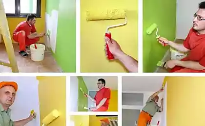
The abundance of colors, materials, coatings, furniture, and many more very easy to get confused and difficult to understand. If your intention is to bring to life unusual and bold design — best entrust this task to a professional. However, if you are ready to venture on independent experiments, take into consideration a few key recommendations.
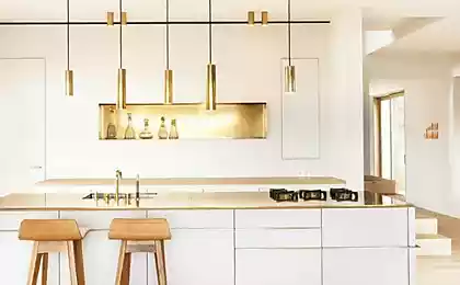
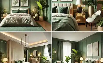
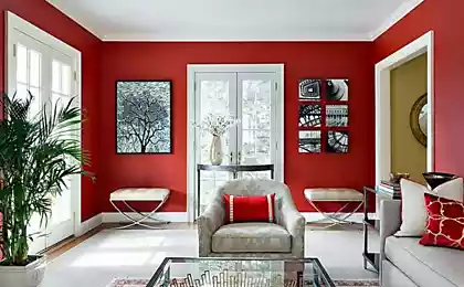
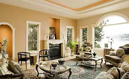
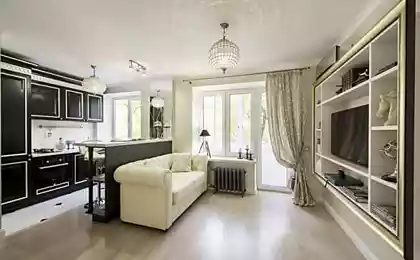
Most importantly the interior should be the basis! To start with style and color that will be used as the core. For example, you like modern interiors in light colours: grey, milk, pastel.
This means that the Wallpaper or plaster it is better to choose in these colors, shades of upholstered furniture may differ slightly in tone, but they should not argue with the color of the walls, the door can be a light shade and flooring are darker or, conversely, lighter. To complete the interior complete the overall space furniture in the same colors.
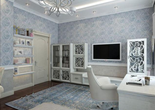
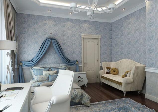
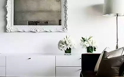
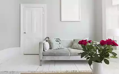
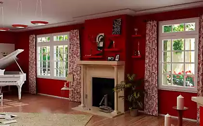
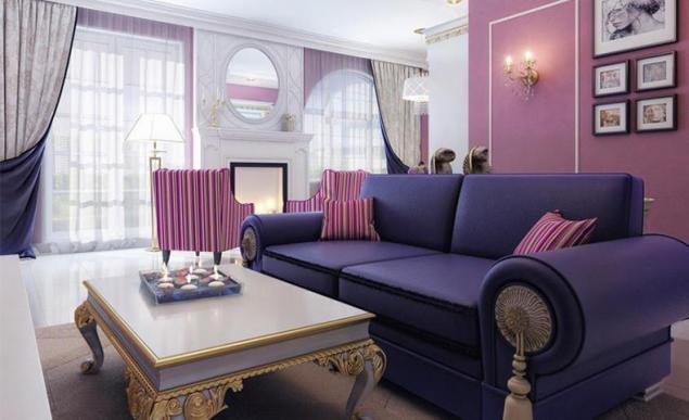
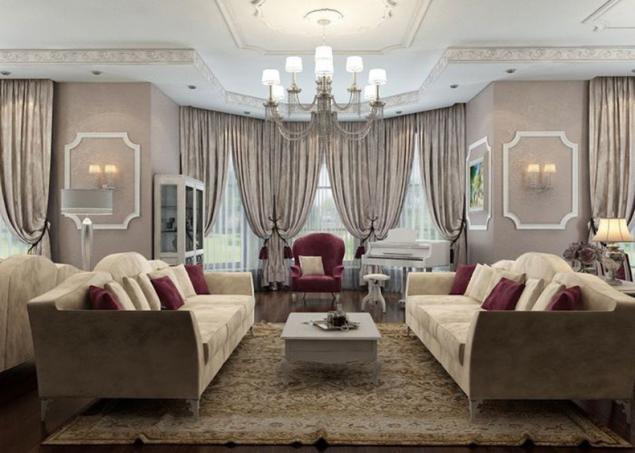
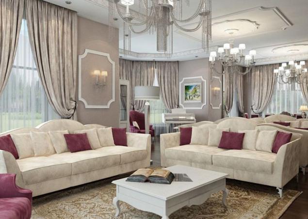
Don't make the walls a different color, this technique has long outlived its usefulness and is rather in bad taste, than an interesting solution. In the future, you can add to the interior some bright accents are one or two colors.
What exactly not to do
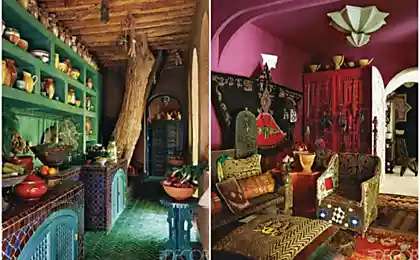
No need to collect in the interior of the completely opposite styles or use the same space more than three different colors. Even if you really like the interior of your beloved friend with the classic moldings and last year you stayed in the hotel in the style of hi-tech, and you feel comfortable, and at the same time in Morocco was the inspiration behind a local cafe — no need to use in your new interior all at once, to make a Hodge-podge of colors and a jumble of parts.
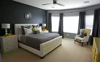
To afford the luxury of will be able only a professional who will carefully think through every detail. Ugly together will look different dark shades for example black gloss furniture next to the brown or blue accessories brutal sofas with Burgundy walls. In this case it is better to use contrasting combinations that always look great against the dark decisions.
Do not use in the interiors of a lot of glossy surfaces, too small, lumpy and irritating to the eye pattern. Home is the abode of peace, there is no place for worries and discomfort.
What can be mixed?
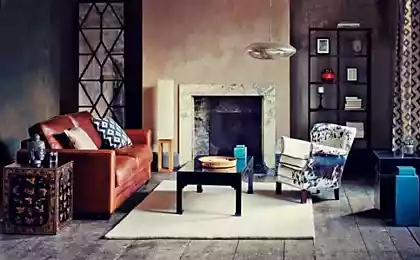
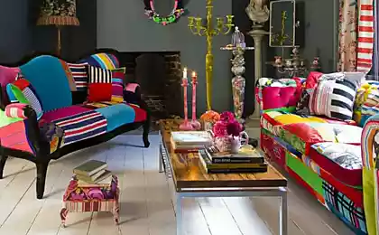
If you want bright solutions, unusual experiments and an extraordinary individual space, try the new interior is to combine two basic bright colors. It can be shades located in close proximity on the color wheel. The rest of the space can be designed in a modern and fun style.
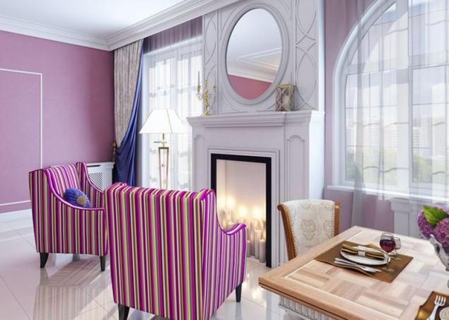
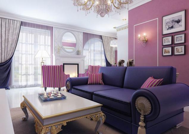
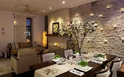
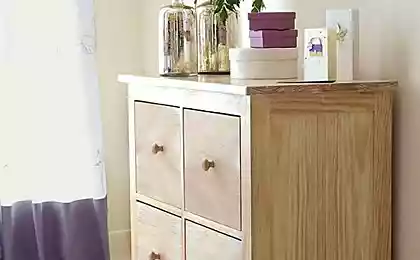
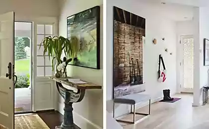
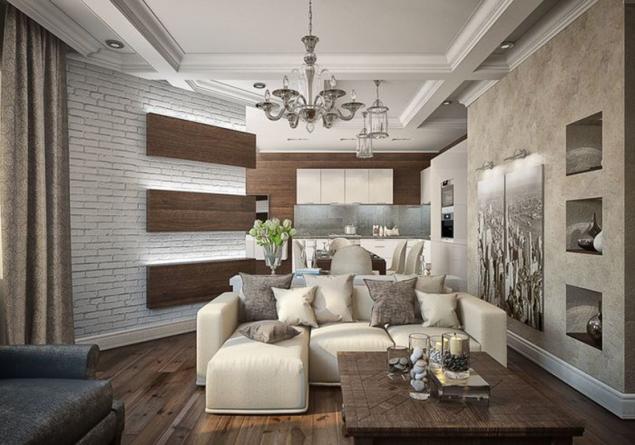
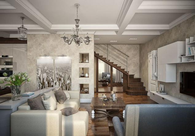
If you can't clearly imagine how will look the selected or desired color combination at the interior, then try to "play" with textures and combine two or three (no more) textures in the interior. It can be brick, plaster and wood. You will receive an original and interesting result.
Come to individual interior solutions carefully and thoughtfully! published
P. S. And remember, just changing your mind — together we change the world! © Join us at Facebook , Vkontakte, Odnoklassniki
Source: kvartblog.ru/blog/smeshat-no-ne-vzbaltyvat-sovmestimye-i-nesovmestimye-elementy-v-interere
The abundance of colors, materials, coatings, furniture, and many more very easy to get confused and difficult to understand. If your intention is to bring to life unusual and bold design — best entrust this task to a professional. However, if you are ready to venture on independent experiments, take into consideration a few key recommendations.

Most importantly the interior should be the basis! To start with style and color that will be used as the core. For example, you like modern interiors in light colours: grey, milk, pastel.
This means that the Wallpaper or plaster it is better to choose in these colors, shades of upholstered furniture may differ slightly in tone, but they should not argue with the color of the walls, the door can be a light shade and flooring are darker or, conversely, lighter. To complete the interior complete the overall space furniture in the same colors.


Don't make the walls a different color, this technique has long outlived its usefulness and is rather in bad taste, than an interesting solution. In the future, you can add to the interior some bright accents are one or two colors.


What exactly not to do
No need to collect in the interior of the completely opposite styles or use the same space more than three different colors. Even if you really like the interior of your beloved friend with the classic moldings and last year you stayed in the hotel in the style of hi-tech, and you feel comfortable, and at the same time in Morocco was the inspiration behind a local cafe — no need to use in your new interior all at once, to make a Hodge-podge of colors and a jumble of parts.
To afford the luxury of will be able only a professional who will carefully think through every detail. Ugly together will look different dark shades for example black gloss furniture next to the brown or blue accessories brutal sofas with Burgundy walls. In this case it is better to use contrasting combinations that always look great against the dark decisions.
Do not use in the interiors of a lot of glossy surfaces, too small, lumpy and irritating to the eye pattern. Home is the abode of peace, there is no place for worries and discomfort.
What can be mixed?
If you want bright solutions, unusual experiments and an extraordinary individual space, try the new interior is to combine two basic bright colors. It can be shades located in close proximity on the color wheel. The rest of the space can be designed in a modern and fun style.


If you can't clearly imagine how will look the selected or desired color combination at the interior, then try to "play" with textures and combine two or three (no more) textures in the interior. It can be brick, plaster and wood. You will receive an original and interesting result.


Come to individual interior solutions carefully and thoughtfully! published
P. S. And remember, just changing your mind — together we change the world! © Join us at Facebook , Vkontakte, Odnoklassniki
Source: kvartblog.ru/blog/smeshat-no-ne-vzbaltyvat-sovmestimye-i-nesovmestimye-elementy-v-interere