583
Pink quartz and purple in interior design 2016
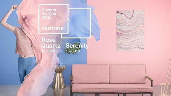
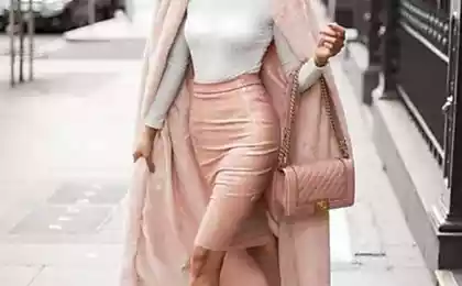
For the first time two tone pink quartz and purple is chosen as the colors of 2016, according to Pantone. This combination showed a perfect balance between the warm pink colors and peaceful cool blue that reflects serenity, peace, sense of order and peace.
The combination of rose quartz and lilac challenges the traditional perception of color associations.
Everywhere blurred faces things that are specific to a particular gender, which will certainly affect the trends in colors and also in all other areas of design. This unilateral approach to color coincides with social movements towards equality of the sexes, superior of the consumer as a form of expression generation, which are less prone to typical and has a more open exchange of information. It certainly affects the various approaches to the use of color.
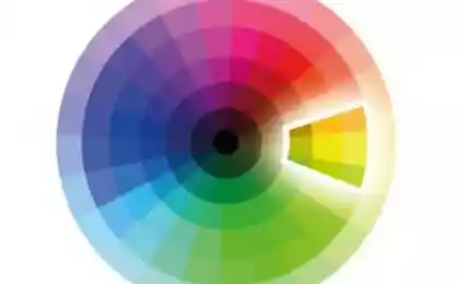
What is the color of the year 2016?
This choice, of course, symbolic; it is the color reflection of the trends observed in our culture, it captures the mood and attitude towards the world.
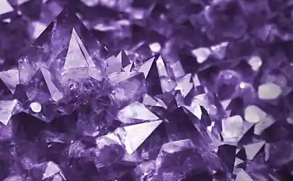
Pantone notes that the first two shades as colors, 2016. Rose quartz is a subtle, gentle tone that conveys a sense of tranquility.
Purple color weightless, similar to the vast expanses of blue sky above our heads, giving a feeling of peace and relaxation in the turbulent flow of time.
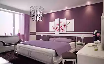
The combination of rose quartz and lavender brings calm and relaxation. They can be easily combined with other colors, including green and purple, rich brown and all shades of yellow and pink. Add silver glitter or hot bright colours to bring a splash and make sparkle.
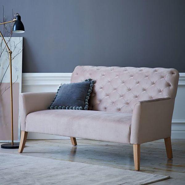
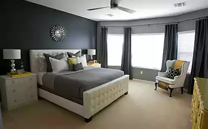
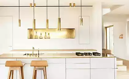
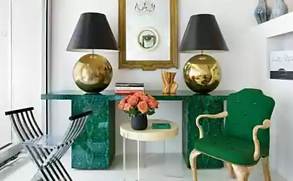
Soothing textilesWe start with a lovely pink for the living room. This sofa is dusty-rose color with a comfortable backrest and a velvety sheen upholstery.
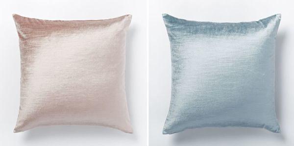
Need pillows for the sofa? Choose the velvet option from the wide range presented in any interior shop. Rose quartz and pale blue shades – a perfect balance of warmth and coolness. If You prefer simple accessories, pay attention to pillows made of cotton in pink color, and hue shale.
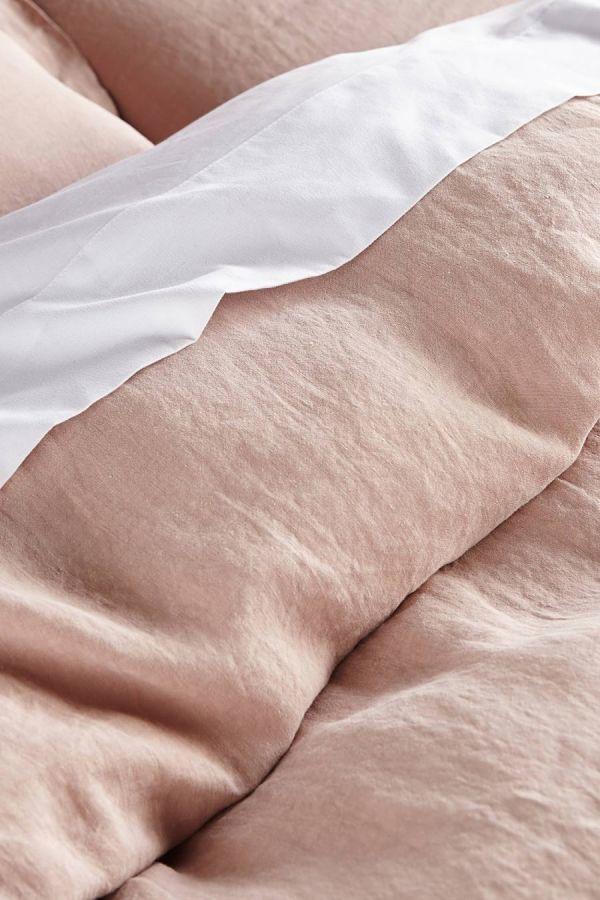
Soft and gentle lingerie brings comfort and warmth to the bedroom and this faded shade of peachy-pink is a softer pink analogue quartz.
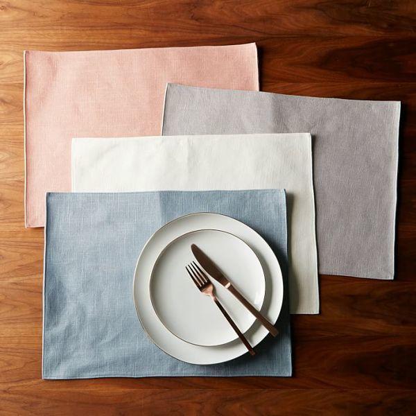
Add some pink and blue charm to the dining room in the form of napkins. They will not leave you indifferent, because it combines the tranquility of a warm pink quartz and purple cold. In addition, they have a little sparkle!
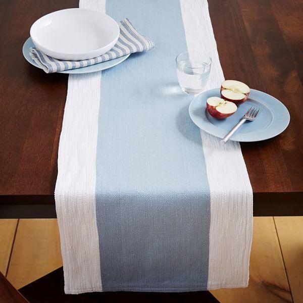
You can also add a quiet light blue on the dining room table with a small tablecloth in the center. The blue looks great against pure white.
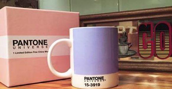
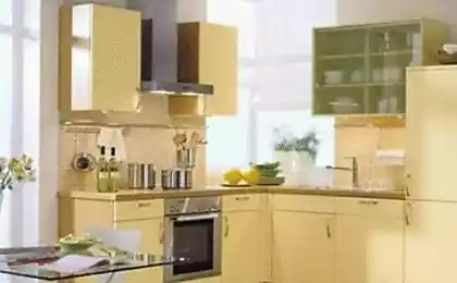
Bright accessoriesAll the shades of Pantone can be used at home in the form of accessories and table accents. A true classic – this cookware color year, for example, circles. This year they have two colors.
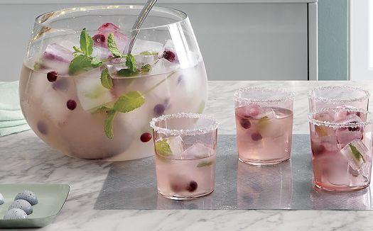
Speaking on the topic of dishes for drinks, will certainly mention a pair of light pink glasses. This color is often featured in trendy shades and can live in Your kitchen.
Fashion ceramic jewelry is filled with shades of rose quartz and lilac. Place them in a prominent place. Don't be afraid to add detail to darker or lighter shades of blue and pink for a change.
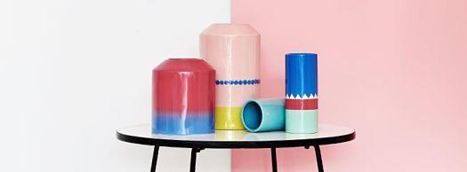
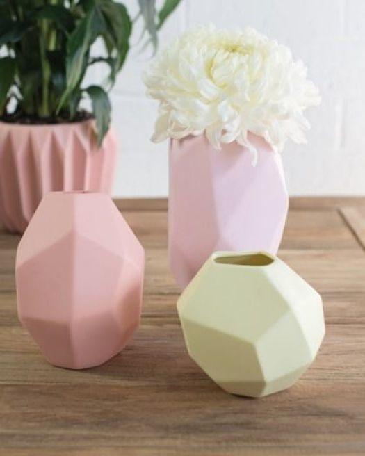
If You prefer solid shades, home accessories, note ceramic vase pink.
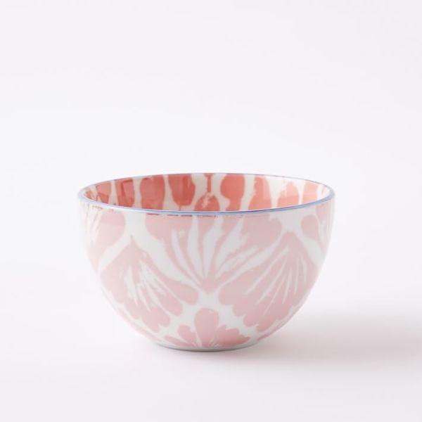
The bowl pattern will be a perfect addition for a Desk or shelf. Let it be a light pink version with a delicate blue rim.
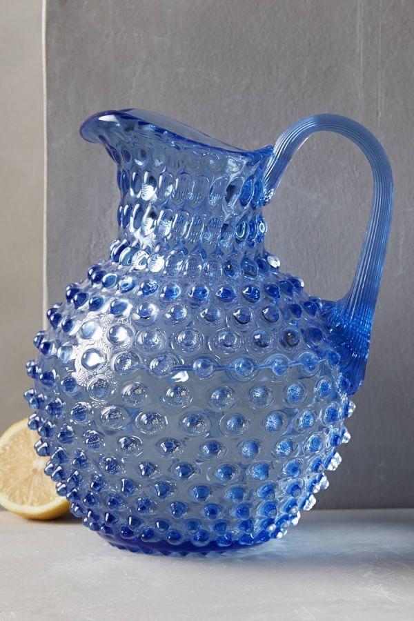
Jug interesting blue tint to use for everyday use. It is possible to keep the water in the dining room. Emphasis will be pink napkin on the table.
Two amazing colors that perfectly complement each other, chosen colors of the year is no accident. They are really interesting. And let 2016 be the year of balance, peace and tranquility! published
P. S. And remember, only by changing their consumption — together we change the world! ©
Join us in Facebook , Vkontakte, Odnoklassniki
Source: styldoma.ru/interer/tsvet-goda-2016
The combination of rose quartz and lilac challenges the traditional perception of color associations.
Everywhere blurred faces things that are specific to a particular gender, which will certainly affect the trends in colors and also in all other areas of design. This unilateral approach to color coincides with social movements towards equality of the sexes, superior of the consumer as a form of expression generation, which are less prone to typical and has a more open exchange of information. It certainly affects the various approaches to the use of color.

What is the color of the year 2016?
This choice, of course, symbolic; it is the color reflection of the trends observed in our culture, it captures the mood and attitude towards the world.
Pantone notes that the first two shades as colors, 2016. Rose quartz is a subtle, gentle tone that conveys a sense of tranquility.
Purple color weightless, similar to the vast expanses of blue sky above our heads, giving a feeling of peace and relaxation in the turbulent flow of time.
The combination of rose quartz and lavender brings calm and relaxation. They can be easily combined with other colors, including green and purple, rich brown and all shades of yellow and pink. Add silver glitter or hot bright colours to bring a splash and make sparkle.
Soothing textilesWe start with a lovely pink for the living room. This sofa is dusty-rose color with a comfortable backrest and a velvety sheen upholstery.

Need pillows for the sofa? Choose the velvet option from the wide range presented in any interior shop. Rose quartz and pale blue shades – a perfect balance of warmth and coolness. If You prefer simple accessories, pay attention to pillows made of cotton in pink color, and hue shale.

Soft and gentle lingerie brings comfort and warmth to the bedroom and this faded shade of peachy-pink is a softer pink analogue quartz.

Add some pink and blue charm to the dining room in the form of napkins. They will not leave you indifferent, because it combines the tranquility of a warm pink quartz and purple cold. In addition, they have a little sparkle!

You can also add a quiet light blue on the dining room table with a small tablecloth in the center. The blue looks great against pure white.

Bright accessoriesAll the shades of Pantone can be used at home in the form of accessories and table accents. A true classic – this cookware color year, for example, circles. This year they have two colors.

Speaking on the topic of dishes for drinks, will certainly mention a pair of light pink glasses. This color is often featured in trendy shades and can live in Your kitchen.

Fashion ceramic jewelry is filled with shades of rose quartz and lilac. Place them in a prominent place. Don't be afraid to add detail to darker or lighter shades of blue and pink for a change.

If You prefer solid shades, home accessories, note ceramic vase pink.

The bowl pattern will be a perfect addition for a Desk or shelf. Let it be a light pink version with a delicate blue rim.

Jug interesting blue tint to use for everyday use. It is possible to keep the water in the dining room. Emphasis will be pink napkin on the table.

Two amazing colors that perfectly complement each other, chosen colors of the year is no accident. They are really interesting. And let 2016 be the year of balance, peace and tranquility! published
P. S. And remember, only by changing their consumption — together we change the world! ©
Join us in Facebook , Vkontakte, Odnoklassniki
Source: styldoma.ru/interer/tsvet-goda-2016


The surveillance camera was shot, which are the envy of the wildlife photographers
Detoxification: what you need to know in order not to harm health