506
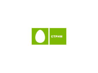
On the green egg someone came. Stream disclaims eggs and changes logo
Telecommunication holding AFK "System" deprived "Stream" its rightful eggs in a square green color.
The new logo will be the element through the brand "Stream", which now incorporates "Stream Online", "Stream TV", "Mobile Stream" and "Stream Content»
"The new logo is ideally reflect the main features of the brand" Stream ": modern, dynamic and unlimited opportunities for our subscribers", - says General Director of "Sistema Mass Media" Eldar Razroyev.
The company attributed the cause of the change of the logo that the brand "Stream" submitted to the media unit, which is engaged in the production of content, and egg - logo only telecom unit "Systems».
A large-scale advertising campaign to introduce the next image "Stream" will start in December and will continue throughout the first quarter of next year.
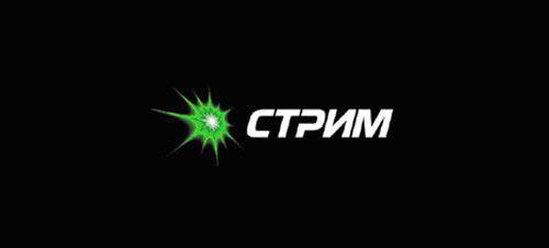
"Green Star", which became the new company's logo instead of the "egg" and the squares for the "Stream-TV" developed by the agency «Maxima».
The agency follows the argument of choice logo:
MARK - means the birth of a supernova explosion, a powerful burst of energy, a breakthrough from another dimension.
Color - green in this case represents the natural growth and development, knowledge and hope.
FORM - an aggressive form of acute angle gives a feeling of morning freshness and at the same time, the breakthrough into the unknown.
BACKGROUND - black emphasizes good logo, giving it the mystique and mystery.
WRITING AND SLOPE - as if the letters are pulled out from the center of the star.

"It was»:
via # image679805
The new logo will be the element through the brand "Stream", which now incorporates "Stream Online", "Stream TV", "Mobile Stream" and "Stream Content»
"The new logo is ideally reflect the main features of the brand" Stream ": modern, dynamic and unlimited opportunities for our subscribers", - says General Director of "Sistema Mass Media" Eldar Razroyev.
The company attributed the cause of the change of the logo that the brand "Stream" submitted to the media unit, which is engaged in the production of content, and egg - logo only telecom unit "Systems».
A large-scale advertising campaign to introduce the next image "Stream" will start in December and will continue throughout the first quarter of next year.

"Green Star", which became the new company's logo instead of the "egg" and the squares for the "Stream-TV" developed by the agency «Maxima».
The agency follows the argument of choice logo:
MARK - means the birth of a supernova explosion, a powerful burst of energy, a breakthrough from another dimension.
Color - green in this case represents the natural growth and development, knowledge and hope.
FORM - an aggressive form of acute angle gives a feeling of morning freshness and at the same time, the breakthrough into the unknown.
BACKGROUND - black emphasizes good logo, giving it the mystique and mystery.
WRITING AND SLOPE - as if the letters are pulled out from the center of the star.

"It was»:

via # image679805