854
Fiero Animals - appartment talents
Studio fotoprodakshena Fiero Animals glove called Russian Platinum FMD. The level fotoretushi that shows this small and very young studio, in our country does not show nikto.Rech is not so much ownership of the tools - this is not the most difficult, and that the "western" level, that suffers Russian advertising the public, including comments to the materials on this site. "When we start to do that?" - The most banal and hackneyed rhetorical question. Exhale, gradually began.
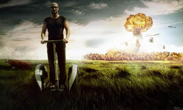
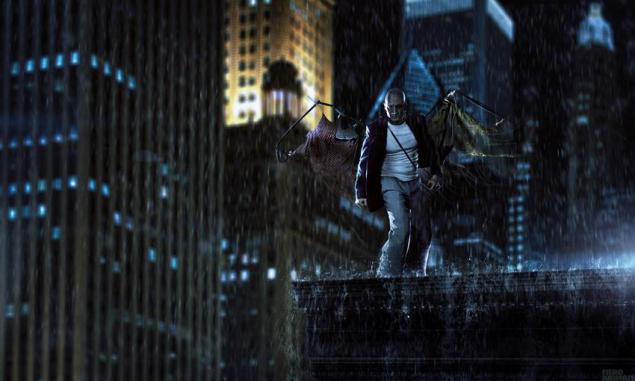
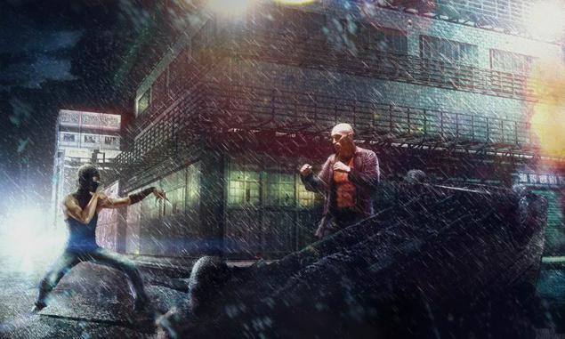
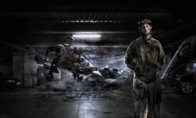
The site turned to the main man Fiero Animals, Nicholas Kvartnikovu , also known as nirt , with the request to tell about the studio and its work.
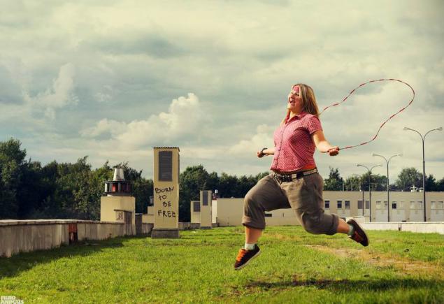
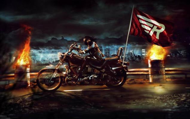
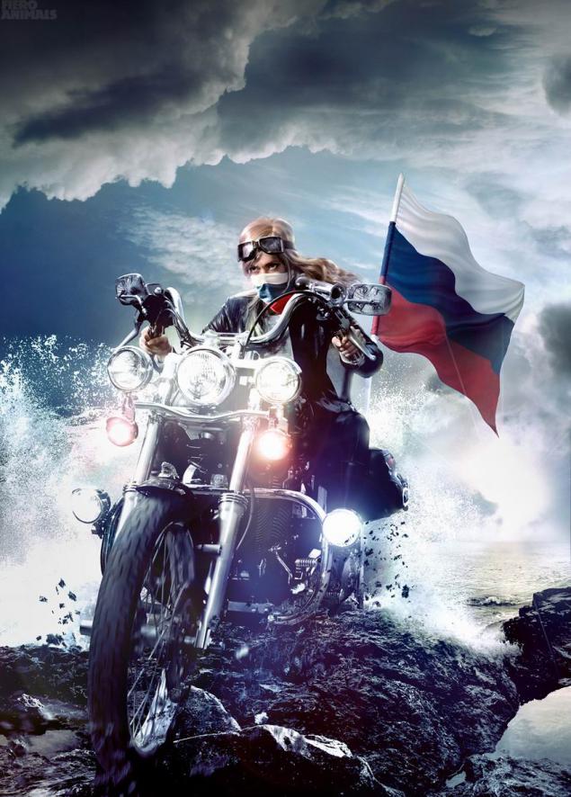
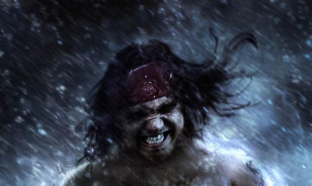
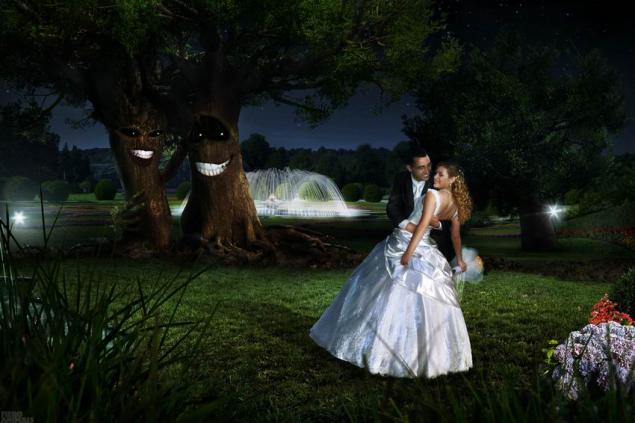
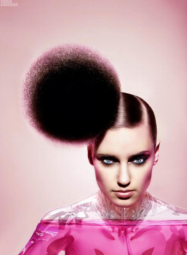
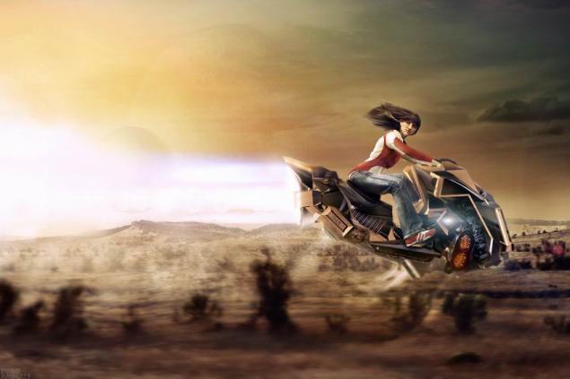
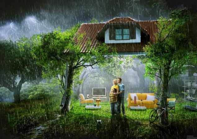
Read what came out of it, and look at the retouching by Fiero Animals.
FIERO Animals
from the Spanish animal fiero - «wild animal»
Italian fiero has a value of "brave, lively, mobile». i>
NachaloVse increased from freelancers. One customer, who were a big project, asked: "Why do not you take shape in the studio? A lot of work, you will develop it. And it will be easier to work together ».
Then I is not touched, I enjoyed freelancing. What might be the studio.
By the way, the big project never took place, because Manual client was afraid to lay down a massive campaign for one person. After two years there was still studio, the work becomes more and one became harder to handle.
Now FA - is 6 people. Four-drawing, modeling, photographing + 2 persons, who are engaged in the organizational part. I can say that the composition was formed recently, as people are not so easy to find.
Now comes a lot of letters from kids who want to learn and work.
But as soon as one realizes that it is only on the website pictures look fun, but in fact it is a lot of work (and sometimes night) - all desire disappears.
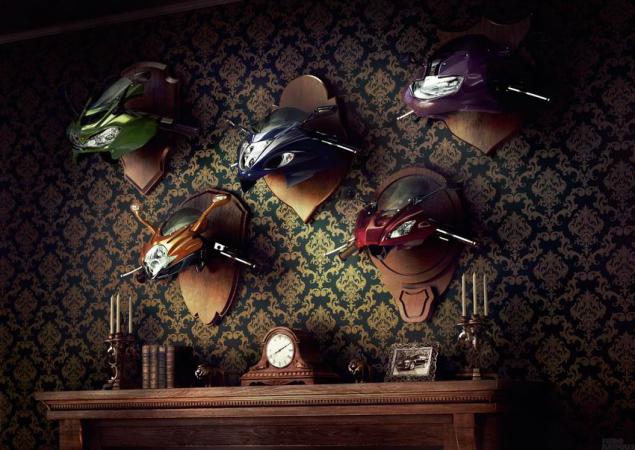
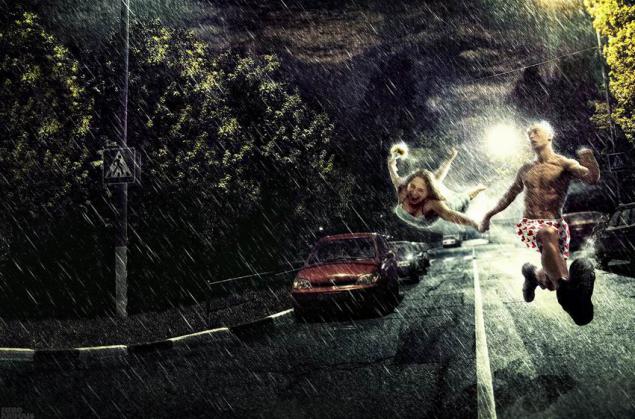
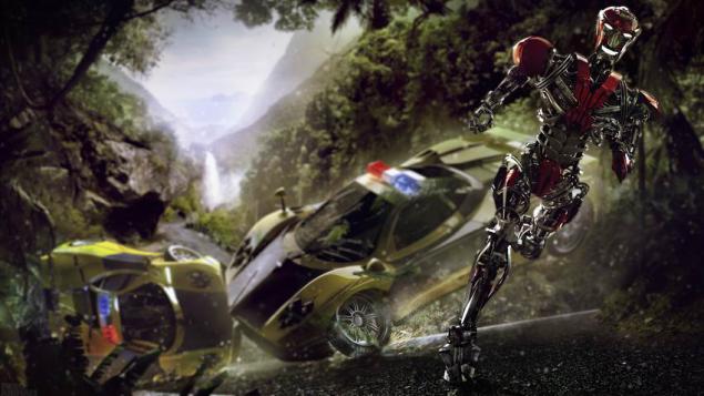
PochemuRetush was selected about 6-7 years ago. I then worked as a designer in a small company that is not involved in the design, ie, it was necessary to know all the little - Photoshop, Illustrator, Corel, flash, html, php, to deal with the graphic arts industry to be a sysadmin.
One day I came across a collection of prints Cannes Lions for several years on some website (it was something like an encyclopedia of advertising on Adme, but no credits at all without anything - just a ton of pictures).
Without exaggeration, but it was a culture shock! My mind can not understand how this is possible. Who does it? Where? A few weeks my sole occupation was just flipping these pictures. That was the direction chosen.
To be a good retoucher (and indeed, anyone good), you need a lot of time to devote to this. It is trite, but it's the only way. Plus you need to watch a lot of good work.
But it is important not to confuse the two. Since look - easy and fun, and do heavy and lazy. At first, continually blows where fun and easy :)
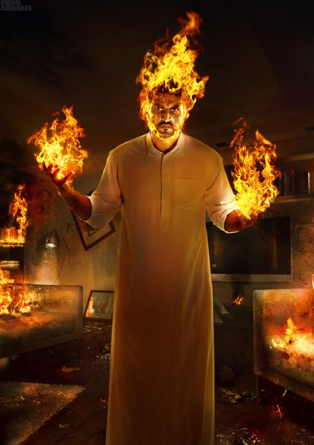
For chegoVozmozhno, I'm navreno about personality, but I think Leo Burnett said the show can be a great idea drawn pencil on a sheet. But he forgot to add that in this way the idea of anyone else outside of the agency will not need it. Implementation determines then someone looking at established or not. Otherwise, only to circle and pencil sketches hung, and we have watched the movie in the form of storyboards. That would be a pleasure.
In nasImage manipulation, in fact, it is very developed in our country. Only it's often extreme - or "caramel" tehdizayn or some trash. But soon all will recover, in Russia is only the beginning of it all, and people learn, experiment. We lag behind at least ten years, but increasingly there are interesting specialists in various branches of advertising. While the piece, but all will be well.
Industry print advertising, in principle, in Russia somewhere in the backyard including due to the lack of sufficient high-quality performers. Many customers put videos on the forefront in the promotion of the large audience coverage.
But at the same time, the rollers now we have more "immunity." You often switch the channel when the ads begin? I almost always. Print is anyone's personal space does not break, and a beautiful picture more chances to stop you on the street when you're flipping through a magazine or on the Internet. A nice video you can not see, because before it started, "Auntie Asya", and you will immediately switched.
This, of course, a vast topic. But the prints, in one form or another, will always be - that's for sure.
Complex technical and well-made photo illustration we are not so common. We often see a good shot people, cars, cosmetics + text. Why not paint on to something else?
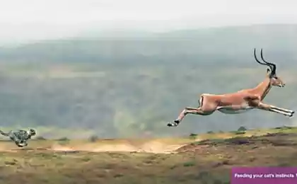
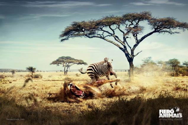
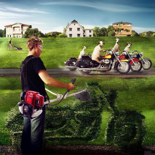
If for prints Fiero Animals, we would have left a lion attacking a zebra, it would be "Hello, in the animal world." A bit manipulation, and the picture became a lot more fun.
Incidentally, this print is especially fond lovers clone. After the first publication of his more than a year ago, and its participation in festivals, I have met three times a zebra, a lion that eats. It fans.
Ambition and festivaliStudii not even "not so many years," and "not so many months." But to declare afford that portfolio had met a few months. Of course, still have a lot of work to do.
I look with admiration at the Platinum FMD, but I can say that he is satisfied how things evolve, because I understand that Platinum for 18 years, and Fiero Animals - 1 year.
Already shortlisted in the Ad Stars showed that the direction taken is correct. Festivals - this, of course, a kind of public relations.
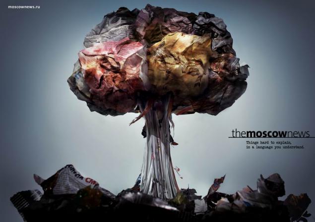
And with the works about animals in general got an interesting story - like the festival, they were not planned. A year ago, when the name of the studio and came up with this series, I would like to place it on the thematic resources and magazines. At that moment we were working with Andreas Toscano on a series to The Moscow News. I showed him a series of animals and said that I was going to post it in our journals devoted to advertising. He said: "You just have to send the series to Cannes." After a while, I saw the news on Adme with the theme of "Russian advertising unexpectedly well appreciated at the festival in Busan" and a preview of our work. The first reaction - in which even Busan?
Then he phoned Andreas: «Fiero in the final Congratulations!". It turned out that he had sent her there on behalf of the studio. Actually, I'm very grateful to him. We did not think about the festivals, we thought about how to work and look for customers.
More interesting feeling when you come to the mall and about Reebok brand shop people look at your work and speak favorably about it. Or when you see the evening of 6 × 3 with lighting that made for TV3. It's like a mermaid swimming in a large aquarium.
But festivals - it's very nice, of course. Although I believe that our work had to take the gold, haha :)
LyubimoeKakuyu something best work hard to mention, each in its own interest.
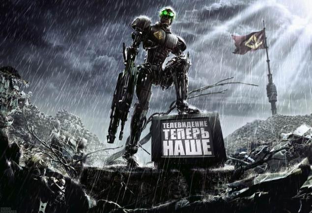
I like the campaign for TV3 - it was a large and technically interesting design + very short time, that is, was doubly fun.
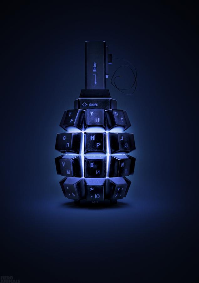
Like the concept of a grenade. It somehow all came spontaneously that the keyboard keys are similar to the tabs that are on the grenade.
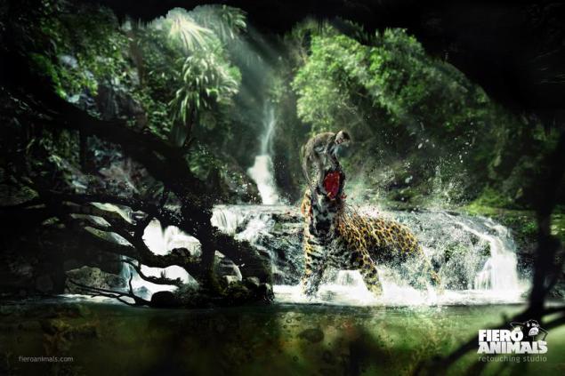
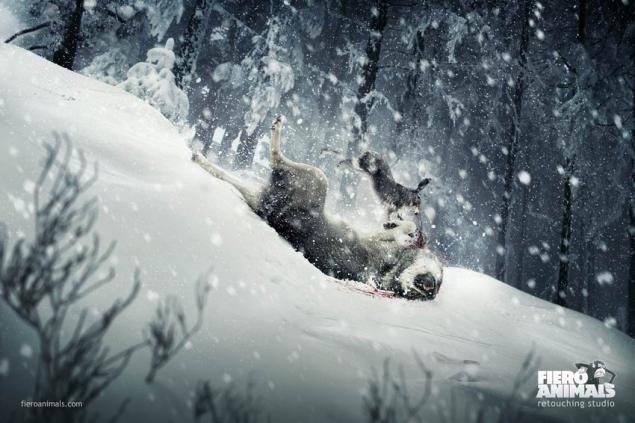
For obvious reasons, I love the series for Fiero Animals. In talking about the logo Fiero Animals that monkey aggressive, I said jokingly that it is necessary to make a zebra, lion zhruschey, and then only after 15 minutes realized that it is really worthwhile idea.
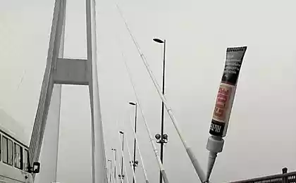
I like the print about the glue that invented Lapshinov Denis and Denis Eliseev from BBDO. On the one hand it's very simple, but on the other it is necessary to come to this.
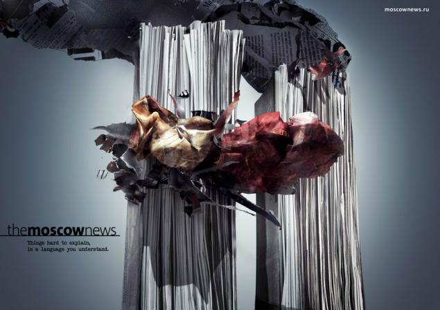
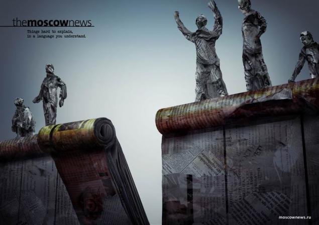
The Moscow News to cool. I really liked how it came to Andreas. He showed photos Shopping Centre and then folded several newspapers and magazines together. And by lines forming a stack of newspapers, this design is very reminiscent of the architectural lines of the World Trade Center.
I like a lot of work to do, but of course, I understand that this is only the beginning.
Clients and rabotaProtsess work with clients is built differently. Sometimes people come to us with well-painted and the brief sketches.
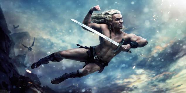
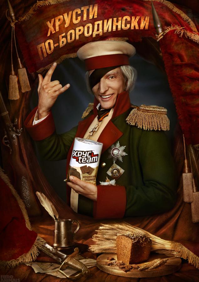
For example, when doing layout "crunches on the Borodino" for BBDO we needed after shooting retouch and collect from various frames with Paul Will, still life, weapons and banners Photoillustrations a whole according to the sketch.
Sometimes it comes with a brief text description of what should be in the end.
Or so - "The main thing that was cool» © Gosha Kutsenko. For SIM magazine also came - he was executed a year, and just a matter of going to the New Year.
In the studio invented stories, drawn sketches, organize surveys and done fast. That is all from the beginning to the end. I can not say that Fiero Animals - is only retouching studio.
The most difficult part in the process - this is the beginning. Planning what to shoot, what to model that will be drawn. If at the beginning miss something, you then have to suffer.
And, probably, it is the first step in the work, only when the future is determined by the style of the image.
When the project begins, the first - a work plan. Of course, it has long been a system, how to construct a similar picture, but all the same it is better to paint.
Previously, it was difficult to carry on more than one project simultaneously. But in the process of creating each image has a lot of original grind. That this point is very important because that's when you start to think through all the details.
The intermediate stages are usually painted in the timing (it is such excel-file with the term of delivery). While freelancing helped me is that I never filled up the timing, was not such that I did not pick up? or something like that. Maybe someone from the outside it may seem silly, but I appreciated the significance of this, as in the work had to deal with people from gouging the problem really exists, although much of it no one says. On Adme unlikely someone would write that "this project we would like to hand over in January and in July passed».
If any comments from the client really need half an hour, he made a half-hour. If we see that it should take longer than the client requests, then we talk about it. But what can be done quickly, we do quickly, and it allows you to stay in the timing.
Over time, our relationship to the intervention of the customer or the agency in the process of becoming calmer.
No, we do not do everything that we were told, and if we see another option, then offer it. To be honest, once I lost a few customers because of unnecessary and absolutely foolish ambition. I do not know where it came from at the time, perhaps, it is common to all who just something began to turn out, but still do not understand that this is a drop in the sea.
Now the work has become much easier. Probably I picked up some experience. Plus, a rule we have now - after the approval of the working conditions, our manager is always on the client side.
I want to say that the strong reaction to the intervention of the customer - it's a sign of immaturity. This is necessary to recover. Inadequacy is very rare - most people simply misunderstand each other. And it must be without any "down" in a common effort.
Shoulder to shoulder to the client or agency works very uncomfortable. It happened that at the time the project was asked to relocate to the client's office. Denial always. What for? Privacy - signed by the appropriate document. Sometimes asking already taking something sketching client to see that the process has begun. But the work always takes time to analyze what happened in the course of filming, and then get to work. With the move, you can only do bad - who cares? For example, if I spent all day taking pictures, I can not in the same evening to start working. This is normal, the client usually also speaks of a time to "digest».
When we hand over to the client work, of course, we still have options that never left the studio. Something just search style, something for the whole composition and plot. For example, a zebra with a lion for yourself redraw times 4.
For Moscow News was 5 stories, and eventually left 3. Not because they were bad technically. They could be in the final level of the existing, but sketches, we realized that something will stand out, something banal, but somewhere in the story is too hard.
Now our work style can be described as the creation of work with all kinds of resources and equipment, such as photography, illustration and 3D, their combination. We will deal with some of our illustrators to create jobs is really a new style. For us it is important that in the production of Russian experts involved. Briefs, which comes with a proposal to remove the western photographer, quietly removed our might. From the West to work is interesting, but the photos we have now really, really not bad.
UrokiProsmatrivat other people's work - is to learn. Once we were discussing whether a man cut off from civilization, to come up with something brilliant?
No. This person can come up with a bike in the best case. Once I was like not the best design courses (when still worked as a designer, system administrator), and even there, they said that without the experience accumulated by generations, can only learn how to shit and eat in different places + more on the little things. We just need the experience of others. See other people's work - is to learn.
Who is the best - Platinum FMD and Taylor James. Both studios are based god knows when. Cgtalk.com - good community illustrators.
Specific other people's work is difficult to distinguish. You can start flipping past and present collections of Cannes Lions and celebrate each time something new. But such "Damn, why did not I?" There is little, because they did not do. Here it is necessary to engage in a project with the head, then to feel that it was bad and what is good.
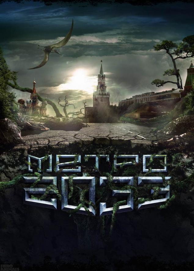
At this stage, we still teach that it is necessary, respectively task. We rented cars - turned to automotive photography. We worked on the environment - addressed to photographers who can shoot the temple as if it sets a science fiction movie. Now there is someone to learn.
MechtaMnogie answer the question "with what the brand would like to work» - Apple. Here with Apple has no desire to work, and so they are all excellent.
At one time, came a lot of orders, "and we need to draw a beer on a background of clouds" or "beer on ice background." Refuses, uninteresting, and without our already hanging a bunch of such advertising. And now we think, because someone must have finally draw a nice beer in the clouds. In general, we now have a dream - to draw a beer in the clouds.
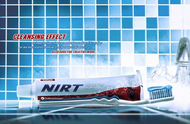
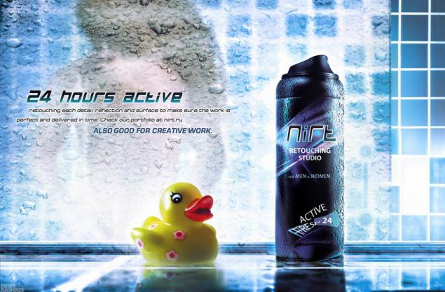
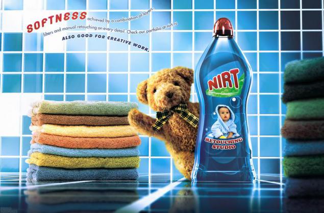
Also read the interview can Kurenkov, Russian nugget Motion graphics.
via / interview / 2009/08/13/60291 /
The site turned to the main man Fiero Animals, Nicholas Kvartnikovu , also known as nirt , with the request to tell about the studio and its work.
Read what came out of it, and look at the retouching by Fiero Animals.
FIERO Animals
from the Spanish animal fiero - «wild animal»
Italian fiero has a value of "brave, lively, mobile». i>
NachaloVse increased from freelancers. One customer, who were a big project, asked: "Why do not you take shape in the studio? A lot of work, you will develop it. And it will be easier to work together ».
Then I is not touched, I enjoyed freelancing. What might be the studio.
By the way, the big project never took place, because Manual client was afraid to lay down a massive campaign for one person. After two years there was still studio, the work becomes more and one became harder to handle.
Now FA - is 6 people. Four-drawing, modeling, photographing + 2 persons, who are engaged in the organizational part. I can say that the composition was formed recently, as people are not so easy to find.
Now comes a lot of letters from kids who want to learn and work.
But as soon as one realizes that it is only on the website pictures look fun, but in fact it is a lot of work (and sometimes night) - all desire disappears.


PochemuRetush was selected about 6-7 years ago. I then worked as a designer in a small company that is not involved in the design, ie, it was necessary to know all the little - Photoshop, Illustrator, Corel, flash, html, php, to deal with the graphic arts industry to be a sysadmin.
One day I came across a collection of prints Cannes Lions for several years on some website (it was something like an encyclopedia of advertising on Adme, but no credits at all without anything - just a ton of pictures).
Without exaggeration, but it was a culture shock! My mind can not understand how this is possible. Who does it? Where? A few weeks my sole occupation was just flipping these pictures. That was the direction chosen.
To be a good retoucher (and indeed, anyone good), you need a lot of time to devote to this. It is trite, but it's the only way. Plus you need to watch a lot of good work.
But it is important not to confuse the two. Since look - easy and fun, and do heavy and lazy. At first, continually blows where fun and easy :)


For chegoVozmozhno, I'm navreno about personality, but I think Leo Burnett said the show can be a great idea drawn pencil on a sheet. But he forgot to add that in this way the idea of anyone else outside of the agency will not need it. Implementation determines then someone looking at established or not. Otherwise, only to circle and pencil sketches hung, and we have watched the movie in the form of storyboards. That would be a pleasure.

In nasImage manipulation, in fact, it is very developed in our country. Only it's often extreme - or "caramel" tehdizayn or some trash. But soon all will recover, in Russia is only the beginning of it all, and people learn, experiment. We lag behind at least ten years, but increasingly there are interesting specialists in various branches of advertising. While the piece, but all will be well.
Industry print advertising, in principle, in Russia somewhere in the backyard including due to the lack of sufficient high-quality performers. Many customers put videos on the forefront in the promotion of the large audience coverage.
But at the same time, the rollers now we have more "immunity." You often switch the channel when the ads begin? I almost always. Print is anyone's personal space does not break, and a beautiful picture more chances to stop you on the street when you're flipping through a magazine or on the Internet. A nice video you can not see, because before it started, "Auntie Asya", and you will immediately switched.
This, of course, a vast topic. But the prints, in one form or another, will always be - that's for sure.
Complex technical and well-made photo illustration we are not so common. We often see a good shot people, cars, cosmetics + text. Why not paint on to something else?
If for prints Fiero Animals, we would have left a lion attacking a zebra, it would be "Hello, in the animal world." A bit manipulation, and the picture became a lot more fun.
Incidentally, this print is especially fond lovers clone. After the first publication of his more than a year ago, and its participation in festivals, I have met three times a zebra, a lion that eats. It fans.

Ambition and festivaliStudii not even "not so many years," and "not so many months." But to declare afford that portfolio had met a few months. Of course, still have a lot of work to do.
I look with admiration at the Platinum FMD, but I can say that he is satisfied how things evolve, because I understand that Platinum for 18 years, and Fiero Animals - 1 year.
Already shortlisted in the Ad Stars showed that the direction taken is correct. Festivals - this, of course, a kind of public relations.
And with the works about animals in general got an interesting story - like the festival, they were not planned. A year ago, when the name of the studio and came up with this series, I would like to place it on the thematic resources and magazines. At that moment we were working with Andreas Toscano on a series to The Moscow News. I showed him a series of animals and said that I was going to post it in our journals devoted to advertising. He said: "You just have to send the series to Cannes." After a while, I saw the news on Adme with the theme of "Russian advertising unexpectedly well appreciated at the festival in Busan" and a preview of our work. The first reaction - in which even Busan?
Then he phoned Andreas: «Fiero in the final Congratulations!". It turned out that he had sent her there on behalf of the studio. Actually, I'm very grateful to him. We did not think about the festivals, we thought about how to work and look for customers.
More interesting feeling when you come to the mall and about Reebok brand shop people look at your work and speak favorably about it. Or when you see the evening of 6 × 3 with lighting that made for TV3. It's like a mermaid swimming in a large aquarium.
But festivals - it's very nice, of course. Although I believe that our work had to take the gold, haha :)


LyubimoeKakuyu something best work hard to mention, each in its own interest.
I like the campaign for TV3 - it was a large and technically interesting design + very short time, that is, was doubly fun.
Like the concept of a grenade. It somehow all came spontaneously that the keyboard keys are similar to the tabs that are on the grenade.
For obvious reasons, I love the series for Fiero Animals. In talking about the logo Fiero Animals that monkey aggressive, I said jokingly that it is necessary to make a zebra, lion zhruschey, and then only after 15 minutes realized that it is really worthwhile idea.
I like the print about the glue that invented Lapshinov Denis and Denis Eliseev from BBDO. On the one hand it's very simple, but on the other it is necessary to come to this.
The Moscow News to cool. I really liked how it came to Andreas. He showed photos Shopping Centre and then folded several newspapers and magazines together. And by lines forming a stack of newspapers, this design is very reminiscent of the architectural lines of the World Trade Center.
I like a lot of work to do, but of course, I understand that this is only the beginning.


Clients and rabotaProtsess work with clients is built differently. Sometimes people come to us with well-painted and the brief sketches.
For example, when doing layout "crunches on the Borodino" for BBDO we needed after shooting retouch and collect from various frames with Paul Will, still life, weapons and banners Photoillustrations a whole according to the sketch.
Sometimes it comes with a brief text description of what should be in the end.
Or so - "The main thing that was cool» © Gosha Kutsenko. For SIM magazine also came - he was executed a year, and just a matter of going to the New Year.
In the studio invented stories, drawn sketches, organize surveys and done fast. That is all from the beginning to the end. I can not say that Fiero Animals - is only retouching studio.
The most difficult part in the process - this is the beginning. Planning what to shoot, what to model that will be drawn. If at the beginning miss something, you then have to suffer.
And, probably, it is the first step in the work, only when the future is determined by the style of the image.
When the project begins, the first - a work plan. Of course, it has long been a system, how to construct a similar picture, but all the same it is better to paint.
Previously, it was difficult to carry on more than one project simultaneously. But in the process of creating each image has a lot of original grind. That this point is very important because that's when you start to think through all the details.


The intermediate stages are usually painted in the timing (it is such excel-file with the term of delivery). While freelancing helped me is that I never filled up the timing, was not such that I did not pick up? or something like that. Maybe someone from the outside it may seem silly, but I appreciated the significance of this, as in the work had to deal with people from gouging the problem really exists, although much of it no one says. On Adme unlikely someone would write that "this project we would like to hand over in January and in July passed».
If any comments from the client really need half an hour, he made a half-hour. If we see that it should take longer than the client requests, then we talk about it. But what can be done quickly, we do quickly, and it allows you to stay in the timing.
Over time, our relationship to the intervention of the customer or the agency in the process of becoming calmer.
No, we do not do everything that we were told, and if we see another option, then offer it. To be honest, once I lost a few customers because of unnecessary and absolutely foolish ambition. I do not know where it came from at the time, perhaps, it is common to all who just something began to turn out, but still do not understand that this is a drop in the sea.
Now the work has become much easier. Probably I picked up some experience. Plus, a rule we have now - after the approval of the working conditions, our manager is always on the client side.
I want to say that the strong reaction to the intervention of the customer - it's a sign of immaturity. This is necessary to recover. Inadequacy is very rare - most people simply misunderstand each other. And it must be without any "down" in a common effort.
Shoulder to shoulder to the client or agency works very uncomfortable. It happened that at the time the project was asked to relocate to the client's office. Denial always. What for? Privacy - signed by the appropriate document. Sometimes asking already taking something sketching client to see that the process has begun. But the work always takes time to analyze what happened in the course of filming, and then get to work. With the move, you can only do bad - who cares? For example, if I spent all day taking pictures, I can not in the same evening to start working. This is normal, the client usually also speaks of a time to "digest».
When we hand over to the client work, of course, we still have options that never left the studio. Something just search style, something for the whole composition and plot. For example, a zebra with a lion for yourself redraw times 4.
For Moscow News was 5 stories, and eventually left 3. Not because they were bad technically. They could be in the final level of the existing, but sketches, we realized that something will stand out, something banal, but somewhere in the story is too hard.
Now our work style can be described as the creation of work with all kinds of resources and equipment, such as photography, illustration and 3D, their combination. We will deal with some of our illustrators to create jobs is really a new style. For us it is important that in the production of Russian experts involved. Briefs, which comes with a proposal to remove the western photographer, quietly removed our might. From the West to work is interesting, but the photos we have now really, really not bad.

UrokiProsmatrivat other people's work - is to learn. Once we were discussing whether a man cut off from civilization, to come up with something brilliant?
No. This person can come up with a bike in the best case. Once I was like not the best design courses (when still worked as a designer, system administrator), and even there, they said that without the experience accumulated by generations, can only learn how to shit and eat in different places + more on the little things. We just need the experience of others. See other people's work - is to learn.
Who is the best - Platinum FMD and Taylor James. Both studios are based god knows when. Cgtalk.com - good community illustrators.
Specific other people's work is difficult to distinguish. You can start flipping past and present collections of Cannes Lions and celebrate each time something new. But such "Damn, why did not I?" There is little, because they did not do. Here it is necessary to engage in a project with the head, then to feel that it was bad and what is good.
At this stage, we still teach that it is necessary, respectively task. We rented cars - turned to automotive photography. We worked on the environment - addressed to photographers who can shoot the temple as if it sets a science fiction movie. Now there is someone to learn.


MechtaMnogie answer the question "with what the brand would like to work» - Apple. Here with Apple has no desire to work, and so they are all excellent.
At one time, came a lot of orders, "and we need to draw a beer on a background of clouds" or "beer on ice background." Refuses, uninteresting, and without our already hanging a bunch of such advertising. And now we think, because someone must have finally draw a nice beer in the clouds. In general, we now have a dream - to draw a beer in the clouds.


Also read the interview can Kurenkov, Russian nugget Motion graphics.
via / interview / 2009/08/13/60291 /
