640
Advertising tools from Voronezh cracked wall
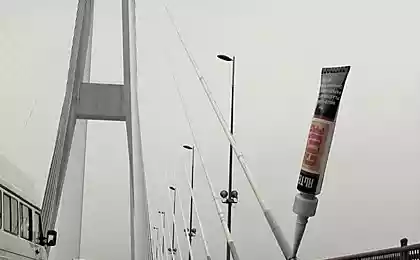
The company "Anchor", which specializes in the wholesale and retail sale of tools, developed an unusual outdoor reklamu.Kak told The site of the company, in addition to the basic functions of advertising - to draw attention to the store, the task was not quite close the beautiful wall.
The design and the idea was conceived in the advertising department of the company.
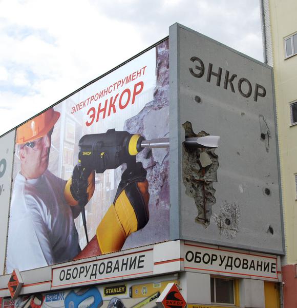
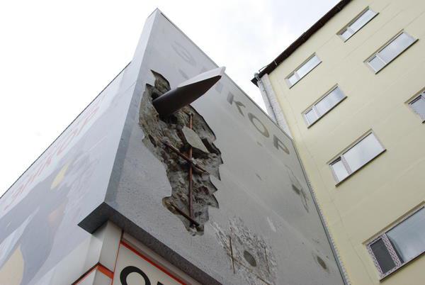
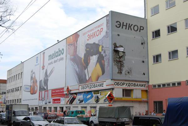
To realize the layout was originally made on a scale of 1: 8. It was picked up by the best sector and the angle of "chisel" to advertising design smotrelalas equally well from different angles while maintaining the visual effect.
The space is built into solid structures, creating the effect of breaking the wall, and, separately, sticking out of his chisel, the rest covered with a banner.
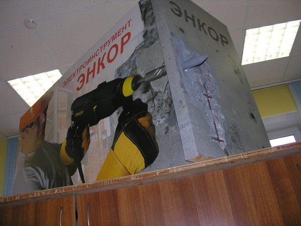
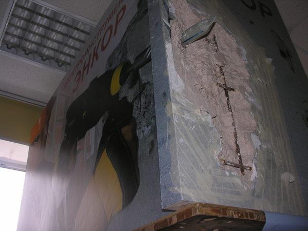
The idea - Stitch Maxim
Design - Natalia Lebedeva
Photographer design - Gribtsova Tatiana
The embodiment of a scale model - stitch Maxim and Barkalov Alexander
Manufacturer - Advertising Production Company SIGN director Nikolai Korjakin
"Dual listing" .Inogda a billboard is not enough, in order to realize a creative idea. And if space and funds permit, you can "stretch" to advertise on two or even three media made a real representation.
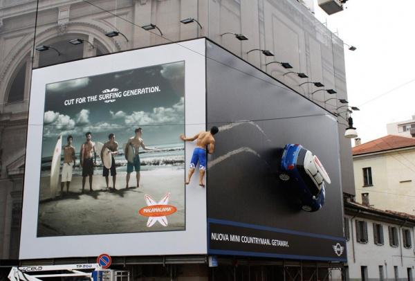
The latest example of using this technique can be called an Italian advertisement Mini. Advertising Mini on the building adjacent to the billboard surf brand Malamalama, which is nothing more than a fake, invented the original Mini in the framework of the campaign. But immediately attracts the attention of passers-by a figure of a young man, supposedly descended from the billboard Malamalama to from the corner to look at a new model of Mini.
Other examples of both unintentional and intentional neighborhood of two billboards, see our review of "Double Serving».
via / kreativnyj-obzor / dvojnaya-reklama-166255 /
The design and the idea was conceived in the advertising department of the company.


To realize the layout was originally made on a scale of 1: 8. It was picked up by the best sector and the angle of "chisel" to advertising design smotrelalas equally well from different angles while maintaining the visual effect.
The space is built into solid structures, creating the effect of breaking the wall, and, separately, sticking out of his chisel, the rest covered with a banner.


The idea - Stitch Maxim
Design - Natalia Lebedeva
Photographer design - Gribtsova Tatiana
The embodiment of a scale model - stitch Maxim and Barkalov Alexander
Manufacturer - Advertising Production Company SIGN director Nikolai Korjakin
"Dual listing" .Inogda a billboard is not enough, in order to realize a creative idea. And if space and funds permit, you can "stretch" to advertise on two or even three media made a real representation.
The latest example of using this technique can be called an Italian advertisement Mini. Advertising Mini on the building adjacent to the billboard surf brand Malamalama, which is nothing more than a fake, invented the original Mini in the framework of the campaign. But immediately attracts the attention of passers-by a figure of a young man, supposedly descended from the billboard Malamalama to from the corner to look at a new model of Mini.

Other examples of both unintentional and intentional neighborhood of two billboards, see our review of "Double Serving».
via / kreativnyj-obzor / dvojnaya-reklama-166255 /
