1271
Over the weekend, Google changed its logo, and you will not even notice
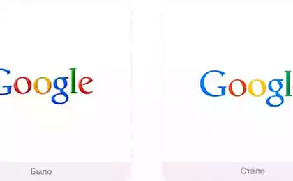
If last weekend while you sat on the Internet - you are likely to have met with the ubiquitous Google logo during your travels. But, nevertheless, you hardly noticed that Google has adjusted the letters on its logo, and even minor changes in the "quantitative" terms - they significantly change the quality.
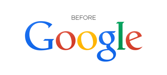
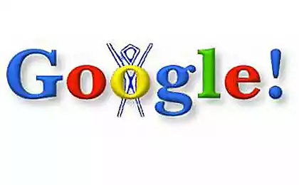
As is well known to every designer, relaxed kerning can cause significant problems. And nothing could be better than watching the letters, pixel by pixel, falls into the "right" place. In Google's case the lower edges of the letters «l» and «e» did not match exactly, and, as noted by the user site reddit.com nal1200, & quot; [It] was to cause bouts of madness, some employees & quot ;. To fix this, Google moved the letter «g» by one pixel to the right and the letter «l» one pixel down and to the right.
However, the correction of the Google logo can not be called unprecedented. Trades site Reddit, devoted to kerning, also pay attention to the fact that it is possible to trace the evolution of the logo by changing the number in the end of URL-a (in reference to the logo www.google.com/images/srpr/logo11w.png change the 11 to a lower value - and admire the earlier version of the logo). Starting with the last :

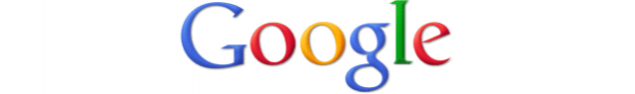
And going back to the very first :
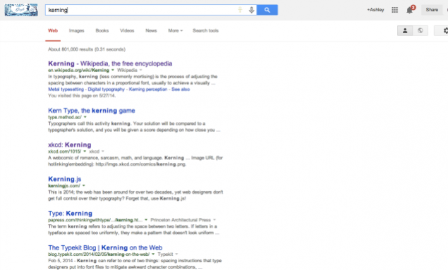
Therefore, if you still have doubts about the significance of proper kerning, simply check the results of a Google search on the word kerning. Every mention of the term is accompanied by a variety of tips and discussions, making kerning kind of science.
Regardless of whether you perceive it consciously or not - the correct placement of characters may indeed play a significant role in how neat and completed look your text - achieving perfect results here is no easy task. After all, even Google continues to try to find the best option. [Reddit via Daily Dot]
A Google spokesman provided a comment for Gizmodo:
We are happy to see that people notice and even positive about changes regarding individual pixels - we have recently made some changes to our logo to make it look as much as possible to clearly display all resolutions. I>
Source: habrahabr.ru/company/host-tracker/blog/224431/


