508
Guidelines for placement of road signs
Nikolay Rusanov (nickrusanov) writes in ru_auto:
I noticed that the signs in some places have begun to duplicate. That is, there is a restriction 50, and then through another thirty meters 50. It should be "overtaking is forbidden", then again he is. To the driver it was understandable. I came up with the idea. If the public service a little closer to that to understand modern Russian driver, why not push to the right decision?
It is clear also that the maximum will be clear only if explained properly.
Namely, to recommend the services responsible for the arrangement of traffic signs, especially in places that are important to not only duplicate the signs, but also to equip the second sign plate more information.
Example №1
Sign of the speed limit (after 30 meters a second sign with a table bearing the additional information to convince the driver to carry out the requirement sign :)
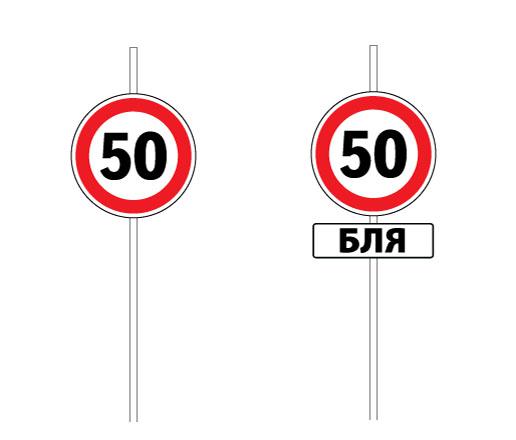
Example №2
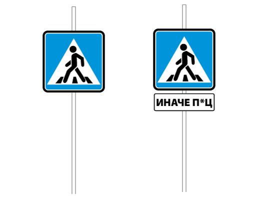
A pedestrian crossing sign (After 30 meters a second sign with a table explaining the responsibility in case of non-compliance tebovaniya mark):
Example №3
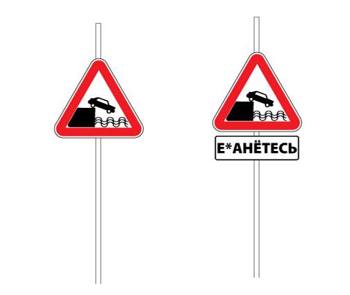
Sign of leaving the embankment (after 30 meters re-sign with the table briefly and clearly describes the potential consequences of non-compliance):
And so on, I think you get the idea. This approach does not impact positively on the standard of speech drivers, but it can have a positive impact on the culture of driving =) Well, duplicate characters will not look like a regular cut excess budget.
Source:
I noticed that the signs in some places have begun to duplicate. That is, there is a restriction 50, and then through another thirty meters 50. It should be "overtaking is forbidden", then again he is. To the driver it was understandable. I came up with the idea. If the public service a little closer to that to understand modern Russian driver, why not push to the right decision?
It is clear also that the maximum will be clear only if explained properly.
Namely, to recommend the services responsible for the arrangement of traffic signs, especially in places that are important to not only duplicate the signs, but also to equip the second sign plate more information.
Example №1
Sign of the speed limit (after 30 meters a second sign with a table bearing the additional information to convince the driver to carry out the requirement sign :)

Example №2
A pedestrian crossing sign (After 30 meters a second sign with a table explaining the responsibility in case of non-compliance tebovaniya mark):

Example №3
Sign of leaving the embankment (after 30 meters re-sign with the table briefly and clearly describes the potential consequences of non-compliance):
And so on, I think you get the idea. This approach does not impact positively on the standard of speech drivers, but it can have a positive impact on the culture of driving =) Well, duplicate characters will not look like a regular cut excess budget.

Source:

